Tag: Measures

  • Temple of DAX – 3D

    Temple of DAX – 3D

    To celebrate joining the Power BI Cat team next week, I thought I would update a DAX game I built last November (2018) which was a DAX-based maze game in Power BI that allowed you to navigate a character through a series of user-created maps in a top-down view.

    The details for that game are in this blog posting. http://radacad.com/fun-with-dax-a-maze-ing-dax.

    The update I wanted to make was to see what is involved in creating a 3D, first-person version of the same maze.  The following is how I got on.

    The PBIX File for the Temple of DAX – 3D can be downloaded using this link and here is a link to the publish to web version.


    Like the 2D version, the report imports a CSV file which it uses to generate the map.  I pretty much used exactly the same code to import the CSV file and pivot the coordinates to a format for suitable for processing in DAX.

    All you need to create/edit your own custom maps is to open and edit a CSV file using your preferred editor and place an X character where you would like a wall to be and an I character for the insight (or exit).  Excel is great for this particular task as you can size and align the columns nicely to easily see where walls will be.

    The following image shows the data1.csv file opened in MS Excel, with all columns set to the same width of 15-pixels.  Once modifications are complete, save the file as CSV (not xlsx) in the folder the PBIX file uses to import from.

    Once again, I’d like to thank Margarida Prozil for providing a custom control to manage the navigation.  This is an updated version of the D-PAD called a 3D-Pad.  You can grab a copy from her GitHub repo if you are keen to work with this control.

    https://github.com/mprozil/dPad-3D/tree/master/dist

    The control has four arrows.  The Up/Down arrows move you back and forward through the map, while the left/right arrows spin you 45 degrees.  This is different behaviour to the D-Pad in the 2D version of the maze.

    I’d also like to thank Mike Carlo at PowerBI.Tips for providing the wonderful background image and the overall visual design of the game.  It was Mikes idea for the evil laugh on the intro page.  This started to drive me a bit nutty as it would play everytime I saved the file.

    The Game Logic

    Like the 2D game, this version uses SVG as the method to draw the graphics to the screen.  Each time an arrow is clicked, a new view needs to be generated based on the interaction, so a calculated measure takes into account the new position or perspective and generates a fresh SVG to be displayed using the Image control by CloudScope.

    The SVG image displayed in the Image Control is a nested set of mini SVG polygons that draw the outline of various shapes into an outer SVG file.  The performance is pretty good and I have still yet to hit any limitations on text size to store the final SVG set.

    The 3D world

    The first challenge was to figure out how to convert coordinates in a table in the data model into an image that looks like you are walking through a maze.

    The map I use in the uploaded PBIX file is 26 steps and 36 steps long, so it isn’t big.  If a step has been designated as a wall, it effectively has 4 walls (panels) around its perimeter, and when a series of X values in the CSV run next to each other, a longer wall effect is created.

    Each of the panels for a step in the board has 5 points.  I initially created these panels as 100 x 100 walls, but I found it added the extra point at the top to help me work out which way was up when I was first playing with the 3D to 2D projection code.

    The Calculated table called 3D Worlds takes the basic X/Y coordinates from the CSV file and generates a 3D world of X/Y/Z points for every panel on every all in the maze.

    The image below shows all X/Y/Z coordinates for 1 step in the CSV map.  The first column shows there are four panels.  Think of these as like north, east, south and a west facing wall.  Each wall as five points.  These five points define each corner of the wall in terms of a 3D world and the X, Y and Z columns for each row specify exactly where each point should be in a three-dimensional plane.

    3D to 2D projection

    The next challenge is to take the 3D coordinates and convert this information into an image that represents what you should see based on your location in the map, along with the direction you are looking.  There was no way I was going to figure the maths for this out from scratch, and after a few internet searches and a bit of reading, I found this article to have all the information I needed.

    https://en.wikipedia.org/wiki/3D_projection

    The key information is in the section on Perspective Projection, including the algorithm I ported into the DAX measure in the game.

    The basic principle is to define a 2D plane (or screen) called a viewport that sits a specific distance from the eyeball. Then an imaginary line is calculated between the eyeball and every X/Y/Z point from the 3D World table.  If any of these lines pass through the viewport, they can be plotted onto the viewport at a specific 2D x/Y coordinate.

    The code I used from the Wikipedia article is the following:

    The Main Map calculated measure contains all the DAX code to convert the 3D data points to 2D coordinates using SVG.

    The section of code in the Map Map calculation that matches first the algorithm from the Wikipedia article is here :

    I’m not going to pretend to understand this any more than it reminds me of math classes from when I was 15, working out SIN, COSINE equations.  I swore then I would never use them for real, so I guess I owe my old maths teacher an apology.

    The good news is I didn’t need to understand the code in the end.  Once I’d added it to the DAX calculated measure and started generating SVG polygons, it’s quickly looked the way I wanted.

    I probably spent less than 2 hours getting this aspect of the game to work.  There was a little fine-tuning while I worked out what the various elements were, but this was much easier than I anticipated.

    A nested set of CONCATENATEX functions in the Main Map calculated column, loop through every object defined in the 3D World table and converts points to 2D versions.  A series of filters are applied to stop plotting any graphics that fall outside the 2D viewport, such as walls that are behind you (taking into account the direction you are looking).

    The objects are drawn from furthest to nearest to make sure far away objects do not appear if they are covered by a nearer object.  This also means portions of further away objects will appear as expected if they can be partially seen.

    Other filters are applied to stop panels of walls being plotted when they simply cannot be seen.

    Mini Map

    A separate Mini Map calculated measure generates a non-3D version of the map and gets added to a separate Image Viewer custom control to show your position in the map.  A small red triangle shows your position and direction and a small white square shows the exit.  In this case, it’s inside the letter E.

    3D Dpad

    Margarida Prozil supplied me with an updated 3D control that sits on the top of three separate columns in the database.  X and Y (rows and columns) control the square you currently occupy, while the third column is V (for view perspective).  X and Y represent how many squares wide, or long the map is.  V represents the angle in steps of 45 degrees and there are 8 possible values (0, 45, 90, 135, 180, 225, 270  and 315).  The example map is 26 squares wide, 36 squares long so combined with the 8 views, mean the control can be set to 7,488 possible values.  A custom control can only manage about 30,000 points, so take this into account for larger custom maps.

    Summary

    I’m pretty happy with the 3D effect and can see it can be used with other X/Y/Z based 3D coordinates plotted to a 2D view plane.  When I was debugging this, I had slicers for height on the screen so I could use a slider to create an effect of flying up in the air – and the maze still rendered as expected.  Power BI seems to cope with the workload pretty well, despite not really optimised for this kind of work.  In future versions, I may add more objects and detail to push the engine harder and see where breaking points are.

    There probably aren’t too many business use-cases in Power BI for this type of report aside from educational.  Feel free to have a look through the PBIX file where you may pick up some useful ideas, tips and tricks in the DAX.

    There is a small bug at the start of the game when the bookmark drops you into the maze and you need to click the up arrow a few times to get going.  Once you are on your way, it’s pretty good.  I’ll try to get that resolved in the next few days.


  • Measures – Intelligent Card Visual – Using DAX

    Measures – Intelligent Card Visual – Using DAX

    As I have been exploring PowerBI and building dashboards I have noticed that often the visuals can obscure your data.  As you click on different visuals there is a need to highlight different pieces of data.  Take for example the following dashboard:

    Sample Visual Example
    Sample Visual Example

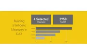
    Notice the different car types in the bar chart.  As you click on each vehicle type, Diesel, Hatchback, etc.. you expect the data to change accordingly.  In some cases it is helpful to present a card visual to show the user what you selected and any relevant data points you want to highlight.  For example if I select the Diesel vehicle type I may want to know the average sales amount, total sales in dollars, or number of units sold.  This is where we can build specific measures that will intelligently highlight selected data within your PowerBI visual.

    Here is a sample of what we will be building today:

    lets begin with starting with some data.  In honor of your news feed being bombarded with Pokemon Go articles lets enter some data on Pokemon characters.

    We will enter our data manually.  For a full tutorial on manually entering in data visit here.

    Click the Enter Data button on the Home ribbon and enter the following information into the displayed table.

    Pokemon XP
    Pikachu 1200
    Weedle 650
    Pidgey 800
    Golbat 300

    Rename the table to Characters.  Once you are finished entering in the data it should look like the following:

    Create Table of Characters
    Create Table of Characters

    Click Load to continue.

    Start to examine your data by building a table visual.

    Table Visual
    Table Visual

    Next add a Bar chart.

    Bar Chart
    Bar Chart

    Note: I added the XP column twice.  Once to the Value attribute and to the Color Saturation.  This enhances the look of your visual by coloring the bars with a gradient.  The largest bar will have the darkest color, and the smallest bar will have the lightest color.

    Next, we will begin building some measures.  The first measure will be a total of all the experience points (XP) for each character. Click the New Measure button on the Home ribbon and enter the following DAX expression:

    Total XP = Sum(Characters[XP])

    Now, add a Card visual and add the new measure we created Total XP.

    Total XP Card Visual
    Total XP Card Visual

    This measure totals all the experience points for all the selected characters within the visual.  Since all characters are now selected the total XP for all characters is 2,950.

    The next, and final measure, will be the intelligent card.  For this measure we want to display the characters name when we select them in the bar chart.  Click the New Measure button on the Home ribbon and enter the following DAX expression:

    Character(s) = IF( DISTINCTCOUNT(Characters[Pokemon]) = 1 , FIRSTNONBLANK('Characters'[Pokemon],'Characters'[Pokemon]) , DISTINCTCOUNT('Characters'[Pokemon]) & " Selected")

    Update: As of Mid 2017 Microsoft introduced a new DAX expression called SELECTEDVALUE which greatly simplifies this equation.  Below is an example of how you would change the DAX equation to use SELECTEDVALUE.

    Selected = SELECTEDVALUE(  Characters[Pokemon],  DISTINCTCOUNT(  Characters[Pokemon]  )  &  " Selected" )

    Explanation of this measure:

    This measure first checks to see how many distinct items are in the column Pokemon of our dataset.  If there is only one selected character then we will display the FIRSTNONBLANK character, which will be the name of our selected character.  If there are more than one characters selected. The measure will count the number of characters selected and return a text string with the count and the word SelectedThus, showing us how many items have been selected.

    Add the measure titled Character(s) to a card visual.

    Add Character Card Visual
    Add Character Card Visual

    We can now see that there are 4 characters selected.  Clicking on Pikachu in the bar chart resolves with the character’s name being displayed and the XP of Pikachu being displayed in the Total XP card visual.

    Selecting Pikachu
    Selecting Pikachu

    You can select multiple items by holding down Ctrl and clicking multiple items in the bar chart.

    Selecting Pikachu and Pidgey

    Well, that is it.  I hope you enjoyed this Pokemon themed tutorial.  Thanks for visiting.

    Want to learn more about PowerBI and Using DAX.  Check out this great book from Rob Collie talking the power of DAX.  The book covers topics applicable for both PowerBI and Power Pivot inside excel.  I’ve personally read it and Rob has a great way of interjecting some fun humor while teaching you the essentials of DAX.

  • Measures – Dynamic Percent Change – Using DAX

    Measures – Dynamic Percent Change – Using DAX

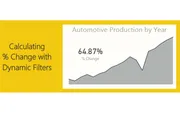
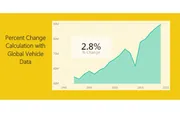
    This tutorial will produce a measure that will dynamically calculate a percent change every time an item is selected in a visual.  The previous tutorial can be found here.  In the previous tutorial we calculated the percent change between two time periods, 2014 and 2013.  In practice it is not always desirable to force your measure to only look at two time periods.  Rather it would be nice that your measure calculations change with changes in your selections on visuals.  Thus, for this tutorial we will add some dynamic intelligence to the measures. Below is an example of what we will be building:

    First here is the data we will be using.  This data is the same data source as used in the previous % change tutorial.  To make things easy I’ll give you the M code used to generate this query.  Name this query Auto Production.

    let
     Source = Web.Page(Web.Contents("https://en.wikipedia.org/wiki/Automotive_industry")),
     Data0 = Source{0}[Data],
     #"Removed Columns" = Table.RemoveColumns(Data0,{"Change", "Source"}),
     #"Changed Type" = Table.TransformColumnTypes(#"Removed Columns",{{"Production", Int64.Type}, {"Year", Int64.Type}})
    in
     #"Changed Type"

    Note: the code shown above should be added as a blank query into the query editor.  Add the code using the Advanced Editor.  Another tutorial showing you how to add advanced editor code is here

    Once you’ve loaded the query called Auto Production.  The Field list should look like the following:

    Production
    Auto Production

    Next add a Table with Production and Year.  this will allow us to see the data we are working with.  When you initially make the table the Year and Production columns are automatically summed, thus why there is one number under year and production.

    Table of Data
    Table of Data

    Rather we want to see every year and the production values for each of those years.  To change this view click on the triangle in the Values section of the Visualizations pane.  This will reveal a list, in this list it shows that our numbers are aggregated by Sum change this to Don’t Summarize.

    Change to Don't Summarize
    Change to Don’t Summarize

    Now we have a nice list of yearly production levels with a total production at the bottom of our table.

    Table of Production Values by Year
    Table of Production Values by Year

    Next we will build our measure using DAX to calculate the percent changes by year.  Our Calculation for % change is the following:

    % Change  =  ( New Value / Old Value ) - 1

    Below is the DAX statement we use as our measure.  Copy the below statement into a new measure.

    % Change = 
    DIVIDE(
     CALCULATE(
     SUM('Auto Production'[Production]), 
     FILTER('Auto Production','Auto Production'[Year]=MAX('Auto Production'[Year])
     )
     ), 
     CALCULATE(
     SUM('Auto Production'[Production]),
     FILTER('Auto Production','Auto Production'[Year]=MIN('Auto Production'[Year])))
    ,0) 
    - 1

    I color coded the DAX expression between the two equations to show which parts correlated.  Note we are using the DIVIDE function for division.  This is important because if we run into a case where we have a denominator = 0 then an error is returned.  Using DIVIDE allows us to return a zero instead of an error.

    Next add our newly created measure as a Card.

    Add Card
    Add Card

    Change the % Change measure format from General to Percentage, do this on the Modeling ribbon under Formatting.

    Change Measure Formatting
    Change Measure Formatting

    Next add a slicer for Year. 

    Slicer for Year
    Slicer for Year

    Now you can select different year and the % change will automatically change based on our selection.  The % change will always select the smallest year’s production and the largest year’s production to calculate the % Change.   By Selecting the Year 2013 and 2007, the percent change is 19.15%.  The smallest year is 2007 and the largest is 2013.

    Selecting Two Years
    Selecting Two Years

    If we select a year between 2013 and 2007 the measure will not change.

    Multiple Years Selected
    Multiple Years Selected

    The measure will only change when the starting and ending years are changed.  By selecting the year 2014, the measure finally changes.

    Selecting Additional Year
    Selecting Additional Year

    Pretty cool wouldn’t you say?  Thanks for taking the time to walk through another tutorial with me.

    Want to learn more about PowerBI and Using DAX.  Check out this great book from Rob Collie talking the power of DAX.  The book covers topics applicable for both PowerBI and Power Pivot inside excel.  I’ve personally read it and Rob has a great way of interjecting some fun humor while teaching you the essentials of DAX.

  • Measures – Dynamic CAGR Calculation in DAX

    Measures – Dynamic CAGR Calculation in DAX

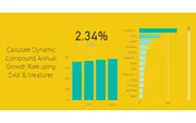
    This tutorial walks through calculating a dynamic Compound Annual Growth Rate (CAGR).  By dynamic we mean as you select different items on a bar chart for example the CAGR calculation will update to reveal the CAGR calculation only for the selected data.  See the example below:

    Lets start off by getting some data.  For this tutorial we will gather data from World Bank found here.  To make this process less about acquiring data and more about calculating the CAGR. Below is the Query Editor code you can copy and paste directly into the Advance Editor.

    let
     Source = Excel.Workbook(Web.Contents("https://powerbitips03.blob.core.windows.net/blobpowerbitips03/wp-content/uploads/2017/11/Worldbank-DataSet.xlsx"), null, true),
     EconomicData_Table = Source{[Item="EconomicData",Kind="Table"]}[Data],
     #"Changed Type" = Table.TransformColumnTypes(EconomicData_Table,{{"Country Name", type text}, {"Country Code", type text}, {"Indicator Name", type text}, {"Indicator Code", type text}, {"1960", type number}, {"1961", type number}, {"1962", type number}, {"1963", type number}, {"1964", type number}, {"1965", type number}, {"1966", type number}, {"1967", type number}, {"1968", type number}, {"1969", type number}, {"1970", type number}, {"1971", type number}, {"1972", type number}, {"1973", type number}, {"1974", type number}, {"1975", type number}, {"1976", type number}, {"1977", type number}, {"1978", type number}, {"1979", type number}, {"1980", type number}, {"1981", type number}, {"1982", type number}, {"1983", type number}, {"1984", type number}, {"1985", type number}, {"1986", type number}, {"1987", type number}, {"1988", type number}, {"1989", type number}, {"1990", type number}, {"1991", type number}, {"1992", type number}, {"1993", type number}, {"1994", type number}, {"1995", type number}, {"1996", type number}, {"1997", type number}, {"1998", type number}, {"1999", type number}, {"2000", type number}, {"2001", type number}, {"2002", type number}, {"2003", type number}, {"2004", type number}, {"2005", type number}, {"2006", type number}, {"2007", type number}, {"2008", type number}, {"2009", type number}, {"2010", type number}, {"2011", type number}, {"2012", type number}, {"2013", type number}, {"2014", type number}, {"2015", type number}, {"2016", type number}, {"2017", type any}}),
     #"Removed Other Columns" = Table.SelectColumns(#"Changed Type",{"Country Name", "2011", "2012", "2013", "2014", "2015", "2016"}),
     #"Filtered Rows" = Table.SelectRows(#"Removed Other Columns", each [2011] <> null and [2012] <> null and [2013] <> null and [2014] <> null and [2015] <> null and [2016] <> null),
     #"Unpivoted Other Columns" = Table.UnpivotOtherColumns(#"Filtered Rows", {"Country Name"}, "Attribute", "Value"),
     #"Renamed Columns" = Table.RenameColumns(#"Unpivoted Other Columns",{{"Country Name", "Country"}, {"Attribute", "Year"}, {"Value", "GDP"}})
    in
     #"Renamed Columns"

    Note: The tutorial on how to copy and paste the code into the Query Editor is located here.

    Paste the code above into the advance editor.  Click Done to load the query into the the Query Editor.  Rename the Query to World GDP and then on the home ribbon click Close & Apply.

    World GDP Query
    World GDP Query

    Loading the query loads the following columns into the fields bar on the right hand side of the screen.

    Fields Load from World GDP
    Fields Load from World GDP

    Next we will build a number of measure that will calculate the required variables to be used in our CAGR calculation.  For reference the CAGR calculation is as follows: (found from investopia.com)

    CAGR Calculation Image
    CAGR Calculation

    For each variable on the right of the equation we will create one measure ; one for Ending Value, Beginning Value and # of Years.  On the Home ribbon click the button labeled New Measure.  Enter the following equation for the beginning value:

    Beginning Value = CALCULATE(SUM('World GDP'[GDP]),FILTER('World GDP','World GDP'[Year]=MIN('World GDP'[Year])))

    This equation totals all the items in the table called World GDP in the column labeled GDP.  This calculation will change based on the selections in the page view.

    Add two more measures for Ending Value and # of years

    Ending Value = CALCULATE(SUM('World GDP'[GDP]),FILTER('World GDP','World GDP'[Year]=MAX('World GDP'[Year])))
    # of Years = (MAX('World GDP'[Year])-MIN('World GDP'[Year]))

    Your fields list should now look like the following:

    Fields List with Measures
    Fields List with Measures

    Next add a Card visual for each new measure we added.  A measure is illustrated by the little calculator image next to the measure.  I have highlighted the Ending Value measure as a card for an example.

    Ending Value Measure as Card Visual
    Ending Value Measure as Card Visual

    Combining all the previous measures we will now calculate the CAGR value.  Add one final measure and add the following equation to calculate CAGR:

    CAGR = ([Ending Value]/[Beginning Value])^(1/[# of Years])-1

    This calculation uses the prior three measures we created.  Add the CAGR as a card visual to the page.

    Card Visual for CAGR
    Card Visual for CAGR

    Notice how the value of this measure is listed as a decimal, which isn’t very useful.  To change this to a percentage click on the measure CAGR item in the Fields list. Then on the Modeling ribbon change the format from General to Percentage.

    Format Change to Percentage
    Format Change to Percentage

    This changes the card visual to now be in a percentage format.

    Percentage Format
    Percentage Format

    Now you can add some fun visuals to the page and depending on what is selected the CAGR will change depending on the selected values.

    ProTip: To calculate the CAGR you can alternatively compute the entire calculation into one large measure like so:

    CAGR = ( [Ending Value] / [Beginning Value] )^(1/ [# of Years] )-1
    
    is the same as below:
    
    CAGR = (  CALCULATE(SUM('World GDP'[GDP]),FILTER('World GDP','World GDP'[Year]=MAX('World GDP'[Year])))  /  CALCULATE(SUM('World GDP'[GDP]),FILTER('World GDP','World GDP'[Year]=MIN('World GDP'[Year]))) ) ^ (1/  (MAX('World GDP'[Year])-MIN('World GDP'[Year]))  )-1

    A final recommendation is to wrap the CAGR calculation in an IFERROR function to make sure if one year is selected the measure doesn’t fail.  This returns a 0 if there is a calculation error of the equation. Documentation on IFERROR is found here.

    CAGR = IFERROR( ([Ending Value]/[Beginning Value])^(1/[# of Years])-1 , 0)

    To finish out the tutorial you can add the following visuals:

    Stacked Bar Chart Visual
    Stacked Bar Chart Visual – GDP by Year
    GDP by Country
    Stacked Bar Chart Visual – GDP by Country

    Note: you can sort the items in the stacked bar chart by selecting the ellipsis (the three dots in the upper right hand corner) and then selecting Sort By and clicking GDP.

    Country Sorted by GDP
    Country Sorted by GDP

    Finally select different items in the GDP by Year chart or the GDP by Country chart.  To select more than one item in the bar charts you have hold shift and left mouse click the multiple items.  Notice how all the measures change.

    Years 2013 & 2014 CAGR
    Years 2013 & 2014 CAGR

    Thanks for following along.

    This tutorial used the following materials:

    Want to learn more about PowerBI and Using DAX.  Check out this great book from Rob Collie talking the power of DAX.  The book covers topics applicable for both PowerBI and Power Pivot inside excel.  I’ve personally read it and Rob has a great way of interjecting some fun humor while teaching you the essentials of DAX.

  • Measures – Calculating a Sum

    Measures – Calculating a Sum

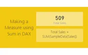
    Often there are times when you will want to display a totals.  Using measures to calculate a total are extremely easy to use.  The power of using a measure is when you are slicing and selecting different data points on a page.  As you select different data points the sum will change to reflect the selected data.  See sample of what we will be building today below.

    Materials for this Tutorial are:

    • Power BI Desktop (I’m using the April 2016 version, 2.34.4372.322) download the latest version from Microsoft Here.
    • CSV file with data, download SampleData in CSV format.

    To load the CSV file into Power BI Desktop you can follow along in this tutorial, Import CSV File into PowerBI Desktop.

    Once you’ve loaded the CSV file into Power BI Desktop your fields items should resemble the following:

    Fields List
    Fields List

    Add the Table visual from the visualizations bar into the Page area.  Drag the following items into the newly created table visualization, Category, Sales, and ID.  Your table should look like the following:

    Table of Data
    Table of Data

    Click the Triangle next to the ID column under the Values section in the Visualization bar.  A menu will appear, select the top item labeled Don’t Summarize.

    Do not Summarize Data for ID
    Do not Summarize Data for ID

    This reveal all the unique items in our table of data.  Now, we will create our measures for calculating totals.  On the Home ribbon click the New Measure button.  Enter in the following DAX expression.

    Total Sales = SUM(SampleData[Sales])

    Note: In the equation above everything before the equals sign is the name of the measure.  All items after the equation sign is the DAX expression.  In this case we are taking a SUM of all the items in the Table SampleData from the column labeled Sales.

    This will total all the items in the sales column.  Click on the Card visual and add the Total Sales measure to the card.  Your new card should look like the following.

    Total Sales Measure
    Total Sales Measure

    Next we will add a bar chart to show how the data changes when the user selects various items on the page to filter down to different results.  Add the Stacked Bar Chart to the page.  In the Axis & Legend selectors add the Category column, and add the Sales column to the Value selector.  This will yield the following bar chart.

    Bar Chart
    Bar Chart

    Now we can click on items in the bar chart to see how the table of data and the Total Sales changes for each selection.  Clicking on the bar labeled Apples provides a total sales of 283, and clicking on the Oranges shows a total of 226.

    Apples Bar Selected
    Apples Bar Selected

    Our measure is complete.  Now we can select different visualizations and each time we do PowerBI is filtering the table of available data down to a smaller subset.

    Pro Tip: When building different visuals and measures often it is helpful to have a table showing what data is being filtered when you interact with the different visuals.  Sometimes the filters that you are applying by clicking on a visual interact in non-expected ways.  The table helps you see these changes.

    We have now completed a measure that is calculating a total of all the numeric values in one column.

    Want to learn more about PowerBI and Using DAX.  Check out this great book from Rob Collie talking the power of DAX.  The book covers topics applicable for both PowerBI and Power Pivot inside excel.  I’ve personally read it and Rob has a great way of interjecting some fun humor while teaching you the essentials of DAX.

  • Measures – Calculating % Change

    Measures – Calculating % Change

    In our last post we built our first measure to make calculated buckets for our data, found here.  For this tutorial we will explore the power making measures using Data Analysis Expressions (DAX).

    When starting out in Power BI one area where I really struggled was how to created % change calculations.  This seems like a simple ask and it is if you know DAX.

    Alright lets go find some data.  We are going to go grab data from Wikipedia again.  I know, the data isn’t to reliable but it is fun to play with something that resembles real data.  Below is the source of data:

    https://en.wikipedia.org/wiki/Automotive_industry

    To acquire the data from Wikipedia refer to this tutorial on the process.  Use the Get Data button, click on Other on the left, select the first item, Web. Enter the webpage provided above in the URL box.  Click OK to load the data from the webpage.  For our analysis we will be completing a year over year percent change.  Thus, select the table labeled By Year[edit].  Data should look like the following:

    Global Auto Production Wikipedia
    Global Auto Production Wikipedia

    This is the total number of automotive vehicles made each year globally from 1997 to 2014.  Click Edit to edit the data before it loads into the data model.  While in the Query Editor remove the two columns labeled % Change and Source.  Change the Name to be Global Production.  Your data will look like the following:

    Global Production Data
    Global Production Data

    Click Close & Apply on the Home ribbon to load the data into the Data Model.

    Add a quick visual to see the global production.  Click the Area Chart icon, and add the following fields to the visual, Axis = Year, Values = Production.  Your visual should look something like this:

    Area Chart of Global Production
    Area Chart of Global Production

    Next we will add a table to see all the individual values for each year.  Click the Table visual to add a blank table to the page.  Add Both Year and Production to the Values field of the visual.  Notice how we have a total for both the year and production volumes.  Click the triangle next to Year and change the drop down to Don’t summarize. 

    Change to Don't Summarize
    Change to Don’t Summarize

    This will remove the totaled amount in the year column and will now show each year with the total of Global Production for each year.  Your table visual should now look like the following:

    Table of Global Production
    Table of Global Production

    Now that we have the set up lets calculate some measures with DAX.  Click on the button called New Measure on the Home ribbon.  The formula bar will appear.  We will first calculate the total production for 2014.  We will build on this equation to create the percent change.  Use the following equation to calculate the sum of all the items in the production column that have a year value of 2014.

    Total 2014 = CALCULATE(sum('Global Production'[Production]),FILTER('Global Production','Global Production'[Year] = 2014))

    Note: I know there is only one data point in our data but go alone with me according to the principle.  In larger data sets you’ll most likely have multiple numbers for each year, thus you’ll have to make a total for a period time, a year, the month, the week, etc..

    This yields a measure that is calculating only the total global production in 2014.  Add a Card visual and add our new measure “Total 2014” to the Fields.  This shows the visual as follows, we have 90 million vehicles produced in 2014.

    2014 Production
    2014 Production

    Repeat the process above instead use 2013 in the Measure as follows:

    Total 2013 = CALCULATE(sum('Global Production'[Production]),FILTER('Global Production','Global Production'[Year] = 2013))

    This creates another measure for all the production in 2013.  Below is the Card for the 2013 Production total.

    2013 Production
    2013 Production

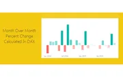
    And for my final trick of the evening I’ll calculate the percent change between 2014 and 2013.  To to this we will copy the portions of the two previously created measure to create the percent change calculation which follows the formula [(New Value) / (Old Value)]- 1.

    % Change = CALCULATE(sum('Global Production'[Production]),FILTER('Global Production','Global Production'[Year] = 2014)) / CALCULATE(sum('Global Production'[Production]),FILTER('Global Production','Global Production'[Year] = 2013)) - 1

    This makes for a long equation but now we have calculated % change between 2013 and 2014.

    Percent Change
    Percent Change

    Wait you say.  That seems really small, 0.03 % change is next to nothing.  Well, I applaud you for catching that.  This number is formatted as a decimal number and not a percentage, even though we labeled it as % change.  Click the measure labeled % Change and then Click on the Modeling ribbon.  Change the formatting from General to Percentage with one decimal.  Notice we now have a percentage.

    Change Format to Percentage
    Change Format to Percentage

    Thanks for working along with me.  Stay tuned for more on percent change.  Next we will work on calculating the percent change dynamically instead of hard coding the year values into the measures.

    Want to learn more about PowerBI and Using DAX.  Check out this great book from Rob Collie talking the power of DAX.  The book covers topics applicable for both PowerBI and Power Pivot inside excel.  I’ve personally read it and Rob has a great way of interjecting some fun humor while teaching you the essentials of DAX.

    Please share if you liked this tutorial.

  • Power BI Histogram with Bins – Includes DAX

    Power BI Histogram with Bins – Includes DAX

    Alright to start this Tutorial off right we are going to incorporate the new feature released this spring from Power BI, called publish to web.  Below you can view last weeks tutorial and interact with the data.  Feel free to click around to see how the visualization works (you can click the shaded states or on the state names at the bottom.

    For this tutorial we will build upon the last tutorial, From Wikipedia to Colorful Map.  If you want to follow along in this tutorial click on the link and complete the previous tutorial.

    Materials:

    • Power BI Desktop (I’m using the March 2016 version, 2.33.4337.281) download the latest version from Microsoft Here.
    • Mapping PBIX file from last tutorial download Maps Tutorial to get a jump start.

    Picking up where we left off we have data by state with data from the 2010 Census and 2015 Census.

    Data from Region Maps Tutorial
    Data from Region Maps Tutorial

    What we would like to identify is how many states are within a given population range.  Say I wanted to see on the map, or in a table all the states that had 4 million or less in population in 2010.

    To do this we will create bins for our data.  Enter custom data in this format.  For the tutorial on entering custom data into Power BI Desktop check out this tutorial on Manually Enter Data. Click on the Enter Data button on the Home ribbon.  Enter the data as following:

    Enter Bucket Data
    Enter Bucket Data

    Note: Make sure you name the new table Buckets as shown in the image above.

    Click Load to bring the data into the data model.  Notice we now have a new table in the Field column on the right.

    Buckets Table
    Buckets Table

    Next we will create a measure to evaluate the state level data into our newly created buckets.  This will be produced using DAX (Data Analysis Expressions).  DAX is an extremely powerful language which is used in SQL applications and Analysis Services.  More information can be found on DAX here.  Since DAX is so complex we won’t go into a full explanation here.  However, we will have many more topics in the future working on and building DAX equations.

    Click the Ellipsis next to the table labeled US Census. Then click the first item in the list labeled New Measure.

    Note: Ellipsis is the term used for those triple dots found in newer Microsoft applications.

    Example of Ellipsis
    Example of Ellipsis

    A formula bar opens up underneath the ribbons bar.  Here is where we will name and type in the new measure.  The equation we will need to add is the following.

    Bins = CALCULATE(COUNTROWS(FILTER('US Census',and([2010 Census] >= min(Buckets[Min]),[2010 Census] <= MAX(Buckets[Max])))))

    Press Enter to enter the measure into PowerBI.

    Explanation of Equation: All text before the equal sign is the name of the measure.  All the data behind the equal sign is the DAX expression.  Essentially this equation is calculating the number of rows where we have data between the Buckets “Min” value and Buckets “Max” value.  This is the magic that is DAX.  In this simple expression we can compare all our data against our buckets ranges we made earlier.

    Finally our new Bin measure should look like the following.

    Bin Measure Created
    Bin Measure Created

    Now lets modify our visuals to incorporate the new Bins measure.  Click on the existing map on the page.  Remove the % Change item from the Values selection.  Add the Bins Measure to the Values section.  Notice the map changes color.  Next, add the Name field from the table called Buckets into the Legend field.  Our map should look similar to the following:

    Map with Bins Added
    Map with Bins Added

    Next Click on State, 2010 Census, Bins, and Name (from Buckets table) and make a table.  It should look like the following:

    Table of Bins Measure
    Table of Bins Measure

    Lastly, we will build a bar chart using our Bins Measure.  Click on the Stacked Column Chart Visual and add the following items to the corresponding categories:  Axis = Name (from the Buckets table), Legend = Name, and Value = Bins (from US Census table).  This will yield the following visual.

    Bins in Bar Chart
    Bins in Bar Chart

    Click on the Ellipsis of the bar chart and then click Sort By, finally click Bins. This will order the items in descending order by the count of the items found in each bin.

    Now have fun with your new data.  Click on each of the bars in the bar chart and watch your data transform between the table, and the map.

    Selection Big in the Bar Chart
    Selection Big in the Bar Chart

    Here is the final product if you want to engage with the data.

    I have to give credit where credit is due.  Below is the page from Power Pivot Pro that I used to create binning in the tutorial chart.  The binning shown on PowerPivotPro is for Power Pivot but the functionality is the same. Enjoy.

    http://www.powerpivotpro.com/2015/03/creating-a-histogram-with-a-user-defined-number-of-buckets/

    Want to learn more about PowerBI and Using DAX.  Check out this great book from Rob Collie talking the power of DAX.  The book covers topics applicable for both PowerBI and Power Pivot inside excel.  I’ve personally read it and Rob has a great way of interjecting some fun humor while teaching you the essentials of DAX.