Tag: Power BI

  • Make Custom Visuals – Create a Bar Chart

    Make Custom Visuals – Create a Bar Chart

    With the release of the custom visuals building tool Charts.PowerBI.Tips we received a number of comments requesting tutorials on how to build visuals.  Ask and you shall receive!  Below is a basic tutorial on how to create a Bar chart.  Within this tutorial we review a couple of the features of the chart tool and how to use them.

    Video Tutorial on Building a Basic Bar Chart Custom Visual

    Comment below on other topics you would like to see.

    Be sure to follow:

    If you like the content from PowerBI.Tips please follow us on all the social outlets to stay up to date on all the latest features and free tutorials.  Subscribe on YouTube.  Or follow us on the social channels, Twitter and LinkedIn where we will post all the announcements for new tutorials and content.

    YouTube Linkedin Twitter
  • Temple of DAX – 3D

    Temple of DAX – 3D

    To celebrate joining the Power BI Cat team next week, I thought I would update a DAX game I built last November (2018) which was a DAX-based maze game in Power BI that allowed you to navigate a character through a series of user-created maps in a top-down view.

    The details for that game are in this blog posting. http://radacad.com/fun-with-dax-a-maze-ing-dax.

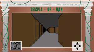
    The update I wanted to make was to see what is involved in creating a 3D, first-person version of the same maze.  The following is how I got on.

    The PBIX File for the Temple of DAX – 3D can be downloaded using this link and here is a link to the publish to web version.


    Like the 2D version, the report imports a CSV file which it uses to generate the map.  I pretty much used exactly the same code to import the CSV file and pivot the coordinates to a format for suitable for processing in DAX.

    All you need to create/edit your own custom maps is to open and edit a CSV file using your preferred editor and place an X character where you would like a wall to be and an I character for the insight (or exit).  Excel is great for this particular task as you can size and align the columns nicely to easily see where walls will be.

    The following image shows the data1.csv file opened in MS Excel, with all columns set to the same width of 15-pixels.  Once modifications are complete, save the file as CSV (not xlsx) in the folder the PBIX file uses to import from.

    Once again, I’d like to thank Margarida Prozil for providing a custom control to manage the navigation.  This is an updated version of the D-PAD called a 3D-Pad.  You can grab a copy from her GitHub repo if you are keen to work with this control.

    https://github.com/mprozil/dPad-3D/tree/master/dist

    The control has four arrows.  The Up/Down arrows move you back and forward through the map, while the left/right arrows spin you 45 degrees.  This is different behaviour to the D-Pad in the 2D version of the maze.

    I’d also like to thank Mike Carlo at PowerBI.Tips for providing the wonderful background image and the overall visual design of the game.  It was Mikes idea for the evil laugh on the intro page.  This started to drive me a bit nutty as it would play everytime I saved the file.

    The Game Logic

    Like the 2D game, this version uses SVG as the method to draw the graphics to the screen.  Each time an arrow is clicked, a new view needs to be generated based on the interaction, so a calculated measure takes into account the new position or perspective and generates a fresh SVG to be displayed using the Image control by CloudScope.

    The SVG image displayed in the Image Control is a nested set of mini SVG polygons that draw the outline of various shapes into an outer SVG file.  The performance is pretty good and I have still yet to hit any limitations on text size to store the final SVG set.

    The 3D world

    The first challenge was to figure out how to convert coordinates in a table in the data model into an image that looks like you are walking through a maze.

    The map I use in the uploaded PBIX file is 26 steps and 36 steps long, so it isn’t big.  If a step has been designated as a wall, it effectively has 4 walls (panels) around its perimeter, and when a series of X values in the CSV run next to each other, a longer wall effect is created.

    Each of the panels for a step in the board has 5 points.  I initially created these panels as 100 x 100 walls, but I found it added the extra point at the top to help me work out which way was up when I was first playing with the 3D to 2D projection code.

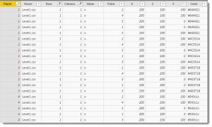
    The Calculated table called 3D Worlds takes the basic X/Y coordinates from the CSV file and generates a 3D world of X/Y/Z points for every panel on every all in the maze.

    The image below shows all X/Y/Z coordinates for 1 step in the CSV map.  The first column shows there are four panels.  Think of these as like north, east, south and a west facing wall.  Each wall as five points.  These five points define each corner of the wall in terms of a 3D world and the X, Y and Z columns for each row specify exactly where each point should be in a three-dimensional plane.

    3D to 2D projection

    The next challenge is to take the 3D coordinates and convert this information into an image that represents what you should see based on your location in the map, along with the direction you are looking.  There was no way I was going to figure the maths for this out from scratch, and after a few internet searches and a bit of reading, I found this article to have all the information I needed.

    https://en.wikipedia.org/wiki/3D_projection

    The key information is in the section on Perspective Projection, including the algorithm I ported into the DAX measure in the game.

    The basic principle is to define a 2D plane (or screen) called a viewport that sits a specific distance from the eyeball. Then an imaginary line is calculated between the eyeball and every X/Y/Z point from the 3D World table.  If any of these lines pass through the viewport, they can be plotted onto the viewport at a specific 2D x/Y coordinate.

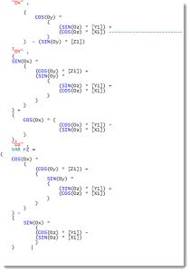
    The code I used from the Wikipedia article is the following:

    The Main Map calculated measure contains all the DAX code to convert the 3D data points to 2D coordinates using SVG.

    The section of code in the Map Map calculation that matches first the algorithm from the Wikipedia article is here :

    I’m not going to pretend to understand this any more than it reminds me of math classes from when I was 15, working out SIN, COSINE equations.  I swore then I would never use them for real, so I guess I owe my old maths teacher an apology.

    The good news is I didn’t need to understand the code in the end.  Once I’d added it to the DAX calculated measure and started generating SVG polygons, it’s quickly looked the way I wanted.

    I probably spent less than 2 hours getting this aspect of the game to work.  There was a little fine-tuning while I worked out what the various elements were, but this was much easier than I anticipated.

    A nested set of CONCATENATEX functions in the Main Map calculated column, loop through every object defined in the 3D World table and converts points to 2D versions.  A series of filters are applied to stop plotting any graphics that fall outside the 2D viewport, such as walls that are behind you (taking into account the direction you are looking).

    The objects are drawn from furthest to nearest to make sure far away objects do not appear if they are covered by a nearer object.  This also means portions of further away objects will appear as expected if they can be partially seen.

    Other filters are applied to stop panels of walls being plotted when they simply cannot be seen.

    Mini Map

    A separate Mini Map calculated measure generates a non-3D version of the map and gets added to a separate Image Viewer custom control to show your position in the map.  A small red triangle shows your position and direction and a small white square shows the exit.  In this case, it’s inside the letter E.

    3D Dpad

    Margarida Prozil supplied me with an updated 3D control that sits on the top of three separate columns in the database.  X and Y (rows and columns) control the square you currently occupy, while the third column is V (for view perspective).  X and Y represent how many squares wide, or long the map is.  V represents the angle in steps of 45 degrees and there are 8 possible values (0, 45, 90, 135, 180, 225, 270  and 315).  The example map is 26 squares wide, 36 squares long so combined with the 8 views, mean the control can be set to 7,488 possible values.  A custom control can only manage about 30,000 points, so take this into account for larger custom maps.

    Summary

    I’m pretty happy with the 3D effect and can see it can be used with other X/Y/Z based 3D coordinates plotted to a 2D view plane.  When I was debugging this, I had slicers for height on the screen so I could use a slider to create an effect of flying up in the air – and the maze still rendered as expected.  Power BI seems to cope with the workload pretty well, despite not really optimised for this kind of work.  In future versions, I may add more objects and detail to push the engine harder and see where breaking points are.

    There probably aren’t too many business use-cases in Power BI for this type of report aside from educational.  Feel free to have a look through the PBIX file where you may pick up some useful ideas, tips and tricks in the DAX.

    There is a small bug at the start of the game when the bookmark drops you into the maze and you need to click the up arrow a few times to get going.  Once you are on your way, it’s pretty good.  I’ll try to get that resolved in the next few days.


  • Respect Layers

    Respect Layers

    If you are like me and you like making your reports look extra good with different visual elements you’ve probably come across the issue before where you use shapes or images layered behind a visual. What you have quickly discovered is that an end user can mistakenly click on that background layer and the entire object pops from the background to the foreground. In this quick tutorial, we’ll show you how to STOP this from happening! We learned the technique through a webinar given by Miguel Myers and wanted to make sure we spread the word because it will have a huge impact on how we can build reports!

    Be sure to follow:

    If you like content from PowerBI.Tips please follow me on all the social outlets to stay up to date on all the latest features and free tutorials.  Subscribe to us on YouTube.  Or follow me on the social channels, Twitter and catch up with me on LinkedIn where I will post all the announcements for new tutorials and content.

  • New Game – aMAZEing DAX

    New Game – aMAZEing DAX

    If you haven’t had your mind melted over the past few games that Phil Seamark has developed here is one more, aMAZEing DAX.  This month’s game is a Gauntlet styled game that uses SVGs, and some fun DAX to allow you to navigate through a maze.  Game play engine developed by Phil Seamark, and Graphics Design by Seth Bauer.

    Play the game below, or hit this link for the full screen version:

    To download your own copy of this game follow this link.

    If you liked this game Check out these other great games:

    To read about how this game was built jump on over to Phil’s blog post.

  • Power BI Dataflows: Change is Coming

    Power BI Dataflows: Change is Coming

    I have been holding on to a copy of Satya Nadella’s book “Hit Refresh” for quite some time. With all the Power BI goodness, the job, etc.… I just hadn’t gotten around to it. However, it made its way into my bag on a recent flight and I found it to be an exceptional story and a very clear view into how Satya plans to take Microsoft into the future. You might say he “open sourced” his plans. After reading this and comparing it to what I’ve been hearing and seeing regarding the fundamental changes in culture and products coming out of Microsoft, I think I’m in a familiar group of those that say he appears to be an exceptional leader who has the talent, vision, and focus to achieve the goals he has set out for himself and Microsoft.

    The main three focus areas for the direction of Microsoft according to Satya revolve around Mixed Reality, Artificial Intelligence (AI), and Quantum Computing. It is important to understand this direction, because it can provide insight into the changes we see in product suites and what future these changes might hold. Setting aside Mixed Reality and Quantum Computing for the moment, we’re already being exposed to how AI is starting to augment Power BI. The latest announcements at PASS Summit revolve around exposing AI delivery mechanisms to business users via Automated Machine Learning features to gain even deeper insights. The work to introduce AI automatically into the tool is already present in features like Explain the Increase/Decrease, Quick Insights and Q&A. Innovations in bringing AI into reporting and analytics is going to continue to change how we look at information in a future that is much closer than I think many are prepared for.

    With the book in mind I was also doing a lot more study in architecture and design in the Azure ecosystem and strengthening my understanding of how the modern data platform is built and can expand to support multiple business needs. Without getting too involved, the overall gist of what I’m seeing is that the process of data ingestion, movement, transformations and storage are being made easier. The 2nd generations of the initial services are being rolled out and the suite of services are starting to do a large part of the heavy lifting in some of the most challenging areas. As a result, these services have a greater potential for wider adoption and becoming a large part of newer modern solutions. In addition, after tying all the services together from source to analytics I started to see a specific service that could be considered the hub for all this analytics activity. Azure Data Lake Storage Gen 2. This service is certainly being positioned as the main storage entity and seems to hold the architectural location as the de facto place where both Enterprise and Business are being funneled for interaction. Data cleansing, machine learning, warehousing, event hubs, etc., etc. can all pull/push from Azure Data Lake Storage Gen 2, and these interactions and manipulations are being made easier with each release.

    Taking what we understand about the overall goals of Microsoft, the centralization around a hub data and activity begins to not just make sense, but be a pivotal part of enabling future objectives to grow and be accessible to every business. Getting “All” of your business data in a single location for analysis will allow you to leverage current and future services to enhance and make use of AI and other technologies quickly, more efficiently and at a much lower cost.

    Power BI Dataflows is the first step in integrating the business into this ecosystem. Power BI Dataflows leverage a familiar product in Power Query, to connect to many sources and perform Extract, Transform and Load operations. They allow flexibility to map data to existing data entities and create new entities that have the potential to streamline and consolidate data silos. These objects that are the result of data flows are stored as CDM folders in Power BI.

    CDM Structure
    CDM Structure

    Two main things to hit here: First, a CDM folder consists of a CSV file for your data, and a model.json structure for metadata definition. Second, “in Power BI” means Azure Data Lake Storage Gen 2 behind the scenes, Microsoft just creates it for you so you don’t need it as a separate service if you aren’t using it for anything else.

    Where this new feature gets exciting is when it is used with your own Azure Data Lake Storage Gen 2. Power BI can connect to your existing Azure Data Lake Gen 2 storage instead and the CDM folders will be put there. This brings the business user into the Enterprise space and allows IT, Data Scientists and business users to collaborate in a single data repository. In addition to the above, we’ve already heard earlier this year that all of Dynamics and now 3rd party line of business and collection tools like SAP and Adobe will also plug into the Azure Data Lake Storage Gen 2 using the CDM folder structure. This means data will be constantly being added to the entities themselves. Power BI Dataflows offer up a unique opportunity to bridge some of the widest gaps that exist between business and IT in the data space.

    CDM Architecture
    CDM Architecture

    For more details on how to use data flows be sure to check out Matthew Roche’s video here -> https://www.youtube.com/watch?v=0bJpCVj3JfQ

    And for the full technical details, take a look at the “Power BI and Dataflows” Whitepaper here by Amir Netz -> https://docs.microsoft.com/en-us/power-bi/whitepapers

    In short order, to be at the top of the competition you’ll have to use Artificial Intelligence to be competitive and stay relevant, and I assume Mixed Reality is going to be a part of that as well. I would argue that what we are seeing here are the building blocks for that future and the efforts to adopt these services will allow us to make exponentially faster gains in analysis and decision making that will give businesses significant competitive advantages. Power BI is front and center in this endeavor as the analytics platform, and that should make any user of the tool excited indeed.

    The preview of Power BI Dataflows is out, based on how these pieces are falling into place across the board, and understanding the direction of Microsoft based on where the ship is being steered, I have a strong inclination that we’re going to be busy re-architecting solutions very soon and that platforms of services will allow businesses to make even more rapid innovations and advancements in their data journey’s. Power BI has already made for a fun ride, but this last month has me feeling like I may have just strapped a rocket to my back that is now being prepped for ignition.

    This is an opinion piece, and as such, I reserve the right to change my opinion as more information is learned. That being said, I’d love to hear feedback from you the reader if you have any on the subject.

  • New Layout – September 2018 Blog Layout

    New Layout – September 2018 Blog Layout

    In the September 2018 blog post the Microsoft team released a new layout.  This layout has a number of really nice design elements.  However, upon reviewing the file used for this demo found here.  Upon downloading we noticed that the new style of the layout was only one page deep.  As an enhancement to this file we added all the pages, renamed all the elements and created a full PowerBI.Tips layout from this page.  We’d love to share our work with you and hope you enjoy this new layout from PowerBI.tips.

    Be sure to download your copy here:

    Demo of September 2018 Layout:

    Be sure to follow:

    If you like the content generated from PowerBI.Tips please follow me on all the social outlets to stay up to date on all the latest features and free tutorials.  Subscribe to me on YouTube.  Or follow me on the social channels, Twitter and LinkedIn where I will post all the announcements for new tutorials and content.

    YouTube Linkedin Twitter
  • How to use Tooltips in Power BI

    How to use Tooltips in Power BI

    In Power BI reports various features are used to enhance the reporting experience.  Tooltips appear when the cursor is hovering over a visual.  Not all visuals will have Tooltips as this feature is added by the report author.  However, Tooltips are useful as they can show deeper trends within your dataset.  This video displays how to use a Tooltip which has been created on a report visual.

    Video for How to use Tooltips in PowerBI:

    Be sure to follow:

    If you like content from PowerBI.Tips please follow me on all the social outlets to stay up to date on all the latest features and free tutorials.  Subscribe to me on YouTube.  Or follow me on the social channels, Twitter and LinkedIn where I will post all the announcements for new tutorials and content.

    YouTube Linkedin Twitter
  • How to Navigate Hierarchies on a Visual in Power BI

    How to Navigate Hierarchies on a Visual in Power BI

    In Power BI reports various features are used to enhance the reporting experience.  A hierarchy is a ordered set of values that are linked to the level above. An example of a hierarchy could be Country, State, and City. Cities are in a State, and States make up a Country.  In Power BI visuals can handle hierarchy data and provide controls for the user to navigate up and down the hierarchy. This tutorial walks you through how to use hierarchies inside a visual.

    Video of How to Navigate Hierarchies in Power BI

    Be sure to follow

    If you like the content from PowerBI.Tips please follow us on all the social outlets. Stay up to date on all the latest features and free tutorials.  Subscribe to our YouTube Channel.  Or follow us on the social channels, Twitter and LinkedIn where we will post all the announcements for new tutorials and content.

    Introducing our PowerBI.tips SWAG store. Check out all the fun PowerBI.tips clothing and products:

    Check out the new Merch!

    Hasta La Vista Data
    Go Ahead Make My Data
    PBIX Hat


    YouTube
    Linkedin
    Twitter
  • How to use Focus Mode in Power BI

    How to use Focus Mode in Power BI

    In Power BI reports various features are used to enhance the reporting experience.  Focus mode allows for a single visual to expand for dedicated interaction and review.  This video walks you though how to use the Focus Mode button on a Power BI visual.

    Video of How to Use Focus Mode:

    Be sure to follow:

    If you like content from PowerBI.Tips please follow me on all the social outlets to stay up to date on all the latest features and free tutorials.  Subscribe to me on YouTube.  Or follow me on the social channels, Twitter and LinkedIn where I will post all the announcements for new tutorials and content.

    YouTube Linkedin Twitter
  • How to use the Ellipsis in Power BI

    How to use the Ellipsis in Power BI

    In Power BI reports various features are used to enhance the reporting experience.  The Ellipsis allows users to open an option menu specific to a visual.  In this video we walk through how to use the various features found when the ellipsis is clicked.

    Video of How to use the Ellipsis in Power BI

    Be sure to follow:

    If you like content from PowerBI.Tips please follow me on all the social outlets to stay up to date on all the latest features and free tutorials.  Subscribe to me on YouTube.  Or follow me on the social channels, Twitter and LinkedIn where I will post all the announcements for new tutorials and content.

    YouTube Linkedin Twitter