
PowerBI.tips

Center the X-Axis on a Line Chart
July 9, 2018 By Seth Bauer
Center the X-Axis on a Line Chart

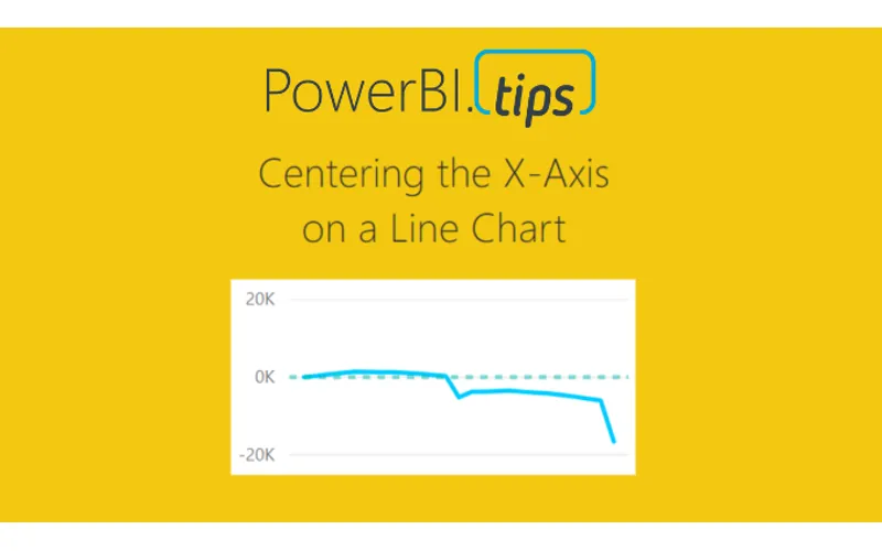
Sometimes when your working on a line chart you want the x-axis to stay centered on a chart. This tutorial will walk you through how to create an X-Axis that will always center it’s self on the graph.

Video Support Material:

The measures discussed within this tutorial are:

Variance All = SUM(Sales[Variance])

The column name Variance is found in the data table called sales.  This is just a numerical column.

After summing up all the variances we can calculate the min and max lines.

Const Max Line = [Variance All] * 1.2

Const Min Line = -1 * [Const Max Line]

Finally to calculate the variance to date you can use this filtered measure, which will only produce historical values.

Variance To Date = CALCULATE([Variance All], FILTER(‘Sales’,‘Sales’[Date] <= EOMONTH(TODAY(),0)))

Thanks for watching our short tutorial.  If you like this video please be sure to follow me (Seth Bauer) on Twitter, LinkedIn and be sure to subscribe to the PowerBI.Tips YouTube channel.

Previous

Power BI and Sudoku – Yes Please

More Posts

Aug 13, 2026

Fabric as a Backend – Ep.554

Mike has been building apps on Fabric as a backend since January, and he's coining it FAB. The case isn't that you already own Fabric — it's that the workspace identity, git integration, and SQL database remove the wiring you'd otherwise do by hand in Azure.

Aug 11, 2026

Crawl, Walk, Run with AI in PBI – Ep.553

Meagan Longoria's five-stage maturity model for agentic Power BI development gives Mike and Tommy a framework to argue with. They mostly agree — except on the crawl stage, where Mike thinks starting with an MCP server beats starting with a chatbot.

Aug 6, 2026

Power BI Desktop Bridge – Ep.552

Desktop Bridge gives agents a local server to drive Power BI Desktop — reload files, check report state, and take screenshots so the agent can verify its own work. Mike and Tommy agree on the prerequisite: don't use it without skills.