Visual Enhancements Updates – Ep. 215
Power BI’s visual polish tends to arrive in tiny increments—but those increments compound. When you’re building (and maintaining) reports at scale, small improvements to spacing, titles, and layout controls can save hours of work and make your content feel instantly more professional.
In Ep. 215, Mike, Tommy, and Seth cover two related threads: (1) Microsoft’s newer ability to view PBIX reports directly from SharePoint/OneDrive (including the lighter ‘Power BI in OneDrive’ experience, admin toggles, and licensing considerations), and (2) the long-requested visual container enhancements from March 2023—subtitle, divider, and padding—that reduce the need for fragile ‘shape-and-textbox’ hacks.
News & Announcements
- Power BI March 2023 Feature Summary — The official release roundup; a good reference when you’re deciding which preview features are worth enabling and communicating to your team.
- Submit an idea or topic for the podcast — Send questions, topics, or real-world scenarios you’d like the team to unpack in a future episode.
- Subscribe to Explicit Measures — Follow the show so you don’t miss new episodes (and catch up on older ones).
- Argus PBI — A ‘Friends of PowerBI.tips’ resource for additional Power BI learning and community content.
Main Discussion
This episode is really two conversations that connect:
- Power BI as a file/workflow: what changes when PBIX files live in SharePoint/OneDrive and you can open a ‘report preview’ directly in the browser
- Power BI as a design tool: how the new subtitle/divider/padding options make better visual layouts easier (and more maintainable)
Key takeaways from the episode:
- Subtitles give you a clean place for context (or even a KPI-style callout) without cramming everything into the main title.
- A divider line is a small design tool that adds structure—separating labeling from the data ink so visuals feel more intentional.
- Padding/negative space is one of the most underrated upgrades: it helps reduce clutter and improves readability with almost no extra work.
- These options reduce the need for brittle workarounds (stacked text boxes, shapes, and manual alignment) that are painful to standardize across a team.
- Viewing PBIX content in SharePoint/OneDrive can be great for quick review, but the experience is closer to ‘Power BI light’—and it requires the right admin toggles and still respects licensing.
- SharePoint’s version history is a meaningful win for report teams (and highlights a gap many people still want in the Power BI Service itself).
- From a governance perspective, easier viewing/embedding can create ‘shadow portals’ if you’re not careful—so treat it as an opt-in capability and document how your org wants it used.
Looking Forward
Expect more iteration here—if Power BI can pair these UX wins with clearer governance and versioning, report teams get both better design and less chaos.
Episode Transcript
0:02 [Music] foreign good morning everyone and welcome back to the explicit measures podcast with
0:33 to the explicit measures podcast with Tommy Seth and Mike happy Tuesday gentlemen wow there goes my voice apparently I forgot to update the title of this video episode on the titles for all the social media things so thanks Tommy for catching that one I must be a bit tired still must have been a long weekend for me so this should be episode 215 diving into the visual enhancements and updates these were
1:05 enhancements and updates these were things that were released out in March it’s basically title here so yeah apologize for those listening live pull up the titles and post we’ll fix it yeah again for a lot of audio listeners there’s nothing to worry about nothing to worry about everything should be titled correctly because Tommy’s on the ball excellent you actually had one of the episodes of episode one two three two oh I did yeah that’s my dyslexia kicking in every so often it flips the numbers around every so often which I’m not gonna lie that actually broke my report and I pulled all the data because it had duplicate values for episode numbers oh no and since I have good
1:37 numbers oh no and since I have good models yeah exactly that’s one with very well defined one Dimensions oh my goodness who care so I have your own error checking data quality Tommy had a little bit of jobs going on there so you little bit of jobs going on there so it’s already he’s already familiar know it’s already he’s already familiar with how to produce good clean data there’s a way we actually extract the description to say if it was it only pulls in obviously the YouTube for the podcast but you would do a lot more on power bi tips so I always look at the description and the
2:07 look at the description and the structure that you’ve done a few times just changed it up a little and like where’s those numbers and say oh that’s because now instead of saying follow the mail bag it doesn’t say that this time so oh yeah in the description yeah that it’s I’ve gotten pretty consistent recently it doesn’t change too much now it just goes to show you we AI is going to do as good as it can and I’ve gone down some AI holes by the way rabbit holes in terms of tools to take
2:39 rabbit holes in terms of tools to take and like just like all the software coming out I’m actually I know we’ve talked about it being a fad but there’s a lot of stuff out there but there’s also some really neat nuggets there outside of just chat gbt I saw a really funny meme or a little phrase that someone came up with over the weekend and they said I’m pretty sure my job is safe from AI because the customer still can’t articulate exactly what they want on their requirements so like we have all this amazing AI if only you could actually ask the right prompt right you
3:09 actually ask the right prompt right you actually ask the right prompt right we’re not there yet I’m not gonna know we’re not there yet I’m not gonna lie I think we’re losing out on the Monday there’s some tools out there it’s like an elaborate website and it’s like yeah like make a business plan for your thing all right and I like to test things out and it’s basically just you can see the back end you enter a few questions and it’s just doing a chat EBT only sign up for twenty dollars a month you’re like okay no thanks yeah So speaking of some new features that have recent come out there was a Blog announcement
3:39 there was a Blog announcement pre-announcing pre-announced a pre-announcement from the microphone has it been announced yet or is it still pre I believe it’s now no longer pre anymore they could update it to say it’s actually a thing I believe I’m not sure exactly what the flavor there was taking why we needed to pre-announce something we knew it was coming it would just be nice to have it up here but I believe the blog has now recently confirmed that you can now open files inside SharePoint and so yesterday I saw in the admin settings in my tenant I saw
4:11 in the admin settings in my tenant I saw some Flags you could flip around viewing files inside SharePoint directly inside of power bi report or basically clicking on a power bi report say view or preview this file and then it actually shows you the power bi report inside your SharePoint location which is very interesting to me did you guys have a chance to play with us at all us at all oh because you posted that you had done it so I figured my mic is primed at the pump to start talking about the
4:41 pump to start talking about the experience it’s interesting interesting in a good way or interesting in a bad way I’m still a little bit I still don’t I’m not sure if I exactly understand what’s going on going on well the reason I say that is because when I clicked on the link so first things first you have to turn on the feature inside your power bi admin settings so that’s the first thing you need to do is turn that feature on in the admin settings there’s actually two settings that you have to toggle on and the one that toggles on
5:13 toggle on and the one that toggles on for SharePoint being able to view the power bi files inside SharePoint it apparently is a setting that’s inside SharePoint maybe that you can then toggle it with the power bi admin portal but it’s actually adjusting something inside SharePoint admin settings I’m not sure if that’s exactly how I read the a statement there but regardless it looks like what Microsoft has done is they’ve produced a new URL so whenever you’re looking at files for things that are inside SharePoint or OneDrive
5:43 OneDrive the URL has changed instead of app. powerbay. com whatever the normal stuff is it now says app. powerbid. com OneDrive OneDrive so there’s now another OneDrive area of that and it looks like the the models are loading into memory so data model like immediately and then showing you what the report is now one thing I couldn’t quite figure out was is it somehow acknowledging the fact that it knows what this report is and then potentially showing you an already
6:13 then potentially showing you an already rendered report that’s inside powerba. com or is it just picking up that file and showing you right there because I wasn’t quite it said some messaging report the report experience like when you’re opening a report yeah yeah and when you open the report if so you could say view this report or when you click on the report inside SharePoint it actually brings you to like a boiled down version of powerba. com it’s just like the report it had the waffle in the upper left hand corner but the waffle wasn’t working yet and it had a couple buttons where you could like
6:43 could like modify a couple things or change the view or you could go from high contrast to low contrast like there’s a couple basic features of powerbi. com that were available to you but it wasn’t fully featured it’s closer to a desktop experience in terms of I think what Microsoft’s doing on the back end because it’s honestly has really no association with the service at all the only way it would but even then it’s still not like that direct tie is again if you connect in power bi service to a OneDrive file
7:14 power bi service to a OneDrive file but everything else is just rendering like like what an other office application and Mike I got to tell you the experience feels a lot like PowerPoint on the OneDrive as I was testing that out too I I tell me I’m wrong yeah there’s so not thrilled about the PowerPoint feel look and feel of things that’s just not my not my jam but but yeah if you click on the files
7:44 yeah if you click on the files themselves so if you click on them inside SharePoint it takes you to this different OneDrive open exercise exercise and there’s also some interesting when you’re looking at the reports after you’ve opened them I believe again I have to do a little bit more digging on some of the features here but there was a there was also a link that said view in powerbia. com so somehow it’s acknowledging to some degree that there’s a link between somehow it’s under acknowledging that this file potentially lives somewhere else maybe maybe not I don’t know or
8:14 else maybe maybe not I don’t know or maybe I actually had linked that file I gotta I gotta figure out a couple more use cases here like maybe I actually linked the file to SharePoint and then it knows oh by the way this file is actually linked between the SharePoint drive and the actual service location so if I edit the file or maybe it’ll take me directly to it so I gotta do a little bit more homework around some of the edge cases here but in general it seems quite interesting it does if it does feel like Power like really like just that SharePoint feeling and like it has a
8:46 SharePoint feeling and like it has a drive ID so it’s it’s associating it as nothing more than a file in one drive yeah and and if you like it has a menu item you click on the menu like it looks it’s like the same menu as powerbi. com but it’s very boiled down you can like only save as rename or download a copy so like it’s literally like powerbi. com light to some degree of all the features that are there so anyways I find it interesting we’ll see where this goes how they enhance this one I’m not sure if I 100 agree with your comment around it feels like PowerPoint
9:16 comment around it feels like PowerPoint yet to Tommy not sure if I agree with that yet that yet I’m with you Tommy I’m not saying I like that I’m just saying it’s closer than I experience the first thing you go oh it just feels more like just feels more like power bi in another window or embedding power bi and like teams to me I don’t know announcing power bi in another window but Microsoft the thing about this too though right from the state now it’s it’s interesting from report consumption perspective right because we
9:47 consumption perspective right because we have these light experiences in like if you’re connecting to in like connecting to an Excel file or connecting new PowerPoint slot you can interact right but there are still certain limitations aren’t there in that in that experience where you’re connecting the file as opposed to downloading taking those programs or are they
10:09 taking those programs or are they exactly the same you can’t export data that’s interesting in what I’m saying like I’ve always I’ve always done like easy stuff when I’m hitting the browser right and opening it in the browser experience but then if I have to do heavy lifting or I want to move a bunch of slides around or like the experience is just better locally yes I wonder it’s it kind better locally yes I wonder it’s it seems like that fits that same vein of seems like that fits that same vein yes yes so I would say
10:39 so I would say I feel like there’s there is so if I my experiences around Excel and PowerPoint those are the two main ones that I use between like Cloud versus on on-prem versus the applications I know Excel a lot of the Excel features initially when they kind Excel features initially when they released Excel for the web of released Excel for the web there was minimal features there and they kept adding things and then it got mature and then there were still things like you couldn’t make a pivot table you couldn’t add a text box but I think now they’ve almost reached full feature parity between what is happening in Excel to 100 there’s
11:10 is happening in Excel to 100 there’s maybe a couple features that you just can’t do maybe there’s nothing to develop a ribbon or tab inside the browser okay fine like those are things I would not expect to be doing inside a browser browser PowerPoint I think the only thing the only feature that I have found there may be others as well the feature I have found is you can’t make links between a link a text link intern into the document right so I can’t make a link and then link it to Page three or four within PowerPoint so to your point like what your question was is it basically a parody yes it probably has like 90 of the main
11:42 it probably has like 90 of the main features between what is in the service and they’re continually closing the gap between what’s in power beta excel. com or powerpoint. com versus what’s inside the desktop application so it seems like yes they’re getting there but it’s not 100 everywhere I look it’s really interesting the I don’t say the lack of parody but what the implications are here we’re not you have modeling in the web now which was no longer associated with desktop and
12:12 no longer associated with desktop and now you may have these files in OneDrive that are not associated with the web because I I think these these features and something you said to me like in the past it’s not for us I this is I really this is a business feature this is a very yeah just a few things like I’m actually using it I have a lot of PBX files I download or test things out I can get a quick view of it but I out I can get a quick view of it but this is not mean this is not it’s a nice to have I but for us from the Enterprise point of view or from a deployment point of view there should be
12:44 deployment point of view there should be no association with this and and service because yeah but you okay so I agree with you 100 like I agree with you on one point and I disagree on another from the standpoint of it’s not for us meaning are we gonna use it no agree but when you say like it it’s not for us from an Enterprise perspective like we’ve talked about like the usage pattern like like how do we understand what’s being used in the ecosystem like if there if this isn’t part of any of
13:14 if there if this isn’t part of any of the service as far as administrating how power bi gets like pushed out in order organization or how people are using it then yeah there is an impact right and like just because what’s this strikes me I’m gonna carry the thought a little further right just because we can do it should we right yes we should how how many how many parts of an organization have we talked about previously that we’re super excited about not having anymore right
13:45 excited about not having anymore right access like these silos of data in all these different locations Excel files Etc and and isn’t this now breaking up the reporting viewer experience like hey how if if I literally don’t have any visibility and they haven’t talked about any any right and I don’t know how usage patterns are going in the organization how would I know how how like where to invest my time like to me this breaks up the reporting
14:15 like to me this breaks up the reporting story and just because you can do it it’s not PowerPoint PowerPoint is this this these individualized presentations that happen throughout an organization at thousands all the time reports aren’t like that there should be a centralized location where you can manage this stuff and understand how people are consuming the most valuable parts of your organizational data this is like as I’m thinking about this tag this is irritating me like
14:45 tag this is irritating me like like if like if there’s like there’s a couple other things where you can create a bunch of reports and then just share however they want to like okay great now we have no context to where that data is coming from or going like it definitely makes this Enterprise story yes and I think it’s so I think what’s going to happen here is there’s a potential for particularly around reports that are coming from us either a central team or this may be a feature that you just may want to turn off in your tenant right so this may be if you’re at a size of an organization
15:15 if you’re at a size of an organization why you need to control that story or that messaging around your data this might be a feature you just do not you just pass on not worth your time because that’s the opt-in are they both opt-in I thought they were both one was already on One’s On by default which is the using one drive in SharePoint for the file storage itself correct so I think in is this visual experience yes and I’m talking purely about what I’m seeing in so I already have a whole bunch of power bi files that are already living inside SharePoint
15:45 already living inside SharePoint somewhere so I’m just purely talking about the once the file gets there what happens and how you click on that file and what happens when you get into that file and and play around with the file itself as long as I think the constraints of the expectations are set honestly I see they’re the big benefit is I’m viewing files on desktop I don’t want to open power bi desktop I want to quickly view something I already have things organized where I have my SharePoint lists or my SharePoint groups for sure different teams so fine great
16:16 for sure different teams so fine great it’s a quick and easy view I can say what are you working on let me just see the visual point of view because two you really shouldn’t have the business like having access to the pbix files anyways well right what I will say though and some things that are yes correct you shouldn’t have access to the actual or the development team should have access to it right this is this is a development team exercise right here’s where the files go we’re going to put them in the SharePoint location one thing I will say that’s very interesting here is you can pull up a report and once the report is pulled up inside SharePoint you now get an ellipsis that
16:47 SharePoint you now get an ellipsis that lets you see the version history so you can now see when that report was created inside SharePoint and this is what I’ve been saying is missing from power bi. com for a long time right every time you publish a file it’s got to go somewhere it’s been stored somewhere in powerpay. com why does powerbi. com not have a version history on a file that would solve a lot of development teams efforts just purely by keeping the file saved in inside power bi. com so I want I like that the one thing that makes me
17:17 like that the one thing that makes me nervous about this is also under the Ellipsis when you look at these files in SharePoint is an ability to embed it looks like it’s embedding this file from SharePoint in an iframe so you can take this file and embed it in another portion of SharePoint which to your point Seth just a moment ago around if this is another area for like working on we’re just giving more access to business users making it a little less friction to open and look at and view reports this potentially could mean you
17:49 reports this potentially could mean you have a collection of RBI files that are sitting in the SharePoint that have been published as an iframe into that same SharePoint as a page so you now have an entire reporting portal that has no bearing or no connection to anything that’s related to powerbia. com which in some ways defeats the whole purpose of having that powerba. com to begin with because now anyway just no it just creates problems in my head but not at all because again if you’re
18:19 but not at all because again if you’re looking at something in PowerPoint that’s prod basically if I’m looking at that in one drive right because that’s what you’re going to be using to do your presentation that same file that same ID this is a completely dissociation so yeah you could do this the embedding but you’re not going to refresh and they’re not going to set up refresh it is simply just rendering the contents of a file nothing more I think the micro to SharePoint size and it’s not a report it’s a Microsoft document and we’re just rendering it as is so I see your naive
18:52 rendering it as is so I see your naive opinion of this but I think what’s really going to happen inside organizations is we’re going to now spend a whole bunch of time of people opening up power bi files refreshing them and then re-saving them back to SharePoint in order to get the data refreshed I didn’t say that’s not gonna I’m just saying no no I I know so I’ve seen very weird patterns when working with companies around this where people have well I have a new month of data and I just keep adding another Power query as opposed to loading from folders and I open this
19:22 loading from folders and I open this file up every month or every day and refresh it and put it back up into this place like okay I understand what you’re doing there but it feels like we’re really we don’t understand how piratebay. com works and therefore we’re making a lot of extra we’re involving a lot of people and and putting people in place where there’s Automation and to our Point our conversation earlier Tommy right people are dumb and they will make mistakes and it will happen and Michael will put an episode of one two three as opposed to 2 30 213 right it will happen
19:54 opposed to 2 30 213 right it will happen and then everything will break right so anytime data is being entered in by people you have you run a higher risk of something going wrong and I just to me this is yes I understand why we’re doing it yes it’s for the business user I’m all for it I’m just waiting for some of the blogs or posts that are going to be the
20:16 blogs or posts that are going to be the darker side of using using the powerbi. com or the embedded files inside SharePoint and what there’s going to be weird use cases yeah the the the Persona of who they are going after and the usage I I’m very 100 agree with you like and it’s not it’s not to say that we don’t poo poo some or not really appreciate some of the features that are out there because we’re on the Enterprise side of things for the most part when we’re doing
20:47 for the most part when we’re doing implementation but I still still when you open the can of worms right so the the one that bugs me is this is exactly what we’re talking about the how many how many users understand Licensing in power bi oh almost not how many how many users a brand new business users know that you publish to the service service right maybe it’s trying to solve that problem however I think it’s just creating a larger one because you’re
21:17 creating a larger one because you’re you’re providing a feature at a low level a low low barrier of entry and then that’s how they think it’s supposed to work to work they never go back like there’s no next step if you get it to work in most business users Minds especially when it’s related to like new technologies or new reporting or whatever you just gave that low barrier threshold of like oh I can share this this is how it’s supposed to work you have no idea that you can share with an entire ecosystem you’ve no idea what the service provides as far as
21:49 idea what the service provides as far as automated refresh Etc and I it just yeah there’s so many scenarios I have in my head of what’s gonna happen and then just what the what an executive is going to think and not care I I would hate to be the business you I I would hate to be the business like well no no you’re looking at know like well no no you’re looking at the file but you want to go to the report and they’re they’re all they’re going to think is well why can’t I view it in one drive someone give me access where’s your data set I don’t know I don’t know yeah if you’re going having
22:20 don’t know yeah if you’re going having to talk to your leadership about that like that’s that’s a losing argument right away oh I I don’t envy you anymore it’ll be interesting too so anyway CBD TBD there’s going to be some interesting features there we’re gonna have to figure out what this means and where does this fit inside the broader ecosystem ecosystem of like management and governance and what does all that look like now so I think this is now added more surface area to what we need to understand and know and and to be clear though all of this featuring of being
22:51 though all of this featuring of being able to open files inside SharePoint has to be done under some license agreement around Pro premium per user or or P1 skus maybe I don’t know it’s it’s only it’s only the pro or premium I think it has to be a user Associated licensing licensing still applies yeah licensing still applies which I was kind licensing still applies which I was nervous about initially was like okay of nervous about initially was like okay what’s going to happen here so that makes that makes total sense maybe maybe this is the ultimate play for purview [Laughter]
23:21 [Laughter] you guys didn’t see value now your entire ecosystem of reporting is just changed changed that’s the mafia that’s a beautiful file report you have beautiful flag that’s a beautiful flower so we’ll see where this one comes from yeah so anyways very interesting neat feature it’s out now it’s actually working so you can go turn it on your tenant I believe and I don’t know if you guys also noticed did your power bi icons change as well or they keep or am I keep getting preview
23:52 they keep or am I keep getting preview features that my icons keep changing on my my data sets so if you go into into a workspace I’m also noticing about a month ago the icons I’ll change to these non-colored icons and I see it again and it’s so confusing so now I’m getting like features that turn on turn off turn on turn off maybe it’s from the preview well you can’t just there’s an admin setting to like basically wear a Microsoft a b testing one thing we haven’t said is the by yourself blog is the
24:22 the by yourself blog is the major update I I think I said this oh yeah that’s true I’m calling it today the we’re not going to have a yellow logo by the end of the year because now they have the green that they started using a desktop is straight up green they’re going all in on green and that’s everything on the blog now when you go to Powerball I thought I was on the wrong page I saw somebody had done a icons in history of of the power bi logo have you seen this on linked LinkedIn no it was like the three or four versions of things are we about to are we about
24:53 of things are we about to are we about to hit another icon who knows at this point marketing every like the pattern is like every three years every two years yeah switch it it’s so it’s a lot it’s a lot less than that I think really I’m not gonna lie yeah I love the icons so much that I basically created a DOT Ico for like an icon and anytime I I basically make that the property on my taskbar is the old file I just had a shirt but I had I have a shirt that is or we
25:24 but I had I have a shirt that is or we have a shirt on the store that’s crawl walk run so the crawl was the very first icon yeah the walk was the second icon that they made right and then and then run is the current icon so I’m gonna have to figure out what’s beyond run AI you figure out what’s beyond run AI hover drive know hover drive Quad Rock Run Drive I don’t know fly maybe there’s gonna be maybe some more things here so we might have to continue to update these shirts with the appropriate logoing
25:55 with the appropriate logoing excellent excellent any other thoughts on the OneDrive stuff Tommy you were finding you said you wanted to talk a little bit about you have found a better way to take notes or capture ideas here recently yeah I I think we can maybe put that in our parking lot since for the sake of time but I’ve been you I’ve been diving into are we parking on it are we going to talk about it because it sounds like you’re going to talk I’m just gonna well I’m not gonna just dismiss what you said I’ll just do a pre okay preview but
26:26 I’ll just do a pre okay preview but start looking into something called the second brain concept and like it’s basically saving all the content that you’re looking at whether it’s your action items or articles you saved and just a better way to do that and then there’s just some really neat things to do with AI so to be continued but our previewed I find that is to your point there Tommy though I find there’s so many things across the internet that I lose track of where everything was and I can read part of an article I’m like I may need that later
26:56 article I’m like I may need that later and I start hoarding and pack writing the information and that’s the reason why we started jam. comtips which is our community site around this information and if you go to gm. power bi tips there’s actually a a page there that Tommy and I maintain it is a collection of all the articles that we find that are interesting it’s called bookmarks and so if you go to this bookmarks page there’s a a ton I think over eight thousand
27:33 was that 8 800 800. so there’s over 8 800 different bookmarks of interesting things that Tommy and myself or and or Seth have found across the internet as we find articles that are interesting you can then look at all the different articles and you can observe and look at the the different features of those collections of bookmarks and items so Tommy put some items out there I put some items out there if we find something interesting about visualizations we’ll tag it and we’ll add it into the list so basically it allows you to peer into a groomed or a Home groomed list of of
28:03 a groomed or a Home groomed list of of news about power bi so that’s just a really fun little opportunity as well if you want to go look at what we think or are we finding as fun and interesting there’s a bunch of articles there anyways that being said let’s go into our main topic for today so the main topic for today is really around diving into these new visual enhancements that have been coming out so this is a a pullback to a Blog that was done out in March 2023 where Microsoft had announced a number of visual container improvements
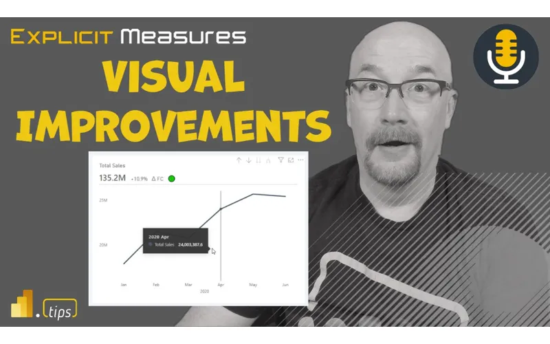
28:35 of visual container improvements Tommy you want to walk us through what were some of the major updates that you saw come out in this yeah these are these are really cool so in March of 2023 based the power bank announced three significant updates to visuals and specifically with titles and things have been really requested so the first is basically the ability to add a subtitle and for the longest time if you’ve wanted to say you longest time if you’ve wanted to say total sales by this with an know total sales by this with an explanation that all had to go within
29:07 explanation that all had to go within the same the title layer which either had the word wrap or just one of the best experience so it’s basically just the ability to reformat and put slightly underneath the title just as a simple subtitle the second one is a divider which has also been I I know a huge request by the community and it’s a very simple part of visual design where with either my title and my subtitle I can have a line format as ever I want in terms
29:39 line format as ever I want in terms of separating that between the data and the ink so to speak those two by themselves are I think one of those like how it’s not been here it’s only been eight years and the last one is actually I think the most underrated is the padding I don’t think a lot of people are going to see the the benefits if you’re just starting out if you’re not really dived into database Theory but it’s basically that build it out of negative space really really can
30:09 out of negative space really really can make an impact and I can do the padding and features both from the title point of view per visual and that is the three main things that they’ve just like I said they look like minor minor feature updates but I think
30:24 minor minor feature updates but I think they have a much wider implications I agree and I I think already I really love the community of my of power bi people right because already I’m seeing videos come out that are very interesting and adding very creative ways of highlighting data or content the one I’m thinking of right now is the gentleman how to power bi YouTube channel and he goes supercharging your visuals with power bi adding kpis to a title right so a performance indicator indicator I thought that was a really creative way
30:54 I thought that was a really creative way of doing it I thought wow there’s there’s a little up Arrow the text can turn red or green depending on what’s happening in the chart you can you so you’re able to provide some additional highlighting at the subtitle level to give some enhancement to drawing people’s attention or ideas or I I to something very specific inside the report so I thought that was really interesting and a very creative way of using the subtitles commuted yourself Tommy
31:29 I that exact example is what I’ve been thinking about too I had to download that and just dive into all the things that’s going down that’s amazing I thought it was a really well done and it looks really good too and this is the stuff I think that people were complaining about from Microsoft really is we need more fine-grained control of what’s occurring in the visuals and and so having a more modern look around with the visuals are a better title a better sub subtitle having that divider line in there it really cleans up the visual in entirely a lot better and I think it really enhances the look and feel of it I I think and I
32:02 the look and feel of it I I think and I agree like what I like about this is it seems like some incremental value where that Miguel Myers talks about recently so Miguel obviously doing a whole visualization re refresh running on power bi to help us out but one one of those core things he talks about is can can we create a look and feel of this title subtitled line in our reports today yeah takes three different objects right like
32:32 takes three different objects right like text boxes and all this stuff that we’re used to having to component ties and build ourselves yes and now it’s it’s wrapped up in the visual right and he talks about like how one of their efforts recently I was watching him on read show where he was talking about take consolidating all of the things that he’s done right like and we’ve talked Ad nauseam about like some of this stuff Miguel would build his like he had he would have 10 15 20 different objects
33:04 would have 10 15 20 different objects for a visual right and now he’s they’re they’re working on creating that as part of the visual so that it’s easy to just enhance enhance how how things look on a page right and one of the great things with starting with titles and subtitles I think is the importance of these obviously it’s a a easy easy name topic I don’t know generic topic but if you think about when you look at a report page a lot of the complexity in the data
33:36 a lot of the complexity in the data itself it confuses users like unless you’re familiar with report report or what it’s talking about you don’t have the context and titles and subtitles right allow our brains like quickly organize the information and then now that we have the subtitle there as well it provides context to the visual right so so just having this as part of the visual is I think makes implementation a lot easier but on oh
34:10 did you lose me no we’re still there you’re still there okay my whole plan my whole screen everything just been black I was like oh no no you’re still there I can we can still see you that it just provides more context than the composition of that visual if it remains consistent right across the board because if I was gonna do this previously on everything it would be you previously on everything it would be now now you have three different know now now you have three different objects on top of all the visuals that you’d have to align and make sure are all the right size and spacing and then final thought in here
34:41 final thought in here is it’s also now providing me the ability to set properties on my themes right yeah for all these objects so I have I have constant consistency across all the visualizations I would totally agree with that one yeah Mike you’ve been seeing my my future request on the theme of their it’s been incredible but I think the what you’re talking about Seth is kind what you’re talking about Seth is there’s two main areas here of of there’s two main areas here of conversation there is the the true
35:12 conversation there is the the true feature set of where Microsoft’s going when it comes to the rich design and getting more aligned with the modern updates the visuals but there’s also two as of now and at least what they’re working on this just these three Concepts the padding the title divider is also where should a business analyst go now and how that really plays into story like data visualization theory of the negative
35:42 visualization theory of the negative space of the separation and now actually having this available I think there’s a larger impact it doesn’t again it doesn’t seem like oh this is going to change all my reports but they’re going into some of the Core Concepts of data visual design when it comes to negative space and the separation that the one of the questions I have for you guys is should the padding and
36:12 you guys is should the padding and these Concepts be how much should they be used or are in a sense implemented now now so I would say so if I was actually just playing around with the padding right now so there’s that one’s been one of the main challenges that I saw previously in in the What’s called the visual container right so the the square that defines where the visual sits on the report page right that container Square Square previously before they did these updates always had like a little bit of a couple pixels there’s almost like three or four pixels there and if you ever wanted to push the text or the lines or something right to the edge you
36:43 lines or something right to the edge you always had a challenge being able to like really push the visual piece to the very edge of that visual container again it just must have been something that they implemented earlier they thought everyone would want a a little buffer or a little padding there but I think in order to give people more creative space to be able to build what they want there are people that are going to be just picky about that extra couple pixels and Seth is one of those people right if the visual’s off by like you right if the visual’s off by like a nudge a pixel like your eye will know a nudge a pixel like your eye will pick it up and you’re like hey that
37:14 pick it up and you’re like hey that seems off so am I going to be changing these settings between reports baby what am I going to be changing the padding of an individual visual between Pages probably not right so this is where I lean in more to the set a standard or or give a designer a desktop file and say Here’s a desktop file go style these visuals the way that we should have them for our company and again ninety percent of this stuff is you’re going to set it and forget it and
37:45 you’re going to set it and forget it and it’s just gonna be the standard on everything you use in your organization or your team or for just you so it I do think it will be with all these additional controls you have the ability to have very different looking reports across teams or or Central things which is okay yeah however I would say if you think about is your content being certified or is it just promoted or is it not anything at all it has no tagging right so if you’re thinking about certified content I would say at that upper level
38:16 content I would say at that upper level of content yeah for sure you should be thinking about standards and how things should look someone should spend a little bit of time and saying okay I’m gonna figure out the styling of our standard type visuals again if you need to customize it fine so be it go do it but someone should spend some time at the very beginning of a project figuring out what that would look like and then from there I think once you have that set anything that goes through this certified level that’s part of your you certified level that’s part of your Kurt Buehler’s checklist is did you know Kurt Buehler’s checklist is did you apply the theme file right has it been
38:46 apply the theme file right has it been style is it does it follow our visual guidelines and there should be a little bit of friction does this thing have accessibility built into it have we done some checking on top of it have we taken a screenshot and run it through a checker are the contrast ratios correct across the report or what we’re building I think those are elements that we’d want to have as part of our certified report checklist and again if it’s not certified I’m but we’re laying it around whether or not you set these or not so I one thing I would really want to
39:16 so I one thing I would really want to say from the padding point of view and this is something that actually worked with Chuck Sterling on one of our academies we did on the use of negative space which we’ve never really had that ability in power bi before I was actually looking at that how to power bi report and just like I need to know how we did it and I like I made a copy and tried to rebuild it but the difference between having no padding because all his visuals have padding and one looks in the center professional and
39:46 one looks in the center professional and then where you have the title right up to the edge of the box it doesn’t look great and it’s I don’t want to say it’s like hard for the user but it sucked it changed to have that ability to have that padding where I think that to me is something that I would be implementing in system-wide saying hey we’re updating the theme file with this padding update it makes such a big change but to your point we have more and more intricacies when it comes to slight tweaks that we’re going
40:16 comes to slight tweaks that we’re going to the theme yes because because yes I can talk all about the padding and the title which I really love these features but what’s happening now is there’s so many little little tweaks that that a team or just myself has to
40:34 a team or just myself has to worry about in terms like oh let me test this out or there’s a new update trying to update multiple reports can you imagine trying to go to each file because the only way to update a theme right now right now open up desktop can do it in OneDrive so I think there’s two points there there’s also it’s an evolution though right yeah like you’re always gonna have like power bi inherently off like adds in the iteration of better features over time so it’s a good point like do you go
41:05 time so it’s a good point like do you go back and retrofit some of your older reports or give them a facelift yeah you do right do you do everything probably not that’s why the certified I think is like a good way to delineate that right where do you want to spend your effort spend it on the stuff that means something that you’re actually spending time to certify yeah to to to to to address like your your basic level versus Advanced right question I I think where this lands in my head is do you
41:35 where this lands in my head is do you have to be an advanced user or know every property if you’re using Photoshop or illustrator I and I would say no like the very Basics if I’ve used these tools in the back in the past it’s like okay I know I can modify an image I I uploaded and then I go searching and I’m like okay I know I can do this property type of thing but I never scratched the surface on just how capable things are or how I could modify or manipulate a
42:05 could modify or manipulate a visualization so I think from a a visualization standpoint around all of these properties that are being in included now in the visual are the these are part of like a hey here are the properties but here check the properties of visualizations and understand that you can stylize things in different ways and present them in different ways and this is how you would go find those on a particular visualization I think that’s
42:35 particular visualization I think that’s where you you land with like the basics because you can’t teach everything you’re not going to have 500 different ways of creating tables and okay if we’re we’re doing titles and subtitles let’s see how this looks on every single visualization and I will show you and then we can talk about the like how we change them dynamically and do all this I I don’t I don’t think we invest that much time into things I think what it does do is lower the bar for more users to get better looking
43:05 for more users to get better looking reports because you’re not forcing people to think outside the box of the confines of what’s in power bi in terms of the framework right like we were talking earlier is is the end user gonna gonna go oh I can create a title subtitle and a bar by creating three different objects and this is gonna be no right like if it’s not out of the box they’re just gonna be like it doesn’t do it so I think it does raise that that I’ve heard that comment before Elevate people a little bit in terms of
43:36 Elevate people a little bit in terms of like being able to create better reports which is fantastic but it also does the exact same for advanced users in that you’re providing inbox capabilities or in visual capabilities that we can now leverage to do even better in different things instead of wasting your time building out like three objects for every one so I think that’s where I I see it as far as like a basic Advanced and ultimately it’s just the
44:06 and ultimately it’s just the every time Microsoft is adding more and more visual layers or abilities for us what’s happening is they’re just included like it’s just the library of tools right the more we can do with the visual the the more automated we can make things the better looking the more like all of those have a net effect I think of creating what people really want or criticize power bi about which is like oh it doesn’t do something that other tools do right and you need that level of advanced
44:37 you need that level of advanced visualization or functionality to be able to able to create create compositions and reports that like really wow people one of the things that I have seen and and I’d be interested I’ll pontificating a little bit but I I think where where Microsoft tends to lead is I’m not going to force you to look like something I’m gonna give you options to look however you want and I think other tools forced you into certain look and
45:07 tools forced you into certain look and feel and and that’s what I like so far is these are options which means you have a larger swath of being able to be creative and show things differently as opposed to 90 of all the reports looking the same the same I I think so I’m gonna take your point there something I think I’m gonna maybe add a little bit of flavor from where I’m seeing some things going or and or my perspective on this right so if you think about all the other tools that are out there and I’m thinking again my experiences really run
45:38 thinking again my experiences really run like charticulator and deneb comparing that to what the standard visuals are inside power bi and I’m there are other tools like Tableau and other open source projects that are around visualizations I don’t spend as much time on them so I can’t speak to them as much but I feel like Microsoft Is providing a UI a user interface around the format pane that is tweaking or setting various options around this declarative visual language and that’s what that’s what the neb uses it’s this idea of you have data and we have ways of describing
46:10 have data and we have ways of describing how to render that data into a visual and I feel like I’m I feel like Microsoft is always going to be stuck in this area of hey we’re going to build a visual and anytime you want to change a property on that visual we have to be able to give you a UI a framework in a format pane that lets you adjust that and I feel like at some level this is always going to be a limiting factor because every feature you want to add to a visual transparency on a bar new headers new titles a divider line like all these
46:41 titles a divider line like all these things that are graphically showing you on the visual like what you want to do what if I wanted to again this is just really weird but like what if I wanted it for whatever reason wanted to take the title of their Visual and put it on the bottom what if I wanted the title at the bottom of the page and put the divider instead of at the bottom of the text at the top of it like so you’d have to then ask or request Microsoft to provide that feature then they would have to go code it into a visual and then give you the properties or the settings that enables you to do that and this is where I feel like a lot
47:12 that and this is where I feel like a lot more of these features would be faster to implement with a using another language like deneb as a base functional language or even Microsoft allowing them to say look Microsoft design a declarative language that describes the visual and let’s go let’s start from there and then give me the UI or the interface that lets me change all the features because now you can have a much richer experience around building those to your point Seth a highly customized area now I say this knowing that that is probably a very small audience of people
47:43 small audience of people because I would argue that probably 90 of anyone working in power bi just uses the defaults it no one changes the size of the page the page is always 16 by nine 720 by 1080. that’s it no one changes the size of their page and no one’s changing a lot of those stylized features inside the visual so this is where I think if if ninety percent of what I use or ninety percent of my users in power bi use only default features and do not stylize anything or tweak the visuals at all
48:14 anything or tweak the visuals at all then how much more important is it for me to at a corporate level push down a theme file to all my desktop users because they’ll just use whatever’s there like this is a feature that is just not enabled today I can’t push a theme file to my entire company but imagine if you could do something like that where every desktop application was able to get updates or get pools like that was just part of this the build of these initial files so I think I think if you really wanted to have a company-wide style time what you were saying earlier I don’t think you’re going to get that
48:44 don’t think you’re going to get that because people are just not as comfortable starting from a template or a standard file at this point but but here’s the issue with that and as much as the the idea I agree with if you’ve ever tried to apply a theme a major update to a theme to an old or existing report a good example is I was actually trying to apply that padding to some other reports I was doing for clients and not just the colors change like if I’m changing from a one color palette to the next
49:15 the next it doesn’t work as straightforward because of again we’re not just dealing with a title header and your bullet points like a master theme and PowerPoint it doesn’t work like that where any even small change to a theme files files it should be all right it doesn’t work like PowerPoint and they’ll get it on the top of it no but exactly how do I die how do I download an idea that’s not down even changing a theme in PowerPoint can be frustrating so if you change certain features like the padding right
49:45 certain features like the padding right and you have small visuals because you were playing that in a sense that sandbox it can really disrupt the design and the look and feel so I I actually would disagree we’re there should be some method but honestly I I report designed are again just based on the model and it’s based on the data within it you can’t apply padding that looks really great that your major like the one visual on a page to every
50:17 like the one visual on a page to every visual in a report then it’s not going to look it’s going to really make it look worse you can’t do subtitles as your default for your theme all those things can make a major break in terms of it it looks nice it looks nice it now looks terrible well well so on on one hand right if you
50:42 so on on one hand right if you have visuals that are so small that padding is affecting that visual this is this is a chicken and egg thing right if you have a themed file so I I’m thinking about the idea of like theming files make more sense before you build anything in the report right that that is where you I think you get the most value from that because retroactively going back to Old reports and trying to apply themes to them to your point makes a major problem things don’t look the right way things get out of whack the colors are all off it’s not color accessible anymore you lose a lot of that
51:13 anymore you lose a lot of that because that initial design work and every single visual has potential options that have been stylized already for that particular Visual and those are overriding the theme file so even if you’ve applied the theme file nothing may change because you’ve already modified all the visuals on the page to have those properties and in order to undo that there is no there is no one button to reset all visuals in a report to default there just isn’t so in order to do that you have to go through each Visual and say click the visual you get
51:44 Visual and say click the visual you get to go to the Ellipsis on the format Pane and then click reset all settings to default and you have to do that for every single object on the page it just becomes a pain so there is no easy undo button to go back to a default look and feel of a report and that’s in that so if we’re talking about what is a good Time Saver for people building reports yeah that’s why we say start with a theme file start building what you think you want the visuals to look like first
52:14 you want the visuals to look like first and then once you’ve got the style down then you go into the report and then you start adding you add the theme file and then you build the visuals and the other elements there because that’s where and then we bring kimanas back we say no give us our shortcuts back and this one needs to be a shortcut you can keep it on the page give me a control a control whatever to reset my defaults and and that I’ll I’ll I’ll accept that right yeah I really feel like that the the quick access toolbar is something that missed it’s gone and we can’t use it and there’s
52:44 gone and we can’t use it and there’s there’s so many little tiny features that I would like to do or reuse all and over and over again so like that would be one of them like let me pin that thing to a shortcut menu where I could just control it to your point that’d be great control a alt one alt two right it just resets everything back to default and then you’re good to go so you can start styling again so there’s there’s a bunch of accessibility items that I think that are still missing desktop at this point and then they need some some additional work there to they’ve pulled out some features that I liked that but maybe I’m weird because I’m a developer right
53:15 weird because I’m a developer right that’s probably why maybe you can make a play to bring those shortcuts back I’ve been trying there’s an idea on the ideas. powery. com like if Miguel and visualization a lot of those shortcuts for visualization related they were alignment but you you had you had a whole Cadence it was like boom like everything on the page I’m done right that would that would be very very helpful so I wanna
53:46 so I wanna push into at least specifically with the title subtitle I don’t know how much you guys been playing around with those features with the divider but I I’m not struggling but I am going through this conversation with myself back and forth of how much is too much when it comes to is should this be designed on all of your major larger visuals your like in a sense the highlights do have the title and divider where in a sense have you seen any
54:16 where in a sense have you seen any good practice or Secret Sauce so to speak when it comes to hey we’re only applying it when the visual is this big or for these certain types of visuals I would say there are certain visuals that are much harder to stylize than other ones for example tables is probably one of the more difficult visuals to stylize because there’s so many settings and features and sometimes you change a setting and you don’t know what it did or it’s just it just the whole table
54:46 or it’s just it just the whole table experience in my mind is just very difficult to stylize it and get it correct I think that’s also one of the reasons why Microsoft added the Styles feature feature two tables so you can say condensed you two tables so you can say condensed colored rows know colored rows alternating rows now granted I don’t really love their defaults and I really don’t know any way of modifying those defaults to something else but like you defaults to something else but like they do have a list of default know they do have a list of default properties for that particular table and I wish there was abilities to have that on every visual right every visual should have again if we’re
55:17 should have again if we’re talking about like theme files every visual should have the ability to have a styles with it every visual should have the ability to let the theme file decide here’s option one here’s option two here’s option three for bar charts and someone should spend some time figuring what that is and then once you have that then it makes this whole space I think a lot easier now I would be 100 so one of the the comments I made was oh it’s great the power bi has we have a lot of options what I would love is as part of the new visualization layout that Miguel does that he sets the default yeah the
55:50 does that he sets the default yeah the actual default of what flowery report should or visualization oh yeah I’d be happy with his defaults over whatever was out there right now a hundred percent and you’ve also I don’t know if you guys saw it but Miguel sent out a Miguel sent out a survey I guess it was a survey that was sent out from Miguel around all the different here’s some more here’s some basic defaults and what do you like you like yeah this was recent he sent that out on I think it’s somewhere he said on the
56:20 on I think it’s somewhere he said on the blog or something like that but the idea is he’s he was trying to solicit for ideas around which how should we do this is this is this going to be like he has questions like do you like a white background are you like like an off-white background do you like visuals with a border do you like them without a border do you like the border to be very dark or the board would be very light right and so one of my favorite design patterns right now that feels very modern in my opinion is it’s like a it’s like a grayish background with white visuals and then maybe or maybe not having like a little border around
56:50 not having like a little border around them but it’s very faint it’s very light and so it’s much more than that for quite a while exactly it’s very clean right and it’s it’s and it’s very different from what you see today in desktop where it’s just all everything’s all white all white and so he’s doing a really good job of like engaging the community picking out features and I think the community aligns again with Miguel’s style he’s got it dialed in like he’s got it dialed yep so what would I was trying to think of a question here around
57:21 think of a question here around this question for chat GPT and I’m struggling to figure out what the right appropriate question for chat GPT would be for today you guys have any suggestions how much should power bi designers focus on titles and subtitles or see hence my problem here we might just skip chat GPT in this one because again shot GPT also doesn’t isn’t acknowledging new features so in
57:52 isn’t acknowledging new features so in the last two years it doesn’t have any data maybe I should Bing it maybe we should put it in the Bing chat instead see if I have that somewhere in here how about the use of negative space and visuals should that be applied universally I’m gonna see I’m gonna see if you haven’t asked that before have we I think so I’m gonna say what is the best way to use power bi theme files in a power bi report and I’m asking this one to Bing because apparently Bing has a
58:25 Bing because apparently Bing has a bit more access to the internet of knowledge so we’ll see what it says so it’s now searching for information oh look Top reference references power bi tips not just that would be pretty funny actually if it returned with that so it basically gives you instruction here’s how to use a theme file in a powerbeat report and gives you the instructions go here do this add the theme file okay and it also talks about using a theme Gallery so you can go find a theme
58:55 Gallery so you can go find a theme gallery to view reports and go upload or download your Json theme files from there and they’ll upload them into desktop very tactical pencils out yeah it kind very tactical pencils out yeah it fills it out maybe maybe I need to of fills it out maybe maybe I need to change the the Bing to be more creative in their Solutions so basically chat GPT or or Bing Bing chat gave you how to example on how to do these things so we’ll skip over the chat GPT chat TBD
59:26 we’ll skip over the chat GPT chat TBD did it okay today not super great as far as a giving me recommendations on how to use a theme file effectively maybe that would be a better question anyways with that thank you very much for listening to podcast we’ve burned through a perfectly good hour just hanging out talking about different features new things stylizing options we want to encourage your teams to think through those areas I would say work figure out what works best for your organization some organizations will spend a lot of time on this some some may not but I think really your report audience will
59:57 think really your report audience will matter depending on whether or not you use these new features or not our only ask of you watch the podcast is we we really appreciate your listenership it’s a free podcast we don’t really do anything to to make money on this thing it’s just fun for us so our request is if you wouldn’t mind if you like what you heard if there’s some interesting ideas or thoughts around this please share with somebody else so they can also enjoy in the chaos and Insanity that is the podcast Tommy where else can you find the podcast you can find the podcast anywhere they’re available apple and Spotify feel free to subscribe leave a rating really helps us out
60:29 rating really helps us out we have a mailbag at Power bi tips the podcast so great place to if you want to suggest a topic or something that you’ve been dealing with and maybe we’ll discuss it and finally join us live every Tuesday and Thursday 7 30 a. m Central on all power bi tips social media channels awesome thank you all very much and we’ll catch you next time
Thank You
Thanks for listening to the Explicit Measures Podcast! If you enjoyed this episode, check out more at PowerBI.tips/podcast and share the show with a friend or teammate.