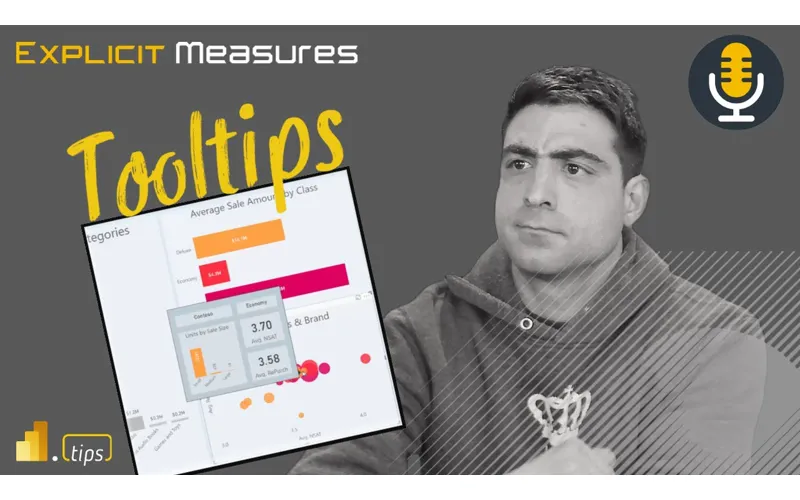
Let us Discuss Tooltips – Ep. 238
If you’ve ever watched someone hover a point on a chart and immediately ask another question, you’ve already discovered the real job of a tooltip: answer the next question without breaking the flow.
In Episode 238, Mike, Tommy, and Seth dig into how to use Power BI tooltips (both default and report-page tooltips) to add context, reduce clicks, and make visuals feel “self-explanatory” without turning the report into a wall of extra visuals.
News & Announcements
-
Power BI report tooltips (Microsoft Learn) — The official documentation for configuring default tooltips and building report-page tooltips, including requirements and limitations to watch for.
-
Submit a topic idea — Got a reporting scenario or a spicy modeling debate you want the team to unpack? Drop it here.
-
Subscribe to the Explicit Measures podcast — Episode archive and listening links you can share with your team.
-
Tips+ Theme Generator — Build consistent, branded Power BI themes without hand-editing JSON.
-
Mike Carlo on LinkedIn — Hands-on Power BI and Fabric patterns from real client work.
-
Seth Bauer on LinkedIn — Data engineering and analytics delivery perspectives (with a strong bias toward what actually works).
-
Tommy Puglia on LinkedIn — BI leadership, adoption, and the “make it useful” mindset.
Main Discussion
Tooltips are one of the fastest ways to make a report feel smarter—because they let you keep the primary visual simple while still giving the viewer the extra context they always need (definitions, comparisons, breakdowns, and “why did this spike?” clues).
Key takeaways:
- Treat a tooltip like a micro-report: it should answer one follow-up question quickly (not repeat the same value the user already hovered).
- Use report-page tooltips when you need richer context (small charts, KPIs, breakdowns) while keeping the main canvas focused.
- Design for decision speed: a good tooltip reduces clicks, keeps filters/context intact, and prevents users from bouncing to other pages “just to check one thing.”
- Keep tooltip pages purpose-built and lightweight—too many visuals or expensive measures can slow the whole interaction down.
- Make tooltip content consistent across visuals (same definitions, same comparison logic) so users build trust in what they’re seeing.
- Use tooltips to clarify the “what” and the “so what”: add a comparison (prior period/target) or a small trend so the hovered value has meaning.
- Remember the UX tradeoff: if users must hover everywhere to understand the report, that’s a sign the primary visuals need clearer framing.
Looking Forward
Pick one high-traffic report page and replace a default tooltip with a small report-page tooltip that adds a comparison (target or prior period) so the hovered value immediately answers “is that good or bad?”
Episode Transcript
0:01 [Music] foreign good morning everyone welcome back to the explicit measures podcast with Tommy Seth and Mike hello everyone good morning Mike
0:32 good morning Mike so how’s everybody doing today we are jumping into a early pre-recorded podcast so we’re jumping in with one of these so just FYI this is a pre-recorded episode we’ve got people traveling around so that’s why these are recorded however we hope you still enjoy the conversation we still put our best foot forward when we’re when we’re not really doing it live there’s always a conversation we have and if we were one of those like man they’re not live so I don’t want to do it the conversation we still somehow get an amazing community on our YouTube
1:03 get an amazing community on our YouTube thread mostly because they don’t know it’s not going to be live and they’re there anyways or maybe it’s just the idea that they don’t really need us like to have a good music to have a good time to talk about power bi we’re not really needed we’re actually just a random excuse for people to get together and talk about power bi right somehow the harmonics of the three different voices are great background to having good conversations that happens in a chat it’ll be funny yeah if
1:33 happens in a chat it’ll be funny yeah if we go back and review this and they’re like talking nothing about the topic for today they’re like everyone’s like talking about something totally random it’s all the time that’s a little different yeah that’s actually true even even when we are live that’s actually actually happening a lot we’re having Side by our conversation nice the nice thing with pre-recorded episodes is we stay on track right because there is no there’s no influx of true oh that’s a great idea that’s true it’s true we always know when one of us is looking at the chat when it’s like what do you think huh oh yeah well I agree with that
2:07 what do you guys think it’s that law the softball lob over to somebody else I can I can tell when you guys aren’t listening to me which is every time I open my mouth I’m good I just waited for someone in the chat to say what a great comment Seth and I go okay I love it it’s usually like someone in the chat was saying Seth dropping the knowledge bomb okay I need to pay attention to what Seth was saying here I gotta I gotta quickly you guys have that labeled right yeah it’s it’s around the 25 to 30 minute window oh oh
2:37 around the 25 to 30 minute window oh oh yeah welcome to this conversation Seth yep yep thanks thank you for joining us now yes knowledge bomb goes on the T-shirt too by the way that we’re still waiting to create knowledge bomb knowledge bomb Game Changer I think knowledgebomb is a good idea I don’t think it’s a good idea to fly with that t-shirt on though I think that one might not yeah I don’t think you want to wear it any word with a bomb on the T-shirt to the airport just I have a Seth dropping
3:09 the airport just I have a Seth dropping the knowledge bomb still no no I think now you’re just dragging Seth into the problem any better of your problem who’s that Seth guy Seth guy from Breaking Bad no no no that helps her hurt that is not appropriate I don’t think you can have that thing on there so let’s jump into our topic for today our topic for today is we’re actually going to do a little bit of a maybe it’s a derivation or deviation I guess would be deviation would be the right word a deviation way for what we’ve been typically talking about we’ve
3:40 we’ve been typically talking about we’ve been talking a lot about Fabric and theory and just how power bi works with our environments we’re actually going to focus in we’ve done a number of these in the past where we’re focusing on a specific feature or a thing of power bi and just discuss or talk about what’s occurring on that particular feature So today we’re going to talk a bit more around tool tips in power bi and just going over what are they how do we like to use them and just maybe some of our experiences around where have we found good use cases for tooltips and
4:10 found good use cases for tooltips and maybe where we would not want to use tooltip so maybe just our general experience around applications for the tooltip feature Tommy give us a quick overview I know you and I have talked a lot about little tips in the past and beat up some ideas there just give us what is a tool tip and and where do we put it in the reports and what does it do for us tool tips are a visual based representation of other metrics in a particular visual allowing you whenever you hover over a
4:40 allowing you whenever you hover over a particular data point to give you context on that if you had for example sales and you want to see sales here today quarter date and month to date rather than creating multiple visuals all you have to do is hover over add these to that particular Visual and you can see for a particular category those particular numbers so this is more of an action hold on hold on I can’t you can’t you can’t just blow by that what that was like Tommy GPT it did sound like tell me about and and I know you I wanted to check why I
5:10 and I know you I wanted to check why I was amazed you just you would need a training mode I went into trading mode wow thank you all done Tommy thank you it did sound like you were you were literally reading off of something but it wasn’t it was just I’m going yeah oh file found like load that one in yeah Tommy just Matrix stuff I think I believe is what it would happen different voice it was am I being deep fake right now yeah Tommy’s not even here well I’m doing my best I’m not even gonna lie to like if I can do this where
5:41 gonna lie to like if I can do this where Mike doesn’t have to add extra things so it makes sense for everybody else super super impressed I think it was clear all right that’s great I need I need to find that I need to channel this I feel bad that I feel bad that you think I’m the one who adds random comments in there no I feel like oh man Have you listened to the Past record [Laughter] s Tommy truth I’m not gonna lie Mike I asked you to do it because I’m like yeah that’s not making sense filter it Mike well I liked I guess I think
6:13 it Mike well I liked I guess I think things are very outside the box sometimes and sometimes I come at things from very different angles maybe that’s why I come in with a little bit of a different item there excellent anyway sorry Tommy great description Mike you were going somewhere and I interrupted you I totally forgot what that was you’ll ask me to do it again nope that’s that’s good so tool tips are helping you add more context to what you’re building your reports exactly I you’re building your reports exactly that’s that’s how I would look at mean that’s that’s how I would look at your summary that you made there Tommy it’s giving you additional data points things you wouldn’t normally see
6:44 things you wouldn’t normally see exposing some additional information for a hover action on your report now I I think maybe where I was going now that I’m I’m saying this out loud is the point I was going to make was tool tips are a there are things that you have to click on in desktop like you’re clicking on a bar things change you you interact with the header tool tips or the header buttons on the top drill up drill down drill through right those are all action based clickable things the tool tips is one of the few things that are hoverable and
7:16 the few things that are hoverable and just by putting your mouse over top of something you hover it and then the tooltip appears so if you have a chart or you have a table it gives you some additional context to what that hovered item is item is the only other visual that I’m aware of that has a another like hover type feature would be the button I think there’s actually a button and you can control some interactions of like when you hover the button what does it do style wise when it changes or not is there anything else that I’m missing that has a hover feature like it has a hovering capability to it the
7:49 capability to it the the funnel icon on the head or the header tool tips so there’s the data point tool tips but then there’s a header visual tooltips for example the funnel icon the drill up drill down that’s what I just said nothing does and so does the helper one so if you have that little question mark if you want context oh so if you if you hover the helper item in the tool in the tool header items it will automatically hover and apply that you don’t actually have to click that one to get in there right that’s the same with the filter one that makes sense yeah and that’s that’s a
8:19 makes sense yeah and that’s that’s a feature on every single visual right every visual gets that one enable that but every visual would have that feature if you turned it on and wrote something in there for a visual you have to add a per visual or it’s a part of your theme I think what I’m saying though is every visual could be
8:33 saying though is every visual could be part of that hovering option if you added the text in there like it’s and I’m just making sure I knew all the different places where things hover yeah so I guess this would then for me brings in the question of where where would we want to use this would be some good practical examples of where you’ve applied tooltips that makes sense for you for you and reports that maybe you’ve built or things that you’ve observed or other reports you’ve seen across the interwebs of where do you see tool tips making
9:03 of where do you see tool tips making sense sense so I’ll start off with one example there is when we started building these things called layouts and scrims I think we had this one called cool blue and inside cool blue we had I believe it was like categories or something in a bar chart and then from those categories there’s a Time series that was related to each object or call it different products right and I think there’s there’s a there’s a data set that comes out of power bi desktop automatically it has like
9:34 desktop automatically it has like products that are like Amarillo and some other random words they put in there as a product name and then if you hover those you actually have a Time series that could show you over time what does that time series look like so you could see the bar chart you could then okay let’s look at this one particular bar let’s add additional time-bound data points to that particular data point and so one thing that I think of when I when I look at charts is okay what is my position and then is there a
10:05 what is my position and then is there a direction component to this and so power bi doesn’t really make it very easy to make a side-by-side chart or a chart that actually shows you like the position elements and directional elements all at the same time you can add like a tooltip on things a a they call it it’s a it’s a measure driven label data label you can add a message of a data label that can do some things there but in reality there’s really no way of of actually showing that so I felt like it was an okay example of I have a list of categories
10:35 example of I have a list of categories that are in a bar chart I want to show a trend of that category over time when I hover it it shows some things there as well well you guys have any other examples of areas where you’ve applied tool tips tool tips I feel like I want to keep it a little standard so you’re talking about the report page tooltip so I have another visual inside of a visual right well it could be that or it could be the the there’s two two there’s two types of tool tips right so I was you’re right I was referring about like the more advanced the setup of a tooltip
11:05 more advanced the setup of a tooltip where I make a separate page in the report that separate page has some information like another visual or two on it and what happens is when you hover that bar it gives you a contextual you that bar it gives you a contextual it’s it’s a the filter context is know it’s it’s a the filter context is passed to that Visual and then the visual shows yes so the basic standard setup and as basically as you can get for those who’ve never heard of it just add other metrics to that tooltip Pane and that I use that all the time we’ve talked about this as well where I have a lot of
11:36 this as well where I have a lot of visuals that are rate representations looking at someone above and be over 85 or 15 having these targets but that’s not very helpful unless the volume so using conditional formatting to show the gradient of highest to lowest darker color to lighter color helping the user out going over that and then seeing okay here’s the total volume and here’s some additional numbers that represent that so interesting and that helps too because it’s hard you have no idea as a user to know what to look at
12:06 idea as a user to know what to look at in a tooltip so the color helps them oh well this one’s darker so let me see more information about it yeah yeah that makes total sense I like them any places where you have seen them work well the only the only one not best use case I agree with yours right I’ve used them in the bar chart scenario where I want to show that category over time or something because bar chart it is at a point in time and if I want to see a
12:37 time and if I want to see a where was it at in the last three months or what whatever the case may be I’ve used it in those cases I’ve done that too I feel I want to touch on that one it’s just a little hard to do or have you gotten feedback from that one I’ve tried that in various different ways but to provide enough information for a user with that trending and making the tooltip larger and trying to add additional information like other cards on top of it so let me let me hang I want to hang on that question one minute because I think that’s the right next
13:07 because I think that’s the right next question I want to add one more just data point here around tool tips in general general and then I want to get right back to your question because I do have a I have feedback for this one I think this is where the feature potentially needs to mature or change slightly based on what I’ve heard people asking about it so it so there’s the tooltip where we have the a visual or something appearing and typically those visual based tooltips take up more landscape there’s usually a bigger like it’s it’s literally covering the rest of the page it does interact
13:38 the rest of the page it does interact interestingly with your mouse because as you move your mouse across it does change for each bar while I think it’s a very cool feature and I definitely have had some requests to build that and add that to some reports I think it’s minimal in value of a feature ad I think more often where I would put tool tips right now is making sure that when I hover a bar I’m just adding data fields into the tooltip option for that Visual and then I’m just seeing it’s this category it’s this total it’s this percent change over
14:10 this total it’s this percent change over time and your X number percent towards a goal or some value right so it’d be something like adds a little bit more context but that’s a window that can appear on top of your visual that’s much smaller and it’s much less obtrusive of what’s going on another tooltip that I’ve seen people use is adding additional text boxes inside that Visual and then when you hover a table you can see row by row items in the table so the other one I’m thinking here recently is if you’ve ever watched or used the release manager from Power bi
14:41 used the release manager from Power bi so the or the release management tool I think Alex Powers built it it pulls data from the website and then it refreshes and then it has a table where you can hover each released feature by month and then there’s a little bit like additional description that goes along with it with it I feel like when the Tool tips are in a table it becomes less relevant for me because I have a harder time clicking on things inside the table I can’t I want to see what’s in the table I want to click the link I want to click on items in the table and if there’s data points in the rows
15:13 in the rows of what the tooltip is covering I lose some context there and don’t really love it how often are you guys applying to a fitness to a report page that’s another great question yeah so well I do also want to go back to Tommy’s question so let’s let’s hit that one first Seth and then go back to Tommy’s here I would say for me when that came out or when I was playing with it I probably used them a lot more now I’m much less using a visual based tool tip because I think it obstructs too much of the user’s view on what is occurring inside
15:44 user’s view on what is occurring inside the report I think a lot of people like the idea or the look of it like oh wow that’s amazing you can do this extra thing on top of the visual but I I don’t have many requests now nor do I put that into many reports at this point in time so I would say how many reports do I have almost never now it’s it’s very rare that I’m putting those in I hate to say this but for training all the time
16:16 I really don’t I I’ll use it to experiment on sometimes but I can’t remember the last time for a client report I’ve I’ve truly utilized that in a helpful or like really put in a production report see I can I can neither of I which is why I asked but I think it’s twofold I think it’s useful and in that Tommy to your point can you add an additional element or data point that’s not in a in a line chart for example right you hover over in
16:46 over in if your calculations and and what you’re looking at in the visual this is just an add-on that’s really helpful to understand as you’re navigating okay what is my number going up and down over time and then the tool tip enhances that a bit the challenge is is both what I think you nailed to Mike is is this visual
17:08 you nailed to Mike is is this visual pop-up right that starts to obstruct a lot more of you what you’re interacting with as an end user which is which is why like one of the first comments I made I put together when we were doing this episode was I think this is it even even if it was used widely I think this is a very Advanced feature I would agree for end users because it it completely disrupts for the most part right like line charts right like you’re you’re hover most people aren’t hovering to see something
17:39 people aren’t hovering to see something a lot of the drive and direction that we’re we’re engaging with customers is click on the bar chart and see the other visuals change so in the even in the use case where I have a bar chart and I want to see things over time yeah I typically have a line chart that shows everything over time and if you want to filter and slicer it like slicer it slice it I click on the bar chart you want to see that category in that one alone boom now you have like a a page where you don’t have things
18:10 a page where you don’t have things popping off and on which I think creates a conflicting experience to some degree where you can have all the elements on a page in visual format to digest as you want as opposed to a tool tip that like hovers there while you’re over a bar and then like how do you get that same same how does that correlate with something else when this object is now obstructing it correcting it yes I I do want to put a caveat there
18:40 yes I I do want to put a caveat there for standard based tooltips that’s a basically a requirement requirement requirement yeah that’s an easy word it’s a requirement for me every time now for anything out of that context and the a few instances where the report-based tooltip makes sense is honestly a table of like a high level categorical information to have it like almost like a yes or no context but from a visual point of view like a bar chart a line any like a tree map I rarely have found
19:12 any like a tree map I rarely have found a new value unless there’s an actual number in that tool tip the other thing I think I find when I’m building if I’m building visual based tooltips again this is to your question Tommy what what are things I don’t like about it one thing I don’t like about it is if you don’t design your tooltip to be very limited in data meaning you can’t put a table in the tooltip the tooltip is not scrollable you can’t interact with the tooltip there’s nothing there’s nothing going on there is right yeah you’ve got you’ve got to really meter the information that’s coming from the tooltip and making sure
19:43 coming from the tooltip and making sure that okay the tooltip is only going to show me this little tiny subset of information now again I’m not sure again I haven’t played with a lot of other data tools right so I couldn’t tell you what Tableau does I couldn’t tell you what click does I’m sure they have some level of tool tipping things that they can also do but I’d also be curious just to get like a baseline of if we look at other data tools that are doing tooltip type things I feel like making the tooltip more interactive would be if value add
20:14 more interactive would be if value add to users or other things potentially thinking like again where my head goes with this right if you had a larger text box if you have a table that has more than three or four items right what will happen is on the tooltip it will show and you’ll see a scroll bar for the table and the user does not get to interact with that scroll bar you can’t put your cursor back into the tooltip and scroll the information right so again being very clear here when you have those visual based tooltips you are limited by what’s
20:45 based tooltips you are limited by what’s visible on that screen so you’re picking bar charts line charts stuff in there that will that will always fit the size of that window but I could imagine an interesting option where oh sorry go ahead no no continue with the idea also say I could imagine a place where you start making that more interactive imagine if the table was there what if there was a maximize button on the tooltip and you could hover something see the tooltip and the tooltip would increase in size you could then work with the
21:15 in size you could then work with the data in that tooltip scroll the table see the kpis right maybe something like that would work or maybe it’s a direct maybe there’s a an option that there’s a button on the tooltip that takes you to the details of a page based on the filter context of what you’ve hovered right so there could be some other interactions that would be on top of it that I think might be helpful but I think again for right now the way I see it today yes I’m with you Tommy I will always teach the tooltip and how to build a visual base to put I don’t think
21:45 build a visual base to put I don’t think it’s hard to make the implications of in real world do I build those things I do not and I think that’s one of the reasons I did not yeah and those are those are the points of frustration though that I’ve I’ve had and heard when implementing tool tips with end users it’s showing me the element it’s showing me the bit of information I want yes I can’t I can’t snag it I can’t grab it it’s just in that hover action so I agree Mike like if there’s some ability to freeze freeze like but now like that gets squirrely if
22:17 like but now like that gets squirrely if you’re very squirrely because because it’s a hover thing so yes now my cursor is just hovering over these objects how do I how do I Engage The Tool tip to do something right it’s like yes you freeze it drill like use it as a drill through right because especially if you’re doing a report pay like report page tooltip is the Assumption here right like you have a visual that’s showing but then what is that experience because your your page can’t be limited
22:47 because your your page can’t be limited to that size like where you drill to should be the full full visual or a blown up or like how do they one of the big mistake areas that I I was just making it around before you went down this route is that table one yes show show a table you can’t scroll it you’re going to show information that somebody’s going to want to extract or snap or do something with or yeah or yeah export yeah right and that’s where if if they unified potentially the drill through capability on top of
23:25 hey here’s the visibility and I can take action on it then I could see an interesting use case of like okay well maybe maybe this is a better drill through right I don’t know well I feel like we’re all generally smart people here right we like to find Solutions speak for yourself but and if you guys don’t mind even before we go through like what things we’d like to see I am sure this two of you have thought of other ways or ingenious ways like even Alternatives that may not be
23:56 like even Alternatives that may not be the best for you to trying to utilize that tool to Future and I’ll give an example here and maybe I’ll kind give an example here and maybe I’ll kick it off sure so things that have of kick it off sure so things that have actually genuinely helped I haven’t implemented this fully but I will greatly expand the size of the tooltip page and I’ll make it much more either vertical or horizontal so it does take up a lot more space but that normal I never use the normal tooltip size because you can’t put a visual a trending in there to actually provide something contextual any other bar chart
24:28 something contextual any other bar chart it’s like okay something’s larger than the other but if I make it large enough and I I do create like report or tool to specific metrics or either a table or just highlight a yes or no basically that’s when I found they actually work well but again going back to everyone’s point I still want to see some updates to it but that’s an alternative for me I like that idea I think I think making the not using the standard size I think the standard size is I can’t yeah and also I think I would also agree with you Tommy there anywhere
24:58 also agree with you Tommy there anywhere in desktop Whenever there are default features the Microsoft team needs to be very careful about what they send out as default features because I think a lot of parts of the tool just never make it out of the default features like the number of reports I see in 16x9 the size of the page never changes it’s oh like every report I see is always 16 by nine no one ever gets created the first thing I do is change the page size right potentially yeah and there’s also there’s also little tricks you can go
25:28 there’s also little tricks you can go along with that as well right so if you want the page size if you want the page size if you want to put more information on a page like oh man this font size doesn’t go small enough like you would want this font size to go really small but if you need more space on a page for visuals
25:40 visuals especially when I’m doing like a data quality report I need more I need more landscape I want I want a bigger canvas so I keep forgetting even nice I forget oh I could just go modify the page size just make it big so if I’m doing a data quality report I have this massive page and then the visuals can get much smaller and I now have a zoom in zoom out so if I need to work in on a per a certain portion of the report I can zoom back out and get back forth on things like that yeah I would agree with that one I think that’s a big Miss I like the idea of going think about
26:11 I like the idea of going think about it think about how you want your report to look right if you if it’s long information or is it wide information and then changing the tooltip to fit that accordingly a line chart or a bar chart over time would make a lot more sense if it was like a longer wider thing yeah versus another tooltip another observation that I have found that has worked well for me is for me is taking like a card or something that dynamically selects the selected value that you’re hovering over so when that way when you hover the object of the
26:42 way when you hover the object of the data bar you get some like additional context things inside the top portion of that that tool tip right hey you selected product is this total value is this percent change was this as a 10 of Target and then the line chart below so you get a little bit more contextual pieces of what you’re actually selecting and I believe now the new cards right of support tool tips yes so that’s another the new the card new I guess that’s the name of it right now it’s interesting
27:13 name of it right now it’s interesting naming schema but okay fine so we have a card and we have card parentheses new that one actually does support tooltips because the old one did not so you can’t hover those things so that I do think is very relevant I think a tool tip around a single data point is probably more valuable than hovering a bar chart potentially or even hovering a a line chart or something else that’s going on there as well I like those options as well I’d like to see I think one of the things that would be very helpful I
27:44 the things that would be very helpful I think to me is more ease around inside that tooltip we’re always trying to indicate things are green things are red things are good things are bad right so that high level editing of things I think it would be nice for desktop in general and this is maybe more of a general comment to make it easier for us to identify styles that indicate success or or not good things right for example imagine you have a bar chart and you have some indicator around you and you have some indicator around when you hover that item you’re
28:14 know when you hover that item you’re you’re able to identify that data point and you’re quickly giving us the whole back of the card is red or green right you’re you’re dynamically changing the entire style of that card all at once yes it’s very much you can do it today you build a bunch of measures you can add different colors you can style all that stuff using Dax today I just wish it was a little bit easier to make that and Implement that because that way as you’re hovering these data points or looking at things against goals it would be easier for you to very quickly indicate which things are successful or not
28:45 not you’re making me think Mike about not so much the future but what would be what is the purpose from a consumer point of view and I think you’re getting right into the the heart of it like if I’m a consumer what do I need to find generally speaking what are those use cases where I’m a tooltip would be helpful like what am I trying to explore so it’s like taking that yes the the philosophical and I I have like a report I’m looking at right it’s the why the why why is this here right why is this here and why like what action am I
29:15 this here and why like what action am I trying to take I’m looking at a report right now that I have actually use it for myself and I have a tool tip in it ironically it’s probably the only report I have in production that has a tooltip yep and it’s the idea here is I’m looking at this and it’s really provided me like four or five different numbers for a category but or one metric for a category but it’s basically okay I’m looking at group a I want to see you looking at group a I want to see the subcategories whether or not know the subcategories whether or not they’re above or below
29:46 they’re above or below so I don’t have to click on anything else right it’s basically what could be a interactive filter mode just within it but it feels like you’re doing something like a like a an explain the increase or explain the decrease it’s very kind thing but with a tool tip right yeah but why is this the bar up why is this bar Down based upon these couple categories right and that’s where that’s where tool tips make a ton of sense if if they can provide you enough information for what
30:16 provide you enough information for what that enhances well just enhances the data point that you’re looking at right and it’s not I I think the trip up sometimes is where you start providing other information that is going to drive you in a different direction as a as opposed to the tooltip closing out what you would be asking about the hover right like to your point Tommy if if I’m looking at the metric and these four other tooltip things saying up down left right whatever the case may be
30:47 down left right whatever the case may be yep and that’s as far as you go then that makes sense to me right because then it’s like oh I would always want to look at these four things if I’m looking at this metric or tool tip it I think we’re we’re where it goes maybe not as useful or off the rails is where you start opening the doors to other types of analysis in the tooltip where people are like oh well now I want to know this and you’re stuck because that and maybe that’s where we were going down with like the
31:18 where we were going down with like the drill through and like I still want to do analysis and like maybe that is another Avenue for it but maybe maybe in the context of a successful use of tooltips it is it should be the bookends right like it’s just gonna it’s just gonna provide the supporting last bits of information you would want to know about hovering on that thing well let’s just support the main kpi I think that’s a really good point if you’re trying to use a tooltip to show something another like metric or another category just separate like a
31:49 another category just separate like a more Discovery Point of View not so much supporting the overall purpose of that like via kpi or why something’s there then it doesn’t make sense it’s really hard to get any information there but if I’m looking at something like wow that’s really high and I visual go over the tool tip and it’s like okay here’s the things that are below okay good now I know right but when you’re trying to go to another self-discovery that’s that makes it really hard and that content in that size size I’m pulling up in desktop here just to
32:19 I’m pulling up in desktop here just to make sure I confirm some things in my head head did did something change with tooltips is I thought I thought tooltips were on by default potentially on certain visuals like the table is what I was thinking potentially I feel like they’ve turned that off by default now or has it always been off by default yeah it’s always been off on a table on a table okay so tables are always it’s just other other visuals ever is it ever on by default on other visual or no it’s usually not I think it’s always standard tool tip unless you
32:50 unless you manually set it to a report page tooltip okay okay so it is it is so unless you’re if you’re adding a data point to a tooltip it’s like you’ll get it by default it will be on but individuals that don’t have it for example there is no field wealth or a table that says these are the data points that are tool tip based so therefore that one’s off by default yeah I see what you’re saying yeah it’s even saying there you have to manually put it but yeah okay the tool tip if you say these metrics yeah I’m just trying to make sure that
33:20 yeah I’m just trying to make sure that there’s no change in that behavior there but okay that was something I wasn’t aware of is trying to get my head around some of that so where where do we see tool tips going and I liked your idea there Seth talking about like the tool tip is it’s probably it’s like the period at the end of the sentence if it can’t be that period if it can’t be that final statement it says yep we’re done this is the this is the complete analysis because once you get to a tool but you’re done digging for analysis right it’s not going to take you anywhere
33:50 it’s not going to take you anywhere beyond what it shows you is there any alternatives or other things you would change to that well but that that that is that’s that’s the 30 minute idea right oh yeah Seth like yeah these should be bookends right and I think even in our earlier examples I probably wasn’t utilizing them correctly because if I start showing things over time I’m always going to have questions I’m always going to have like true
34:14 I’m always going to have like true that’s interesting point like I’m gonna go look at that further so in terms of like how do we how do you enhance the tooltip I guess it’s the the use case particularly right so if the primary use case right now is to put bookends on something or a period then how would you enable which how you would you enable other use cases and the one I think we outlined was I’m going to want to drill into whatever you’re showing me in some way shape or form so that would be like freezing the
34:44 so that would be like freezing the tooltip or allowing you to use it as a drill through to a different page or visual the other interesting thought in here is like tool tips make a lot more sense in in a visual like would make more sense in an expanded view where all I’m looking at is the visual and then I have a lot more real estate to look at a a report page tooltip tooltip but I would I would definitely want that that take me into experience where it’s
35:14 take me into experience where it’s almost like the gateway to other further analysis right like yes it would be interesting because man it’s interesting because it’s almost like a wind a windowed experience of like oh I’m gonna show you this this tool yes that’s going to take you here and and then you’ll have a different report page experience as opposed to trying to do that with buttons and bookmarks on on the report page or taking people from one report page to another yep I do find it that that
35:45 another yep I do find it that that would be an interesting one just as I’m like hovering I I see the visual right and that’s the benefit of it where I’m I’m I’m I’m tweaking an experience of what I’m already giving you on a report page and enhancing it as I’m as I’m just spewing words really what would be really interesting I think is to test out utilizing tool tips for like Advanced visuals hmm okay toggle on and off
36:17 hmm okay toggle on and off what if okay that no so so here if I have a visual what would be fun is if I had an experience where which you could create with bookmarks right I have your base level yep but then I have an enhanced mode where like I give you the visual experience with that tooltip that shows you like you like some visual you’re not used to right or it drills in and gives you some context to to a a much harder to understand
36:48 a a much harder to understand visualization that then I could look at I could drill in and look at oh Andrew example example no it’s so we’ll get an example let me jump into what your your idea there is let me see if I can materialize your idea and I’m visualizing so that’s what you’re saying you’re saying a thing and I’m like I’m in my mind on my pain I’m just going oh this would be cool so I’m going to just say something and you guys react to it let me know if I’m kind guys react to it let me know if I’m like on base with your idea Seth I of like on base with your idea Seth I could be totally way off here so a lot of times people tell me I want to see this bar chart or I want to see
37:18 to see this bar chart or I want to see this as a table and so a hover tooltip of a button on the right hand side so I’m envisioning like there’s potentially a chart in front of you right and then maybe on the right hand side or somewhere around that you’re actually adding two or three other buttons you adding two or three other buttons as table as chart as line chart as know as table as chart as line chart as whatever or compare to Gold compared to whatever and so when I hover them it would basically I’d have the visual and I could hover it and say okay this hover tooltip is hovering and it’s going to
37:48 tooltip is hovering and it’s going to show me a tool tip of that chart as if it was rendered as a tree map a line chart or hey take this very simple again because a lot of I think a lot of times what we’re doing with users is we’re trying to get them tiers of visual in front of you the data culture may not allow us to be able to show them this bar chart with an added line for Target right so show this bar chart but now show this bar chart with a Target attached now I’ll show
38:18 with a Target attached now I’ll show this bar chart as a line chart now or here’s here’s all the categories over time so you’re showing the categorical x-axis and you may be in that way you’re saying the tool tips are now showing different possibility visual features previewing them and then if you click the button it then does a bookmark where it switches the visual out for you and now you’ve got that visual as the the portion of that thing does that make sense sense you might be thinking something different but that’s how I interpret what you said Seth that’s that’s that’s cool yeah let me build on
38:51 that’s that’s cool yeah let me build on this yeah well this because I think I got something that’s fire okay yeah give me two things right now in a visual or in the power bi service report that Scrolls but we have no control over so it’s a riddle yes yes it’s a scrollable object in the tooltip thing in a visual that you can interact with that or the report you can scroll but we have no control over you can scroll but have no control over
39:22 you can scroll but have no control over yeah the thing you don’t click you can’t click anything in there but it’s a scrollable object or it would scroll for you oh you’re just I can’t control what it shows yeah it’s Auto generated but I have no control so this is like my riddle across the bridge but this is true so what is the value proposition I’m not sure if I’m following the value I think I already exists exists it’s not something or objects already exists we have to do something but you can’t scroll you can
39:52 something but you can’t scroll you can scroll this allows us to scroll but the author has no control what it shows the format pane because it’s literally hard to work with it’s public yeah when it’s already published give me a visual right now I have no control of what this will show once all those AI generated ones it’s it’s no it’s it’s the so what you’re talking about yeah so like I can look at the automatic insights or I can look at the anomaly detection or like I literally I can do those things right it shows me
40:22 can do those things right it shows me things about it’s doing some analysis for me but I don’t really get I can tweak it a little bit but I can’t really do anything with it so the automated insights if I can either do this on a report page or it show what I would really like yeah is it will open a pain to the side and I can scroll that but I have no control over what those insights are that if I have we’ve talked about the no ability to scroll if I want to add more context for a user I want my visual tooltip rather than expanding into a new page which takes me
40:53 expanding into a new page which takes me out of the context of the page sure the tool tip is to support whatever I’m looking at yes open a new pane to the side with visuals that I can add to there or the things that you’re talking about rather than having buttons I can have all those metrics there on an expanded page or on the same page just as a pane so you’re saying you would want the experience to shift the report page and and display a different pane display a pane of all the
41:24 different pane display a pane of all the supporting things I really love even the analyze buy can’t be helpful sometimes yes but I don’t control it yeah I’m looking at the find where this distribution is different so I it let me let me let me re-articulate what I’m hearing you saying you’re in your comment there Tommy so maybe that’ll help me understand what you’re thinking through all right so today in the experience right now I can right click and say analyze this thing and show me where it’s different what I would like to do is potentially give context to If you’re looking at why this is different
41:55 you’re looking at why this is different these are the charts I would want to show you that would tell you why this is different right explain it if you’re using an explaining type tool this is the stuff that we care about like don’t tell me where the week number is 52 because it’s the largest week number in the whole year week ID and day at quarterly yes I don’t I don’t really like focus on like if if there’s an AI generated thing hey computer hey power bi focus on these six columns these are what we care about these columns are important to me
42:26 about these columns are important to me if you’re in the service click on automated insights I love how it supports everything but it doesn’t take away from what you’re trying to do and I’m in desktop right now doing the same thing saying it’s basically saying if I’m an insights doesn’t exist in the desktop well no I’m talking about analyze find where distribution is it’s a little bit different so it’s like find where this distribution is different so there’s an analyze feature in desktop right and it runs some maths and says oh
42:49 right and it runs some maths and says oh okay on this whatever I have a really simple data set on this day these categories are different and here’s how different they were so you can see like okay here’s what normal things should look like what you’re looking on this one is oh on this particular data point you can see the bars here’s your normal distribution line here’s these lines as overlaid against us and say oh wow this is very different on this like for example example I have a bunch of categories and it has on on Saturday these two categories are
43:20 on on Saturday these two categories are like almost next to nothing these other two categories are extremely large so this doesn’t fit the normal distribution of things it’s showing you patterns there it’s like an automated insights but with drill through so I have the categories only choose these categories if there’s something available but the point again is rather than expanding the page which you might as well just have drill through at this point you want to keep the user in the experience I love the one on the right hand side the the UI of the automated insights interesting
43:50 UI of the automated insights interesting hmm I didn’t think of it that way but I like that one too these are all really good ideas for Tool tips tips so we’re starting our own product or are we submitting a I think this is we’re just going to take this I they’re gonna take these ideas and we’re just going to make an ideas. powerbay. com and we’re just going to put the link to the video and say just do this about minute 43 go go to minute 43 listen to what we’re talking about and just make one of those things happen I think this these are good ideas I think this would really help part of
44:21 think this would really help part of that user experience in all of these new ideas we’re talking about here there’s a nagging voice in the back of my head saying whatever we do whatever happens with tool tips and however they change whatever Microsoft does whatever we come up with ideas at the end of the day there’s always this hurdle to the end user the report consumer this is a great place though yeah and I think I think this this is a universal thought across everything power bi does it doesn’t matter what it is drill up drill down
44:51 matter what it is drill up drill down drill through all the different features in a visual like everything you build in a report a report needs to have some like visual language with it and I really do think for for users who’ve never touched power bi like it takes a little bit of time to get used to how it works and and how it’s different it is a my opinion I keep thinking it’s a data application you don’t you don’t see people building software applications they’re just like all right World here you go and don’t ever let people don’t tell them like
45:21 ever let people don’t tell them like what the software’s doing so I think in the same way as us as report designers again if I’m looking back at all the reports I built all the things that are helpful I think one of the most helpful things to drive adoption to encourage people to use features that you think are cool is to really go through at a more detailed level in the report and explain here’s why we did what we did how can I convey the mindset of the report author into the report consumer whether that be with videos whether it be instructional things a write-up a tutorial like whatever the things are I
45:53 tutorial like whatever the things are I think it’s helpful for you to produce something of value to that end user consumer and think about how they will use what you built and everything we’re talking here for tooltips is just adding one more thing to that list of all right what we’re going to teach them how to do this and it’s it it has to be as intuitive as possible possible it’s where my thought goes yeah it’s one of those things that the more you enhance like adding report page tool tips right it’s another thing that you have to train your users
46:24 thing that you have to train your users on on and and making sure that it’s the right use case I think that would be something I would use with more advanced users who have been looking at reports for a while I would enhance it would be an enhancement later on I don’t think I would lead with a report anymore for new users and I would even ask who’s who’s the audience this report how long have they been using power bi are they very comfortable with it or they not if they’re not very comfortable with it I would like we probably we should probably simplify it a bit more let’s just make a couple very simple things let’s just get them using the filter pane let’s just get them
46:55 the filter pane let’s just get them using personalized bookmarks let’s start there there and then we’ll we’ll work we’ll work from there and build into it okay here’s what tooltips can do because now you can actually have a language about your reports the buttons are all styled the same way it’s the language is similar that way whenever a report you walk into it’s not this different thing every single time I look at it I think you’re going to the heart of the the argument here right where it’s not so much about a report page tools if not providing context is a lot of users don’t even know that a standard tooltip exists I would agree and the same thing with drilling up or down
47:26 drilling up or down it makes a little sense but it’s still it’s not as intuitive from a user point of view if you’ve never touched it or even an intermediate user yeah not like it’s not one of my thinking like front-facing so to speak you need like this level of I need to have empathy for my end user right I need to how as again this is I think a challenge just for anyone who’s a more skilled or more versed person if you’ve been spending nine years with power bi you understand a lot of how it works it just becomes it’s natural to you I know what these icons are I know that I have
47:56 what these icons are I know that I have to put my cursor in the upper right hand corner of a visual to get these icons I just know it because I’ve been doing it so long new users don’t have that same comfort that we do and so we have to continually put ourselves in the mindset of I’m a new user I’ve never seen this before I don’t know what’s going on what’s important what do I really care about and how do I get that information to them without distracting them or overwhelming them and clicking like seven eight nine ten that’s the same thing I hate about desktop right in desktop Microsoft make as few clicks as
48:27 desktop Microsoft make as few clicks as I possibly can do to do everything I want and that’s the danger yeah but at the same time like that’s the danger of Alder even some of the more things oh we can do all this with tool tips things it’s this hover experience so are you going to start adding actions onto a hover thing how would you stop the hover from happening exactly and now all of a sudden it’s like well wait before it was just a right click into something now yes now it’s what like how so there’s a lot of user UI experience
48:59 so there’s a lot of user UI experience thing it’s hard to get thrown into here and and yeah it’d be interesting to see like what what it what or if they do anything with it as they they work through the new visualizations as I’m going through my report Manifesto rules I think rule number 12 is if unless you’re telling an explicit story do not assume the user is going to self-discover I would agree and then I would I would also dovetail that with another best practice that I would say as well if you’re doing something that’s a bit more custom that’s a bit less discoverable it
49:30 that’s a bit less discoverable it requires training it requires something that goes along with report here’s something I need to teach you about how this works right I love it and yeah well I think that’s a good and good place to note here we love the feature I think it’s good I think there’s a lot of opportunity for Tool tips in the future I hope you got some insights around some things that we do or not do on tool tips and just being mindful again have empathy for your user who’s consuming these features make sure they know why it’s cool how it’s adding value and if again going back to other
50:02 if again going back to other conversations we’ve had about visual design tufty right tuft if if you have to add things on the page and it’s not adding value to the end story why put it there keep it simple so with that thank you all very much we appreciate you listening to the podcast I hope you found some value from today talking about tool tips and things if you haven’t explored them go check out the Microsoft documentation we’ll leave that in the description as well thank you all very much and Tommy where else can you find the podcast to find the podcast anywhere that exists Apple
50:32 the podcast anywhere that exists Apple Spotify make sure to subscribe leave a rating if you have a topic an idea or a question you want us to talk about on the podcast make sure to leave a mailbag at powerbi. tips slash the podcast finally join the conversation live with our great Community every Tuesday and Thursday 7 30 a. m Central thank you so much we’ll see you next time
51:21 [Music] foreign
Thank You
Want to catch us live? Join every Tuesday and Thursday at 7:30 AM Central on YouTube and LinkedIn.
Got a question? Head to powerbi.tips/empodcast and submit your topic ideas.
Listen on Spotify, Apple Podcasts, or wherever you get your podcasts.