Tag: Custom Visuals in Charts

  • No Code Custom Visuals – Webinar

    No Code Custom Visuals – Webinar

    This month we did a webinar with the Microsoft team on how to build different custom visuals in Charts.PowerBI.Tips a version of Charticulator.

    If you haven’t seen Charts.PowerBI.Tips this video explains the program, all the functions of each button and building demos. We walk through all the buttons on the tool bar and what they do. Finally we build multiple different charts. Check out this webinar if your curious about building custom visuals with no code.

    I want to give a super big thank you to the Microsoft team especially Kelly Kaye for making this video happen.

    Thanks for watching and have a Wonderful Day!

    If you like the content from PowerBI.Tips please follow us on all the social outlets. Stay up to date on all the latest features and free tutorials.  Subscribe to our YouTube Channel.  Or follow us on the social channels, Twitter and LinkedIn where we will post all the announcements for new tutorials and content.

    Introducing our PowerBI.tips SWAG store. Check out all the fun PowerBI.tips clothing and products:

    Check out the new Merch!

    Hasta La Vista Data
    Go Ahead Make My Data
    PBIX Hat


  • Stacked Bar Chart

    Stacked Bar Chart

    For this week we are building a stacked bar chart on https://Charts.PowerBI.Tips. While you can build this type of chart within Power BI Desktop this video is more of an example showing how you can build a similar custom visual chart. There are two areas that i’d like to point out.

    1. When working with a chart you can add a Legend to a shape object (2:40)
    2. Adding a grand total requires an additional Glyph (3:14)

    While these two tips are pretty simple it really does help you when building more complex custom visuals.

    Watch the Tutorial

    Download this Custom Visual

    If you liked this visual and want to download it, head over to this repository to download.

    Learn More About Custom Visuals

    We have been working hard to help you learn how to make custom visuals. Check out our full YouTube Playlist to learn more about using Charts.PowerBI.Tips.

    If you like the content from PowerBI.Tips please follow us on all the social outlets. Stay up to date on all the latest features and free tutorials.  Subscribe to our YouTube Channel.  Or follow us on the social channels, Twitter and LinkedIn where we will post all the announcements for new tutorials and content.

    Introducing our PowerBI.tips SWAG store. Check out all the fun PowerBI.tips clothing and products:

    Check out the new Merch!
    Hasta La Vista Data
    Go Ahead Make My Data
    PBIX Hat


  • Dual Y-Axis Line Chart

    Dual Y-Axis Line Chart

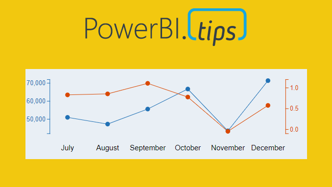
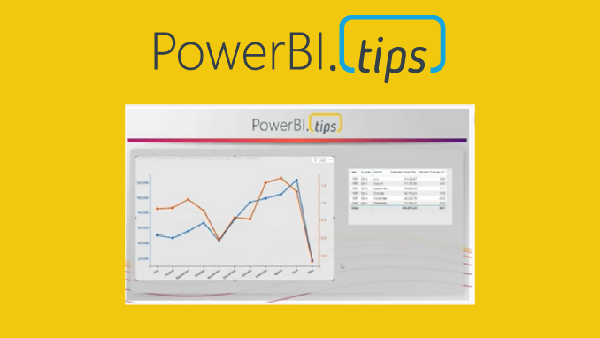
    Ever need two different scales on the Y-Axis of a line chart? If so, then this tutorial is for you. While creating a dual y-axis line chart is pretty common in excel, it is not as easy in power BI. The only standard chart that comes with Power BI Desktop that enables dual y-axis is the Column and line combo chart types.

    For this particular visual I needed to show correlation between two time series with different Y-axis scales. The Y-axis on the left of the chart had data elements in the thousands, but the right side needed percentages. The tutorial below illustrates how to accomplish by building a custom visual using the Charts.PowerBI.Tips tool.

    Video Tutorial

    note: there are a bunch of really good custom visuals that can be downloaded from the Microsoft App Source store. However, this article will not review all third party visuals that are able to produce a dual Y-axis line chart.

    Source files

    All files used to create this visual are located here on GitHub.

    Layout file

    The file used in this tutorial was a derivation of the Sunset layout from PowerBI.Tips. If you like this file, you can download it here:

    If you like the content from PowerBI.Tips please follow us on all the social outlets. Stay up to date on all the latest features and free tutorials.  Subscribe to our YouTube Channel.  Or follow us on the social channels, Twitter and LinkedIn where we will post all the announcements for new tutorials and content.

    Introducing our PowerBI.tips SWAG store. Check out all the fun PowerBI.tips clothing and products:

    Check out the new Merch!
    Hasta La Vista Data
    Go Ahead Make My Data
    PBIX Hat


  • Make Custom Visuals with no Code

    Make Custom Visuals with no Code

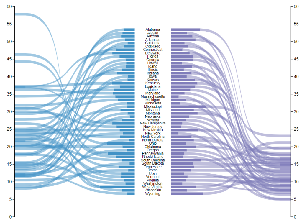
    Welcome to another installment of building custom visuals with the Charts tool from PowerBI.Tips. In this edition we make the following custom visual.

    Custom Ribbon Chart

    This chart comes to us from the sharp mind of Nick Snapp, Check out is work on Charts.PowerBI.Tips within our custom visual gallery. This chart combines the ability to see both the relative size of values between states as well as distributions of data with adjacent number lines. Pretty cool don’t you think?

    Below is the walk through video on how to build this custom chart.

    Building the Custom Visual

    If you want some other help making custom visuals check out this other tutorial building a simple bar chart.

    If you like the content from PowerBI.Tips please follow us on all the social outlets. Stay up to date on all the latest features and free tutorials.  Subscribe to our YouTube Channel.  Or follow us on the social channels, Twitter and LinkedIn where we will post all the announcements for new tutorials and content.

    Introducing our PowerBI.tips SWAG store. Check out all the fun PowerBI.tips clothing and products:

    Check out the new Merch!
    Hasta La Vista Data
    Go Ahead Make My Data
    PBIX Hat


  • Make Custom Visuals – Create a Bar Chart

    Make Custom Visuals – Create a Bar Chart

    With the release of the custom visuals building tool Charts.PowerBI.Tips we received a number of comments requesting tutorials on how to build visuals.  Ask and you shall receive!  Below is a basic tutorial on how to create a Bar chart.  Within this tutorial we review a couple of the features of the chart tool and how to use them.

    Video Tutorial on Building a Basic Bar Chart Custom Visual

    Comment below on other topics you would like to see.

    Be sure to follow:

    If you like the content from PowerBI.Tips please follow us on all the social outlets to stay up to date on all the latest features and free tutorials.  Subscribe on YouTube.  Or follow us on the social channels, Twitter and LinkedIn where we will post all the announcements for new tutorials and content.

    YouTube Linkedin Twitter