PowerBI.tips

Make Custom Visuals with no Code

June 20, 2019 By Mike Carlo
Make Custom Visuals with no Code

Welcome to another installment of building custom visuals with the Charts tool from PowerBI.Tips. In this edition we make the following custom visual.

Custom Ribbon Chart

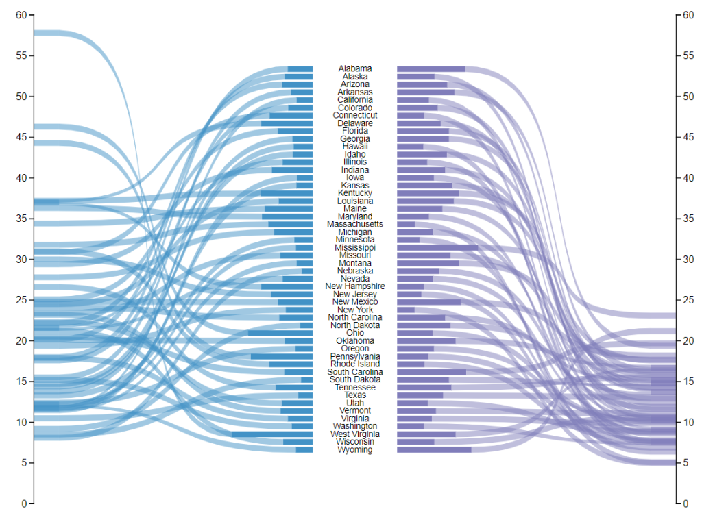
This chart comes to us from the sharp mind of Nick Snapp, Check out is work on Charts.PowerBI.Tips within our custom visual gallery. This chart combines the ability to see both the relative size of values between states as well as distributions of data with adjacent number lines. Pretty cool don’t you think?

Below is the walk through video on how to build this custom chart.

Building the Custom Visual

If you want some other help making custom visuals check out this other tutorial building a simple bar chart.

Previous

New Layout – Square One

More Posts

May 15, 2026

Importance of Skills for the Fabric Developer - Ep.528

In this episode, Mike and Tommy dig into why building the right skills matters for Fabric developers and how that thinking changes what you learn first. They also discuss how to evaluate skill depth, avoid tool-chasing, and create a plan for steady growth.

May 13, 2026

Semantics Layer Genie & Data Agents - Ep.527

Mike and Tommy explore what ‘semantic layer genies’ and data agents could mean for Fabric and Power BI teams, from metadata-driven modeling to assisted development workflows. They break down where agents help today, what needs governance, and how to stay practical as the hype accelerates.

May 8, 2026

Stop Using Bookmarks - Ep.526 - Power BI tips

In Episode 526 of Explicit Measures, Mike Carlo and Tommy Puglia unpack the latest Power BI and Microsoft Fabric topics from the show. You’ll get a quick read on the episode’s biggest ideas, why they matter, and where to dig deeper in the full conversation.