Tag: Tutorials

  • Make Custom Visuals – Create a Bar Chart

    Make Custom Visuals – Create a Bar Chart

    With the release of the custom visuals building tool Charts.PowerBI.Tips we received a number of comments requesting tutorials on how to build visuals.  Ask and you shall receive!  Below is a basic tutorial on how to create a Bar chart.  Within this tutorial we review a couple of the features of the chart tool and how to use them.

    Video Tutorial on Building a Basic Bar Chart Custom Visual

    Comment below on other topics you would like to see.

    Be sure to follow:

    If you like the content from PowerBI.Tips please follow us on all the social outlets to stay up to date on all the latest features and free tutorials.  Subscribe on YouTube.  Or follow us on the social channels, Twitter and LinkedIn where we will post all the announcements for new tutorials and content.

    YouTube Linkedin Twitter
  • Respect Layers

    Respect Layers

    If you are like me and you like making your reports look extra good with different visual elements you’ve probably come across the issue before where you use shapes or images layered behind a visual. What you have quickly discovered is that an end user can mistakenly click on that background layer and the entire object pops from the background to the foreground. In this quick tutorial, we’ll show you how to STOP this from happening! We learned the technique through a webinar given by Miguel Myers and wanted to make sure we spread the word because it will have a huge impact on how we can build reports!

    Be sure to follow:

    If you like content from PowerBI.Tips please follow me on all the social outlets to stay up to date on all the latest features and free tutorials.  Subscribe to us on YouTube.  Or follow me on the social channels, Twitter and catch up with me on LinkedIn where I will post all the announcements for new tutorials and content.

  • How to use Tooltips in Power BI

    How to use Tooltips in Power BI

    In Power BI reports various features are used to enhance the reporting experience.  Tooltips appear when the cursor is hovering over a visual.  Not all visuals will have Tooltips as this feature is added by the report author.  However, Tooltips are useful as they can show deeper trends within your dataset.  This video displays how to use a Tooltip which has been created on a report visual.

    Video for How to use Tooltips in PowerBI:

    Be sure to follow:

    If you like content from PowerBI.Tips please follow me on all the social outlets to stay up to date on all the latest features and free tutorials.  Subscribe to me on YouTube.  Or follow me on the social channels, Twitter and LinkedIn where I will post all the announcements for new tutorials and content.

    YouTube Linkedin Twitter
  • How to Navigate Hierarchies on a Visual in Power BI

    How to Navigate Hierarchies on a Visual in Power BI

    In Power BI reports various features are used to enhance the reporting experience.  A hierarchy is a ordered set of values that are linked to the level above. An example of a hierarchy could be Country, State, and City. Cities are in a State, and States make up a Country.  In Power BI visuals can handle hierarchy data and provide controls for the user to navigate up and down the hierarchy. This tutorial walks you through how to use hierarchies inside a visual.

    Video of How to Navigate Hierarchies in Power BI

    Be sure to follow

    If you like the content from PowerBI.Tips please follow us on all the social outlets. Stay up to date on all the latest features and free tutorials.  Subscribe to our YouTube Channel.  Or follow us on the social channels, Twitter and LinkedIn where we will post all the announcements for new tutorials and content.

    Introducing our PowerBI.tips SWAG store. Check out all the fun PowerBI.tips clothing and products:

    Check out the new Merch!

    Hasta La Vista Data
    Go Ahead Make My Data
    PBIX Hat


    YouTube
    Linkedin
    Twitter
  • How to use Focus Mode in Power BI

    How to use Focus Mode in Power BI

    In Power BI reports various features are used to enhance the reporting experience.  Focus mode allows for a single visual to expand for dedicated interaction and review.  This video walks you though how to use the Focus Mode button on a Power BI visual.

    Video of How to Use Focus Mode:

    Be sure to follow:

    If you like content from PowerBI.Tips please follow me on all the social outlets to stay up to date on all the latest features and free tutorials.  Subscribe to me on YouTube.  Or follow me on the social channels, Twitter and LinkedIn where I will post all the announcements for new tutorials and content.

    YouTube Linkedin Twitter
  • How to use the Ellipsis in Power BI

    How to use the Ellipsis in Power BI

    In Power BI reports various features are used to enhance the reporting experience.  The Ellipsis allows users to open an option menu specific to a visual.  In this video we walk through how to use the various features found when the ellipsis is clicked.

    Video of How to use the Ellipsis in Power BI

    Be sure to follow:

    If you like content from PowerBI.Tips please follow me on all the social outlets to stay up to date on all the latest features and free tutorials.  Subscribe to me on YouTube.  Or follow me on the social channels, Twitter and LinkedIn where I will post all the announcements for new tutorials and content.

    YouTube Linkedin Twitter
  • How to use Drillthrough in PowerBI

    How to use Drillthrough in PowerBI

    In Power BI reports various features are used to enhance the reporting experience.  Drillthrough allows users to navigate to different report pages within a report.  Below is a demo of Drillthrough.

    Video of How to Use Drillthrough:

    Be sure to follow:

    If you like content from PowerBI.Tips please follow me on all the social outlets to stay up to date on all the latest features and free tutorials.  Subscribe to me on YouTube.  Or follow me on the social channels, Twitter and LinkedIn where I will post all the announcements for new tutorials and content.

    YouTube Linkedin Twitter
  • Using Grids to Improve Visualization Placement

    Using Grids to Improve Visualization Placement

    When you design a report, there are a number of things to consider.  For example, the types of visuals, the colors used within the visuals, and the location of the visuals.  The orientation and alignment of the visuals is a subtle but important aspect of your report build.  Doing a good job aligning the items removes distractions from the report page and allows users to engaged with your data story.

    To that end, using grids in Power BI desktop has been extremely helpful to me to aid in aligning elements on the page.  In this tutorial, I walk through how to use the default Grid settings of Power BI.  Additionally, I developed a couple of grids as images that can be used to aid in aligning visuals.  Check out the video below to see how you can use Grids, and download the new Grids Layout for your reports.

    Tutorial Video:

    To download this layout follow this Link, or use the product image below:

    [product id=”18774″ ]

    Be sure to follow:

    If you like the content generated from PowerBI.Tips please follow me on all the social outlets to stay up to date on all the latest features and free tutorials.  Subscribe to me on YouTube.  Or follow me on the social channels, Twitter and LinkedIn where I will post all the announcements for new tutorials and content.

    YouTube Linkedin Twitter
  • Game Time – DAX Mission Impossible

    Game Time – DAX Mission Impossible

    PowerBI.Tips and Phil Seamark are proud to release our third game written in Power BI, DAX Mission Impossible.  This game is similar to the game play of the old game of Hang Man.  However, Phil and I decided that was a bit morbid so instead we decided to change the style of the game a bit.  Your mission, should you choose to accept it is to disarm the bomb by guess letters that comprise a DAX formula.  You have 5 chances, to guess the expression correctly.  If you guess the wrong letter, the Power BI Logo will slowly dis-appear, and once it is all gone… Boom…

    Play the game below:

    For a full screen version of the game follow this link.  Phil Seamark has also completed a very well documented blog on how this game is built.  To read more about it follow this link.  We hope you enjoyed this game.  If you are curious and want to download the file to see how it works follow this link to get a free download.

      Be sure to follow:

    If you like the content generated from PowerBI.Tips please follow me on all the social outlets to stay up to date on all the latest features and free tutorials.  Subscribe to me on YouTube.  Or follow me on the social channels, Twitter and LinkedIn where I will post all the announcements for new tutorials and content.

    YouTube Linkedin Twitter
  • Microsoft Business Applications Summit – New Layout – Purple Haze

    Microsoft Business Applications Summit – New Layout – Purple Haze

    In honor of the 2018 Business Applications Summit, PowerBI.Tips has published a new layout, Purple Haze.  Purple Haze is the brain child of Seth Bauer, and utilizes the latest features of the July 2018 Power BI Desktop.

    In the previous versions of Power BI desktop there was always a header present at the top of a visual.   Now, the header is no longer needed, and design elements within the report can extend all the way to the very top of the report page.  This is great news for report designers and new possibilities for Layouts.

    Hit the link to download the Purple Haze layout.

    [product id=”18324″ ]

    Cool Features of Purple Haze:

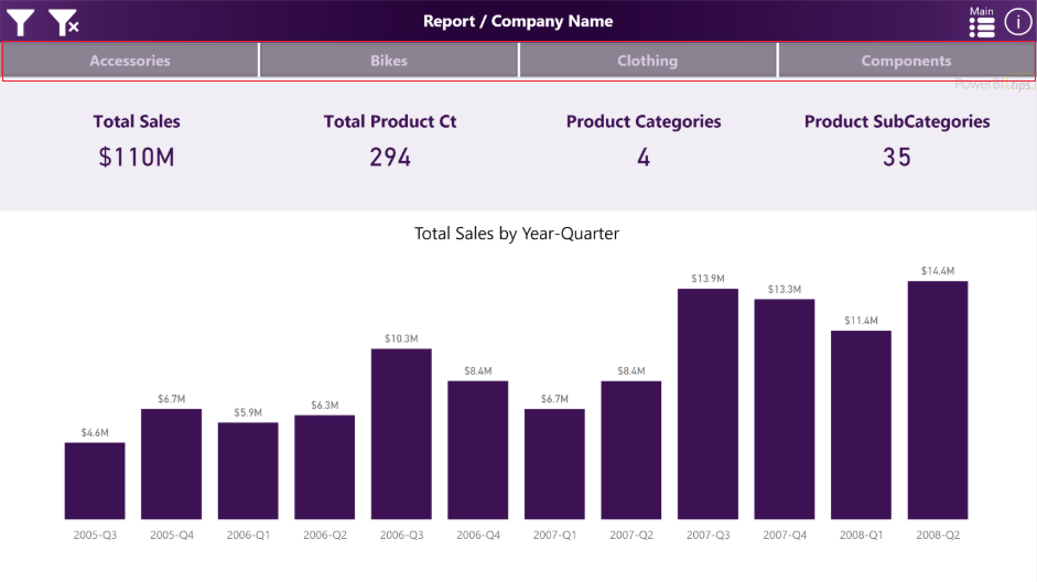
    • The report comes with four (4) pages.  In the example the are listed as Accessories, Bikes, Clothing, and Components.  By Clicking on these buttons the report navigates to a new page where all the visuals for these topics exist.

    Purple Haze Menu Bar
    Purple Haze Menu Bar

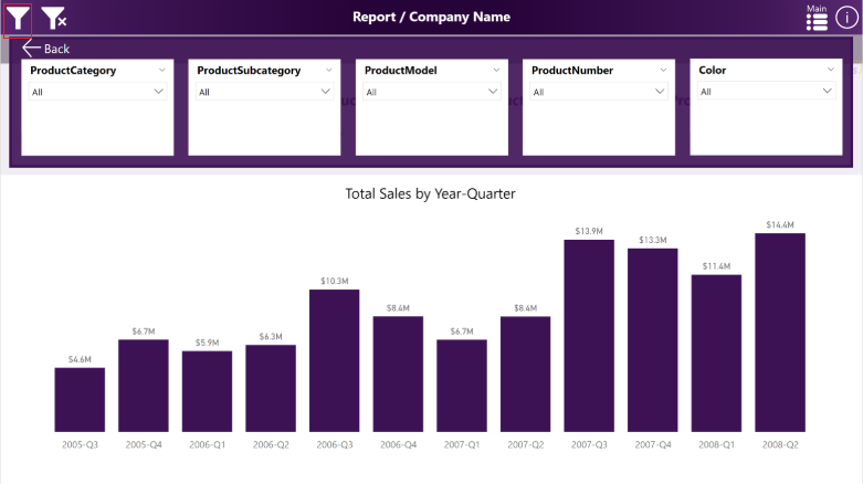
    • The filters across the top of the report are using an upper third filter context window.  This window is exposed when clicking on the filter icon, which is found in the upper left hand corner of the report:

    Purple Haze Filter Menu
    Purple Haze Filter Menu

    We hope you enjoy this new free layout.

    Be sure to follow:

    If you like the content generated from PowerBI.Tips please follow me on all the social outlets to stay up to date on all the latest features and free tutorials.  Subscribe to me on YouTube.  Or follow me on the social channels, Twitter and LinkedIn where I will post all the announcements for new tutorials and content.

    YouTube Linkedin Twitter