
PowerBI.tips

Using Grids to Improve Visualization Placement
September 4, 2018 By Mike Carlo
Using Grids to Improve Visualization Placement

When you design a report, there are a number of things to consider.  For example, the types of visuals, the colors used within the visuals, and the location of the visuals.  The orientation and alignment of the visuals is a subtle but important aspect of your report build.  Doing a good job aligning the items removes distractions from the report page and allows users to engaged with your data story.

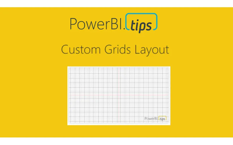
To that end, using grids in Power BI desktop has been extremely helpful to me to aid in aligning elements on the page.  In this tutorial, I walk through how to use the default Grid settings of Power BI.  Additionally, I developed a couple of grids as images that can be used to aid in aligning visuals.  Check out the video below to see how you can use Grids, and download the new Grids Layout for your reports.

Tutorial Video:

To download this layout follow this Link, or use the product image below:

[product id=”18774″ ]

Previous

Game Time – DAX Mission Impossible

More Posts

Aug 13, 2026

Fabric as a Backend – Ep.554

Mike has been building apps on Fabric as a backend since January, and he's coining it FAB. The case isn't that you already own Fabric — it's that the workspace identity, git integration, and SQL database remove the wiring you'd otherwise do by hand in Azure.

Aug 11, 2026

Crawl, Walk, Run with AI in PBI – Ep.553

Meagan Longoria's five-stage maturity model for agentic Power BI development gives Mike and Tommy a framework to argue with. They mostly agree — except on the crawl stage, where Mike thinks starting with an MCP server beats starting with a chatbot.

Aug 6, 2026

Power BI Desktop Bridge – Ep.552

Desktop Bridge gives agents a local server to drive Power BI Desktop — reload files, check report state, and take screenshots so the agent can verify its own work. Mike and Tommy agree on the prerequisite: don't use it without skills.