New Buttons in PBI – Ep. 219
Power BI reports don’t just succeed because the model is clean—they succeed when users can operate the report confidently. In this episode, Mike, Tommy, and Seth focus on the practical side of “report UX plumbing”: buttons, navigation, and interaction patterns that keep end users moving in the right direction.
If you’ve ever watched someone get lost bouncing between pages (or unknowingly filter themselves into a corner), this one’s for you.
News & Announcements
- Button navigators in Power BI — An overview of page and bookmark navigators, plus the design patterns that help you keep navigation consistent across pages without duplicating work.
- Apply all / Clear all slicers buttons — How to give users explicit “commit” and “reset” controls for slicers so filtering becomes intentional (and less error-prone) in complex reports.
Main Discussion
Buttons are one of those features that seem “simple” until you build a report that has to survive real users, real workflows, and real constraints. The team talks through where the new button options help most—especially when you’re trying to standardize navigation, reduce clutter, and make interactivity feel predictable.
Key takeaways from the episode:
- Treat navigation as a first-class design surface: consistent placement and labeling beats cleverness.
- Prefer navigators when you need repeatable patterns across many pages (less manual maintenance over time).
- Use bookmark navigation intentionally—bookmarks can be powerful, but they can also introduce “state surprises” if you’re not disciplined.
- For heavy slicer-driven experiences, explicit apply/clear patterns can reduce accidental clicks and make the report feel more controlled.
- Design for the person who didn’t build the report: the goal is fewer “what did I just change?” moments.
- Small UX improvements compound—better navigation and filtering clarity often reduces support questions more than another metric does.
Looking Forward
As Microsoft keeps adding UX building blocks in Power BI, expect report navigation and interaction patterns to become more standardized—and raise the bar for what users consider “normal.”
Episode Transcript
0:00 [Music] foreign foreign [Music] good morning everyone welcome back to the explicit measures podcast with Tommy
0:31 the explicit measures podcast with Tommy Seth and Mike it is happy Tuesday gentlemen happy Tuesday happy Tuesday it is indeed at least I’m not confused about what it is this time it happened a couple episodes ago I don’t think we’re gonna have as many major drops this week as we did last week that’s for sure that’s all right I started confusing when one of my co-workers was going to be out of the office he for a little bit he was saying it was going to be Friday and I pinged him
1:02 and I pinged him it’s like hey and he’s like what are you talking about I’m like whoa didn’t you have this thing and he’s like that’s a Friday man I’m like whoa I’m like wow I guess I was just hoping that hard that it was good there’s been so many announcements trying to catch up on so many things it was just all out of sorts that may be the hardest thing through all this is as you navigate the documentation and kudos to Microsoft to do this announcement and then provide all of the
1:33 announcement and then provide all of the like Rich content learning really that was really well done yeah yeah it was really well done like there’s tutorial like in-depth tutorials nine hours of walk through just yeah so you’re talking you’re talking about the release of at build yeah I build with fabric because they could have easily released this and gone okay kids go play and figure it out but they they released that perfectly in the documentation’s so rich but I think that’s going to be one of the hardest things for us is just navigating the documentation what does Microsoft say
2:04 documentation what does Microsoft say best practice are do we follow that to the T I don’t think we know what best practice in this new world’s gonna look like yet I think we’re still still trying to figure stuff out yeah for sure put that as a backlog what are the hardest things for fabric we have so many more topics that’s true one of the things I noticed last week was looking at watching guy in the cube they did a reaction video I think with a few few folks they got these pretty cool sweatshirts you’ve seen these like fabric
2:35 you’ve seen these like fabric sweatshirts or okay I saw I saw them you see the green I did see the green I like The Styling I don’t know what I don’t know what the rest of it looks like yeah hey that’s cool I wasn’t as enthralled no no I was like someone else uncommon on Twitter commented it was like look at those cool sweaters where do I get one of those I’m like like it’s a bit much it’s a bit much it was like the whole front of it was just like totally green was it no I thought it was just like the
3:06 was it no I thought it was just like the I thought it was all black and then had like maybe green underneath or green on the seam or something yeah maybe I don’t know whatever okay I will admit that would be cool if you had like an all-black sweat like all black hoodie and then there was just the fabric on the seams were green I could get behind that but I I feel like when I looked at it there was this huge impact of a green thing down the middle there and I was like whoa maybe maybe that maybe I’m maybe I miss and if I miss maybe I just create my own baby you create your own creator
3:42 it’s been hard and I actually it’s been funny I was watching a lot of the stuff from the announcements from fabric come out and part of that was every other blog was so you’re overwhelmed with fabric now what it seemed like everyone was like you it seemed like everyone was like jumping on the bandwagon of okay know jumping on the bandwagon of okay where do I start what’s important where do we begin with this content because there’s so much of it now so indeed great segue to today’s topic yeah right so yeah nothing related to what we’re
4:13 so yeah nothing related to what we’re talking about today today’s topic is going to be more around getting into desktop a bit and and working on or thinking about stylizing or working with different aspects of desktop we we’ve done a lot of like right high level topics here this one’s going to focus a bit more and more and also this is a pre-recorder episode so FYI this might be a little bit shorter than our normal ones but we’ll get into the topic for today but this is a good grounding right because I think so last week is all Fabric and let’s
4:43 so last week is all Fabric and let’s let’s remind ourselves the power bi is right here it’s still right here all this not all the same different but a lot of the things didn’t just disappear it’s all the same a lot of things are done you still have to build a report you still have to understand how to measure things and you still have to create a user experience unfortunately that hasn’t gone away none of the all if you watched Fabric or watched the announcements there was a ton of conversation around is going to be in everything co-pilot
5:15 is going to be in everything co-pilot will help you build fold your bed sheets in your bed and it will it’ll do everything so even though they’ve been talking about a lot it’s nowhere to be seen yet so it’s not in the product it’s like it’s on the road map of things that they’re going to be producing or pulling out so everything is future in the future even if it came out today I wrote this online when all the big announcements like all the stuff is great but you still need a plan like this you still have to incorporate and have the wisdom
5:46 have to incorporate and have the wisdom for people process and technology that does not go away at all that’s really a good point Tommy because there is a there is this is a three-legged stool
5:54 there is this is a three-legged stool and the one leg that’s getting a lot of love right now is the the technology side the other two items are people in the process we need to adapt to be able to use these if I can’t prompt chat GPT or if I can’t propped co-pilot to write the right Dax statement I won’t write direct statement like it starts there and that’s a people problem and even with fabric these are all AIDS but this does not solve a business problem that we’ve been having for the last 20 years I agree with that one 100 so
6:25 I agree with that one 100 so okay solving business problems a lot of what we were talking about you a lot of what we were talking about so know so how do you want to bust into this one well I was just going to drop drop right in if you want go for it so topic for today will just be around we’ve done an episode around working with Microsoft buttons and how buttons are interacted across the report this episode we’re thinking about there’s a it’s funny funnily enough we did
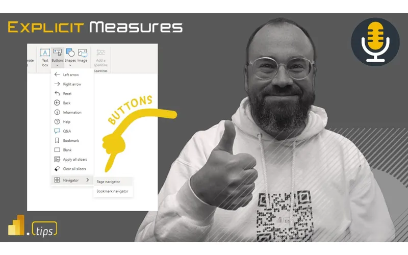
6:55 it’s funny funnily enough we did an episode on buttons and like the month after a whole bunch of new buttons are released it was the day after it was like the day after a whole bunch of new buttons appeared and we didn’t get to talk about them so this will be maybe a bit more elaboration or additional thoughts around some of the items around buttons and what those are and what other things have appeared here so that’s where I was thinking the topic would go today yeah so predominantly these were what were the the navigation buttons right yeah Navigator bookmark Navigator and the like a few of the additional
7:26 and the like a few of the additional formatting options yeah so I think I think there are some now so page Navigator bookmark Navigator appeared and then and then there are now two other ones that are more related to slicers and performance of the report which also appeared but that was I think that was a little bit later than right after our episode does that sound right yeah what’s what’s striking to me is there’s there’s now a very simple way to implement page navigation and incorporate these things into your reports which we had been doing
7:58 reports which we had been doing for a long time prior to this but this is the simplification of those those individualized objects on the page right which yes are impacting the report because it’s an additional report object that has to render yes and in this case now it’s a single right so if we if we even think about some of the stuff that Miguel is is looking at introducing or where the new implementation of visualization is going to go within power bi a lot of that he’s already talked about is consolidating a lot of these artifacts that people are figuring
8:29 these artifacts that people are figuring out how to do but take up a lot of rendering time because they’re all individualized objects that are just layered over each other to create one unified button click or something that is a great point do you remember when there was when you had a one button and there’s only one action you can apply which was a bookmark there’s now eight actions when you insert a new button that you can apply I didn’t even that didn’t even register yeah yeah that’s right okay very cool right and I think that’s a big part too where we’ve always had the hesitation or if I’m
9:00 always had the hesitation or if I’m going to really build this infrastructure of how a bookmark or a button works well there’s a plan Mike you have the great article on I think Steve Campbell too on how to code basically codify the selections yep but a lot of that I don’t want to say has gone away but because that’s the button now those actions basically are the shortcut to that and the the Navigator icons are solving a lot of those problems we had before with the is it worth the debt is it worth the effort
9:31 worth the debt is it worth the effort there’s a lot more use cases and a lot more less barrier to entry yeah I would totally agree with that and and so to talk about like a couple there’s a couple things here you mentioned Tommy you talked about like there’s a lot more actions now which is good I think that’s helping out what you’re trying to accomplish on the report report I I will note that I did find a very interesting maybe call it a bug maybe not I don’t know I’ll try to describe this the problem here here so there is an action on top of a
10:02 so there is an action on top of a button that you can do to say page navigation so you can say okay I’m going to click this button and I’ll go to a page in the report that’s one of those new actions you were talking about Tommy we found when we published the report and this was this was something that was a bit more subtle but when you use the page navigation of a button it would go to the page and it would do the the it’s the feature where it would actually highlight the entire part of the page so you would see a black line appear
10:32 appear right so when you tab through on things like if you’re on a report and you tap you hit tab it basically navigates your way through the different groups on the report page but what it was doing it was selecting you click the button go to page two and then the page two would be highlighted because it was actually highlighting the page as if it was tabbed on the tabbing feature for like accessibility so I was like interesting so the client actually came back to me was like Hey this doesn’t look right can you can you turn that off I’m like I can’t turn
11:03 turn that off I’m like I can’t turn anything off that’s all built into like that’s accessibility buddy like I can’t I can’t turn off that’s how they built it this is how they built it it’s like well I don’t want I don’t want to go to this page and have a black line up here so I was like oh boy I don’t I don’t know I feel this is dumb how do I how do I fix this so I found instead of using a button as a page Navigator you can make a bookmark and turn everything off and use instead of all selected you could just say selected visuals and by doing that it goes to the page without selecting the
11:35 goes to the page without selecting the page page very weird Behavior but by by changing from a page navigated button to a bookmark button interesting with different settings you could go to the page without having it highlight the
11:48 page without having it highlight the background of the page well what what that’s what that’s saying to me is right they they figure out how to do something for accessibility and then yes they’re like hey we should have that for non-accessity Nobody’s Gonna Know Zab unless they’re gonna like let’s add another button a pair about that black Square no no they’ll be fun the number the number of people that freaked out about the black Square highlighting around stuff was surprising to me actually it was it was to help you like tab through and see
12:19 you like tab through and see like which objects you’re on I get I get why it’s there but on the other hand I’m like wow people are really upset about having that thing up here so let’s focus on page Navigator first before we go to bookmark are you using it at all why what are the use cases you’re using at the end that’s a great question so I’ve been using page Navigator more frequently and I I think I use page Navigator with yeah so well I like the idea that it highlights so if you wanted to highlight the button of the page that you’re on so one thing I think is a good practice when you’re
12:50 I think is a good practice when you’re talking about page navigation is Okay click the button go to the page highlight that page button so it stays lit up right so okay I’m on I have a visual indicator that says I’m on page two right so to me that makes sense so so that’s what I like using that for and I’ve been using it for more on the left hand side of the navigation window where you click the button a little short word here’s the different pages and so you click the page it takes you there and then it stays highlighted with a color so you
13:21 stays highlighted with a color so you can see that yes I’m on page two or whatever that is yeah so that’s that’s how I’ve been using that embedding are you embedding at all or is it this all just normal service reports this is all normal in the service yeah see and I can I can from my perspective I could definitely see using this and I’ll probably apply it in some upcoming reports I’m building for internal but in embedding I I don’t need page navigation because with the application correct can can get them to their own tabs and their own navigation
13:53 their own tabs and their own navigation so that experience is much more customized because it’s not part of the iframe it can sit outside the iframe index right so they can have it look however they want to and really do anything right so if they if they want to take a couple pages of this report and have another page from a different one they can do that right because you have all that flexibility in there so I use it a lot less less and I think that’s interesting point not at all yeah I think that’s a big point for me unless it’s an embedded solution
14:23 for me unless it’s an embedded solution it’s really hard for me to justify using the real estate in canvas for page navigation when you have I think probably the best page navigation available with the left hand side of if you’re in the service without any embedding solution oh and like the app yeah yeah or in an app or just in a normal report this is a this is a great point you bring up Tommy I really like this point because this is where I think the button bookmark stuff falls apart and you don’t want to use button bookmarks because you basically get a hierarchy on the
14:54 you basically get a hierarchy on the left-hand nav in the app this is a great point because if you’re if you’re talking about the context of a single report okay buttons make sense maybe the navigation probably makes sense right to some degree and then again another another little detail I’ll I’ll put in here as well I typically use a lot of hidden Pages or I’ll hide a couple pages so if I’m using the page navigation button I’ll use the hide page and do not show hide hidden pages in the button that way I can have extra pages if I want because I’ll have
15:25 extra pages if I want because I’ll have here’s some documentation here’s some other things that I want you to see maybe I’m doing a drill through page and I want you to drill through that page and come back so I don’t want you to actually navigate there because it doesn’t make sense based on the context of how to get to that page so that’s one thing and then coming back to your point there Tommy around like it doesn’t make sense to have a single report navigation and then have another left-hand window in the app navigation and then when you go across different reports reports yeah you could probably make a button
15:56 yeah you could probably make a button that would take you to a separate report that’s that’s a lot of work and a lot of Maintenance and I’d rather just not do that it takes you out of this I agree with this one right like there there are a lot of places where sometimes having multiple options to get to the same place is fine but with page nav like nav like should be one place yeah right I don’t need multiple different ways in in which to get to like page two right yeah and honestly it’s is there is
16:27 right yeah and honestly it’s is there is there any justification if you’re in the service or in an app to use page Navigator not bookmark Navigator I I feel like they’re very few and far between page Navigator versus bookmark I’m not sure if we’re just focusing on the page Navigator if I’m in the service yep is what justification or like real reasoning I feel it’s very few and far between isn’t it yes we should okay using our real estate for this so bookmark navigation I think fits a bit
16:58 bookmark navigation I think fits a bit more in my mind around I have multiple things on the same page right that I’m trying to manipulate so that’s where I feel so I feel like the use case for like again page navigation yeah it makes sense you’re navigating across pages right so that to me that feels like more of like a a top menu type item or a left-hand nav type item that you’re going to put inside the report whereas the The Bookmark Navigator is hey Kate maybe I want to toggle between like a line chart and a table and I need to have two visuals that I’m going back and
17:28 have two visuals that I’m going back and forth on so then I’ll hide one and show the other and then that bookmark Navigator will then let me toggle between the two the downside of this one I think again there’s always a downside to something right when you have that the name of the bookmark becomes the
17:42 the name of the bookmark becomes the name on the button so if you have multiple buttons that are doing table and and visual or table and line chart you could you’re going to have multiple bookmarks named the same way just to get the functionality when it gets confusing yeah and I’m actually going to slightly back or or remark my words or whatever the saying is the page navigation the one use case I’ve actually seen it work really well even in the service is almost like a table of contents page for new users or if you have a very large
18:13 new users or if you have a very large report yes especially if you’re introducing it we we there was one project it was basically like a product life cycle and it had it was all detail space it was new products launching products retired products pricing all the stuff and it can get complicated the first page was a summary and it basically looks like a table of contents which even though you saw the left hand side there was this ease of use part of this especially when you have a lot of pages yeah I think like I said it’s
18:43 of pages yeah I think like I said it’s very Niche reasoning for page navigation but but I think the real the real winner here is bookmark navigation and because of the settings you can do real winner here is you well thank you and I’ll throw down one more you and I’ll throw down one more again these are some experiences know again these are some experiences that I’ve had when building these kind that I’ve had when building these things and and some ideas to help you
19:13 of things and and some ideas to help you keep things consistent in your report I keep things consistent in your report Seth and I and Tommy you are too mean Seth and I and Tommy you are too like we are very picky around when stuff starts accidentally moving a pixel or two around the report page drives me bonkers so from a from a tip or trick standpoint when I’m building a bookmark or some navigator that needs to be on multiple pages don’t build them on multiple pages and then try to style them build it on one page First Take pick the first page you’re going to build yeah build the bookmark get all the styling correct
19:43 bookmark get all the styling correct everything you want and once you have that single page done you can select that bookmark Navigator and then go to the second page and paste it and then paste it paste it so the idea is that way the position is exactly identical and that way as you navigate between multiple Pages you’re now not trying to like oh shoot okay what was the dimension on this one okay go back to page one change the dimensions go to page two modify Dimensions so shoot the colors off okay gotta go back to it just you can you could waste so much time by trying to just put the object on all the
20:14 trying to just put the object on all the pages first positioning yeah it also Echo two do build a template page if you have a page build it to page with the book like that’s what you start with but the bookmark navigator on it put it in its right location put your background image on there or the scrim or whatever you want on the background round and then that becomes your new page button you copy that one and that becomes your new page that also keeps things very consistent and if you ever need to change the bookmark Properties or styling you can go to the template page
20:46 styling you can go to the template page change or adjust it delete out all the other bookmarks and then just copy paste them into other pages I also find that’s a very a very it’s a technique that I use to go faster because I’m I just hate wasting so much time stylizing everything can we just focus on the win and I think so many people don’t use it I personally call mine a component page because I also do like kpis and like other objects that they reuse yeah that’s a good idea yeah I agree with that yeah but I think this win and I don’t think a lot of people do this they’re trying to create their first version on the report page and
21:17 first version on the report page and it’s hard please do if you want to select it all or copy or it’s also you have the load of all the data there where if you’re just doing this on a hidden components page that’s basically like your master reference you still have to copy paste but yeah man what a win people start doing this I I like that idea and I think this actually actually this this I think it speaks to a little bit of how do you design your your design flow what is your flow of how you design things right so I think you’re speaking to a an area of
21:49 I think I find a lot of new users jumping right into the report they go get data because that’s that’s what Microsoft teaches you that’s what dashboard a day is you start with go get data you get it much information in and then you bring things to the page and then you begin styling stylizing it I think the data exercise getting the data together and this is why I like the model and thin report scenario and and also probably we just had build builds announcing a new file format pbip which is going to be amazing for this because you’ll be able to have many different ports and a same model to be
22:20 different ports and a same model to be to be operated on but I think I really like this idea and you’re telling me what you’re talking about is you can now build out what is a stylized thing fairly easily and then once you have those stylized objects now you can you can model data separately you can focus on what are the wireframes or style or what is the general look and feel the report going to be here’s the visuals you’re going to use over and over again it’s going to be a bar chart it’s going to be a line chart it’s going to be a table like if you start just style those three objects
22:51 you start just style those three objects those are going to probably meet a most of your needs please don’t stylize a pie chart you don’t need to use it you should not be putting on your page it’s more of an exception than the I I used the pie the pie charts oh no your executive loved it
23:35 and then you added the number to it because you couldn’t see it and then you
23:36 because you couldn’t see it and then you added a label to it so the benefit right is you can now you now get the percentage and the count yeah right yeah yeah there’s no overall count so you’re still overlaying another thing over and overall yes you have the overall number yeah in in the in the pie chart right yeah I don’t do the pie chart without the default the percentage the category name and the label and this is what I’m saying though makes no other sense if you if you anytime you put down a pie chart the first thing people ask
24:06 a pie chart the first thing people ask you for is I don’t know how many count that is can you give me the percentage of the total like I’ve just written out all the information that you need in the pie chart as as text so I just might as well either just write it out as text or use a bar chart where I can actually can do a legit comparison the best case for a pie chart and or the only case for a pie chart if you have if you have four categories one has to be over 50 if and you’re trying to at least track that if anything else is under 50 people are looking upside down there’s no other useful well if you’re you’re
24:37 useful well if you’re you’re your your comment there befuddles me to some degree because because if you only have two items one of them always has no no no okay all right Seth was saying two items he said for two items like okay there’s only two items the only time yeah something’s gotta win here like I’m so confused I remind 45 49. 5 each it doesn’t even add up to 100 what’s going on going on stupid thing since we’re on that since we’re on a side side track of like kind
25:07 we’re on a side side track of like kind we’re on a side side track of like stylization one thing that was pushed of stylization one thing that was pushed back on me like we we talk about a lot and how I initially built a report is there are multiple different visualizations on the page and the legend is the the colors are the same yeah so I I removed the legend from all the other visuals because it was prominently displayed in the pie chart right right so if I only have two two options and this is my Legend the feedback I got was like the the person was initially confused and then they were like oh that makes a lot of sense like now I can see
25:37 makes a lot of sense like now I can see that as long as the coloring flows across all of these other visuals that it’s the same thing I’m like yeah so like I intentionally did that so I could remove a lot of the visual clutter from all the other visuals and something I hadn’t thought about before she pushed back she’s like can you can you add them back in back in I was like why she’s because as I’m like as I’m looking at this at this there are like I’m gonna be snapshotting or screenshotting some of these visuals
26:07 or screenshotting some of these visuals for other groups where they can’t see everything so I need the legend in there and I was like oh interesting let’s just go to personalized visuals exactly that is interesting though that is an interesting clutter back in but it like on the bottom right yeah visually out of the way everything yeah yeah let’s probably go back to bookmarks and I I want to say a huge no no I’m gonna do one more thing about pie charts okay let’s just one more thing have you
26:37 okay let’s just one more thing have you seen have you seen it’s like a meme I don’t know what it is it’s a meme or something like that around pie charts someone has made a pie chart that is a pyramid and they have the three labels have you seen these no Google right now Google go Google your favorite pyramid go Google pie chart pyramid and someone went through and actually went so someone took a bunch of pie charts and started coloring them as if they were like actual shapes or objects or things and so this is there’s a there’s
27:07 things and so this is there’s a there’s a whole bunch I saw a website one time that had a whole bunch of these all together like this is the sunset or something like or whatever they did but this one is a pyramid yeah so this is the sky this is a sunny-side pyramid this is Shady Side of pyramid like I was like yeah that’s good that’s good for a pie chart so the the pie chart pyramid is pretty funny and there’s apparently a handful of other ones that are like funny pie charts with with coloring kind funny pie charts with with coloring stuff as a joke you can now rotate of stuff as a joke you can now rotate the pie chart now okay yeah yes
27:39 the pie chart now okay yeah yes usually oh nice so now we can relate rotate it all the way down yeah make a pyramid I think I saw someone else to take this they had like you take this they had like pointy pyramid and they made it know pointy pyramid and they made it really pointy and they had like wide pyramid and they had like a narrow pyramid like your pie chart parachute is going way off but we will save a pie chart episode for like 250 or something we’ll just
28:10 for like 250 or something we’ll just dreams so why we hate pie charts I do want to say a big win with the new bookmark Navigator and hopefully people have understood this where with page Navigator it’s going to show all the pages but bookmark Navigator not only solves the major issue or the problem where if I need to create like in a sense three buttons I had a re basically create six back in the day one for enabled one for disabled yes correct this solves a lot of that too as well so it solves that but also I can create
28:41 it solves that but also I can create these groups so I can create a group of bookmarks so I actually have a report open right now just looking at it that for a client that three pages each need to show the summary like overview a few tables one is a trending and then one is a full ranking of the categories but they’re different for each so rather than what would that be but 18 bookmarks yes I have three in a sense six bookmarks with all grouped into their own category yes and the setup is incredibly easy and it solves so many
29:13 incredibly easy and it solves so many issues that I had for the hide and showing but really for any other option the enablement side is so easy to set up I really like that and the only other thing I can think of here around bookmarks or enhancements to bookmarks would be it would be nice to be able to control whether or not a visual was
29:32 control whether or not a visual was shown based on some formula or a Dax measure measure I don’t think we can do that today someone may have hacked that I think I saw someone commenting this on Twitter recently around how they’re able to hide things I think you can do some things where you have an object over top of something of an of an element right so if I had two objects and I could put like a white square over top of the chart and when you click something that could disappear and then when and when you then the transparency will change but I I think
30:03 I I think yeah I think I think the that would be another feature that I would like to see inside bookmarks potentially is to in the bookmarks allow the the concept or idea not only just hiding or showing things or book or buttons anyways is we could be able to use a button button have a piece of data point set in the model and that would then hide or actually show the visual thing again trying to I’m trying to remove extra work steps here if I can do more things programmatically to get things to hide or show to your point Tommy
30:33 or show to your point Tommy there there should be an easy switch statement to do something like that right it should be something that says show this show this visual if this measure equals three or four or five and then you could have one measure toggle through four or five shapes or objects or turn things on and off all together at the same time that’d be cool it would be phenomenal but I think even just the navigation now has a saved utility wise or or effort wise like maybe half the effort that you do before or more in terms of yeah I agree probably more I
31:04 terms of yeah I agree probably more I would say probably more yeah and and it’s the headache of having to manage it after you built it yeah one thing that you’ve and I Seth and I have complained much about is if you did this complex navigation thing anyways the next person in line to work on the report has no clue how any of the bookmarks work so in this in this scenario like literally it’s just drop the visual on the page and it just works you can change the style done so I think in that respect it makes it way easier to be able to like hand this work off to somebody else or have multiple people
31:35 somebody else or have multiple people pick up this work because now you’re not being buried in bookmarks and I’ll say I’ve probably now very rarely use a bookmark I usually do not use it I do tell people about how to make bookmarks in the personal bookmarks in the service because I think that’s much more valuable find a way that you’re looking at the data click on some things bookmark it and come back to it I think that makes sense but I do not build a lot of reports with bookmarks now really no it’s more about the page navigation and the bookmark well I use
32:05 navigation and the bookmark well I use bookmark connection very sparingly you’re using a lot more page navigation a lot more page navigation now for me really yeah if I had to pick the two okay between the two yeah I for me it’s it’s really trending where I’d be remiss to not talk about the drill through button at some point I I know we’re running low on time that’s a huge win for me for my user experience but the bookmark navigation I like that one too yeah to me that’s a whole topic that’s a new that’s a new other but that’s another action on existing buttons yeah I would say that’s probably the
32:35 I would say that’s probably the majority of one I’m using a button because again it’s still it’s not hard to find drill through but people don’t know that it exists to make it so easy to say hey click on something to find out details is in a ridiculous win a ridiculous win if you’re building if you’re part of that adoption or you’re built you don’t have drill through in every page it should be something you should really strongly consider the bookmarks though they are more Niche because you don’t always need a bookmark but for me it’s it’s hard to
33:05 a bookmark but for me it’s it’s hard to not create it it’s hard for me to create an individual bookmark rather than part of a navigator I’d agree with that as well yeah the the fact that they they simplified the experience I think is fantastic you’re always going to find it a requirement at some point in time where somebody wants an app-like experience in their report and this just simplifies that experience or the like the the time to completion is is significantly reduced with some of
33:35 significantly reduced with some of these additions right because all the components that you had to build before are now like button clicks instead and you can still replicate a lot of like the same behaviors or more than you used to be able to to create those really unique experiences that are sometimes demanded but Mike to your point point should you be pushing them all the time I wouldn’t right they add a lot of complexity and overhead to report pages and look for the simpler Solutions if possible because you’re already going to overwhelm most most end users
34:06 overwhelm most most end users with one action let alone like many right yeah so as the more you build into the report the more documentation or the more training you’re gonna have to do around it agreed well that we’ve burned through a perfectly good 30 minutes of just yammering about bookmarks and pie charts that look like pyramids so with that we’ll say thank you very much for listening we appreciate you joining the podcast today so if you love power bi go grab this shirt here eat sleep however I repeat that is that is what
34:36 however I repeat that is that is what you should be wearing because that’s pretty much what I do every day I literally this is like all I do throughout the week this is my pattern so so thank you all very much for participating we on the only ass that we give you or the all this free content we would just love for you to share this with somebody else if you found some value from this if you found some interesting ideas on how you want to build reports or things that we are able to impact your report building experience please share with somebody else we just appreciate you sharing with another individual around RBI
35:06 with another individual around RBI building things Tommy where else can you find the podcast you can find the podcast anywhere it’s available on Apple and Spotify make sure to subscribe leave a rating helps us out a ton join the conversation live every Tuesday and Thursday just follow power bi tips on social media channels awesome thank you all very much and we’ll see you next time
Thank You
Thanks for listening to the Explicit Measures Podcast. If you want more episodes, subscribe here: https://powerbi.tips/podcast