Here we are, jumping in to 2020. This Month PowerBI.Tips is kicking off and sponsoring the next year of Power BI user groups (PUGs) for Milwaukee. If you are not participating in your Local Power BI User Group we highly recommend that you get plugged in. Power BI User groups are intended for like minded Power BI individuals to get together and learn from each other.
If you don’t have a User Group you can follow along with our group. We record each user group and post the highlights from the 2 hour event. This month we go over the top three most popular blog posts from 2019. Then we demo creating a Paginated report in from a PowerBI.com dataset. Finally we publish the Paginated report into the PowerBI.com service for end users.
If you like the content from PowerBI.Tips please follow us on all the social outlets. Stay up to date on all the latest features and free tutorials. Subscribe to our YouTube Channel. Or follow us on the social channels, Twitter and LinkedIn where we will post all the announcements for new tutorials and content.
Introducing our PowerBI.tips SWAG store. Check out all the fun PowerBI.tips clothing and products:
Recently I had the privilege of working with Microsoft doing a Webinar on layouts. One thing we are passionate about at PowerBI.Tips is good looking reports that drive action. Often as report authors we spend a ton of time working on the data model, and the calculations. While these things are important, we must also consider the user experience.
You may have the most compelling report but lack some visual appeal. Alternatively we might have a great looking report but the navigation or interactions is un-intuitive. We then are spoiling the impact power of our report.
Use Layouts
This is where we feel our layouts make a great fit. It provides a shortcut to provide excellent looking reports on top of your existing data model.
Get your hands on some layouts now and try them out. Check out the downloads below.
Want a Layout without the PowerBI.Tips Branding. Check out these paid layouts.
If you like the content from PowerBI.Tips please follow us on all the social outlets. Stay up to date on all the latest features and free tutorials. Subscribe to our YouTube Channel. Or follow us on the social channels, Twitter and LinkedIn where we will post all the announcements for new tutorials and content.
Introducing our PowerBI.tips SWAG store. Check out all the fun PowerBI.tips clothing and products:
This month we did a webinar with the Microsoft team on how to build different custom visuals in Charts.PowerBI.Tips a version of Charticulator.
If you haven’t seen Charts.PowerBI.Tips this video explains the program, all the functions of each button and building demos. We walk through all the buttons on the tool bar and what they do. Finally we build multiple different charts. Check out this webinar if your curious about building custom visuals with no code.
I want to give a super big thank you to the Microsoft team especially Kelly Kaye for making this video happen.
Thanks for watching and have a Wonderful Day!
If you like the content from PowerBI.Tips please follow us on all the social outlets. Stay up to date on all the latest features and free tutorials. Subscribe to our YouTube Channel. Or follow us on the social channels, Twitter and LinkedIn where we will post all the announcements for new tutorials and content.
Introducing our PowerBI.tips SWAG store. Check out all the fun PowerBI.tips clothing and products:
Thanks for your interest in our product Scrims. For more details on what is a scrim click this link to Learn More.
Download a scrim from the products page. You can access all the available scrims here.
Instructions
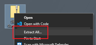
After downloading, you will have a Zip file stored on your computer. Right Click on the zip file and Select the option Extract All from the drop down menu.
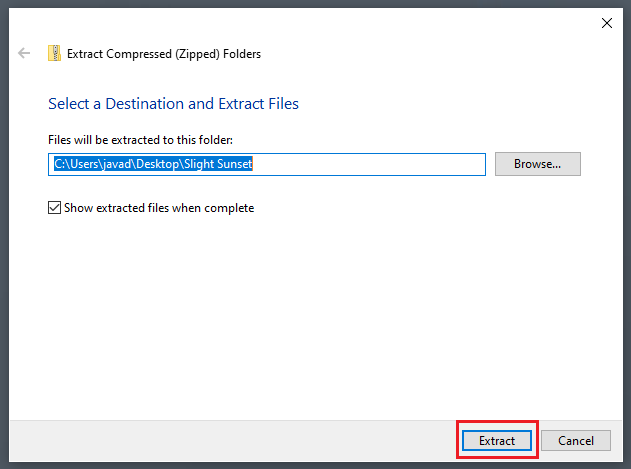
The extract compressed folder menu will appear. Click on the Extract button found in the bottom right corner of the menu.
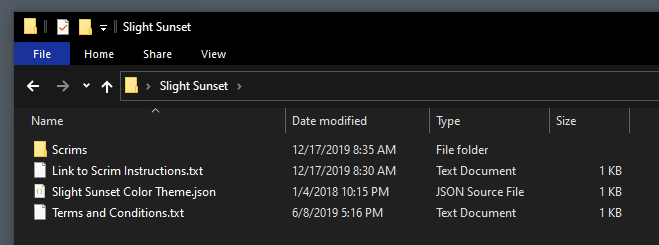
A new folder will be extracted to the location noted in the previous menu screen. Open the newly created folder. Within this folder you will find all the images for the Scrims and a JSON theme file to use within your report.
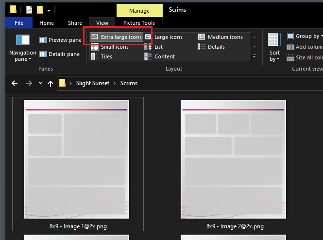
When working with scrims it is helpful to see which image contains the the correct background layout for each of your pages. I find that it is helpful when reviewing images as Extra large icons. To turn this on, Open the View ribbon in the File Explorer. Then in the Layout window select the option titled Extra large icons.
Add Scrims to Report
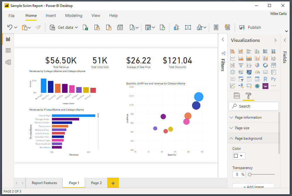
Open a Power BI report in the Power BI Desktop application.
Note: Reports do not necessary have to be brand new. You can use scrims on existing reports. For illustration purposes an existing report was opened with only visuals. The remainder of this tutorial will show you how to add scrims to a pre-developed report.
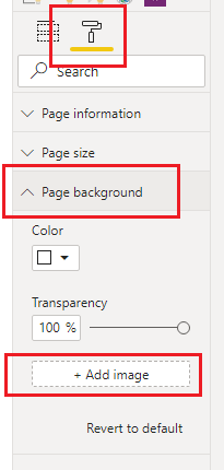
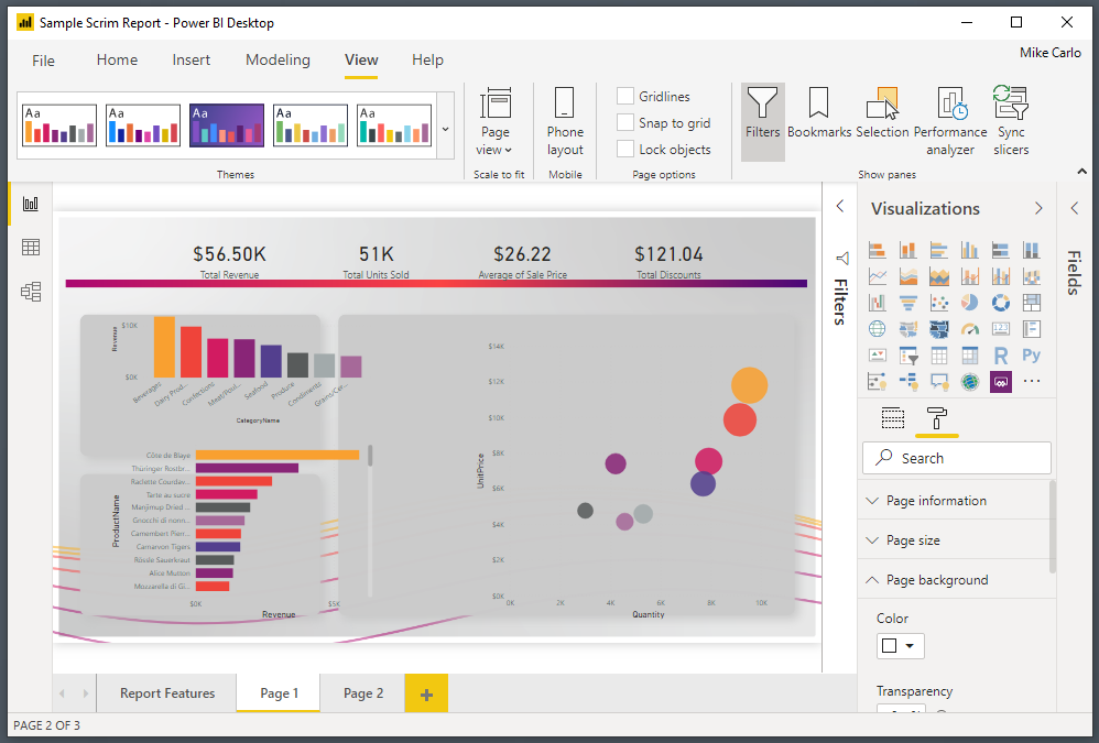
Click on the Paint Roller button. Then Open up the Page background item in the menu options. Click on the option labeled Add image.
Note: for these options to appear you have to have a report open and none of the visuals selected on the page.
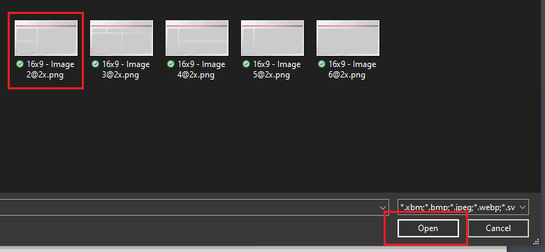
In the open file selection dialog box pick the scrim that you want to load. Click on Open to load the image to the report page.
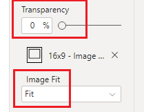
The image will not initially appear. This is because the default settings for background are set incorrectly for this feature. Change the transparency to 0% and adjust the Image Fit to the drop down option of Fit.
Note: Images provided in scrims are larger than the report page pixel size. This is because in order for the images to not look blurry we have to supply a larger image. The Fit feature then scales the image back down to the report canvas size but retains a crisp and clean look.
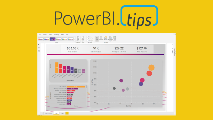
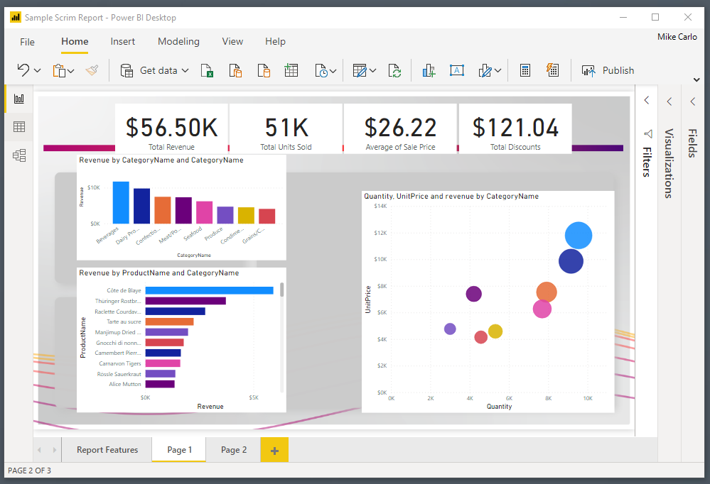
Our report should now look similar to the following:
Add JSON Themes
Initially the visuals will not be formatted for the style of the report. We can control this by using a JSON theme file to pre-format some options for the visuals.
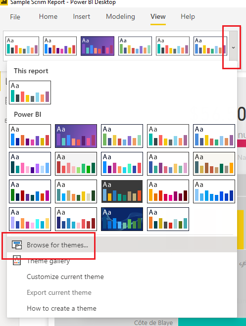
On the View ribbon, select the Drop Down Arrow icon. Then Select the option at the bottom of the menu titled Browse for themes…
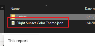
Navigate to the scrims download folder and add the supplied theme with scrim download.
This will apply formatting for the colors and some Visual style properties.
Clean up Visuals
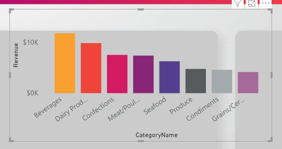
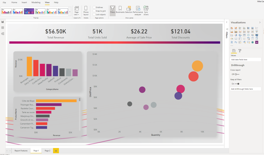
Next Select individual visuals and Align them to the defined areas within the scrim.
See sample image below with visuals aligned to the scrim.
Finalize Report
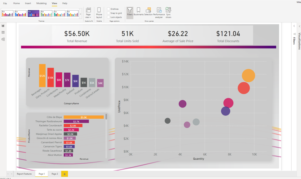
Apply any additional style properties for your visuals. In the below image the following settings are added for reference:
The top 4 cards are grouped and the group
The Grouped cards were applied a background of white @ 40% transparency
Labels were added to the bar charts
Unneeded axis were removed from the bar charts for clarity
White lines were added to the scatter chart for x and y axis
Then rinse wash and repeat for every other page you need to develop.
In some recent conversations the notion of minimizing the number of required visuals came up as a topic. While I know from talking with the Microsoft development team more visuals on a report page increases load time. But I haven’t been able to find any substantial numbers on how performance is impacted by increasing the visual count on a page. Spoiler alert, adding a ton of visuals to a page slows it down.
Test Set up
To begin our test I started with a know report the Microsoft September 2018 Layout. This was a good sample as it already had a number of visuals and buttons on the page. I then proceeded to create a single text box with some text in it. Then copy the text box over one hundred times. All the text boxes are placed into a single group. Grouping the text boxes allows for the ability to toggle on and off all of the visuals with a single click.
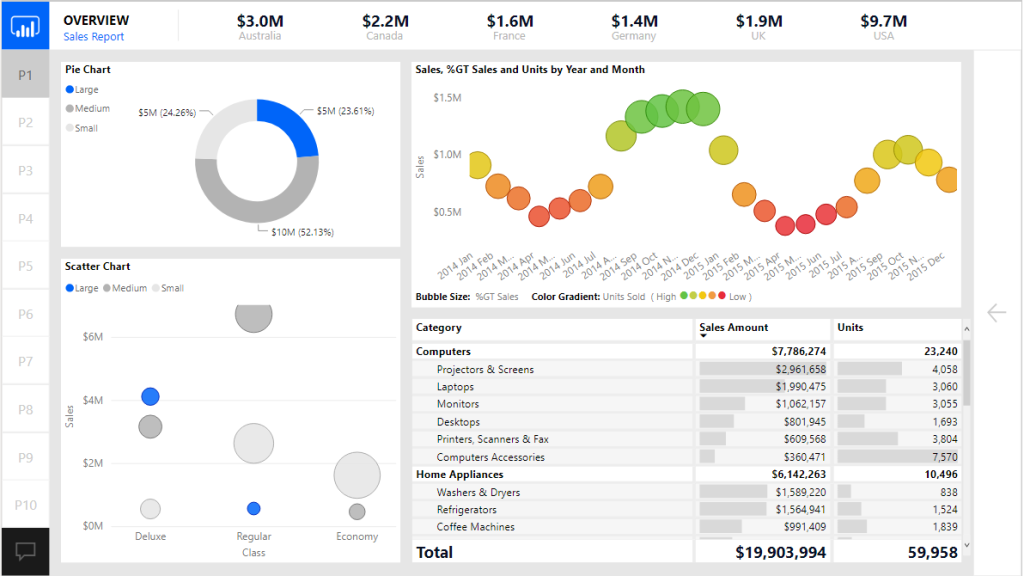
Here is the before image of the report with the text boxes turned off:
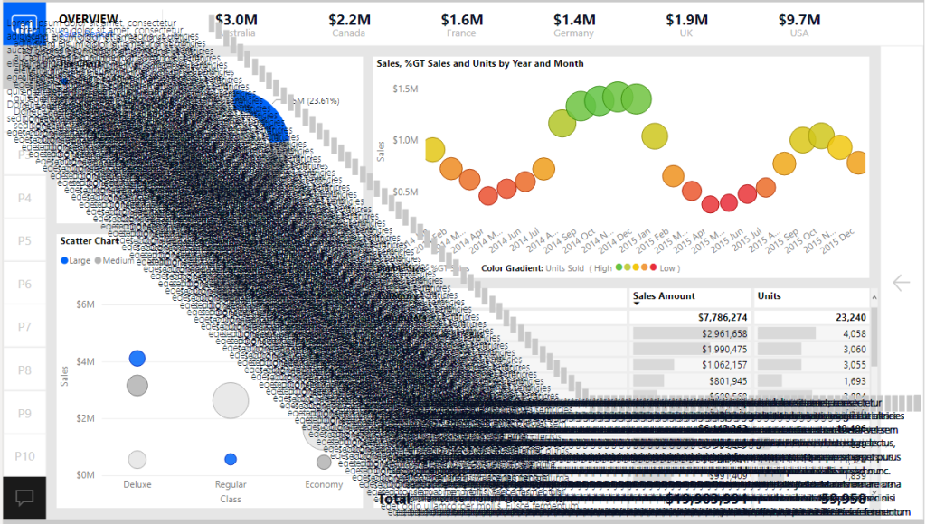
Now with all 100 text boxes turned on. Yes, not pretty I know, but it makes the point.
Conducting the Test
Now that the set up was complete we are able to use the performance analyzer to render all the visuals on the page.
To open the performance analyzer with the new modern Power BI ribbon. Navigate to the View ribbon and click on the Performance analyzer button.
With the Performance analyzer window open we Click the Start Recording button. This begins how the visuals perform when you interact with the report.
There are two options at this point to start recording data.
We can click on items on the report page
Click the Refresh visuals button to refresh the entire page
I chose option number two since I wanted a consistent method to record performance. This removes any human error by performing a sequence of clicks across the screen.
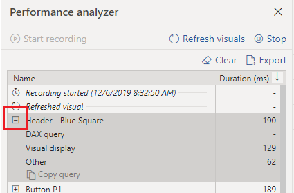
After clicking the Refresh visuals the Performance analyzer generates a ton of data that we can sift through to understand performance of the report page. You can expand on one of the visual elements to understand how many milliseconds it takes for the visual to render by function.
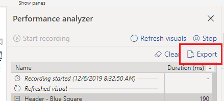
We can now export the data from the recording by Clicking the Export button.
For my test I ran 5 performance tests with the text boxes turned off and 5 tests with the text boxes turned off. The process was the following:
Click Start Recording
Click Refresh visuals
Click Export to extract the data, name the file for future review
Click Clear to remove all data
Go back to step 2 to Refresh visuals
Repeat process until 5 performance tests are complete
Turn on the Text boxes and repeat the process for 5 performance tests
The Test Results
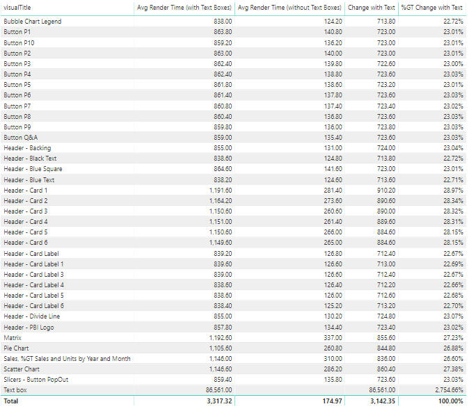
Finally we can dig into the data and figure how much impact we incurred from all the visuals. After a bit of playing around with the datasets in Power Query we are able to come up with the following results.
At a high level adding the 100 extra text boxes increased the load time from 174 ms up to 3,100 ms which is a approximately a staggering 1700 % increase in load time.
Here is the detailed break down for average load times compared with and without text boxes.
There are some interesting notes here. When we added the text boxes it caused all other visuals to increase load time from 22 up to 28 % percent longer per object. Clearly the text boxes took the longest to render.
After completing this test there were a couple of observations that I felt would be best practices when building future reports.
It is important to take time to clearly label your visual elements on the report canvas. Doing so makes it easy to identify each item in the performance analyzer.
Increasing the number of visuals on a page hurts rendering performance. So think carefully about how many visuals you need to add to convey the data story you are trying to tell.
When a visual is not shown it does not impact performance rendering of the page.
A trend I am seeing is individuals are creating really long pages. Meaning the page is 1280 x 3000 or even 4000 pixels long. This is a nice feature that lets the report consumer scroll through multiple visuals. However, this has an unintended consequence adding all the extra visuals is slowing the time for the report to render. Instead of increasing the page length it would be better to control which visuals are being shown by using Bookmarks and Grouping. To learn more about bookmarks & grouping visuals visit:
Limit adding style elements such as drop shadows and visual shading images as these will increase load speeds. Instead push those types of changes down to a background image that can be placed on the page. This is the technique used in creating PowerBI.Tips layouts.
If you like the content from PowerBI.Tips please follow us on all the social outlets. Stay up to date on all the latest features and free tutorials. Subscribe to our YouTube Channel. Or follow us on the social channels, Twitter and LinkedIn where we will post all the announcements for new tutorials and content.
Introducing our PowerBI.tips SWAG store. Check out all the fun PowerBI.tips clothing and products:
For each visual in Power BI Desktop there is a button called Focus Mode. This feature highlights a single visual. While this can be helpful, it does remove the ability to change or adjust the visual based on filters or slicers. I’d like to introduce to you the concept of Scaling a visual.
In this tutorial we walk through how to take a collection of visuals. Then group all the visuals. Finally, control the group of visuals by hiding or showing them with bookmarks.
Check out this video tutorial on how to accomplish this within Power BI Desktop.
Tutorial Video
Downloads
Download the icons and sample PBIX file at my GitHub repo.
If you like the content from PowerBI.Tips please follow us on all the social outlets. Stay up to date on all the latest features and free tutorials. Subscribe to our YouTube Channel. Or follow us on the social channels, Twitter and LinkedIn where we will post all the announcements for new tutorials and content.
Introducing our PowerBI.tips SWAG store. Check out all the fun PowerBI.tips clothing and products:
For this week we are building a stacked bar chart on https://Charts.PowerBI.Tips. While you can build this type of chart within Power BI Desktop this video is more of an example showing how you can build a similar custom visual chart. There are two areas that i’d like to point out.
When working with a chart you can add a Legend to a shape object (2:40)
Adding a grand total requires an additional Glyph (3:14)
While these two tips are pretty simple it really does help you when building more complex custom visuals.
Watch the Tutorial
Download this Custom Visual
If you liked this visual and want to download it, head over to this repository to download.
Learn More About Custom Visuals
We have been working hard to help you learn how to make custom visuals. Check out our full YouTube Playlist to learn more about using Charts.PowerBI.Tips.
If you like the content from PowerBI.Tips please follow us on all the social outlets. Stay up to date on all the latest features and free tutorials. Subscribe to our YouTube Channel. Or follow us on the social channels, Twitter and LinkedIn where we will post all the announcements for new tutorials and content.
Introducing our PowerBI.tips SWAG store. Check out all the fun PowerBI.tips clothing and products:
This month at our Power BI User group in Milwaukee Seth and myself walk through some of the basics of Power BI. We digest how can we leverage Power BI to Act like the business, and Think like I.T. Discuss the concept of global and local measures within a data model. As well as some tips and tricks while working in the power query editor. Check out our presentation that we recorded for this month.
YouTube Video
If you like the content from PowerBI.Tips please follow us on all the social outlets. Stay up to date on all the latest features and free tutorials. Subscribe to our YouTube Channel. Or follow us on the social channels, Twitter and LinkedIn where we will post all the announcements for new tutorials and content.
Introducing our PowerBI.tips SWAG store. Check out all the fun PowerBI.tips clothing and products:
In October of 2019 Power BI released a new file type, PBIDS. The Power BI Desktop Source (PBIDS) file is a JSON object file that aids users connecting to data sources. In true PowerBI.Tips fashion we have of course, made a tool for that.
Introducing Connections
Today we release the new tool called Connections. It can be found at https://connections.powerbi.tips/ . With this tool you can use our predefined templates or customize one of your own file. To learn more about this sweet sweet JSON editing tool check out the following YouTube Video:
Technical Details
For more information on the Power BI Desktop Source file check out these links:
If you like the content from PowerBI.Tips please follow us on all the social outlets. Stay up to date on all the latest features and free tutorials. Subscribe to our YouTube Channel. Or follow us on the social channels, Twitter and LinkedIn where we will post all the announcements for new tutorials and content.
Introducing our PowerBI.tips SWAG store. Check out all the fun PowerBI.tips clothing and products:
We are starting today off with a fun chart. We will be making a filled donut chart. Typically, I don’t use donut charts but in this case I think we have a good reason, and it’s delicious…
The data being used in this visual varies from o to 100%. This could be something like a test score or a compliance number. Thus, we will be using the donut chart to represent a completion of 100% or some variant below.
Video on how to build this chart.
During this video we used a couple measures. They are the following:
Measures
Average Product Score = AVERAGE( 'Product Scores'[Score] ) / 100
Average Product Score Inverse = 1 - [Average Product Score]
Where the value of the Score comes from the Product Scores table. The Score column ranges from 0 to 100%. If you like this visual and want to download a sample file visit my GitHub page.
If you like the content from PowerBI.Tips please follow us on all the social outlets. Stay up to date on all the latest features and free tutorials. Subscribe to our YouTube Channel. Or follow us on the social channels, Twitter and LinkedIn where we will post all the announcements for new tutorials and content.
Introducing our PowerBI.tips SWAG store. Check out all the fun PowerBI.tips clothing and products: