There are cases when working with Power BI files, that you would want to transfer a visual from one report to another report. While this feature is not available within the Power BI desktop program as of today, this is available within the PowerBI.com service.
To copy a visual from one report to another, both reports need to be located with the PowerBI.com service.
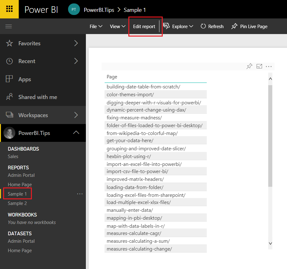
Navigate to the report where you want to copy the visual from. In this example I have created two reports, Sample 1 and Sample 2. I will copy a table visual from Report Sample 1 and paste it into Report Sample 2. Once you have opened the report Click the Edit report button on the top navigation bar. This will change the report into edit mode and provide additional options.
Navigate to Sample 1 Report
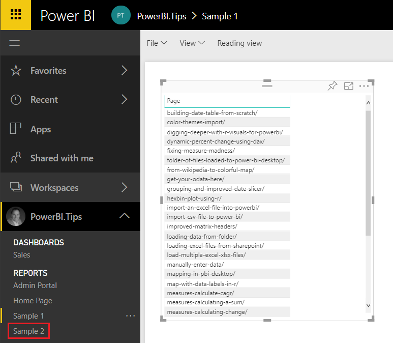
Select the visual you wish to copy and press CTRL + C, to copy the visual. Next click on the new report Sample 2, in our example, where you want to paste the visual.
Select Sample 2 Report
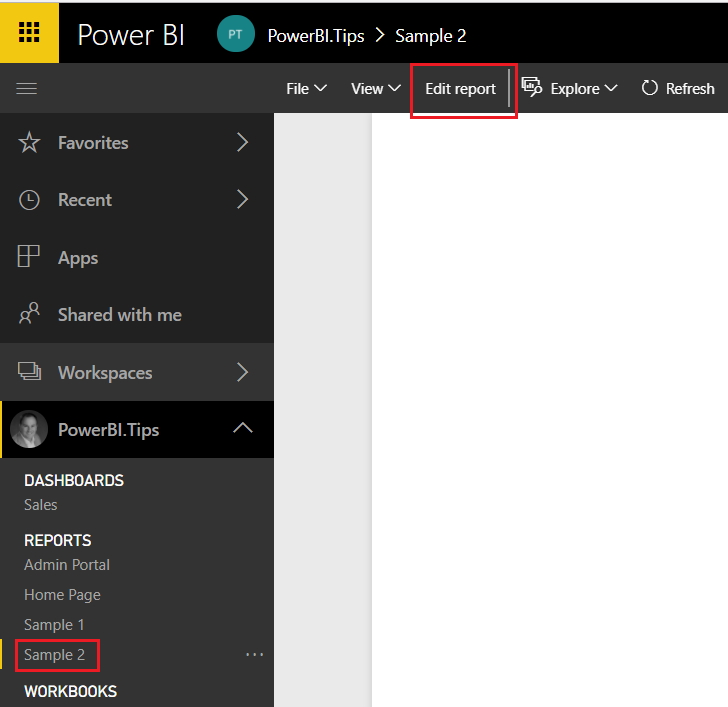
Again, click the Edit report on the report (Sample 2) where the visual is being placed.
Edit Sample 2 Report
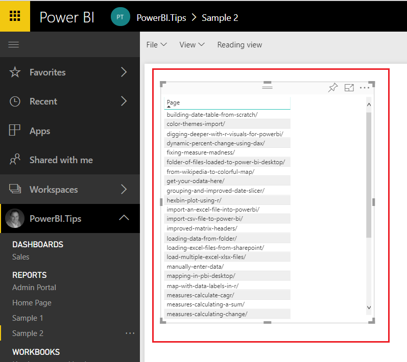
Finally, click anywhere on the white space within the report page and press CTRL + V to paste the visual into the new report.
Paste Visual to Sample 2 Report
That is it. You have successfully moved a visual from one report to another.
Points to Consider:
Both the Copy From report and the Copy To reports need to be in the PowerBI.com service.
Once you have copied the visual over to the new report you can download the report by clicking File, then selecting Download report(Preview). You can only download reports from PowerBI.com, if the report was originally authored by the Power BI Desktop program. If the report is made using the PowerBI.com service, the download report option will be grayed out.
When coping from one report to another, you have to use the same tab in either internet explorer or chrome. For this demo I used google chrome and was able to copy and paste the visual between report pages.
I hope you enjoyed this little trick. Please share it with someone else that might find this valuable.
While on a recent project I needed to build a variation of the DAX date table. In my previous post, found here Creating DAX Date Tables I was built a date table for every day of the month for multiple years. I’ve only ever needed to consume a fully populated date calendar, but in this instance because the data I was collecting was already aggregated to the first of the month I only needed a date calendar with each month’s start date. After some playing around with my previous DAX functions I think I was able to come up with an elegant solution.
Let’s get into it.
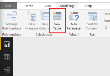
Let’s begin by making a basic table. Open Power BI Desktop, on the Modeling ribbon click New Table.
Enter the following code:
Dates =
  GENERATE (
    CALENDAR ( DATE ( 2017, 1, 1 ), DATE ( 2017, 12, 31 ) ),
    VAR currentDay = [Date]
    VAR day = DAY( currentDay )
    VAR month = MONTH ( currentDay )
    VAR year = YEAR ( currentDay )
  RETURN ROW (
    "day", day,
    "month", month,
    "year", year )
  )
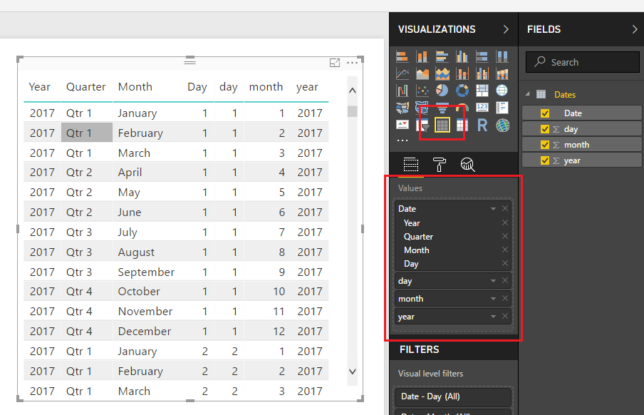
This will produce our standard table from January 1st to December 31st, 2017 with every day populated in between. In, addition we get numerical values for Day, Month and Year.
Note: This table is producing a list of dates using the Calendar DAX function then iterating row by row to calculate each numerical value for the Day, Month and Year.
Add the Table visual with the following Values from our created DAX table.
Dates Table
Note: When you drag over the field labeled Date the field will be naturally added as a Date Hierarchy. To remove the Date Hierarchy, you have to click the little drop down arrow next to the word DATE and select the word Date in the drop down menu. This will remove the Year, Quarter, Month and Day date context from the visual.
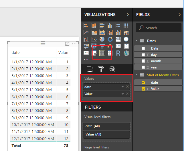
The date calendar we made has every date, but we want only the first of each month.
Lets build a new table by following the previous steps and adding the following:
Start of Month Dates =
  GENERATE (
    GENERATESERIES(1,12),
    VAR inc = [Value]
  RETURN ROW (
    "date", DATE(2017,inc,1)
    )
  )
Add the Table visual to the report page and add the following fields:
Start of Month Date Table
Note: I already removed the Date Hierarchy using the instructions listed above in the previous note.
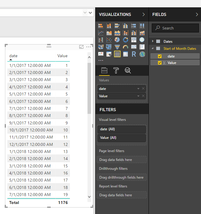
This new DAX Date table is first generating a list of numbers 1 to 12 one for each month. Then it iterates through the list and produces a date using the Date function were we manually provide the Year, and the day. You can see the Generate function produces a column of data called [Value]. The variable denoted by VAR inc is capturing the number for each month. So, now what if we want to produce more than one year of dates? Super simple, just change the generate series from 1 to 12 to 1 to 48. This will produce three years of dates.
Change your Start of Months Dates to the following:
Start of Month Dates =
  GENERATE (
    GENERATESERIES(1,48),
    VAR inc = [Value]
  RETURN ROW (
    "date", DATE(2017,inc,1)
    )
  )
With one number change we can produce 4 years of dates.
Four Years of Dates
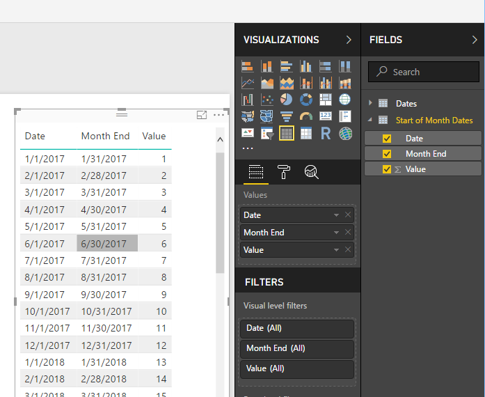
Cool, let’s go a little further. Just in case we need it we can also produce a list of dates that contain the end of the month. Add the following your Start of Month Dates with the following DAX table (don’t forget the comma on line 1 in the ROW function):
We have added a new column to note the end of each month.
Date Table with Start and End Columns
Well, thanks for following along. In my use case this start of month date table was exactly what I needed. I thought this was a handy little DAX table, and I hope you have found this helpful as well. Be sure to share this post if you found this helpful.
One of the really cool features contained within the PowerBI.com service is the ability to monitor how often your dashboard or report is being viewed. You’ll find this feature by opening up either a Dashboard or a Report, then clicking the button called Usage Metrics. Clicking this button will generate a custom usage report. For more details on Report Usage Metrics see the following article from Microsoft.
Note: In order to see the usage metrics report you must be able to edit the report and have a minimum of a Power BI Pro license. Also, the usage metric report only captures the last 90 days of report usage.
The sad thing is that this report is only the usage metrics for the Dashboard or Report that you opened. This report is also read only and cannot be modified. However, there is a way to fix this, and see all the usage on all the Dashboards or Reports within a workspace.
Let us begin.
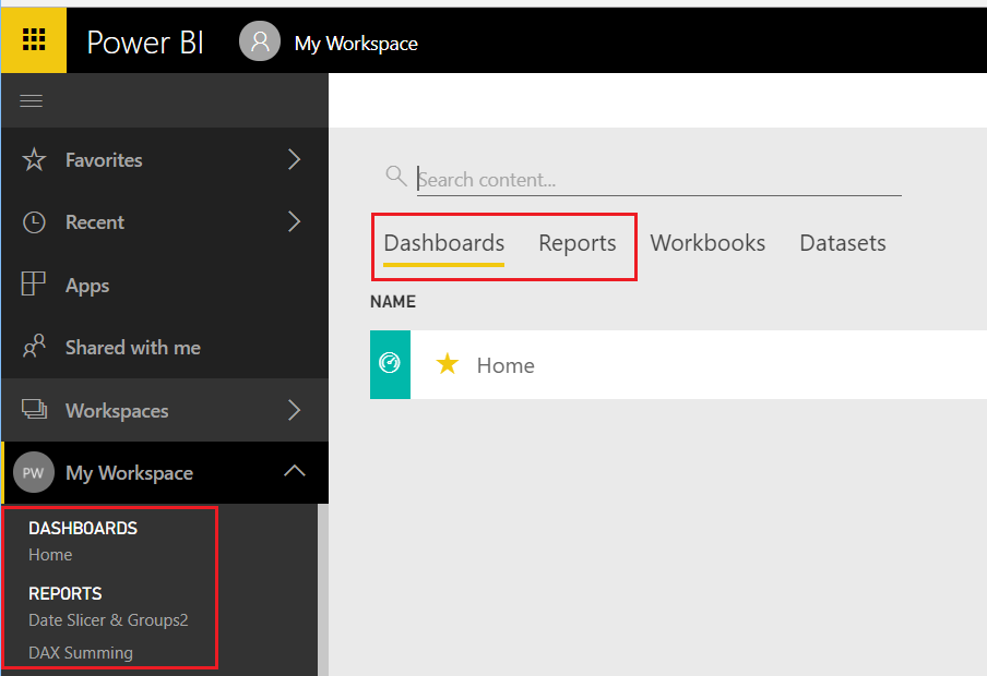
You will first need to log into PowerBI.com, once you have logged in navigate to either a Dashboard or Report. To open a dashboard or report start by opening a workspace in the left navigation bar. If you are already in a workspace you can open a Report or Dashboard by clicking on the Dashboards or Reports headers in the main selection area of the workspace.
Navigate to a Dashboard or Report
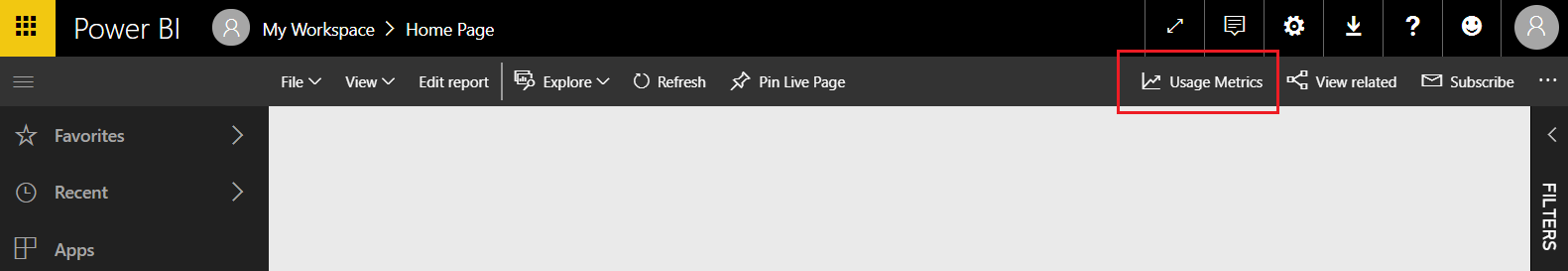
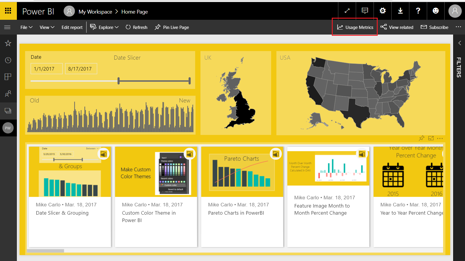
For this tutorial I will use a report but the same steps will work for both the Dashboard and Report usage metric reports. Open up the report that your interested in viewing the metrics. I am using my report called Home for this example, this report is used on PowerBI.Tips, and you can view the report here if your interested. Now that we have opened the report, click on the Usage Metrics link on the top navigation bar. This will open up a usage metrics report. This report is read only and does not allow changes.
Link to Report Metrics
Here is where we get sneaky… If you observe the URL for the usage metrics report it looks like the following:
Notice the middle of the report where it states “?filter=Reports” this means the Usage Metrics report has been filtered for only one report in the workspace. The report filter context is passing the Globally Unique Identifier (GUID) of the selected report down to the Report Metrics. This is good news because knowing this we can modify the report and remove the filter, thus allowing visibility to all the reports in a workspace.
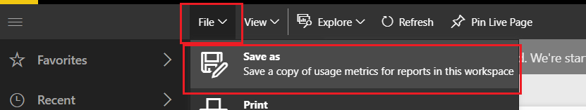
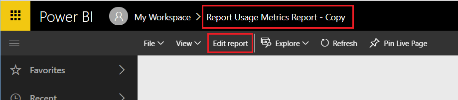
First we will need to save a copy of the report so we can make changes. With the Usage Metrics report open click File then in the drop down click Save As.
Save Report As
This will save a copy of the report into the workspace. Notice we now see in the Power BI header bar that the report has been named Report Usage Metrics Report – Copy. Also we can now see an Edit report button.
Usage Metrics Report – Copy
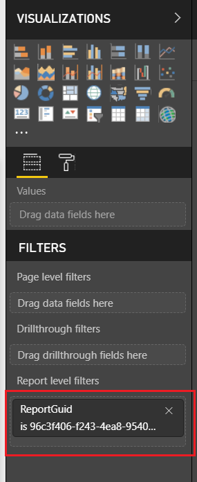
Click on Edit report to start changing the report. As soon as you open the report you can see in the visualizations pane that there is a Report filter applied. Remove this filter by Clicking the little Grey X for the ReportGUID in the Report level filters section of the visualizations pane.
Report Filters
After removing the report filters, we can see all the data from all reports.
Let the modifications begin.
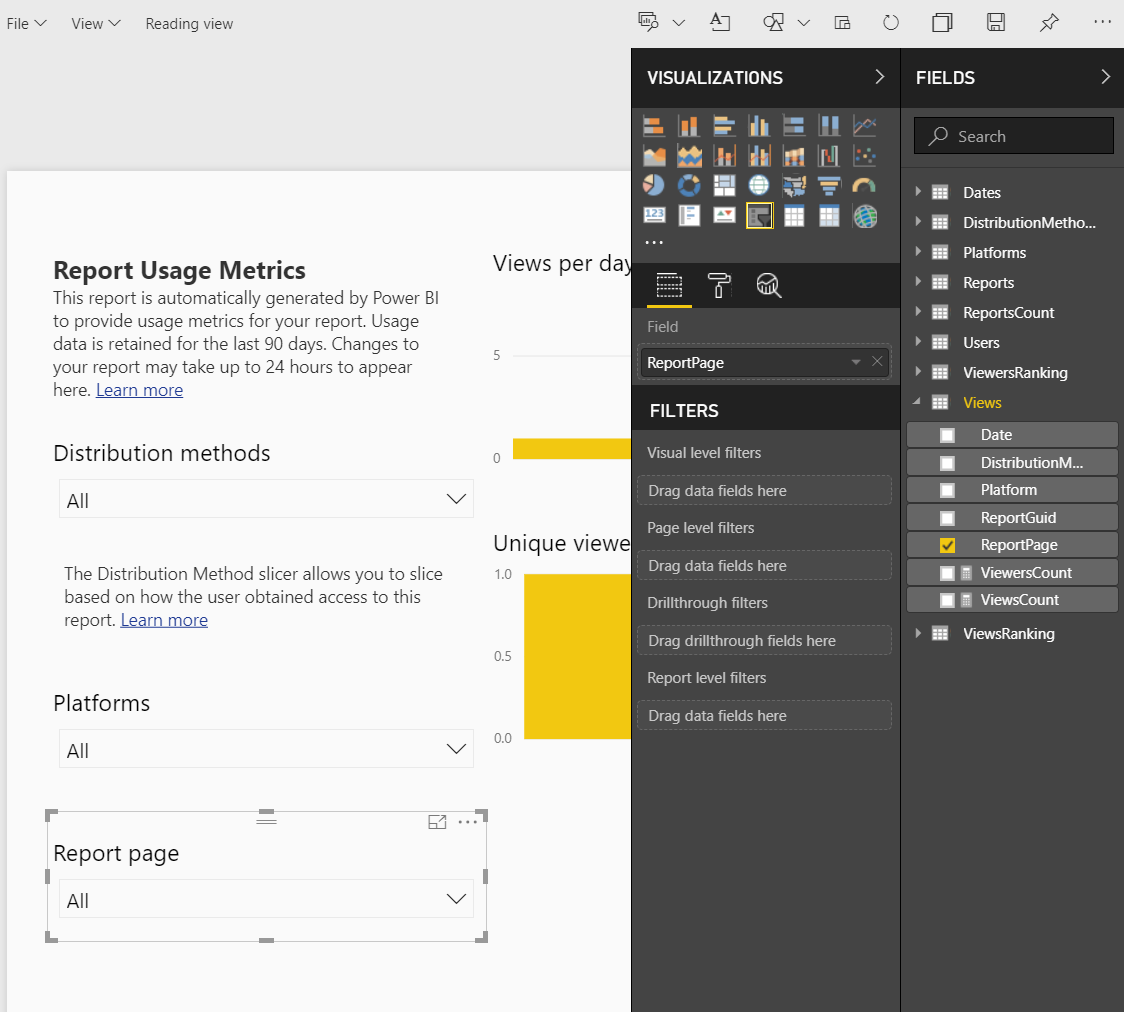
On the left of the report we have a report page slicer. This allows you to see the activity on one page of a report. Now that we can see all the reports across the workspace filtering only pages of each report doesn’t make sense. We need to add an additional slicer to select reports we are interested in.
Report Page Slicer
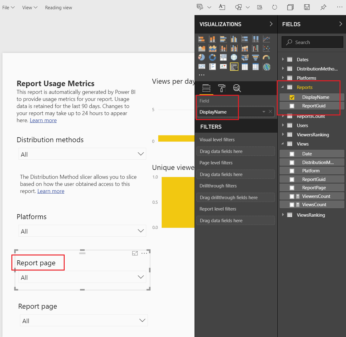
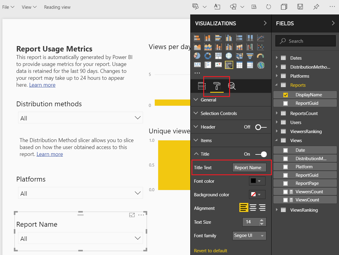
Select the Report Page Slicer the using Ctrl C copy the slicer, then paste it using Ctrl V. We should now have two slicers on the page. Select the top slicer named Report page. Change the field of the top slicer from ReportPage to DisplayName. The DisplayName is found under the Reportstable in the Fields pane.
Link Report Display Name
Notice even though we changed the slicer information that the slicer title did not change. We have to manually change the title description in the display settings. Click the Paint Roller to open the display settings. Expand the Title section and change the Title Text to Report Name.
Change Slicer to Report Name
The title of the slicer visuals is now changed. Sweet!
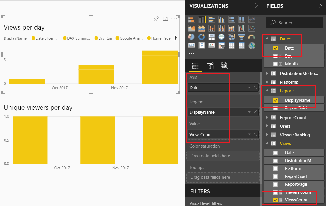
Let’s move on to modify some of the standard visuals. Select the report titled Views per day and change it to the following settings:
Views Per Day Change
Note: We changed the Axis Date column field. We removed the date field from the views table and added the date from the Dates table.
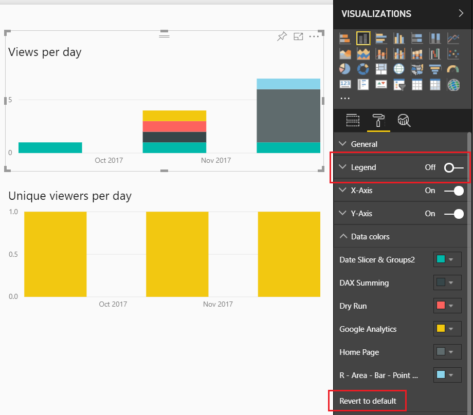
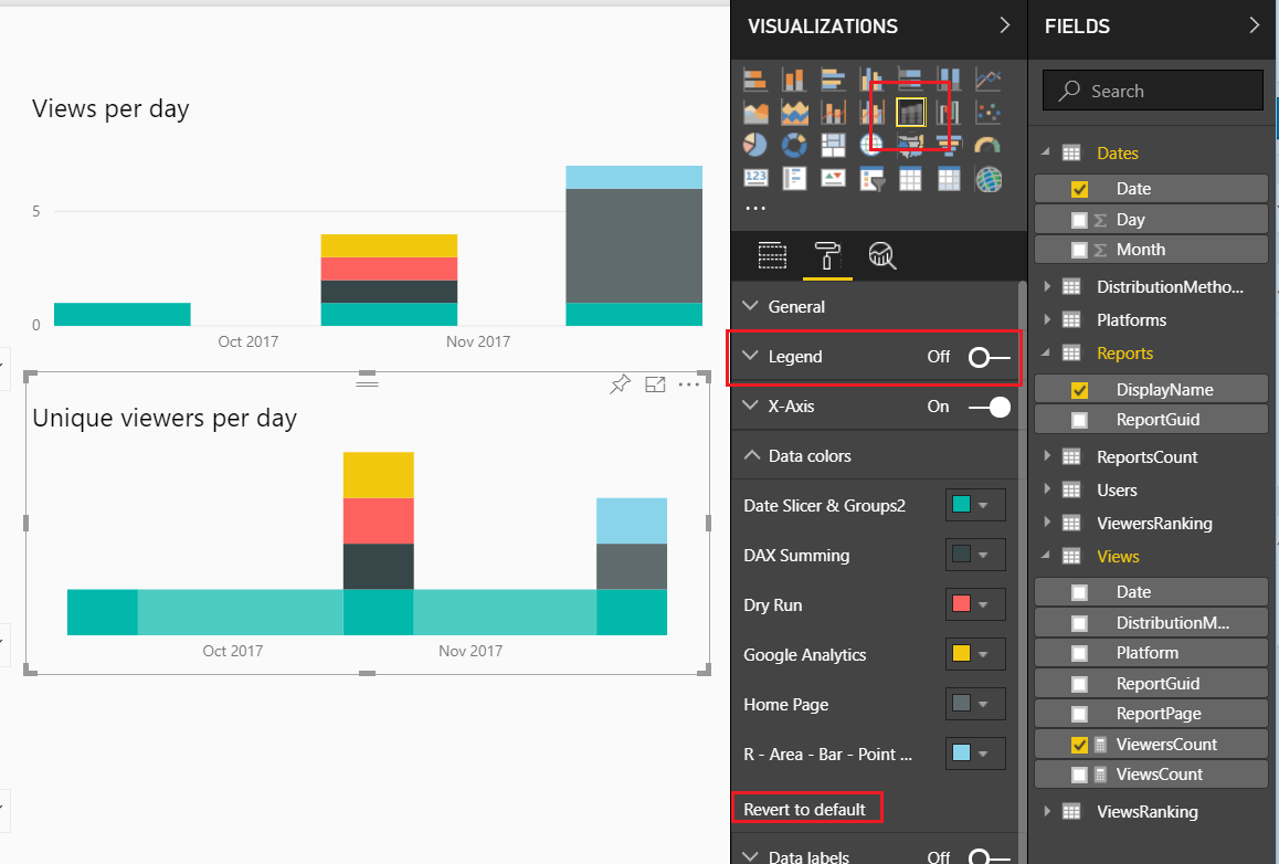
This allows us to see over time the number of views per report. Lets clean this up a bit. Change the settings of this visual by Clicking on the Paint Roller ribbon. Start by Turning Off the Legend, then open up the Data Colors, and Click the Revert to default to return the visual to it’s normal colors.
Change Visual Settings
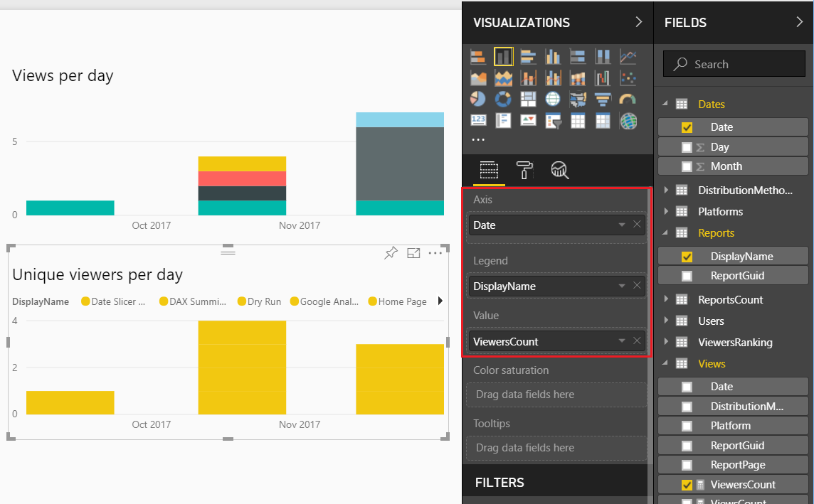
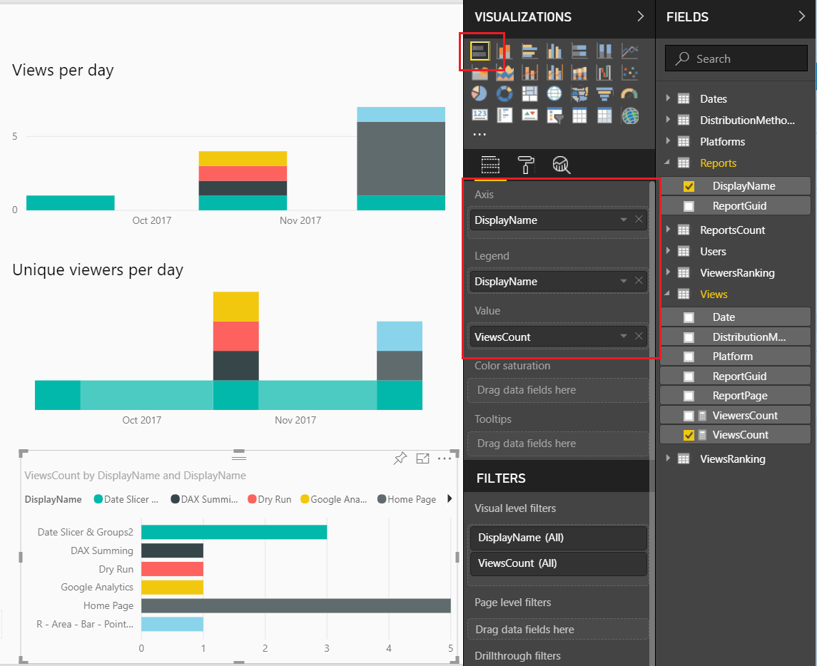
Now, lets modify the Unique viewers per day.
Change Unique Viewers per Day
Again, the formatting of this visual isn’t great so let’s modify it. Click on the Paint Roller again and Turning Off the Legend, then open up the Data Colors, Click the Revert to default to return the visual to it’s normal colors. Finally, change the visual type from Stacked Column Chart to the Ribbon Chart. Your visual should look like the following:
Change Visual
This visual will show you which report has largest viewing audience.
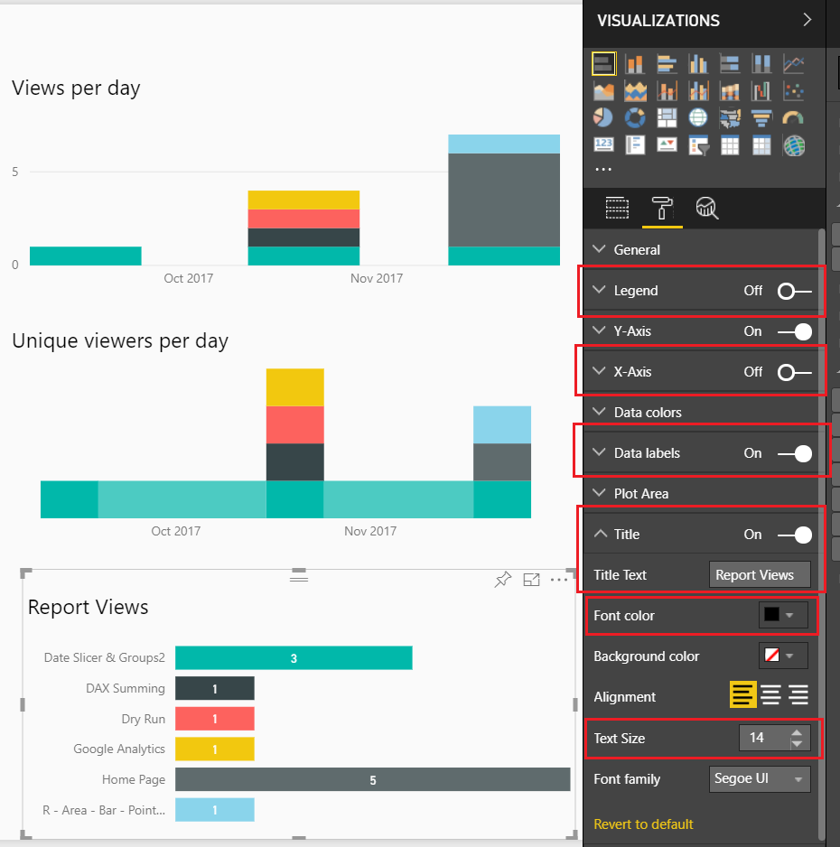
You might have noticed that in both of these visuals I’ve been removing the legends. Which means, you don’t know which report is represented by each color. We will fix that by adding a final visual. Add the Bar Chart visual from the visualization pane. Add the following field names to the visual, as shown below:
Add Bar Chart
Next, we will format the visual to clean it up. Make the following changes, Toggle the Legend to Off, Toggle the X-Axis to Off,Toggle the Data labels to On, Toggle the Title to On and change the Title Text to Report Views, finally change the Font color to Black and Text Size to 14.
Formatting the Bar Chart
We want to sort the reports not by name but by how often they are viewed. To do this, Click on the ellipsis and from the drop down Select sort by ViewsCount.
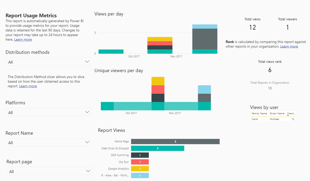
Now we have a custom Usage Metrics Report.
Final Report
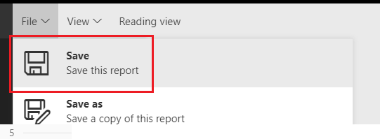
Be sure to save the file. Click on File then in the drop down Click the Save button.
Save Changed Report
You will notice that our modified Usage Metrics Report will be saved in the Workspace.
Thanks for following along. If you found this tutorial helpful please share it with someone who will find this valuable.
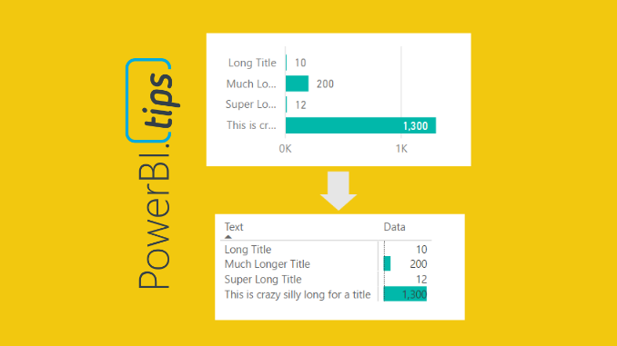
The more you work with Power BI Desktop it is more than likely you will find some tool limitations that impact your overall design pursuits. As I have worked with data visualization software, I find there is always a balance between what I want to make and what is possible. The more you become familiar with your visualization tool, the better you think of report designs that are both beautiful and feasible. One such design style that I use is to limit the use of slicers on the report page as much as possible. My solution for removing slicers is adding a stacked bar chart or a stacked column chart. The chart can be used as a slicer because you can click on the data bars and filter the page of data. One of the visualization limitations I’ve had to work around was the ability to make a stacked bar chart with long y-axis titles. In order to overcome this limitation we need to fire up our creativity to figure out another way to more accurately control the y-axis labels and the associated bar chart.
There are two main issues we will need to solve:
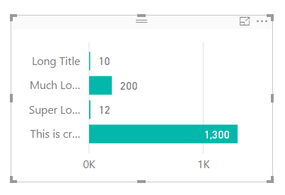
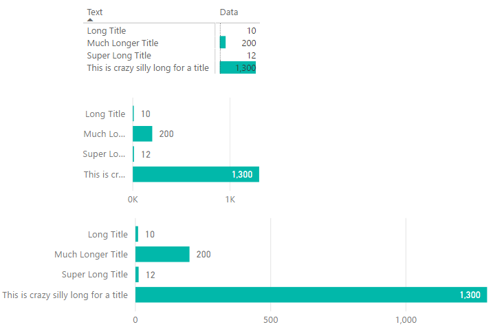
First issue, when you have text along the y-axis in the stacked bar chart, the text becomes truncated. See below.
Stacked Bar Chart
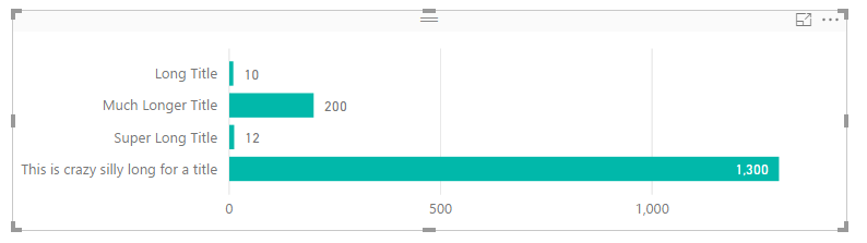
Note: All the text next to each bar is truncated if the text is to long. This can be fixed by extending the visual to a ridiculous length, as illustrated by the following picture. While this solves the text issue, this totally defeats the purpose of this visual, provide a “slicer” that can be used to filter the report page with minimal space consumption.
Super Long Stacked Bar Chart
Second issue, when there are super small values next to large values, it is almost nearly impossible to click on the bar to enable the filtering. In the example image above, it’s easy to click on the value of 1,300 but almost impossible to click on the value of 10. Womp, Womp, and clicking on the bar text value does not enable filtering, insert ridiculous horn sound, or other familiar but annoying horn sound (as recommended by one of our readers Terence).
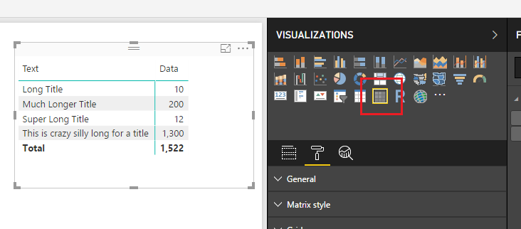
After some playing around with various visuals here is what I came up with. First, you must change the visual from a stacked bar chart to the matrix visual. On the Visualizations pane click on the Matrix visual.
Matrix Visual
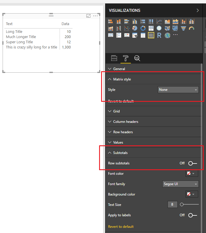
This will change the visual to a matrix. It’s a little busy so we will clean it up a bit. On the Visualizations pane change the Matrix style to None, then open up the Subtotals section and set Row subtotals to Off. Your visual should now look similar to the following:
Change Matrix Style
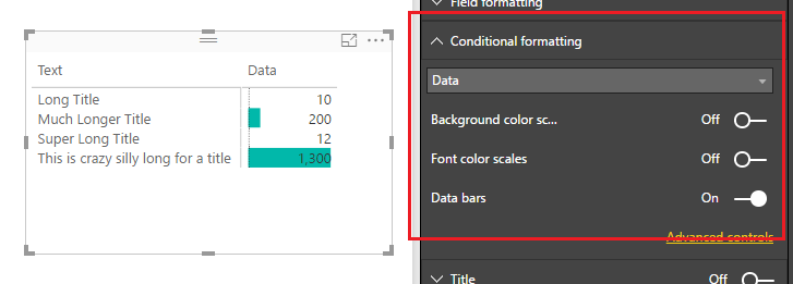
Next we will add the “bars” to the visual. Open the Conditional formatting section and turn Data bars to On.
Turn on Data Bars
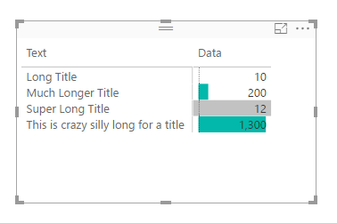
Short and sweet. Now we can properly resize the “text labels” of the y-axis and when we try to select small values such as 10, we are presented with a little grey selector bar, enabling us to select very small values.
Grey Selector Highlighting Bar
When you compare all three items side by side you can see that the most condensed version is the Matrix visual with conditional formatting bars. This provides you much more control when dealing with data that contains long text labels.
Comparison of Bar Charts
Note: There are many ways you can format your matrix to get the desired look. This tutorial is simply covering one type of look. Additionally, you could hide the text and grid completely by making the grid and column title colors of those match the color of your background, or use could choose one of the many of the grid type options to fit your style needs.
Thanks for following along, as always if you found this helpful please share it with someone who might find this helpful.
There are many cases when you will need to create a date table within Power BI desktop. This could be as simple as creating a master date table or more complex such as creating a monthly or weekly index number tied to a date. To create a date table there are two methods for creating a date table. Method one, create the table directly in the Power BI Desktop, or method two load the date table from the data source.
For this tutorial we will walk through a couple different examples that are specifically addressing creating a date calendar via DAX expressions.
Let’s begin by making a basic table. Open Power BI Desktop, on the Modeling ribbon click New Table.
New Table
In the formula bar enter the following DAX expression:
Dates  =
  GENERATE (
    CALENDAR ( DATE ( 2017, 1, 1 ), DATE ( 2017, 12, 31 ) ),
    VAR currentDay = [Date]
    VAR day = DAY( currentDay )
    VAR month =  MONTH ( currentDay )
    VAR year =  YEAR ( currentDay )
  RETURN   ROW (
    "day", day,
    "month", month,
    "year", year )
  )
This generates a simple date table. Let’s walk through what is happening here.
The CALENDAR DAX function generates a table with a list of dates from Jan 1 to Dec 31 of 2017.
We define variables (denoted by VAR) to capture details from the column named [Date] that is created by the CALENDAR function.
The Return function generates one row at a time. The row iterates through each [Date] item in the list which was created by the CALENDAR function. Variables are re-calculated for every row execution.
Note: When creating DAX tables as we are doing so in this example, the DAX table only refreshes when the report refreshes. Thus, if you want the date list to increase over time, or your using a NOW() in the DAX table you will need to be sure to schedule refreshes for the Power BI report in the PowerBI.com service.
By contrast we can also generate the same data table by calculating our data column by column. Again, on the Modeling ribbon click the New Table icon and add the following DAX:
While this is great, we have a date table now, but what we lack is flexibility and automatic time intelligence. One option to change this table to auto detect dates within your data model is to replace the CALENDAR DAX statement with CALENDARAUTO().
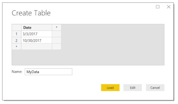
To use CALENDARAUTO we need to supply a table with a column of dates. We will quickly create a dummy data table with a couple of dates, so we can use CALENDARAUTIO.
Click Enter Data on the Home ribbon. Enter the following information into the Create Table screen. Click Load to add this data to the data model.
Enter Date Table
Now that we have loaded a table into the model with two dates, we can add our new date table. On the Modeling ribbon click the New Table icon and add the following DAX:
Dates 3 =
  GENERATE (
    CALENDARAUTO(),
    VAR currentDay = [Date]
    VAR day = DAY( currentDay )
    VAR month =  MONTH ( currentDay )
    VAR year =  YEAR ( currentDay )
  RETURN  ROW (
    "day", day,
    "month", month,
    "year", year )
  )
Note: In the MyData table we added two dates, 3/3/2017 and 10/30/2017. When we look at the included dates in the new Date 3 table we have every date listed from January 1 to December 31st. This is because the DAX function CALENDARAUTO will return the entire year of calendar dates even if it only finds one date within a given year period of time.
Let’s say we want to build a date calendar that will automatically grow and change over time. We want to identify today’s date and then create a list of dates for the previous year.
Moving back to generating a date table by rows we can now use the DAX NOW function. On the Modeling ribbon click the New Table icon and add the following DAX:
Dates 4  =
  GENERATE (
    CALENDAR( DATE( YEAR( NOW() ) - 1, MONTH( NOW() ), DAY( NOW()) ), NOW()),
    VAR currentDay = [Date]
    VAR day = DAY( currentDay )
    VAR month = MONTH ( currentDay )
    VAR year = YEAR ( currentDay )
  RETURN ROW (
    "day", day,
    "month", month,
    "year", year )
 )
Note: In this DAX table we used the NOW() function which returns a date and time. The same can be done when using the TODAY() function which only returns the date and not the time.
This now generates is a date table that starts one year ago and populates all the dates until today. For example, if today is 10-29-2017, then the date list would start at 10-29-2016 and end on 10-29-2017. Pretty cool…
Let us move further down the rabbit hole. We can also start adding calculations that helps us move through date time calculations. For example, you may want to calculate this month’s total sales and possibly last month’s sales. By adding columns with an index, you can quickly shift time periods. Doing so makes time calculations much easier.
On the Modeling ribbon click the New Table icon and add the following DAX:
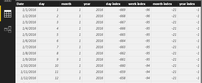
Dates 5 =
  GENERATE (
    CALENDAR( DATE( YEAR( TODAY() ) - 2, MONTH( TODAY() ), DAY( TODAY()) ), TODAY()),
    VAR startOfWeek = 1 // Where 1 is Sunday and 7 is Saturday, thus a 3 would be Tuesday
    VAR currentDay = [Date]
    VAR days = DAY( currentDay )
    VAR months = MONTH ( currentDay )
    VAR years = YEAR ( currentDay )
    VAR nowYear = YEAR( TODAY() )
    VAR nowMonth = MONTH( TODAY() )
    VAR dayIndex = DATEDIFF( currentDay, TODAY(), DAY) * -1
    VAR todayNum = WEEKDAY( TODAY() )
    VAR weekIndex = INT( ROUNDDOWN( ( dayIndex + -1 * IF( todayNum + startOfWeek <= 6, todayNum + startOfWeek, todayNum + startOfWeek - 7 )) / 7, 0 ) )
  RETURN ROW (
    "day", days,
    "month", months,
    "year", years,
    "day index", dayIndex,
    "week index", weekIndex,
    "month index", INT( (years - nowYear ) * 12 + months - nowMonth ),
    "year index", INT( years - nowYear )
  )
)
Note: The DAX equation above will work in your report without any changes. However, I made a variable called startOfWeek. This variable allows you to define the start day of the week. For example, if you data starts a new week on Sunday, then the startOfWeek number will be a 1. If your data start of week begins on Wednesday then the start of week number would be a 4. This allows you to auto detect the day of the week and then automatically arranges all your weekly index numbers in the correct format. Try playing around with this variable to see how DAX table changes.
So why work so hard on the date table? Well by having a robust date table you can simplify many of your measures that you need to build for your report. Consider the following example:
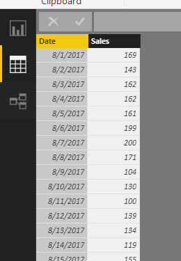
You have a Sales table with a date and sales column.
Sample Sales Data
And you have our fancy Dates 5 Table we created earlier:
Date 5 Calendar
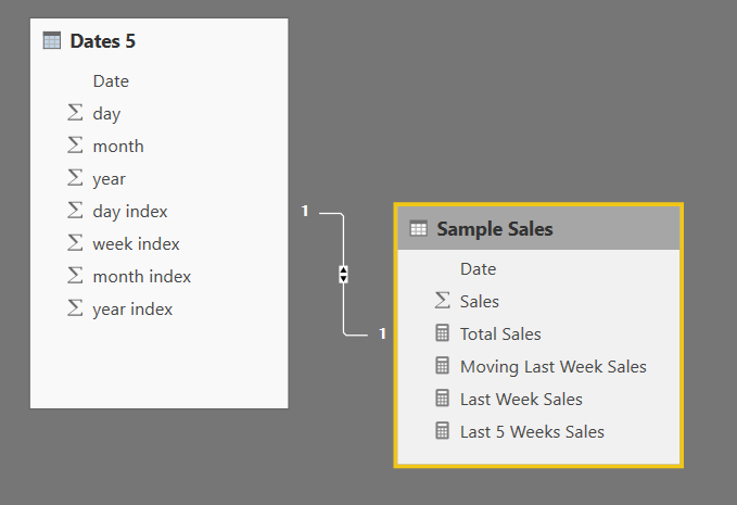
The Date 5 table is linked to the Sample Sales table:
Date and Sales Tables Linked
You can now build the following DAX measures inside the Sample Sales table:
The nice thing about these measures is that every time the data set refreshes the dates will automatically recalculate the last week and last five weeks.
If you want to be able to handle the additional filter context of the visual, you can pick up the visual filter context using variables (VAR). Then you can RETURN a calculate function that will shift all your time ranges for you.
Well that is about it. Thanks for following along.
I am so thankful you have taken the time to read my tutorial. My hope is that by using these free tutorials you can become a rock-star at work. In order to keep these tutorials free please consider purchasing the Power BI Desktop file for this tutorial. Come on it’s only a dollar, I mean you spent than that on your coffee this morning.
You can pay with your PayPal account or via credit card
DAX (Database Access Expressions) can be quite complex. It is essential to being able to appropriately manipulate the Power BI data model for the visuals. The following information was discussed at the Power BI World Tour 2017 and if you’d like to review the content or learn more about DAX hit some of the links below. For all who were able to attend, you were a great audience and super fun! I hope you learn some fun facts and tricks.
To everyone who was able to attend the Power BI World Tour 2017, Thank you! It has been a pleasure presenting my favorite tips and trips. This post consolidates all the links for each topic that was discussed. All the links to the content are below, if you want to go through the tutorials at your own pace hit a link below. When going through 7 topics in an hour, it is difficult to completely learn everything. So, if your like me, you learn by doing, making mistakes and gritting it out until you understand. Enjoy and have fun.
September is here and there is a new update for Power BI desktop! I’m so excited for this month’s update as there are many solid features. One of the more anticipated features, Drillthrough. This allows a user to right click on items in a table and drill to more detailed pages within the report with applied filters specific to the user’s need. This feature was initially announced at the 2017 Data Insight’s summit.
Another feature that is definitely worth checking out is the ability to now create more detailed themes for a report. More of the properties of a visual are now being exposed in the JSON format for themes. For people who do a lot of customizing of visuals this is a huge time saver. PowerBI.Tips has provided a tool to assist you with generating your own report themes. Click the image below to go to the improved Report Theme Generator.
I’ve been using Power BI since it was released back in 2015, and I’ve found that when talking with other PowerBI users there is always a little confusion about how to share Power BI reports. My experience has been that most people are first introduced to the service and go directly to PowerBI.com, login and start playing around. They explore a little and find a cool data source to connect to, such as a SQL database or some good old google analytics data. Typically they will begin making a dashboard and really get into making visuals on a report.
While this is an excellent way to get started because this removes the complexity of having to model your data, it does come with some challenges that leads to issues later on.
There comes a point in time that the user usually needs some additional data. The “this is good data but, if I could only join the data with another source….” question almost always comes up.
These reports are typically made in your personal workspace which is not a good solution for sharing a report with another user. I’ll explain later.
How do I source control this document? What if I want to go back in time and restore my changes?
In order to answer these questions, I’ll show you what I use to get around these issues.
To start off, and most importantly!, try to refrain from building your dashboards in the PowerBI.com service. Yes, you can do it, but it is not recommended. I don’t recommend this because any report created in your personal workspace can only be edited by you and no one else. Also, if your account is deleted or you loose access to your account no other PowerBI user can modify your original report. It’s the classic, win the lottery, or hit by a bus case, depending if your an optimist or pessimist. What you should do instead, is download and open up the PowerBI desktop application. This will save you ton’s of headache later when you want to join multiple data sources or want to have a saved copy of your Report.
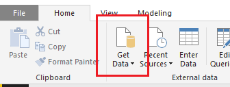
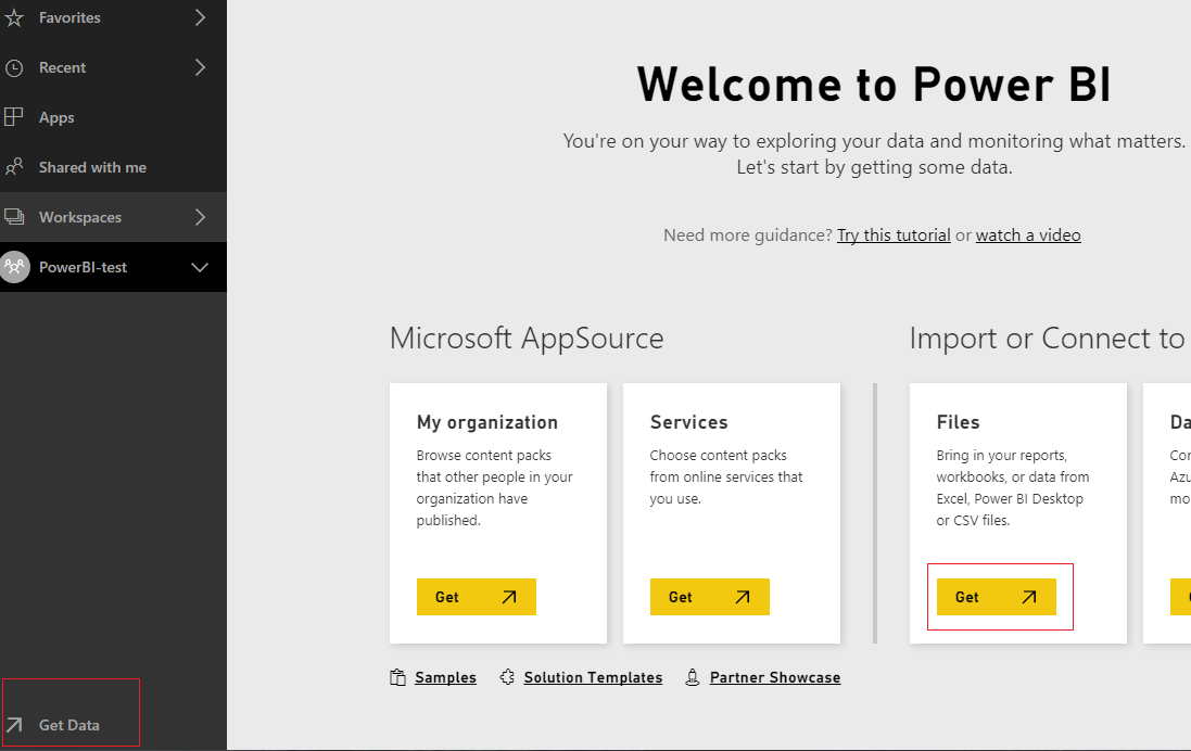
After you download the desktop application you will load the data using the Get Data button found on the Home ribbon.
Get Data Button
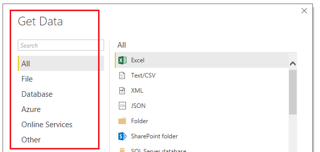
Almost, all data sources found in the Get Data window are on the PowerBI.com service. You will notice this changes over time, with each monthly release of PowerBI desktop.
FYI, I have noticed that changes happen faster in the PowerBI.com service as it appears as though there are weekly or bi-weekly updates. But the Desktop version is slightly slower to get changes as builds are only released once a month.
Get Data Window
Next you will load data into the Power BI desktop. If you want to learn more about modeling you can browse through these tutorials on data modeling. Modeling happens in the query editor with the M language, and on the report pages using DAX.
Now we will create a very simple PBIX file to publish to the PowerBI.com service.
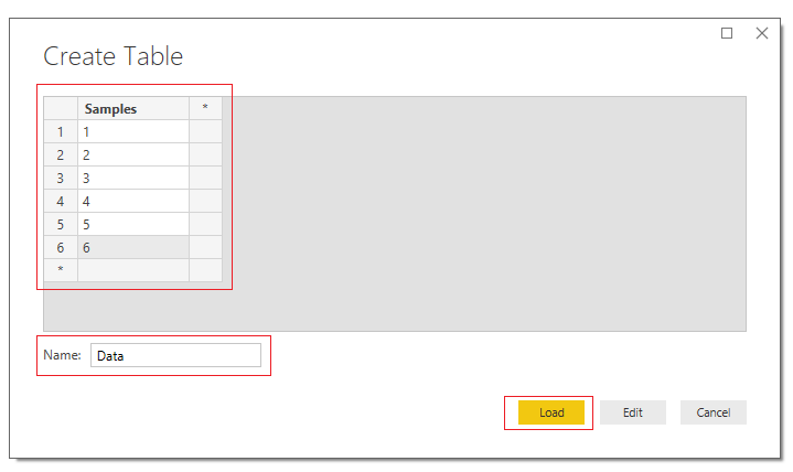
On the Home ribbon click the Enter Data button and enter the following:
Create Table of Data
This will create a simple data table. Click Load to bring the data into PowerBI Desktop.
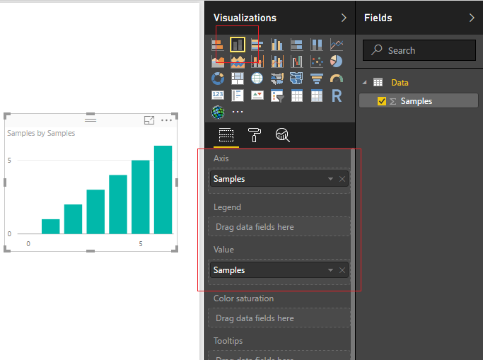
Create a visual by clicking on the Stacked ColumnChart and adding the following columns to the visual.
Add Column Chart
Congratulations, we have completed a very simple report and you have loaded data inside the desktop. In addition to loading data PowerBI is equipped with a robust modeling tool called the Query Editor. The very topic of modeling your data is a huge. It covers the Query Editor, making DAX expression and has been covered in numerous books. This this post will not address modeling your data. As a side note, here are some really good sources of information for learning more about DAX.
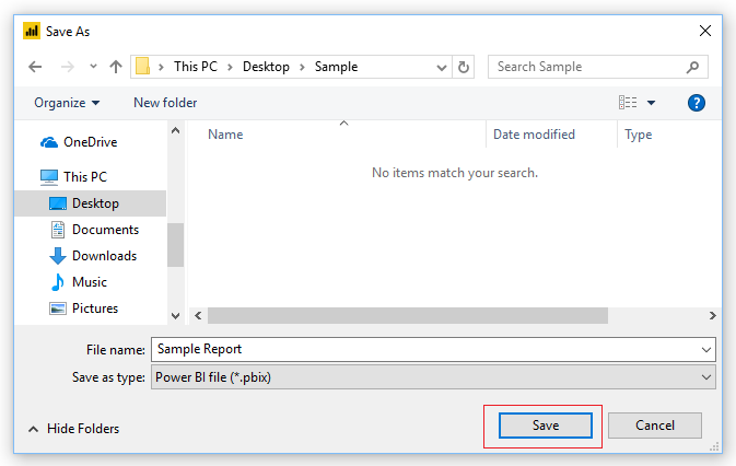
Alright, let publish this bad boy. First save the Report. Do this by clicking File then click Save. Enter a simple name such as Sample Report, click Save.
Save File
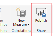
To publish the report to the PowerBI.com Service click the Publish button found on the Home ribbon.
Publish Button
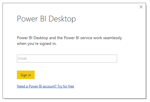
If you have not already signed into the PowerBI.com service you will be prompted to sign in.
Sign In Screen
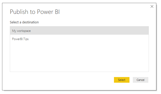
If you already have a more than one workspace in the PowerBI.com service a second window will pop up asking you to choose a workspace location. Choose a workspace location to publish the report.
Choose a Workspace
Couple of important notes about workspaces.
A workspace can have admin users or members. The admin user can add and remove individuals to the workspace. A member can be configured to either, edit reports, or only view reports.
The workspace can have many admins if necessary which is helpful when collaboratively working on reports with a team.
I have found that when working on many different reporting projects a workspace helps target a specific audience or provides an organized method to share only reports that would be relevant.
You cannot create a workspace in this Publish to Power BI window. This has to be done from the service.
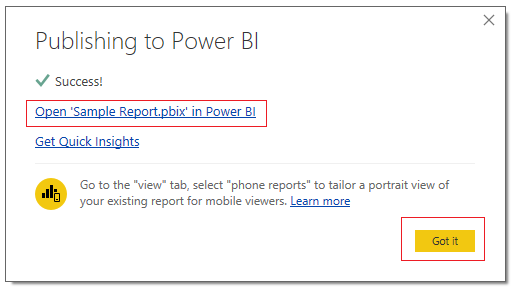
Since I am not sharing this report I will publish to My workspace. Click Select to complete the publishing. Once the report is done loading you will have a window that notifies you that the process has completed. A link is provided to check out your report directly on the service. You can dismiss the message by clicking Got it.
Link to Report
Click Got it to dismiss the pop-up window.
While remaining in PowerBI desktop, save the file one more time but use SAVE AS and save the file with the name of Sample Report V2.
Now we will create a new workspace for a report that we might want to share.
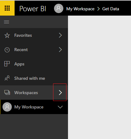
Go to PowerBI.com and login. On the left navigation bar click the arrow to expand the workspaces.
Open Workspaces
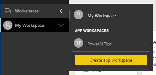
A fly-out menu will appear and you can click Create App Workspace.
Create App Workspace
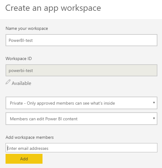
Fill out your workspace name and configure your settings. Be sure to enter your email address that you used to log into the PowerBI.com service in the workspace members area.
Create Workspace
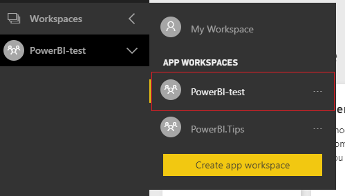
At the bottom of the menu click Save when you have completely configured the settings. Opening up the workspaces fly-out menu will now reveal your new workspace.
App Workspace
Click on the ellipsis of the new workspace PowerBI-test.
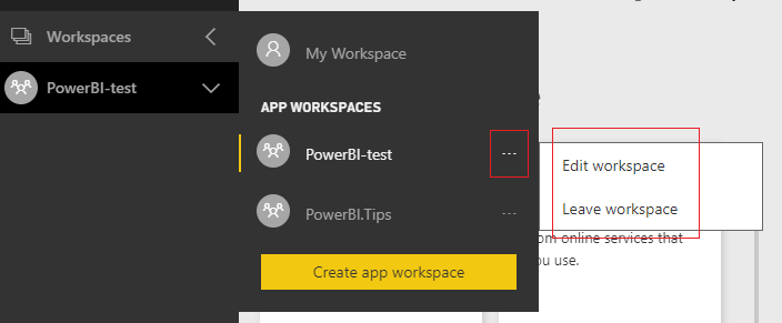
Click on Ellipsis
Notice when you click the ellipsis, that there are only two options, Edit and Leave. If you give it about 10 minutes or so, a third option will show up, Files. The reason we have to wait is because behind the scenes this workspace is tied to 0365 Groups. Thus, we have to wait for all the services to be fully provisioned before we can proceed. We will want to use the files option of our workspace. Now would be a good time to take a little potty break, pet your dog, get a snack… and come back in 5.
Yumm, I love Oreos…
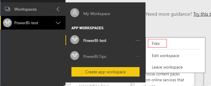
Now that we have waited a bit, Refresh your browser page. This is important, if you don’t do this you won’t be able to observe the change. Click the ellipsis again and now we have a new item calledFiles.
Workspace Files
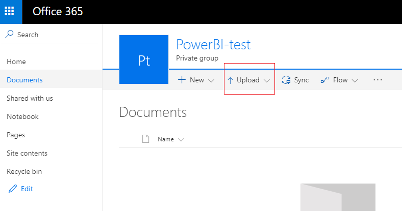
Click on Files and you will be re-directed to a custom SharePoint 0365 page for this workspace’s files.
Now we can upload the version two of our PBIX file. Click the upload button on the navigation bar.
Upload File
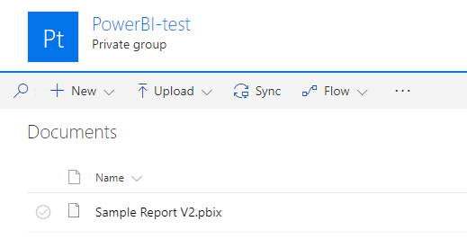
After uploading your file it should look like the following:
Loaded File
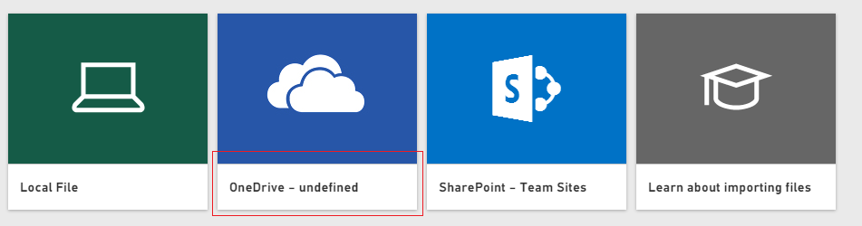
Go back to PowerBI.com, make sure you are still in the created workspace, then click Get Data at the bottom of the left navigation bar. Then click Get in the Files window.
Get Files Screen
Then a screen will pop-up showing you which source you can use to get data. Click the title labeled OneDrive.
Get One Drive Files
Upon clicking this we are taken to the OneDrive location that we created with the workspace. In here we will have the Sample Report V2.pbix file. Click the name of the file Sample Report V2.pbix. Then click Connect to load the file.
Note: If you want to make changes to the pbix file you have to overwrite the file in the OneDrive location. Don’t worry, SharePoint does have version control on the files. This will keep the files location nice and clean. It also removes the need for you to version or date each and every file. To learn more about versioning files in SharePoint hit this link.
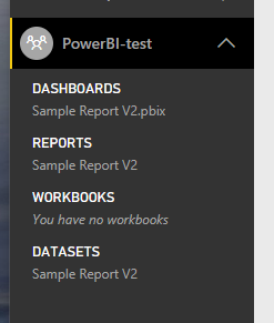
Now when we click on the workspace PowerBI-test we can see that the dataset, report, and dashboard has all loaded.
Workspace
There are some advantages of loading your pbix file this way.
loading a file from OneDrive will automatically refresh the report every hour from the pbix file.
If any team members want to modify the original file the members of the workspace can access the file from the SharePoint page.
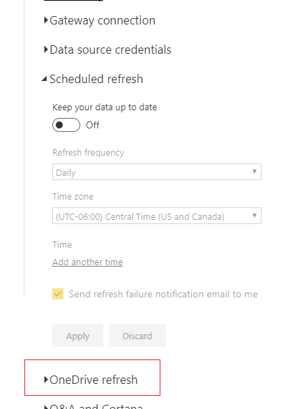
Click on the Ellipsis of the Sample Report V2 under the DATASETS section and select Schedule Refresh from the fly-out window. You will notice just under schedule refresh is a new setting called OneDrive refresh.
OneDrive Refresh
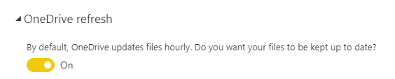
Click OneDrive Refresh, and now you can see there is a toggle for keeping the file refreshed every hour, which is enabled by default.
Hourly Refresh
Whew, I think that about wraps it up, start with the desktop to make your files, be sure to create workspaces to share content, and use the workspace files to store and source control your pbix files.
I hope it was helpful.. Make sure you share this blog with another person if you found it valuable.
I love these updates, it’s like Christmas comes every month!! This month we get a ton of really great features, I for one am super pumped to get into the tool and checking it out.
Here are a couple of highlights you should check out. First up, matrix & tables now support conditional formatting for TEXT!!! Definitely long over due, but I’m happy it’s here. In one of my recent projects we had a horrible time trying to get the subtotals working correctly in the matrix visual. So much so that we had to abandon the matrix view all together. Now it looks like with this months update there is a substantial improvement to how subtotals work.
Lastly, I think the most important update and I think the best feature for this month’s update What-if Parameters… I haven’t played with this much, but from what I know this is going to be awesome! I would be willing to be the heavy analyst is going to love this feature.
Here is the full video of all the updates for this August, Enjoy.
If you want to review the full August release for PowerBI Desktop, you can hit the PowerBI Blog here.
Manage Consent
To provide the best experiences, we use technologies like cookies to store and/or access device information. Consenting to these technologies will allow us to process data such as browsing behavior or unique IDs on this site. Not consenting or withdrawing consent, may adversely affect certain features and functions.
Functional
Always active
The technical storage or access is strictly necessary for the legitimate purpose of enabling the use of a specific service explicitly requested by the subscriber or user, or for the sole purpose of carrying out the transmission of a communication over an electronic communications network.
Preferences
The technical storage or access is necessary for the legitimate purpose of storing preferences that are not requested by the subscriber or user.
Statistics
The technical storage or access that is used exclusively for statistical purposes.The technical storage or access that is used exclusively for anonymous statistical purposes. Without a subpoena, voluntary compliance on the part of your Internet Service Provider, or additional records from a third party, information stored or retrieved for this purpose alone cannot usually be used to identify you.
Marketing
The technical storage or access is required to create user profiles to send advertising, or to track the user on a website or across several websites for similar marketing purposes.