Search results for: “percent change”

  • Measures – Year Over Year Percent Change

    Measures – Year Over Year Percent Change

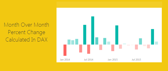
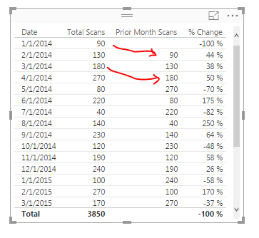
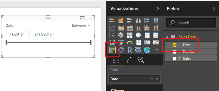
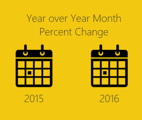
    This tutorial is a variation on the month to month percent change tutorial.  This specific exploration in year over year performance was born out of reviewing my google analytics information.  The specific analysis question I am trying to answer is, how did this current month of website visitors compare to the same month last year.  For example I want to compare the number of visitors for November 2016 to November 2015.  Did I have more users this year in this month or last year?  What was my percent changed between the two months?

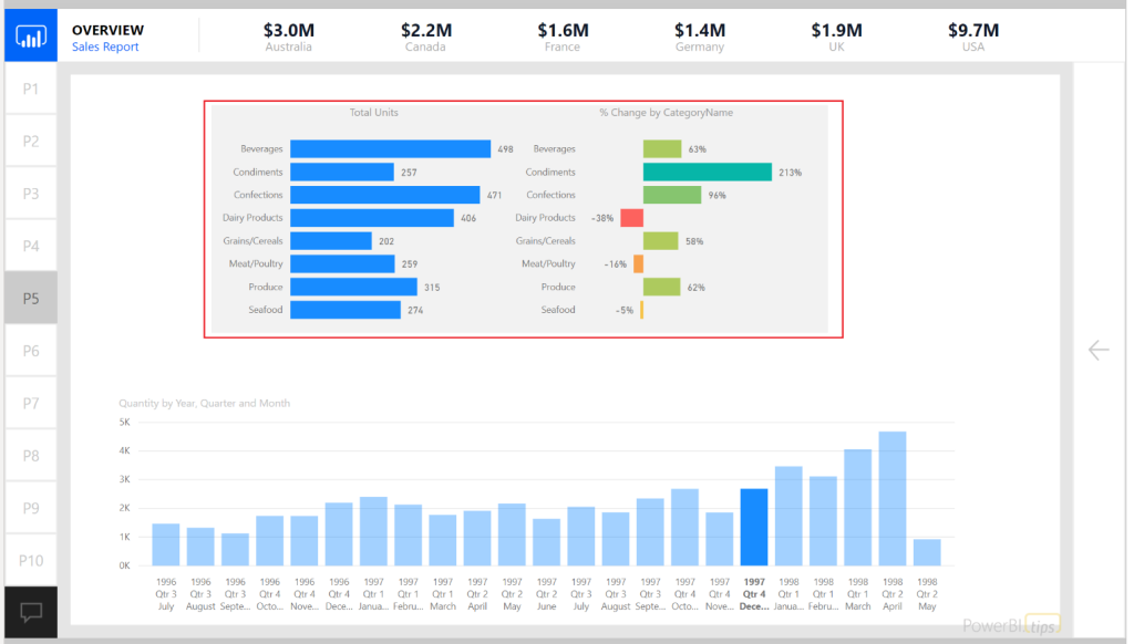
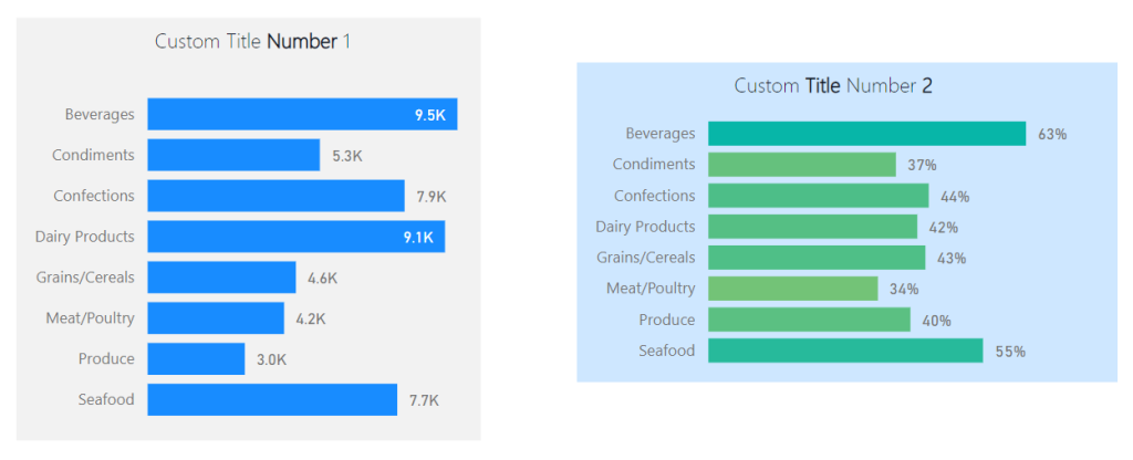
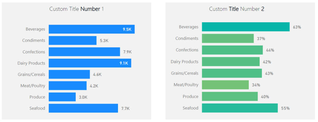
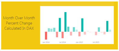
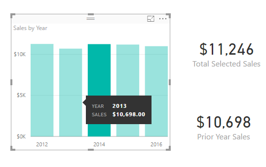
    Here is a sample of the analysis:

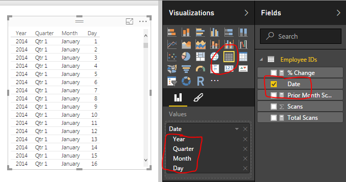
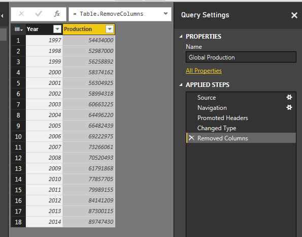
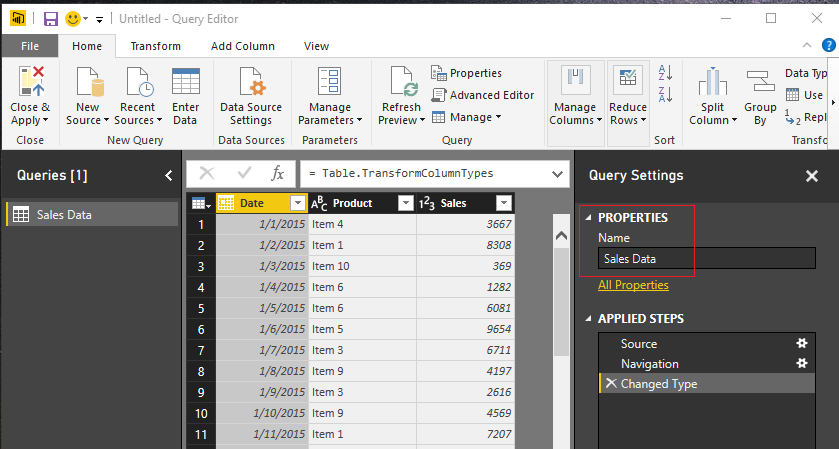
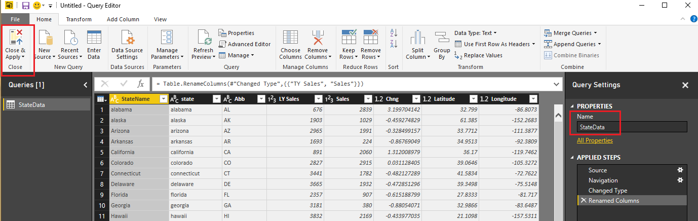
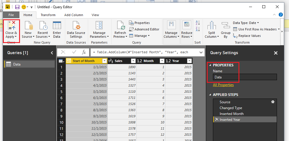
    let’s begin with loading our data and data transformations.  Open up PowerBI Desktop, Click the Get Data button on the Home ribbon and select Blank Query.  Click Connect to open the Query Editor.  Click Advanced Editor on the View ribbon.  While in the Advanced Editor paste the following code into the editor window, click Done to complete the data load.

    Note: If you need some more help loading the data follow this tutorial about loading data using the Advanced Query Editor.  This tutorial teaches you how to copy and paste M code into the Advanced Editor.

    let
     Source = Table.FromRows(Json.Document(Binary.Decompress(Binary.FromText("VdDBDcQwCETRXnyOFMAYcC1W+m9jV8BhfH1ygJ9zBr/8CvEaz+DYNL7nDAFjnWkTTNsUbIqnLfyWa56BOXOagy2xtMB5Vjs2mPFOYwIkikIsWd6IKb7qxH5o+bBNwIwIk622OCanTd2YXPNUMNnqFwomp0XvDTAPw+Q2uZL7QL+SC1Wv5Dpx/lO+Hw==", BinaryEncoding.Base64), Compression.Deflate)), let _t = ((type text) meta [Serialized.Text = true]) in type table [#"Start of Month" = _t, Sales = _t]),
     #"Changed Type" = Table.TransformColumnTypes(Source,{{"Start of Month", type date}, {"Sales", Int64.Type}}),
     #"Inserted Month" = Table.AddColumn(#"Changed Type", "Month", each Date.Month([Start of Month]), type number),
     #"Inserted Year" = Table.AddColumn(#"Inserted Month", "Year", each Date.Year([Start of Month]), type number)
    in
     #"Inserted Year"

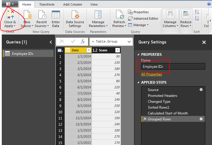
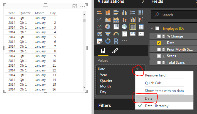
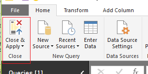
    While still in the Query Editor rename the query to Data.  Then click Close & Apply to complete the data load into the data model.

    Load Monthly Data
    Load Monthly Data

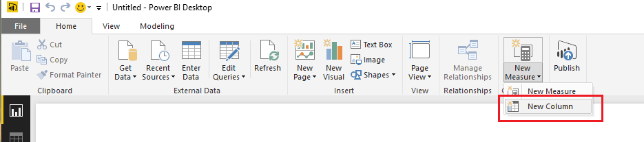
    Next, make four measures.  On the Home ribbon click the New Measure button.  Enter the following to establish a reference date to the subsequent equations:

    Date Reference = DATE(2016,12,31)

    Enter in the following equation to calculate the last year monthly sales amount.
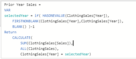
    LastYear = 
      VAR 
        CurrentDate = [Date Reference]
      RETURN
        CALCULATE( 
         SUM(Data[Sales]), 
         Data[Year] = YEAR(CurrentDate)-1
        )

    Note: Using the NOW() function calls the current time when the query was last run.  Thus, if you refresh your data next month the NOW() function wrapped in a YEAR() will return the current year from the date-time observed by PowerBI.

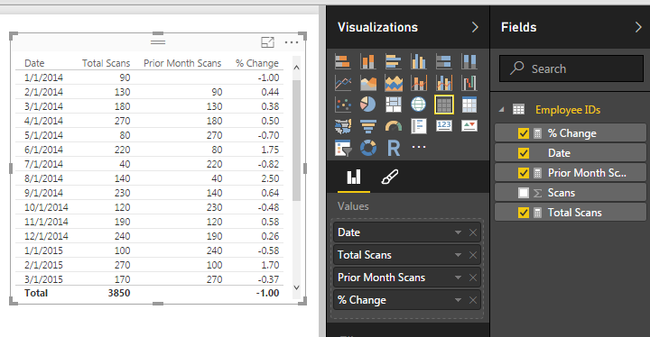
    Following the same process enter the following additional measures.  The ThisYear measure calculates the sales for the current month.

    ThisYear = 
      VAR 
       CurrentDate = [Date Reference] 
      RETURN
       CALCULATE(SUM(Data[Sales]),Data[Year] = YEAR(CurrentDate))

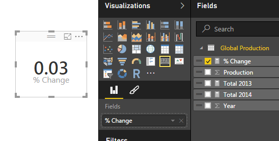
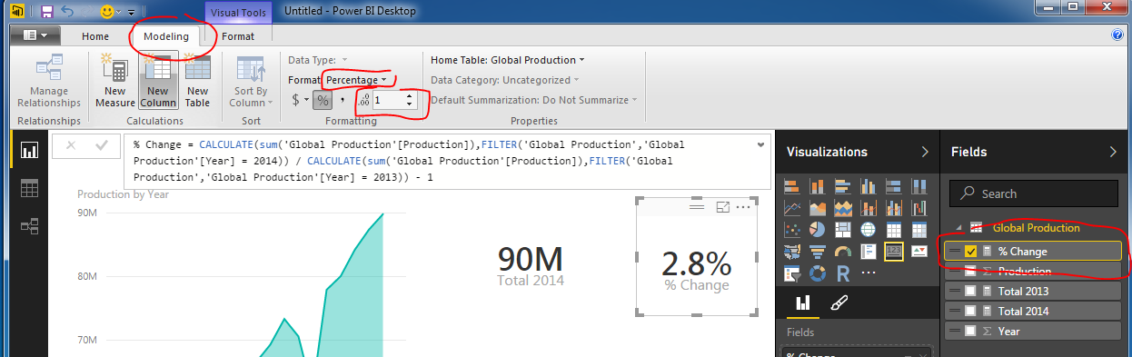
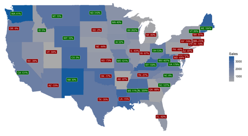
    Finally, add the calculation for the Year to Year comparison.

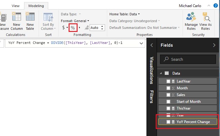
    YoY Percent Change = DIVIDE([ThisYear], [LastYear], 0)-1

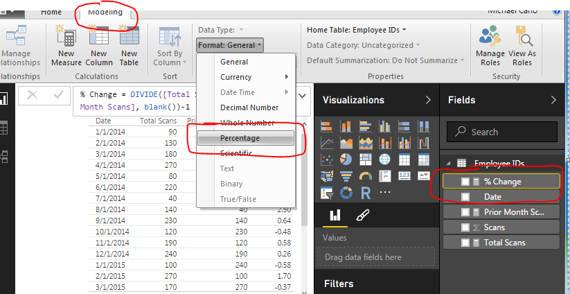
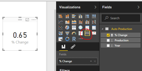
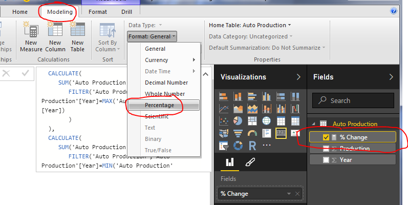
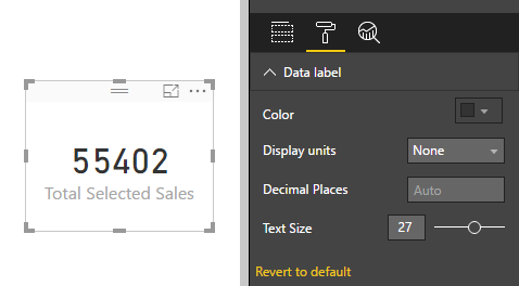
    Since the YoY Percent Change is a real percentage we need to change the formatting to a percent.  Click on the YoY Percent Change measure then on the Modeling ribbon click the symbol in the formatting section of the ribbon.

    Change Measure Format
    Change Measure Format

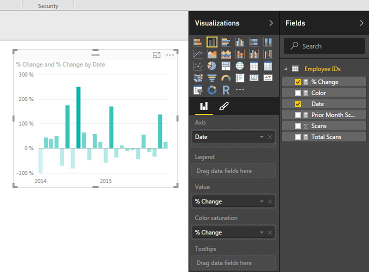
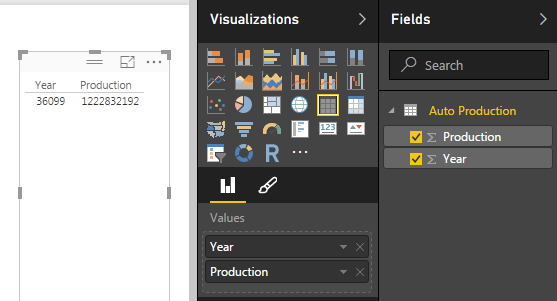
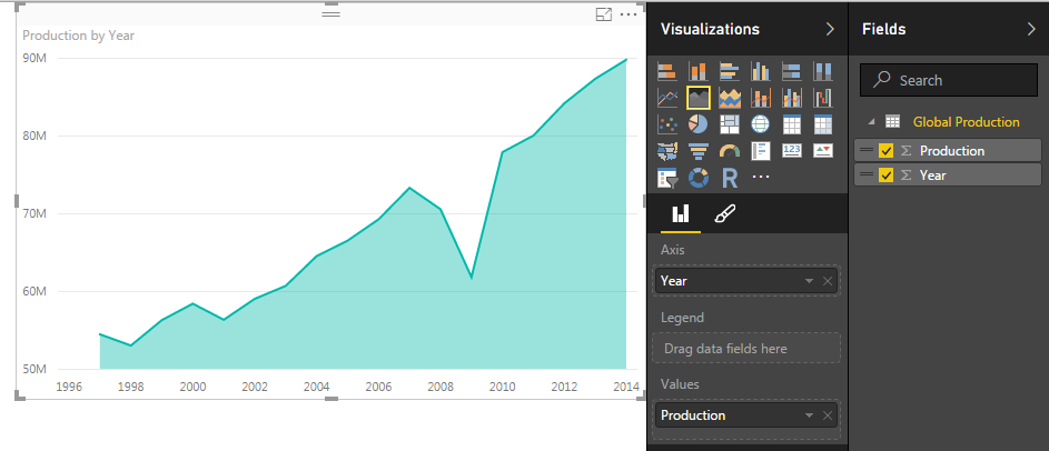
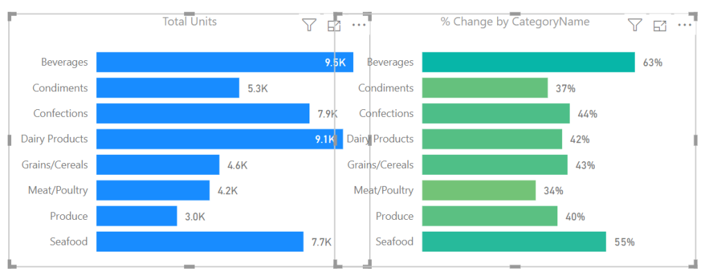
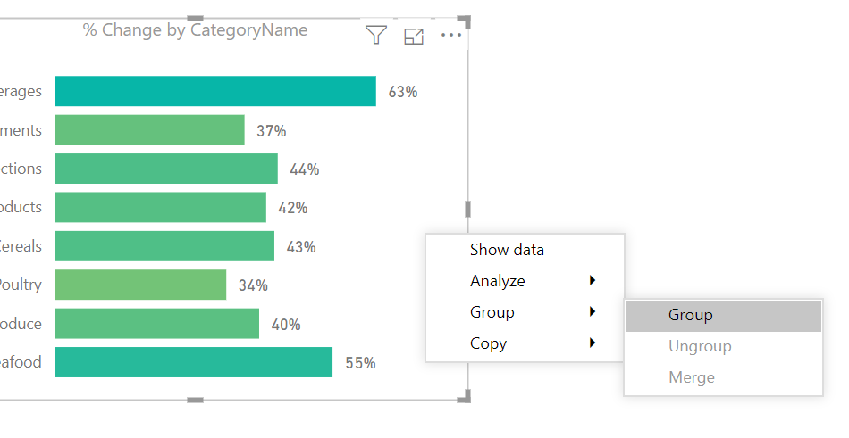
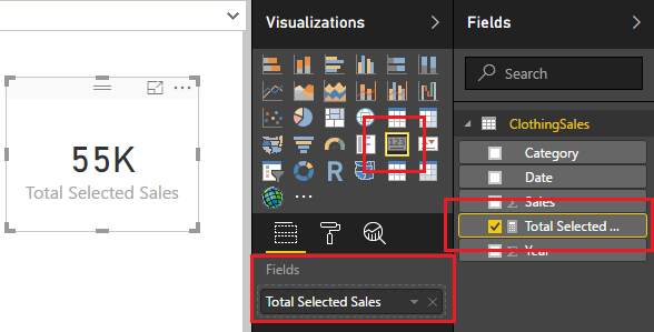
    Next, add a Stacked Column Chart with the following columns selected.

    Add Stacked Column Chart
    Add Stacked Column Chart

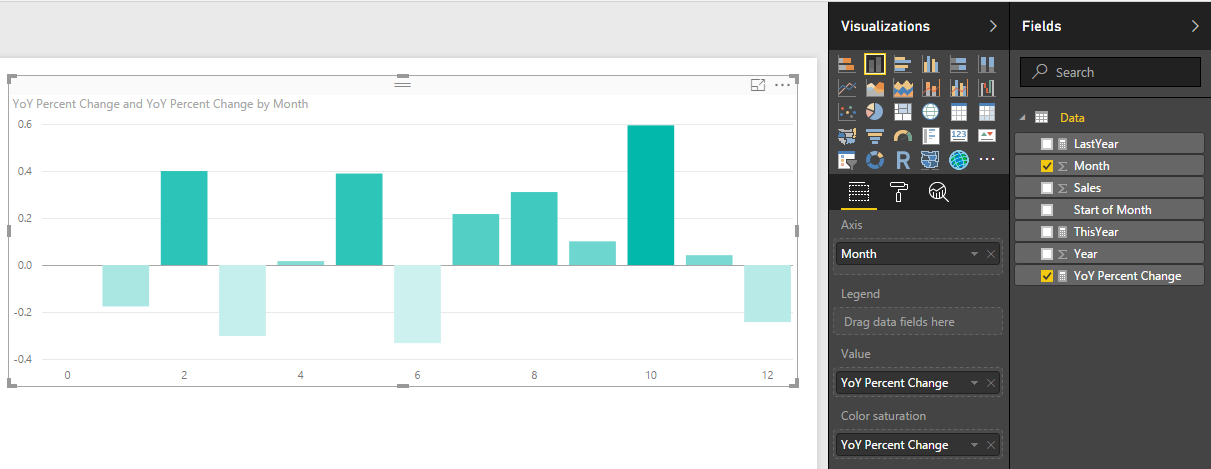
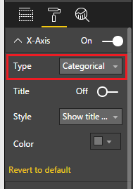
    OK, we have a chart, but it is kinda awkward looking right now.  The x-axis is the month number but we don’t have a month 0.  That simply does not make sense.  Let’s change some of the chart properties.  While having the Stacked Column Chart selected click on the Paint Roller in the Visualizations pane.  First, click on the X-Axis and change the Type to Categorical.

    Change X-Axis
    Change X-Axis

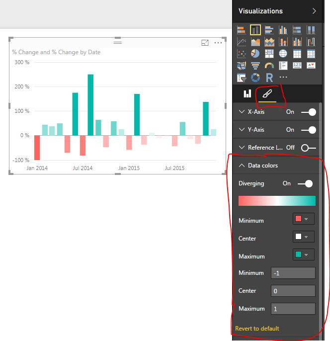
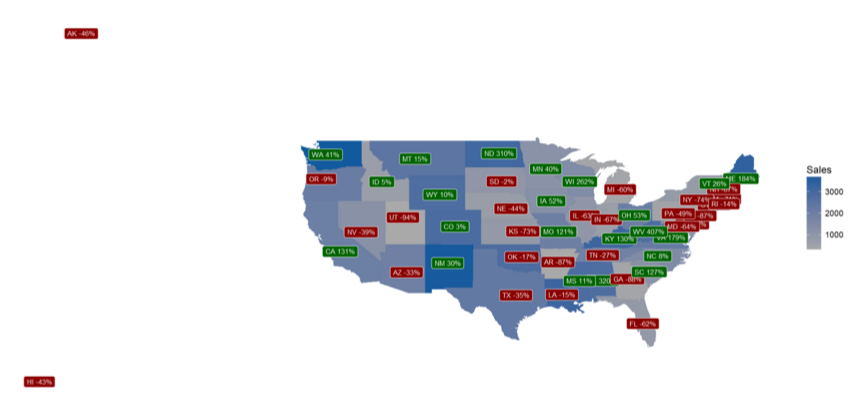
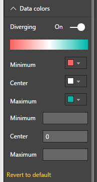
    Then click on the Data Colors and turn on Diverging.  Change the Minimum color to Red and the Maximum color to Green.  Set the Center to a value of 0.

    Change Colors
    Change Colors

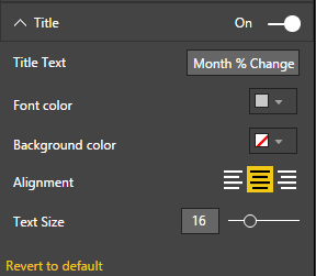
    Click on the Title change it something meaningful, Center the text and increase the font size.

    Change Title
    Change Title

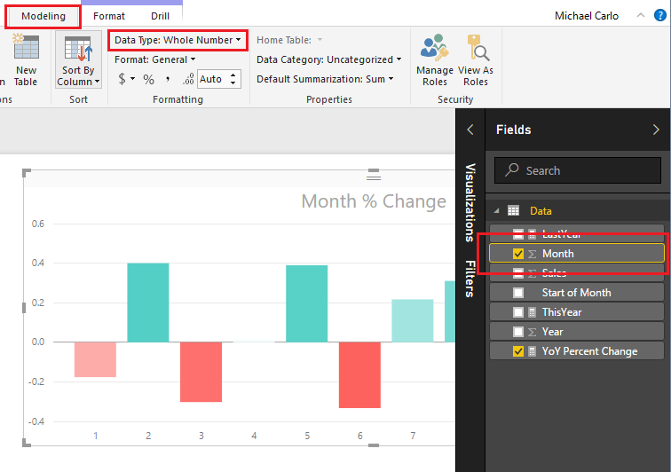
    Our bar chart looks much better.  However, the month numbers do not look quite right.  Visually the month indicators would be cleaner if we didn’t have any decimals.  Click on the Month field and then on the Modeling ribbon change the Data Type to Whole Number.  There will be a warning letting you know that you are changing the Data Type of the Whole number.  Click OK to proceed with the change.

    Change Month to Whole Number
    Change Month to Whole Number

    Another successful percent change tutorial completed.  I hope you enjoyed this year over year month comparison example.  Make sure you share if you like what you see.

  • Measures – Month to Month Percent Change

    Measures – Month to Month Percent Change

    I had an interesting comment come up in conversation about how to calculate a percent change within a time series data set.  For this instance we have data of employee badges that have been scanned into a building by date.  Thus, there is a list of Badge IDs and date fields.  See Example of data below:

    Employee ID and Dates
    Employee ID and Dates

    Looking at this data I may want to understand an which employees and when do they scan into a building over time.  Breaking this down further I may want to review Q1 of 2014 to Q1 of 2015 to see if the employee’s attendance increased or decreased.

    Here is the raw data we will be working with, Employee IDs Raw Data.  Our first step is to Load this data into PowerBI.  I have already generated the Advanced Editor query to load this file.  You can use the following code to load the Employee ID data:

    let
     Source = Csv.Document(File.Contents("C:\Users\Mike\Desktop\Employee IDs.csv"),[Delimiter=",", Columns=2, Encoding=1252, QuoteStyle=QuoteStyle.None]),
     #"Promoted Headers" = Table.PromoteHeaders(Source),
     #"Changed Type" = Table.TransformColumnTypes(#"Promoted Headers",{{"Employee ID", Int64.Type}, {"Date", type date}}),
     #"Sorted Rows1" = Table.Sort(#"Changed Type",{{"Date", Order.Ascending}}),
     #"Calculated Start of Month" = Table.TransformColumns(#"Sorted Rows1",{{"Date", Date.StartOfMonth, type date}}),
     #"Grouped Rows" = Table.Group(#"Calculated Start of Month", {"Date"}, {{"Scans", each List.Sum([Employee ID]), type number}})
    in
     #"Grouped Rows"

    Note: I have highlighted Mike in red because this is custom to my computer, thus, when you’re using this code you will want to change the file location for your computer.  For this example I extracted the Employee ID.csv file to my desktop. For more help on using the advanced editor reference this tutorial on how to open the advance editor and change the code, located here

    Next name the query Employee IDs, then Close & Apply on the Home ribbon to load the data.

    Close and Apply
    Close and Apply

    Next we will build a series of measures that will calculate our time ranges which we will use to calculate our Percent Change (% Change) from month to month.


    Now build the following measures:

    Total Scans, sums up the total numbers of badge scans.

    Total Scans = SUM('Employee IDs'[Scans])

    Prior Month Scans, calculates the sum of all scans from the prior month.  Note we use the PreviousMonth() DAX formula.

    Prior Month Scans = CALCULATE([Total Scans], PREVIOUSMONTH('Employee IDs'[Date]))

    Finally we calculate the % change between the actual month, and the previous month with the % Change measure.

    % Change = DIVIDE([Total Scans], [Prior Month Scans], blank())-1

    Completing the new measures your Fields list should look like the following:

    New Measures Created
    New Measures Created

    Now we are ready to build some visuals.  First we will build a table like the following to show you how the data is being calculated in our measures.

    Table of Dates
    Table of Dates

    When we first add the Date field to the chart we have a list of dates by Year, Quarter, Month, and Day.  This is not what we want.  Rather we would like to just see the actual date values.  To change this click the down arrow next to the field labeled Date and then select from the drop down the Date field.  This will change the date field to be viewed as an actual date and not a date hierarchy.

    Change from Date Hierarchy
    Change from Date Hierarchy

    Now add the Total Scans, Prior Month Scans, and % Change measures.  Your table should now look like the following:

    Date Table
    Date Table

    The column that has % Change does not look right, so highlight the measure called % Change and on the Modeling ribbon change the Format to Percentage.

    Change Percentage Format
    Change Percentage Format

    Finally now note what is happening in the table with the counts totaled next to each other.

    Final Table
    Final Table

    Now adding a Bar chart will yield the following.  Add the proper fields to the visual.  When your done your chart should look like the following:

    Add Bar Chart
    Add Bar Chart

    To add a bit of flair to the chart you can select the Properties button on the Visualizations pane.  Open the Data Colors section change the minimum color to red, the maximum color to green and then type the numbers in the Min, Center and Max.

    Changing Bar Chart Colors
    Changing Bar Chart Colors

    Well, that is it, Thanks for stopping by.  Make sure to share if you like what you see.  Till next week.

    Want to learn more about PowerBI and Using DAX.  Check out this great book from Rob Collie talking the power of DAX.  The book covers topics applicable for both PowerBI and Power Pivot inside excel.  I’ve personally read it and Rob has a great way of interjecting some fun humor while teaching you the essentials of DAX.

  • Measures – Dynamic Percent Change – Using DAX

    Measures – Dynamic Percent Change – Using DAX

    This tutorial will produce a measure that will dynamically calculate a percent change every time an item is selected in a visual.  The previous tutorial can be found here.  In the previous tutorial we calculated the percent change between two time periods, 2014 and 2013.  In practice it is not always desirable to force your measure to only look at two time periods.  Rather it would be nice that your measure calculations change with changes in your selections on visuals.  Thus, for this tutorial we will add some dynamic intelligence to the measures. Below is an example of what we will be building:

    First here is the data we will be using.  This data is the same data source as used in the previous % change tutorial.  To make things easy I’ll give you the M code used to generate this query.  Name this query Auto Production.

    let
     Source = Web.Page(Web.Contents("https://en.wikipedia.org/wiki/Automotive_industry")),
     Data0 = Source{0}[Data],
     #"Removed Columns" = Table.RemoveColumns(Data0,{"Change", "Source"}),
     #"Changed Type" = Table.TransformColumnTypes(#"Removed Columns",{{"Production", Int64.Type}, {"Year", Int64.Type}})
    in
     #"Changed Type"

    Note: the code shown above should be added as a blank query into the query editor.  Add the code using the Advanced Editor.  Another tutorial showing you how to add advanced editor code is here

    Once you’ve loaded the query called Auto Production.  The Field list should look like the following:

    Production
    Auto Production

    Next add a Table with Production and Year.  this will allow us to see the data we are working with.  When you initially make the table the Year and Production columns are automatically summed, thus why there is one number under year and production.

    Table of Data
    Table of Data

    Rather we want to see every year and the production values for each of those years.  To change this view click on the triangle in the Values section of the Visualizations pane.  This will reveal a list, in this list it shows that our numbers are aggregated by Sum change this to Don’t Summarize.

    Change to Don't Summarize
    Change to Don’t Summarize

    Now we have a nice list of yearly production levels with a total production at the bottom of our table.

    Table of Production Values by Year
    Table of Production Values by Year

    Next we will build our measure using DAX to calculate the percent changes by year.  Our Calculation for % change is the following:

    % Change  =  ( New Value / Old Value ) - 1

    Below is the DAX statement we use as our measure.  Copy the below statement into a new measure.

    % Change = 
    DIVIDE(
     CALCULATE(
     SUM('Auto Production'[Production]), 
     FILTER('Auto Production','Auto Production'[Year]=MAX('Auto Production'[Year])
     )
     ), 
     CALCULATE(
     SUM('Auto Production'[Production]),
     FILTER('Auto Production','Auto Production'[Year]=MIN('Auto Production'[Year])))
    ,0) 
    - 1

    I color coded the DAX expression between the two equations to show which parts correlated.  Note we are using the DIVIDE function for division.  This is important because if we run into a case where we have a denominator = 0 then an error is returned.  Using DIVIDE allows us to return a zero instead of an error.

    Next add our newly created measure as a Card.

    Add Card
    Add Card

    Change the % Change measure format from General to Percentage, do this on the Modeling ribbon under Formatting.

    Change Measure Formatting
    Change Measure Formatting

    Next add a slicer for Year. 

    Slicer for Year
    Slicer for Year

    Now you can select different year and the % change will automatically change based on our selection.  The % change will always select the smallest year’s production and the largest year’s production to calculate the % Change.   By Selecting the Year 2013 and 2007, the percent change is 19.15%.  The smallest year is 2007 and the largest is 2013.

    Selecting Two Years
    Selecting Two Years

    If we select a year between 2013 and 2007 the measure will not change.

    Multiple Years Selected
    Multiple Years Selected

    The measure will only change when the starting and ending years are changed.  By selecting the year 2014, the measure finally changes.

    Selecting Additional Year
    Selecting Additional Year

    Pretty cool wouldn’t you say?  Thanks for taking the time to walk through another tutorial with me.

    Want to learn more about PowerBI and Using DAX.  Check out this great book from Rob Collie talking the power of DAX.  The book covers topics applicable for both PowerBI and Power Pivot inside excel.  I’ve personally read it and Rob has a great way of interjecting some fun humor while teaching you the essentials of DAX.

  • Measures – Calculating % Change

    Measures – Calculating % Change

    In our last post we built our first measure to make calculated buckets for our data, found here.  For this tutorial we will explore the power making measures using Data Analysis Expressions (DAX).

    When starting out in Power BI one area where I really struggled was how to created % change calculations.  This seems like a simple ask and it is if you know DAX.

    Alright lets go find some data.  We are going to go grab data from Wikipedia again.  I know, the data isn’t to reliable but it is fun to play with something that resembles real data.  Below is the source of data:

    https://en.wikipedia.org/wiki/Automotive_industry

    To acquire the data from Wikipedia refer to this tutorial on the process.  Use the Get Data button, click on Other on the left, select the first item, Web. Enter the webpage provided above in the URL box.  Click OK to load the data from the webpage.  For our analysis we will be completing a year over year percent change.  Thus, select the table labeled By Year[edit].  Data should look like the following:

    Global Auto Production Wikipedia
    Global Auto Production Wikipedia

    This is the total number of automotive vehicles made each year globally from 1997 to 2014.  Click Edit to edit the data before it loads into the data model.  While in the Query Editor remove the two columns labeled % Change and Source.  Change the Name to be Global Production.  Your data will look like the following:

    Global Production Data
    Global Production Data

    Click Close & Apply on the Home ribbon to load the data into the Data Model.

    Add a quick visual to see the global production.  Click the Area Chart icon, and add the following fields to the visual, Axis = Year, Values = Production.  Your visual should look something like this:

    Area Chart of Global Production
    Area Chart of Global Production

    Next we will add a table to see all the individual values for each year.  Click the Table visual to add a blank table to the page.  Add Both Year and Production to the Values field of the visual.  Notice how we have a total for both the year and production volumes.  Click the triangle next to Year and change the drop down to Don’t summarize. 

    Change to Don't Summarize
    Change to Don’t Summarize

    This will remove the totaled amount in the year column and will now show each year with the total of Global Production for each year.  Your table visual should now look like the following:

    Table of Global Production
    Table of Global Production

    Now that we have the set up lets calculate some measures with DAX.  Click on the button called New Measure on the Home ribbon.  The formula bar will appear.  We will first calculate the total production for 2014.  We will build on this equation to create the percent change.  Use the following equation to calculate the sum of all the items in the production column that have a year value of 2014.

    Total 2014 = CALCULATE(sum('Global Production'[Production]),FILTER('Global Production','Global Production'[Year] = 2014))

    Note: I know there is only one data point in our data but go alone with me according to the principle.  In larger data sets you’ll most likely have multiple numbers for each year, thus you’ll have to make a total for a period time, a year, the month, the week, etc..

    This yields a measure that is calculating only the total global production in 2014.  Add a Card visual and add our new measure “Total 2014” to the Fields.  This shows the visual as follows, we have 90 million vehicles produced in 2014.

    2014 Production
    2014 Production

    Repeat the process above instead use 2013 in the Measure as follows:

    Total 2013 = CALCULATE(sum('Global Production'[Production]),FILTER('Global Production','Global Production'[Year] = 2013))

    This creates another measure for all the production in 2013.  Below is the Card for the 2013 Production total.

    2013 Production
    2013 Production

    And for my final trick of the evening I’ll calculate the percent change between 2014 and 2013.  To to this we will copy the portions of the two previously created measure to create the percent change calculation which follows the formula [(New Value) / (Old Value)]- 1.

    % Change = CALCULATE(sum('Global Production'[Production]),FILTER('Global Production','Global Production'[Year] = 2014)) / CALCULATE(sum('Global Production'[Production]),FILTER('Global Production','Global Production'[Year] = 2013)) - 1

    This makes for a long equation but now we have calculated % change between 2013 and 2014.

    Percent Change
    Percent Change

    Wait you say.  That seems really small, 0.03 % change is next to nothing.  Well, I applaud you for catching that.  This number is formatted as a decimal number and not a percentage, even though we labeled it as % change.  Click the measure labeled % Change and then Click on the Modeling ribbon.  Change the formatting from General to Percentage with one decimal.  Notice we now have a percentage.

    Change Format to Percentage
    Change Format to Percentage

    Thanks for working along with me.  Stay tuned for more on percent change.  Next we will work on calculating the percent change dynamically instead of hard coding the year values into the measures.

    Want to learn more about PowerBI and Using DAX.  Check out this great book from Rob Collie talking the power of DAX.  The book covers topics applicable for both PowerBI and Power Pivot inside excel.  I’ve personally read it and Rob has a great way of interjecting some fun humor while teaching you the essentials of DAX.

    Please share if you liked this tutorial.

  • Grouping with Style

    Grouping with Style

    Grouping with Style

    The release of grouping visuals was an extremely welcomed feature. As one who builds lots of reports grouping elements together is essential to stay organized and to increase report building speed. Since I’ve been using this great new, I found an interesting design element to style groupings for reporting impact. The grouped visuals feature enables a new property, background color.  This can be applied for the entire group of visuals.

    See the following example of setting a background around two visuals.

    In this example the intent is to show the user that these two visuals are related. The graph on the left shows the number of units sold for a selected time period. The bar chart on the right shows the relative sales over time represented as a percent change. This illustrates the principle of position and direction. The number of units sold is what happened right now. It is my place in time with respect to sales. However, this does not show any context to performance. The percent change provides the directional context.  Since the position and direction are an important insight as a paired visual, we use the grouping to visually bind the two.

    For those who have done some research around design principals inevitably you will stumble across the Gestalt Principals of design.  Grouping visuals with a common background falls into the Law of Common Region or Law of Proximity.

    Alright let’s walk through how to use grouping with backgrounds colors. 

    Once you have created the visuals which will be grouped together; select each visual by holding CTRL and Selecting each visual.

    Right Click on one of the visuals and select the menu item labeled Group, in the flyout menu select the option called Group.

    A grouped element will be created in the Selection Pane

    Note: If you don’t see the Selection Pane, you will need to turn this on.  The setting to turn the Selection Pane is found in the View ribbon with the check box for Selection Pane. See below for reference.

    With the newly created group being selected, Click on the Paint Roller (Format) icon in the Visualizations Pane.

    Expand the property section called Background. Toggle the background to be On and select a Color from the drop-down menu.  For this example, I selected the very first shade of grey in the first column of colors.

    The final product will be a grouped arrangement of visuals with a shaded background.

    To extend this idea further we can take the same approach when working with Text boxes and Visuals.  Often, I find I need more style for applying a Text box or header to a visual.  In these cases, I will use two visual elements to create one visual.  See this example of two visuals with custom titles created with a textbox.

    Note: Backgrounds are colored differently to illustrate that each background for the grouped visuals is different.

    While this meets the need the boxes are not identical in size.  This violates yet another Gestalt Principle, symmetry.  The bounding regions of the elements inside the grouping define the outer perimeter of the background shading.  Knowing this we can modify the visuals within the groups to provide a symmetrical background shape.

    Here are the same before and after images with each visual object colored to see the adjustments in size for each visual type.  This creates the proper background sizes. 

    Before:

    After:

    The visual on the left required an increase of the text box at the top to get the desired width of the background shape.  By contrast the visual on the right required an extension of the bar chart in length to acquire the desired length of the background.  The result provides a symmetric view of both visual groups.

    If you like the content from PowerBI.Tips please follow us on all the social outlets. Stay up to date on all the latest features and free tutorials.  Subscribe to our YouTube Channel.  Or follow us on the social channels, Twitter and LinkedIn where we will post all the announcements for new tutorials and content.

    Introducing our PowerBI.tips SWAG store. Check out all the fun PowerBI.tips clothing and products:

    Check out the new Merch!

    Hasta La Vista Data
    Go Ahead Make My Data
    PBIX Hat


  • Power BI World Tour 2017 – Chicago – Top Tips

    Power BI World Tour 2017 – Chicago – Top Tips

    To everyone who was able to attend the Power BI World Tour 2017, Thank you!  It has been a pleasure presenting my favorite tips and trips.  This post consolidates all the links for each topic that was discussed.  All the links to the content are below, if you want to go through the tutorials at your own pace hit a link below.   When going through 7 topics in an hour, it is difficult to completely learn everything.  So, if your like me, you learn by doing, making mistakes and gritting it out until you understand.  Enjoy and have fun.

    Mike Carlo

    https://powerbi.tips/2016/06/loading-data-from-folder/

    https://powerbi.tips/2017/03/using-parameters-to-enable-sharing/

    https://powerbi.tips/2016/07/measures-month-to-month-percent-change/

    Note: Percent change seems like a major topic, if you want to see more tutorials on percent change you can follow this link for more tutorials.

    https://powerbi.tips/2016/04/power-bi-histogram-with-bins/

    https://powerbi.tips/2016/09/hexbin-plot-using-r/

    https://powerbi.tips/tools/report-theme-generator-v3/

    https://powerbi.tips/2017/08/best-practices-for-sharing/

    If you like this content and found it valuable make sure you share it with others.  Odds are they will like it as well.

    Want to meet more people who love Power BI, get connected with the Power BI User Groups (PUG).  Click this link to find your nearest PUG group.

  • Microsoft Data Insights Summit

    Microsoft Data Insights Summit

    This year I had the wonderful privilege to attend the Microsoft Data Insights summit for 2017 as a speaker.  My topic was the Top Ten Tutorials from PowerBI.Tips.  So, let me say thank you to all those who attended you provided a very fun audience and were very positive, Thanks.   For those of you who couldn’t make it to the Data Insights Summit below is the actual talk:


    We went through 10 different tutorials in 50 minutes.  Needless to say we went pretty quick.  So, if you were there, or just want to go through the tutorials on your own here is the list of the Top Ten Tutorials.

    10. Loading Data From a Folder ( Link to Tutorial )

    9. Using Parameters ( Link to Tutorial )

    8. Loading Multiple Excel Files ( Link to Tutorial )

    7. Custom Date Tables ( Link to Tutorial )

    6. Percent Change ( Link to Tutorial )

    5. Histograms & Disassociated Tables ( Link to Tutorial )

    4. Bar and Whisker Plot in R ( Link to Tutorial )

    3. Bar, Scatter, and Area Chart in R ( Link to Tutorial )

    2. HEX Bin Scatter Plot in R ( Link to Tutorial )

    1. Color Theme Generator ( Link to Tutorial, Link to Advanced Color Theme Generator )


    If you wan to learn more about Power BI or DAX follow this Link to books and other helpful Power BI resources.

  • Using Variables within DAX

    Using Variables within DAX

    Every so often you find a hidden gem, something so valuable, just hiding there in plain sight.  Recently, I found out that I LOVE the using Variables with in a DAX expression.  Ok, brief introduction, I was trying to calculate sales changes between different years.  The data looked similar to the following table:

    Year Month Sales
    2013 1 20
    2013 2 25
    2014 1 22
    2014 2 23
    2015 1 21
    2015 2 31

    I wanted to sum the sales for each year and compare the percent change between each year.  If you have followed my blog for a while, I have a ton of tutorials about percent change.  ( See list of other tutorials dealing with percent change )

    Now, for the twist making this calculation more difficult.  I want to calculate percent change even when a filter is applied by clicking on a visual.  By using variables we can apply some data modeling voodoo magic to get the desired results.  See a sample of the measures working in the Power BI Embedded sample below:

    Let’s dive in!

    Open up PowerBI Desktop, Click the Get Data button on the Home ribbon and select Blank Query.  Click Connect to open the Query Editor.  On the View ribbon click the Advanced Editor button.  While in the Advanced Editor paste the following code into the editor window, click Done to complete the data load.

    Note: If you need some more help loading the data follow this tutorial about loading data using the Advanced Query Editor.  This tutorial teaches you how to copy and paste M code into the Advanced Editor.

    let
     Source = Excel.Workbook(Web.Contents("https://powerbitips03.blob.core.windows.net/blobpowerbitips03/wp-content/uploads/2017/05/Clothing-Sales.xlsx"), null, true),
     ClothingSales_Table = Source{[Item="ClothingSales",Kind="Table"]}[Data],
     #"Changed Type" = Table.TransformColumnTypes(ClothingSales_Table,{{"Date", type date}, {"Category", type text}, {"Sales", Int64.Type}}),
     #"Inserted Year" = Table.AddColumn(#"Changed Type", "Year", each Date.Year([Date]), type number)
    in
     #"Inserted Year"

    Your loaded data should look like the following:

    Load ClothingSales Data
    Load ClothingSales Data

    Rename the Query to ClothingSales, and click Close & Apply to load the data into the data model.

    It is a good practice to review the data columns and verify that the formatting is set up correctly.  To do this click on the the column Date in the Fields pane, then click on the Modeling ribbon.  In the Formatting section change the format to Date Time and select M/d/yyyy format.  Repeat this for the following columns:

    • Format Sales to Currency then select $ English (United States)
    • Format Year to Whole Number

    With our data properly formatted we are ready to build a simple bar chart.  See the image below for the bar chart set up:

    Create Bar Chart
    Create Bar Chart

    To start we will create a explicit calculation for the total selected sales.  On the Home ribbon click the New Measure button and enter the following code:

    Total Selected Sales = SUM(ClothingSales[Sales])

    Pro Tip: To learn more about explicit vs implicit calculations within Power BI Click the following link.

    Add a Card visual and add our new measure.

    Add Card Visual
    Add Card Visual

    Let’s change the formatting measure so we can see the full number.  With the Card still selected click the Paint Roller expand the section labeled Data label and change the units from Auto to None.  This allows us to see the entire sales number.

    Remove Number Formatting from Card
    Remove Number Formatting from Card

    Let’s enhance this card visual further by adding dollars formatting.  Make sure you have the Total Selected Sales measure selected by Clicking on the words of the measure.  Then, click on the Modeling ribbon click and change the Format to Currency, then select $ English (United States). The final format of the card visual should look like the image below:

    Final Card Format
    Final Card Format

    For the next step we will repeat the previous steps for our new measures.

    1. Create the measure
    2. Change the formatting of the card
    3. Change the formatting of the measure

    The next measure will calculate the prior year total sales, but only calculate this value when a filter context from a different visual is applied.  Take note this is the magic I was talking about!!

    Prior Year Sales = 
    VAR 
    selectedYear = if( HASONEVALUE(ClothingSales[Year]), 
        FIRSTNONBLANK(ClothingSales[Year],ClothingSales[Year]),
        BLANK() )-1
    Return 
        CALCULATE(
            SUM(ClothingSales[Sales]),
            ALL(ClothingSales),
            ClothingSales[Year] = selectedYear)

    I am going to pause a second here and explain what is going on in this measure as we have multiple things going on.  First, we are creating a variable with the VAR.  In the below image I show you that the variable that we are defining is called selectedYear.  SelectedYear returns a value of blank if multiple years are selected.  This is accomplished by using the if statement and the HASONEVALUE() DAX formula.  The Return in then allows us to output a value.  In this case we are using the CALCULATE() to sum all the sales.  The next part is crucial to making this work.  Within the Calculate we are applying two filters.  The first filter selects the entire table with the All() then we apply the filter from the earlier defined variable with the name of selectedYear.

    Prior Year Sales in Color
    Prior Year Sales in Color

    Apply the same formatting steps 2, and 3 mentioned earlier.  Now, we can select one of the years within our bar chart.  Doing so populates the two measures we created.  The selected year total sales, and the prior year of sales. I selected the year of 2014, which has sales of $11k.  Hover your mouse over the bar for year 2013 and the tool tip will appear showing a total sales of $10K.

    Selected Bar
    Selected Bar

    Now we will make our percent change measure.  Enter the following as a new measure:

    Percent Change = DIVIDE([Total Selected Sales],[Prior Year Sales],1)-1

    Pro Tip: Use the DAX function DIVIDE when dividing two numbers, this protects against odd cases where the denominator is zero.

    Click on the Modeling ribbon and change the formatting of the measure to Percentage.  Add a final measure that calculates the difference.  See measure below:

    Prior Year Delta = [Total Selected Sales] - if( [Prior Year Sales] = BLANK(), [Total Selected Sales],[Prior Year Sales])

    This measure calculates the total changes in sales between the two selected years.  The if statement at the end of the equation handles a special case that if you don’t have any individual year selected the prior year delta defaults to zero.

    Thanks for following along an learning about variables.  Trust me, these are super helpful.  Make sure you spend some learning how to leverage variables in your DAX equations.

    This Tutorial was inspired by the following article I found from SQLBI authored by the master of DAX Alberto Ferrari.  I mean, come on, Ferrari, how baller is that last name!  I guess that is why he is the master.  Kudos to you Alberto!

    Still need more reading about DAX, check out the following books:

  • Grouping and Improved Date Slicer

    Grouping and Improved Date Slicer

    In the October update of PowerBI Desktop we were given a number of really useful features, ranging from a new Date Slicer, Grid lines, Grouping, Binning, Top N Filters, and R-powered custom visuals.  For the full release on the October 2016 software release you can read more here.

    For those of you who have followed my site you already know that I absolutely love the ability to create R-visuals within PowerBI.  If you want to learn more you can read the R script tutorials here.

    As I’ve been exploring this October release of Power BI Desktop two features have really stood out.  First, the ability to use the Date Slicer and second the new feature of Grouping for Bar Charts.  In my daily work flow I have struggled in the past with solutions which are now solved.

    Welcome to my love & hate relationship with time bound data sets.  Inevitability at some point you will encounter a need to manipulate data over time.  Common business questions will come in the form of:  What was my percent change compared from this month compared to last month?  What is my sales performance for this year? Are we up or down compared to the same period last year?  While these questions are simple I have found that calculating measures and subsequently building visuals can get very complex in a hurry.  Enter the Date Slicer.  Let me be clear, the Date Slicer will not solve all your problems, it does present a very useful interface that will let report users quickly navigate through their time delineated data.

    What is the Date Slicer?  I’m glad you asked. Behold….

    Date Slicer
    Date Slicer

    Here are a couple of key items to point out.  On the left side of the visual you are given the ability to select the starting date, and ending date.

    Start and End Dates
    Start and End Dates

    The bottom of the Date Slicer has an adjustable time bar that allows quick time adjustments.

    Changed Timeline
    Changed Timeline

    On the right side of the visual you can toggle between different date selection modes, Between, Before, After, and List.

    Time Parameter Selector
    Time Parameter Selector

    Ok, enough about the Date Slicer, how about the Groupings feature.  Lets say you start off with a bar chart that looks similar to the following:

    Sample Bar Chart
    Sample Bar Chart

    Well, maybe you’re only interested in Items 9, 10, and 5.  Grouping now allows the selection of multiple bars and by right clicking you can Group, Include, or Exclude.

    Right Click on Selected Data Bars
    Right Click on Selected Data Bars

    Clicking group creates a new column in the Fields area that groups the items together and adds them to the chart legend.

    Grouped Items in Bar Chart
    Grouped Items in Bar Chart

    Let me tell you this is helpful, especially when your bar chart looks like this:

    Ugly Bar Chart
    Ugly Bar Chart

    Be honest, you have published a report or two when there were just way to many bars.  The different between the largest bar and all the small bars barely tells you any information.  This is why grouping is helpful.  When you receive data and you need to focus your story to the important pieces then grouping is your friend.

    Enough babbling, let’s get to the tutorial.

    Open up PowerBI Desktop, Click the Get Data button on the Home ribbon and select Blank Query.  Click Connect to open the Query Editor.  Click Advanced Editor on the View ribbon.  While in the Advanced Editor paste the following code into the editor window, click Done to complete the data load.

    Note: If you need some more help loading the data follow this tutorial about loading data using the Advanced Query Editor.  This tutorial teaches you how to copy and paste M code into the Advanced Editor.

    let
     Source = Excel.Workbook(Web.Contents("https://powerbitips03.blob.core.windows.net/blobpowerbitips03/wp-content/uploads/2016/11/Sales-Data-Two-Years.xlsx"), null, true),
     Sales_Table = Source{[Item="Sales",Kind="Table"]}[Data],
     #"Changed Type" = Table.TransformColumnTypes(Sales_Table,{{"Date", type date}, {"Product", type text}, {"Sales", Int64.Type}})
    in
     #"Changed Type"

    Rename the Query to Sales Data.  Once you’ve completed the data load your data should look like the following.

    Load Sales Data
    Load Sales Data

    On the Home ribbon click Close & Apply to complete the data load.

    Close and Apply
    Close and Apply

    Great, we are ready to start adding visuals now.  Add a Slicer visual from the Visualizations window and populate the visual with the Date field.  By default, the slicer will auto recognize that the field being added is a date and will automatically show the Date Slicer.

    Add Date Slicer
    Add Date Slicer

    Next, add a bar chart visualization.  The Date field will be the Axis, and the Sales will be the Value.

    Add Bar Chart
    Add Bar Chart

    Again by default the Date filed will be entered as a Hierarchy field.  Click the Drill Down button until you see a monthly view of the date.  This should require two clicks, the first drills down to quarters, then second click drills down to month level.  After doing this your visual should look like the following:

    Drill Down to Month
    Drill Down to Month

    Add a second bar chart with following fields selected.

    Second Bar Chart
    Second Bar Chart

    Sort the Sales by Product bar chart in descending sale order by clicking the Ellipsis and when the drown down menu appears selecting Sort by Sales.

    Descending Sort by Sales
    Descending Sort by Sales

    Now that we have built a couple visuals and a Date Slicer, take some time to explore how the Date Slicer interacts with the bar charts.  In the example below I modified the starting date to 6/1/205 and the ending date to be 9/30/2015.

    Modify Date Slicer Properties
    Modify Date Slicer Properties

    To utilize the grouping feature we will group Items 1,2,3 and 4 together.  While holding the control button click Items 1,2,3 and 4 on the Sales by Product bar chart.

    Ctrl Click Items
    Ctrl Click Items

    Right click Item 3 an menu will appear, select Group.  Notice once you do this a new Product (Group) field appears in the field menu and the Product (Group) is automatically added to the legend of the bar chart visual.

    Grouping in Bar Chart
    Grouping in Bar Chart

    To edit the grouping you can click on the Field labeled Product (groups) and select Edit Groups.  Doing this reveals the grouping dialog box.

    Grouping Dialog Box
    Grouping Dialog Box

    You can rename the created group by double clicking the name Item 1 & Item 2 & Item 3 & Item 4.  

    Rename Grouping
    Rename Grouping

    Change the name of the grouping to be titled Special Items.  Click OK to close the Groups dialog box. Notice how the bar chart updates the legend values to renamed grouping.

    Rename Group
    Rename Group

    Well, that wraps up this tutorial.  I hope you enjoyed it.  Below is a live demo of what we built today.

    Make sure you share the content if you liked this tutorial.

  • Map with Data Labels in R

    Map with Data Labels in R

    Mapping is one of the better features of PowerBI.  It is one of the more distinguishing feature differences between Excel and PowerBI.  You can produce a map inside an excel document using Bing maps, however, the experience has always felt a little like an after-thought.  Mapping within PowerBI has a planned, and thoughtful integration.  While the mapping functionalities within PowerBI Desktop are far improved when compared to excel, there are still some limitations to the mapping visuals.  This past week I encountered such an example.  We wanted to draw a map of the United States, add state name labels and some dimensional property like year over year percent change.

    I started with the standard map visual, but this didn’t work because there is no ability to shade each state individually.  This just looked like a bubbled mess.

    Globe Map Visual
    Globe Map Visual

    Next, I tried the Filled Map visual.  While this mapping visual provides the colored states it lacks the ability to add data labels onto the map.  Clicking on the map would filter down to the selected state, which could show a numerical value.  Alternatively, you can place your mouse over a state and the resulting tag will show the details of the state (hovering example provided below).

    Filled Map Visual
    Filled Map Visual

    Still this did not quite meet my visual requirements.  I finally decided to build the visual in R which provided the correct amount of flexibility. See below for final result.  You can download the pbix file from the Microsoft R Script Showcase.

    R Map Visual
    R Map Visual

    In this visual, each state is shaded with a gradient color scale.  The states with the lowest sales are grey and the states with higher sales numbers transition to dark blue.  The darker the blue the more sales the state saw.  Each state has an applied label.  The color of the label denotes the percent change in sales.  If the color is green then the sales this year were higher than last year, red means that the state sales were lower this year.  The state name is listed in the label as well as the calculation for the year over year percent change.

    Alright, let’s start the tutorial.

    First, before we open PowerBI we need to load the appropriate packages for R.  For this visual you will need to load both the maps and the ggplot2 packages from Microsoft R Open.

    Open the R console and use the following code to install maps.

    install.packages('maps')

    Install Maps Package
    Install Maps Package

    Repeat this process for installing ggplot2.

    install.packages('ggplot2')

    After installing the R packages we are ready to work in PowerBI Desktop.  First, we need to load our sample data.  Open up PowerBI Desktop and start a blank query.  On the View ribbon in the query editor open the Advanced Editor and enter the following M code.

    Note: If you need some more help loading the data follow this tutorial about loading data using the Advanced Query Editor.  This tutorial teaches you how to copy and paste M code into the Advanced Editor.

    let
      Source = Excel.Workbook(Web.Contents("https://powerbitips03.blob.core.windows.net/blobpowerbitips03/wp-content/uploads/2016/10/State-Data.xlsx"), null, true),
      StateData_Table = Source{[Item="StateData",Kind="Table"]}[Data],
      #"Changed Type" = Table.TransformColumnTypes(StateData_Table,{{"StateName", type text}, {"Abb", type text}, {"TY Sales", Int64.Type}, {"state", type text}, {"Latitude", type number}, {"Longitude", type number}, {"LY Sales", Int64.Type}, {"Chng", type number}}),
      #"Renamed Columns" = Table.RenameColumns(#"Changed Type",{{"TY Sales", "Sales"}})
    in
      #"Renamed Columns"

    After pasting the code into the Advanced Editor click Done to load the data.  While in the Query Editor, rename the query to be StateData, then click Close & Apply on the Home ribbon.

    Load Mapping Data
    Load Mapping Data

    We still need to prepare the data further by adding two calculated columns.  Click the bottom half of the New Measure button on the Home ribbon and select New Column.

    Add New Column
    Add New Column

    Enter the following code into the formula bar that appears after clicking New Column.

    Change = StateData[Abb] & " " & ROUND(100*StateData[Chng],0) & "%"

    Change Column Measure
    Change Column Measure

    Again, click on the New Column button found on the Home ribbon and add the code for a color column.

    Color = if(StateData[Chng] > 0 , "Dark Green", "Dark Red")

    Color Column Measure
    Color Column Measure

    The Fields list should now look like the following.

    Fields List
    Fields List

    Add the R visual with the following fields.

    R Visual Fields
    R Visual Fields

    Add the following R script into the R Script Editor.

    # Load the ggplot2 and maps packages
     library(ggplot2)
     library(maps)
    
    # Load the mapping data into a dataframe called states_map
     states_map <- map_data("state")
    
    # Start ggplot2 by sending it the dataset and setting the map_id variable to state
     ggplot(dataset, aes(map_id = state)) +
    
    # Add the map layer, define the map as our data frame defined earlier
     # as states_map, and define the fill for those states as the Sales data
     geom_map(map = states_map, aes(fill=Sales)) +
    
    # Add the data for the labels
     # the aes defines the x and y cordinates for longitude and latitude
     # colour = white defines the text color of the labels
     # fill = dataset$Color defines the label color according to the column labeled Color
     # label = dataset$Change defines the text wording of the label
     # size = 3 defines the size of the label text
     geom_label( aes(x=Longitude, y=Latitude), 
      colour="white", 
      fill=dataset$Color, 
      label=dataset$Change, size=3
      ) +
    
    # define the x and y limits for the map
     expand_limits(x = states_map$long, y = states_map$lat) +
    
    # define the color gradient for the state images
     scale_fill_gradient( low = "dark grey", high = "#115a9e") +
    
    # remove all x and y axis labels
     labs(x=NULL, y=NULL) +
    
    # remove all grid lines
     theme_classic() +
    
    # remove other elements of the graph
     theme(
      panel.border = element_blank(),
      panel.background = element_blank(),
      axis.ticks = element_blank(),
      axis.text = element_blank()
      )

    After adding the R script press the execute button to reveal the map.

    Paste R Script
    Paste R Script

    Final Map Product
    Final Map Product

    Notice how we have data included for Alaska and Hawaii but those states are not drawn.  We want to remove the Alaska and Hawaii data points.  Add the StateName field to the Page Level Filters and then click Select All.  Now, un-check the boxes next to Alaska and Hawaii.  The data is now clean and the map correctly displays only the continental United States.

    Page Level Filters
    Page Level Filters

    Here is the filtered final map product.

    Filtered Final Map
    Filtered Final Map

    Thanks for following along.  I hope you enjoyed this tutorial.  Please share if you liked this content.  See you next week.