Tag: Tutorials

  • Crazy Table Gymnastics – Part 2 – Build Support Materials

    Crazy Table Gymnastics – Part 2 – Build Support Materials

    This is part 2 in the 3 part series on developing super cool tables using some fancy measures.  In part 1 we walked through how to build a table that uses an un-pivoted data source in the Query Editor.  This technique allows you to change the types of categorical values in a table.  If you missed part 1 and want to get caught up follow this link.  Now, continuing with the series, Part 2, we will build the supporting materials (Selector Table, What If Slicers, and measures) for the report.

    Once we are done the final product will look like the following:

    Part 2… Go.

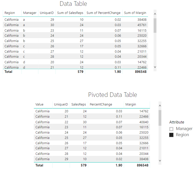
    To make sure we are starting off on the correct step.  We left off part 1 when we had completed a Pivoted Data Table and included an Attribute Slicer that would allow us to toggle between the Manager and Region Categories.  Your table should look like the following diagram:  (If you don’t have this you might want to start with Part 1 found here)
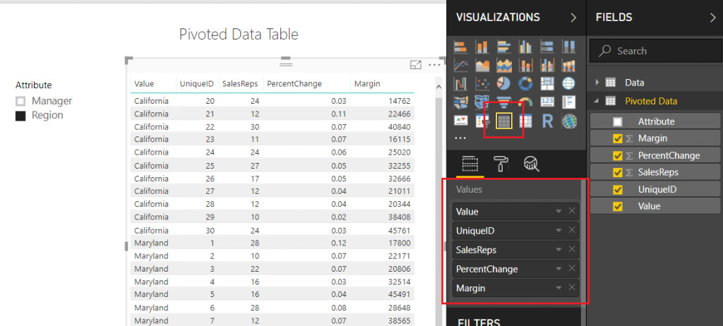
    Pivoted Data Table
    Pivoted Data Table

    Note: I have also included a Slicer which is used with the Attribute field.

    Next, we will need to add a table that will allow us to use the SalesReps, PercentChange, and Margin column headers in our report.  On the Home ribbon click Edit Queries, then select New Source on the Home ribbon.  In the Get Data window select Blank Query, click Connect to proceed.  Open the advanced editor by clicking the Advanced Editor button found on the Home ribbon.  Enter the following M code into the Advanced Editor:

    let
       Source = #"Pivoted Data",
       #"Kept First Rows" = Table.FirstN(Source,1),
       #"Removed Columns" = Table.RemoveColumns(#"Kept First Rows",{"Attribute", "Value", "UniqueID"}),
       #"Unpivoted Columns" = Table.UnpivotOtherColumns(#"Removed Columns", {}, "Attribute", "Value"),
       #"Removed Columns1" = Table.RemoveColumns(#"Unpivoted Columns",{"Value"})
    in
       #"Removed Columns1"

    Click Done to close the Advanced Editor.  Rename the table to Selector.  When you are finished your table should look like the following:
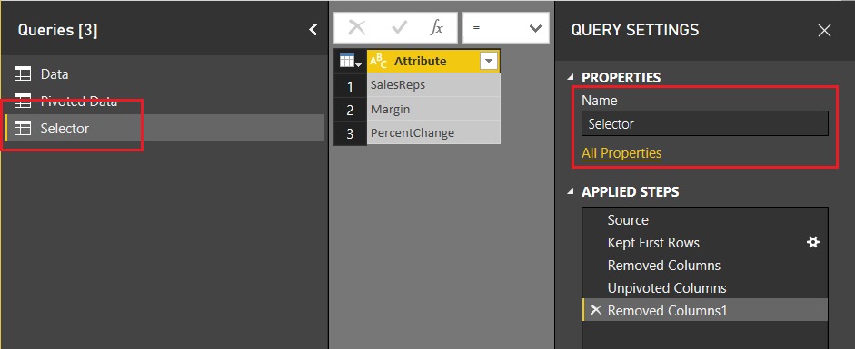
    Create Selector Table
    Create Selector Table

    Click Close & Apply on the Home ribbon to close the Query Editor.  Add a slicer with the following selections:
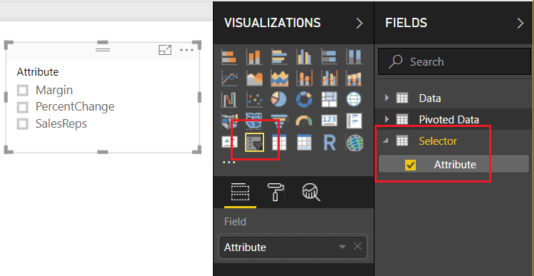
    Add Selector Attribute Slicer
    Add Selector Attribute Slicer

    Now, we want to detect which of the Attributes have been selected from this table.  We can accomplish this by creating a measure using the DAX function SELECTEDVALUE.  Right Click on the table named Selector and from the drop down select New Measure.  Enter the following DAX equation:

    rankBy = SELECTEDVALUE(Selector[Attribute])

    In addition to the knowledge of which column was selected from the selector table, we will also want to detect to make sure at least one categorical value has been selected.  The categorical values we are talking about were generated earlier.  The values could be either the Manager or Region values of the Attribute column in the Pivoted Data table.  Using the ISFILTERED DAX function enables this section.  Add the following measure to the Pivoted Data table:

    Attribute Filtered = ISFILTERED('Pivoted Data'[Attribute])

    Next, we need to gather some user input in the form of a number from 1 to 10.  To input this information we need to produce a What If Parameter.  On the Modeling ribbon click New Parameter in the What If section of the ribbon.  Enter the following information into the What-if parameter dialog box:
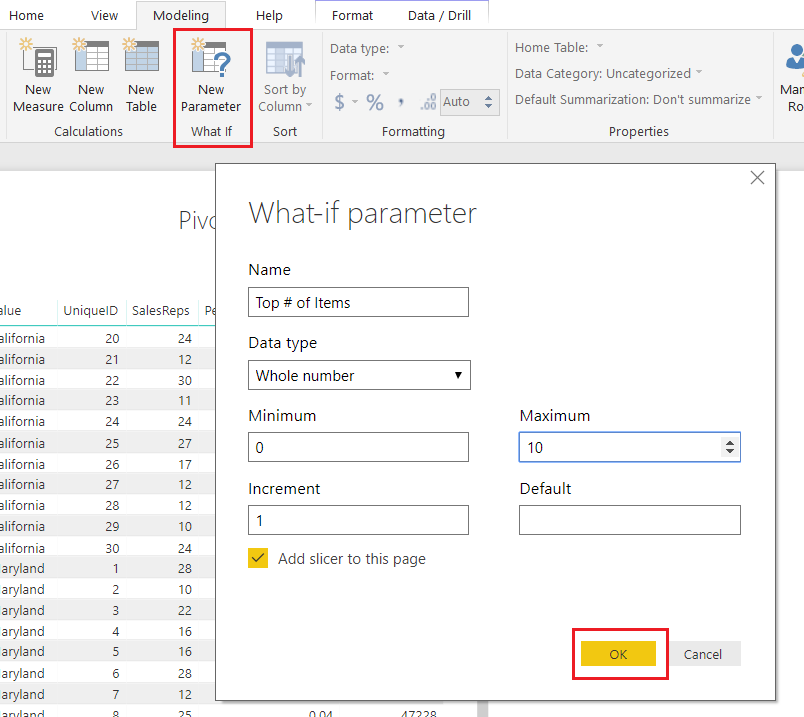
    What If Parameter
    What If Parameter

    Note: Don’t forget to change the Name of the parameter.

    Click OK to proceed.  Power BI will automatically produce a measure table, a measure and a slicer on the report page.
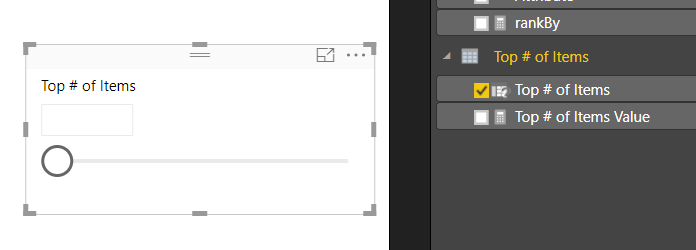
    Slicer Produced by What-if
    Slicer Produced by What-if

    Note: By default there is nothing selected in the box.  However, you can adjust the slicer and a number will appear within the value box.  You can also type in a number between 1 and 10 to the box to adjust the value.

    This is where we go crazy with DAX.  This portion of DAX is where all the magic happens.

    We start off by building our totals measures.  Place all these measures in the Pivoted Data table.

    Total % Change = MAX( 'Pivoted Data'[PercentChange] )
    Total Margin = SUM( 'Pivoted Data'[Margin] )
    Total SalesReps = SUM( 'Pivoted Data'[SalesReps] )

    These will be used repeatedly in our next group of DAX formulas.

    The following measures will produce a calculated ranking for each numerical column.  OK, Pause, This part really excites me here because the next few measures are where the magic happens.  Pay close attention to what is happening here.  Un-Pause, by using the DAX Switch function we can dynamically tell Power BI to adjust which column we want to see ranked by the top items.  For example, if we select SalesReps in our attribute slicer.  The following measures will automatically rank all the items in the table by the column named SalesReps.  Thus, the items with the highest counts of SalesReps will be listed first.  When you select Margin, the table will automatically adjust and re-rank the items by the Margin column.  This is being done in the switch statement.  For each column we are calculating custom rankings and then hiding or replacing values with the Blank() DAX function to not show items we don’t want.

    Enter the following three measures into the Pivoted Data Table:

    Rank Margin = if( [Attribute Filtered],
        SWITCH( [rankBy]
            ,"Margin", CALCULATE( [Total Margin], FILTER('Pivoted Data', RANKX( ALLEXCEPT('Pivoted Data','Pivoted Data'[Value]), [Total Margin]) <= [Top # of Items Value]) )
            ,"PercentChange", CALCULATE( [Total Margin], FILTER('Pivoted Data', RANKX( ALLEXCEPT('Pivoted Data','Pivoted Data'[Value]), [Total % Change]) <= [Top # of Items Value]))
            ,"SalesReps", CALCULATE( [Total Margin], FILTER('Pivoted Data', RANKX( ALLEXCEPT('Pivoted Data','Pivoted Data'[Value]),[Total SalesReps]) <= [Top # of Items Value]))
        )
        , BLANK() )
    
    Rank PercentChange = if( [Attribute Filtered],
         SWITCH( [rankBy],
           "PercentChange", CALCULATE( [Total % Change], FILTER('Pivoted Data', RANKX( ALLEXCEPT('Pivoted Data','Pivoted Data'[Value]), [Total % Change]) <= [Top # of Items Value]))
           ,"Margin", CALCULATE( [Total % Change], FILTER('Pivoted Data', RANKX( ALLEXCEPT('Pivoted Data','Pivoted Data'[Value]), [Total Margin]) <= [Top # of Items Value]))
           ,"SalesReps", CALCULATE( [Total % Change], FILTER('Pivoted Data', RANKX( ALLEXCEPT('Pivoted Data','Pivoted Data'[Value]), [Total SalesReps]) <= [Top # of Items Value]))
        )
        , BLANK() )
    
    Rank SalesReps = if( [Attribute Filtered],
        SWITCH( [rankBy]
            ,"SalesReps", CALCULATE( [Total SalesReps], FILTER('Pivoted Data', RANKX( ALLEXCEPT('Pivoted Data','Pivoted Data'[Value]), [Total SalesReps]) <= [Top # of Items Value]))
            ,"Margin", CALCULATE( [Total SalesReps], FILTER('Pivoted Data', RANKX( ALLEXCEPT('Pivoted Data','Pivoted Data'[Value]), [Total Margin]) <= [Top # of Items Value]))
            ,"PercentChange", CALCULATE( [Total SalesReps], FILTER('Pivoted Data', RANKX( ALLEXCEPT('Pivoted Data','Pivoted Data'[Value]), [Total % Change]) <= [Top # of Items Value]))
        )
        , BLANK() )

    Whew, that was a ton of measures.  All the key components are complete now.  In part 3 we will clean up our report page and make it shine.  I hope you enjoyed this tutorial. Also, follow me on Twitter and Linkedin where I will post all the announcements for new tutorials and content.

    Linkedin Twitter
  • Crazy Table Gymnastics – Part 1 – Dynamic Column Categories

    Crazy Table Gymnastics – Part 1 – Dynamic Column Categories

    When I teach Power BI to new users, there are typically questions about how to get Power BI to act more like Pivot Tables in Excel.  Through my discussions, two key pieces of functionality stand out to me that people want.

    1. They would like to select a categorical property to adjust the table.  In this scenario a user would want to select the State, Sales Territory, or something else that describes a breakdown of the data.  This is similar to adding a field of data into the Rows selection for Pivot Tables.
    2. They want the ability to rank a column and select only the top N number of items in a given column.  Imagine that you have Sales Units, Revenue, or some other numerical column.  Then based on a selected column such as Sales Units, I want to see the top 3 or 4 sales items.  This would be a similar in the excel experience when you modify the filters for a given pivot table column.

    Disclaimer: This is quite a large topic and therefore I have broken this up into three segments for read-ability.  Thus, to poke your curiosity below is the final example of the report.  We will walk through reach phase of this report, so you can produce this dynamic table. 

    This series of blogs will be broken up into three parts.

    Part 1: Build a Table or Matrix visual that can dynamically change based on a slicer

    Part 2: Build supporting tables & measures

    Part 3: Bring it all together for the final report

    OK, hold on tight, here we go!

    Let’s begin with acquiring our data.  Open Power BI Desktop.  Click Get Data on the Home ribbon and select Excel.  When the Open dialog box opens enter the following file name, and click Open:

    https://powerbitips.blob.core.windows.net/powerbitipsdatas/SampleData.xlsx

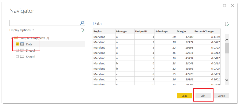
    The Navigator window will open showing you the contents of the file.  Select the Data Table by clicking in the square next to the word labeled Data, click Edit to load the data and enter the Query Editor.

    Load Data from Excel
    Load Data from Excel

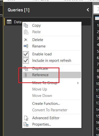
    Next, Right Click on the table labeled Data in the Queries pane, from the drop-down menu select Reference.

    Create Reference Query
    Create Reference Query

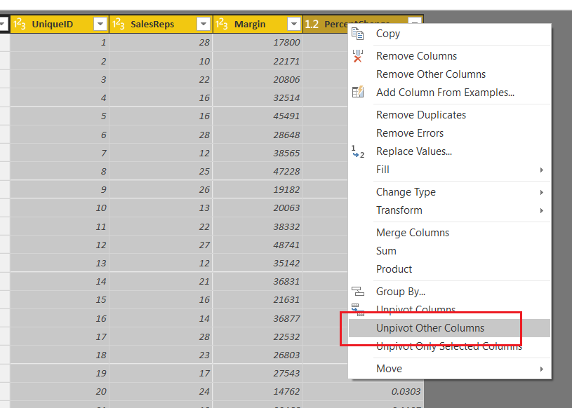
    This will produce a second table labeled Data (2).  In the Properties pane on the right side of the screen edit the name of the query to Pivoted Data. Select the columns UniqueID, SalesReps, Margin, and PercentChange by holding Ctrl and clicking on each column.  While keeping all four (4) columns selected right click on the last column and select Unpivot Other Columns.

    Unpivot Columns
    Unpivot Columns

    Note: It is important to notice that we selected Unpivot Other Columns instead of selecting the Region and Manager columns and selected Unpivot Columns.  Selecting Region and Manager and selecting Unpivot Columns will achieve the same results, but if our excel file or underlying data set adds more Categorical columns our query will break.  Using this technique creates a flexible query that can handle any number of new categorical columns.  You know your data the best, and how it will change over time.  It is important to consider these aspects when loading data via the Query Editor. 

    We have completed our data load.  On the Home ribbon click Close & Apply to complete the data load for our two tables, Data and Pivoted Data.

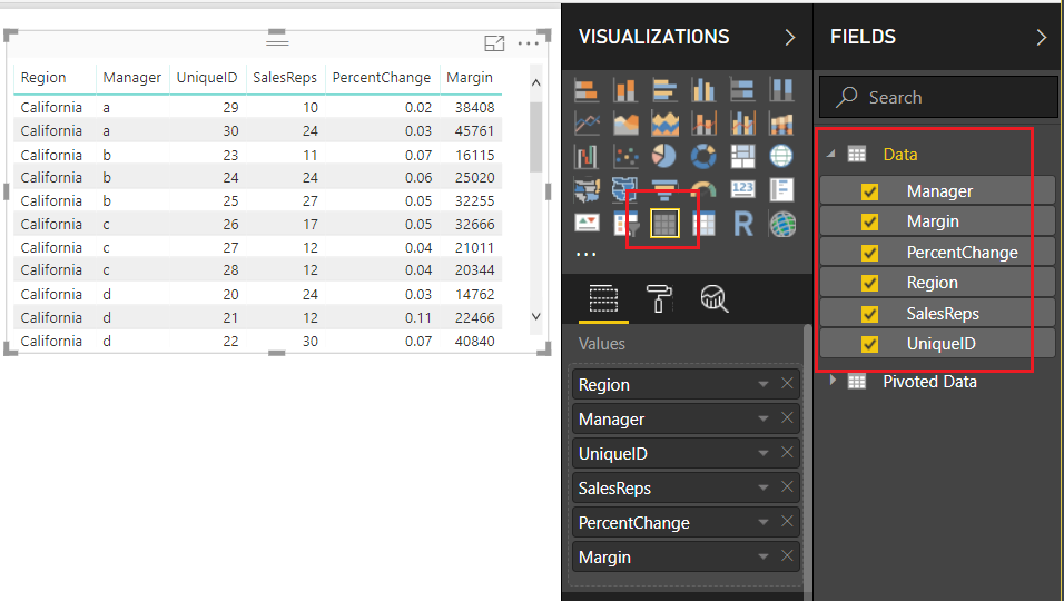
    Load the Fields from the Data table into a Table Visual, as shown below:

    Data Fields Loaded Into Table
    Data Fields Loaded Into Table

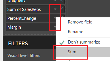
    For the following fields SalesReps, PercentChange, and Margin change the Fields to SUM by clicking on the Triangle next to each field’s name.  We will use this information to confirm that our Pivoted table is providing the correct data.

    Change Fields to Sum
    Change Fields to Sum

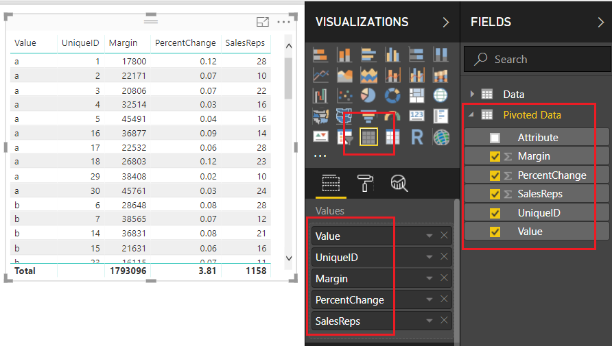
    Add a second Table visual and bring over the fields from the second data set, our Pivoted Data table.  Be sure to leave off the Attribute column as this will not be needed in this second table.

    Table for Pivoted Data
    Table for Pivoted Data

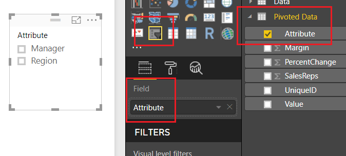
    Add a Slicer to the report layout and add the column labeled Attribute from the Pivoted Data table.

    Add Slicer
    Add Slicer

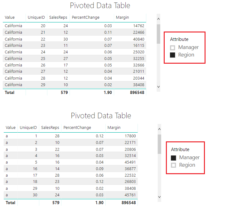
    Notice we now have the ability to select either the Manager Column or the Region column.  By doing so, we are able to change the columns within our table to only show the items relevant to our slicer selection.  Pretty cool.

    Using The Slicer
    Using The Slicer

    It’s also important to note here that in our Pivoted Data Table, we can only acquire the correct totals with a single attribute selected.  When the slicer has no selection our totals for SalesReps, PercentChange and Margin are all twice the amount they should be.  Later on, in part 2 of this tutorial, we will fix this using measures.

    Data In Both Tables Match
    Data In Both Tables Match

    Thanks for reading along.  Stay tuned for part 2 where we will build supporting data tables to aid the user experience on the report page.  If you like what you learned, please forward this on to someone else who would enjoy these free tutorials.  Also, follow me on Twitter and Linkedin where I will post all the announcements for new tutorials and content.

    Linkedin Twitter
  • Adding Data Types Within Query Editor

    Adding Data Types Within Query Editor

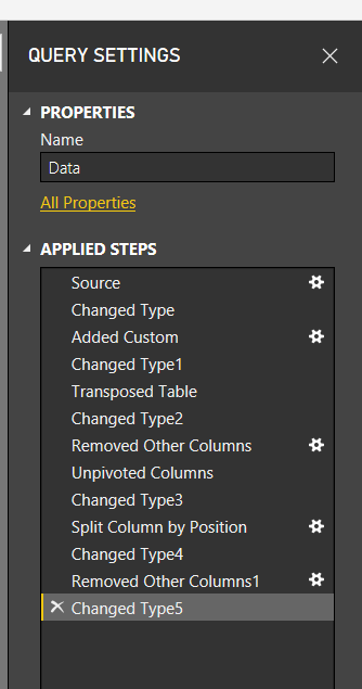
    If you have spent any time working in Power BI, your very first step is to, wait for it… Get Data.  Using Get Data will start loading your data into the Query Editor for Extracting, Transforming and Loading (ETL).  When you start out in Power BI it is likely that you don’t spend much time in the Query Editor.  However, the longer you use Power BI desktop, and the more you learn, you find that the Query Editor is highly under-rated.  There are so many amazing transformations that you can perform on your data.  After some time getting comfortable you’ll be building larger queries with many, many, steps.  Eventually, it may look something like this:

    Multiple Query Transformations
    Multiple Query Transformations

    Perhaps your queries are already long, or may be even longer.  Wouldn’t it be nice to shorten the number of steps?  It would make it easier to read.  In this tutorial we are going to talk through how we can combine several steps when you create a new column.  This is achieved by modifying the M scripts or equations slightly when new columns are created.

    While doing this won’t cut down every query in half, but it will remove a couple of additional steps per query.  This makes your queries easier to read and maintain.  Also, using this best practice, will save you headaches in the future.  At some point you will run into a data type error.  This is seen when you try to join multiple tables on columns with different data types, or when you need a measure to create a SUM but the column data type is still text.

    Let’s get to the tutorial.

    Open up your Power BI Desktop program and on the Home ribbon click Enter Data.  Using the dialog box for entering data enter the following table of data:

    Sales
    100
    120
    94
    20
    80

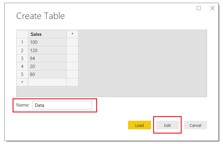
    Once you’ve entered your data the Create Table screen should look like the following.  Be sure to name your table, in this case I named my data table Data…. yea, feeling a lack of creativity today.  Next, click Edit to modify the query before loading the data into Power BI.


    Create Table
    Create Table

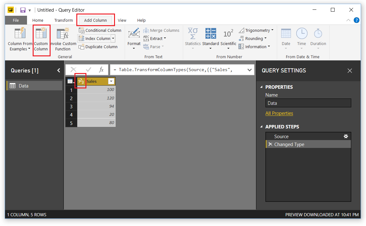
    This will open the query editor.  Click on the Add Column ribbon, then select Custom Column.  The Custom Column dialog box will open.

    Note: When you bring in the created table that the Sales column already has the data transformed into a whole number. Also note in the right under Applied steps we have two steps, one for the source and one for Changed Type.  This is because not every M equation (M language is the language used to perform the ETL in the query editor) can handle data types.  

    Add Custom Column
    Add Custom Column

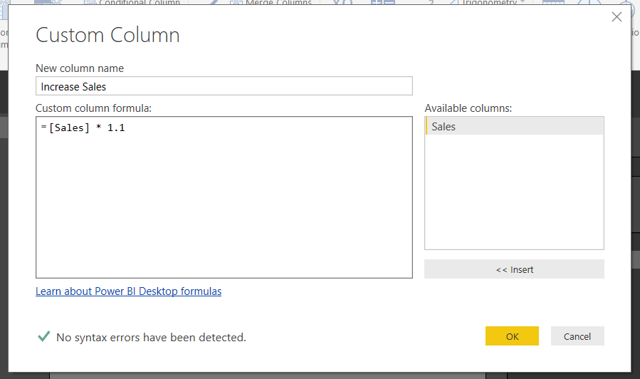
    In the Custom Column dialog box enter the following, the column name, the equation below.  Click OK to add the column.

    Insert Custom Column
    Insert Custom Column

    Note: It is good practice to name the new column something meaningful.  This helps when you are working in the query editor.  When you come back to your query months later and wondered what you were creating, the column names will help!  Trust me I learned this lesson the hard way… 

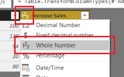
    Great, now we have our new column.  Notice the image in front of our column named Increase Sales.  This means Power BI thinks that the data type of this column could be Text or a Number.  Let’s change it.  Click on the ABC123 icon and select Whole Number.  Now the column data type has changed to numbers only.

    Change Column Type to Whole Number
    Change Column Type to Whole Number

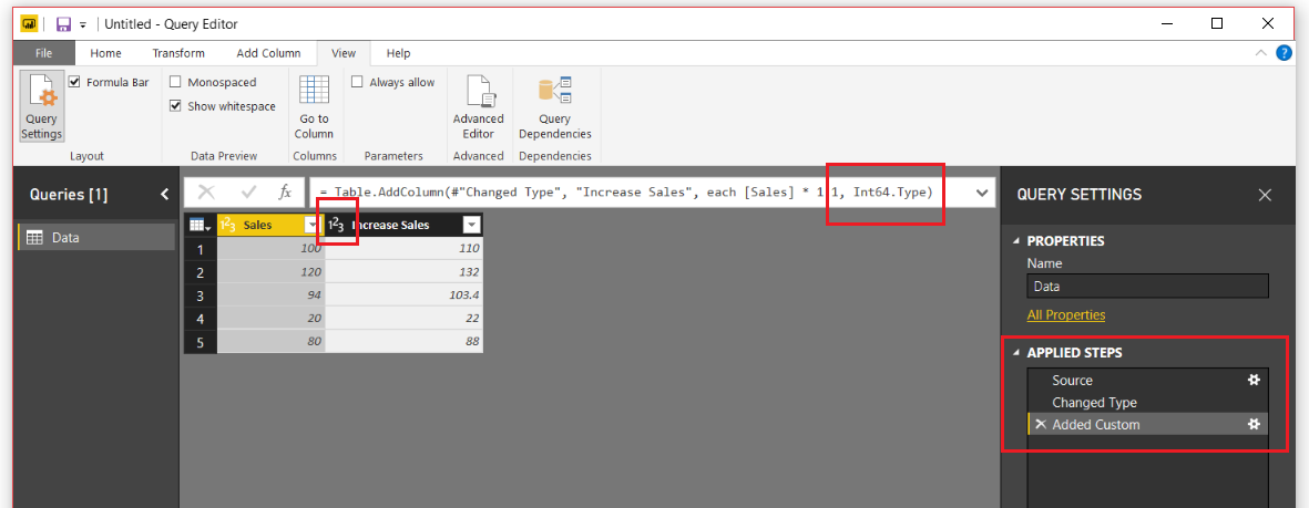
    If we glance at the Query Setting under the Applied Steps, we now have 4 steps.  Two were added, one for the added column and the second for the data type of the column.  This is not what we want.  Instead we would like the column to be added with the appropriate data type right from the beginning.

    Let’s remove the very last step labeled Changed Type1.  To do this we will click on the little X next to the step.  This will remove the step.  While highlighting the Added Custom step click in the formula bar and modify the equation to include the following statement in RED.  Press the Enter to execute the new formula.

    = Table.AddColumn(#"Changed Type", "Increase Sales", each [Sales] * 1.1, Int64.Type)

    Note: if you don’t see the formula bar it can be toggled on or off in the View ribbon in the check box titled Formula Bar.

    The query editor should now look like the following:

    Desired Data Type
    Desired Data Type

    Without adding an extra step on the Query Settings, we have changed the data type.  I know this might seem trivial, but when you are creating large queries, they can get difficult to read.  For me, I find this technique quite useful, and it doesn’t only support whole numbers.  This technique also supports the following data types:

    Data Type Syntax
    Whole Number Int64.Type
    Decimal Number Number.Type
    Dates Date.Type
    Text Text.Type

    Thanks for following along.  If you liked this tutorial, please share it with someone else who might find this valuable.  Be sure to follow me in LinkedIn an Twitter for posts about new tutorials and great content from PowerBI.Tips

    Linkedin Twitter
  • New Layout – Splash o Red

    New Layout – Splash o Red

    First off, let me say WOW!  The announcement of Layouts was well received by the Power BI Community.  Thank you so much for the positive feedback.  So much so, that I got excited and developed another Layout, Splash o Red.

    This new layout is called contains two pages.  It uses the drill through feature to navigate from the main page to the sub page.  The demo below shows you how it works.  I hope you enjoy this new layout, you can download it here.

    To see how to load data into the Layouts check out the following video below.  It will guide you through the process.  Additionally, each layout download will contain an instructions sheet just in case.

    You can check out all the layouts here.

    [products columns=”4″ category=”Layouts”]

  • Introducing Layouts

    Introducing Layouts

    PowerBI.tips is extremely happy to be part of, and contribute to, the Power BI Community. We’re constantly trying to think of new and interesting ways we can enhance the Power BI experience for everyone by providing helpful tips & tools. Some examples of what we’ve done so far are Power BI Desktop Theme generator, and the Power BI toolbox:


    Image Link to Advanced Color Theme Generator V3

    Image Link to Advanced Color Theme Generator V3

    Today we’re happy to announce another tool that we hope you will get an immense amount of use from.

    Introducing:

    Layouts

    Layouts are Power BI Template (PBIT) files that will contain layouts with visualizations already in place and only require your data to light up. We have, and will be, using as many of the visualization techniques.  We are taking some of the best layouts we’ve seen, and those we’ve developed to create these files for you. This means that you don’t have to spend any time worrying about the vast number of design techniques.  Additionally, it will save you time placing or moving things around on the report page.  All that is required of you, is to download the PBIT file, load your data, and start selecting the pre-placed visualizations.  With each layout template there will be a sample file (demo) that will show you the look and feel of each layout so you can easily choose the layout you want on each report page. You can always change the visual type with the click of a button.

    Today, we’re releasing the first of our efforts with a 3 tab layout focused on the business analyst. These layouts are designed with maximum flexibility in mind, to let you alter color themes, easily change the visualization type, and provide enough visualizations to give you a huge initial benefit. One of the best parts about the Layout is that you are not limited by our designs, they are just the starting point, you can fully customize them however you would like. We just provide you with a solid foundation to build from.

    Layouts - Basic
    Click Image to Download Layout Files

    Demo of Layouts:

    In addition to the first analyst layout, we’re releasing an Info-graphic style layout that contains some deeper interactions using Bookmarks.  However, these Layouts will be a bit more restrictive in terms of how much you can change visually.  This is due to the need to rely more heavily on other tools to create the look & feel.  Thus, you will have limits in just how much you can change. Our hope with these is to build more stunning report layouts that will maximize presentation, or help wow an audience.

    Layout - Sunset
    Click Image to Download Layout

    We are releasing layouts for the analyst, executives and still have some fun with highly stylized files. We hope you get as much use out of these new Layouts as we know we will! Over time, we will continue to develop and produce an entire library of the selections. Thanks to all of you who make this such a fun and great Community to be a part of.

  • Move Visuals Between Reports

    Move Visuals Between Reports

    There are cases when working with Power BI files, that you would want to transfer a visual from one report to another report.  While this feature is not available within the Power BI desktop program as of today, this is available within the PowerBI.com service.

    To copy a visual from one report to another, both reports need to be located with the PowerBI.com service.

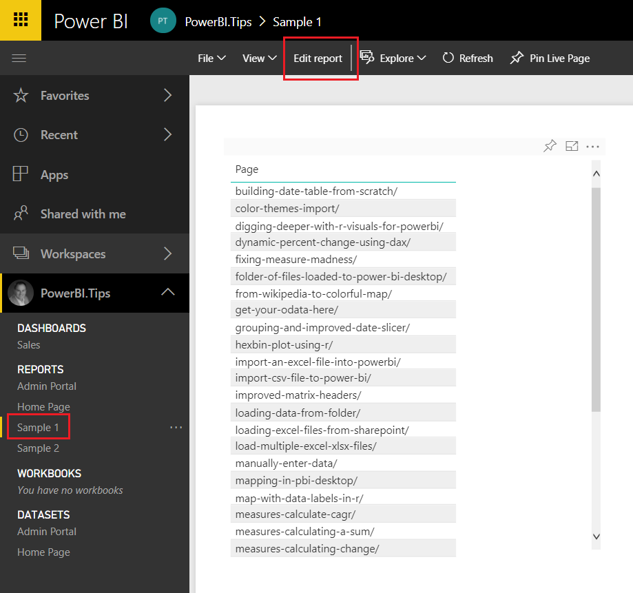
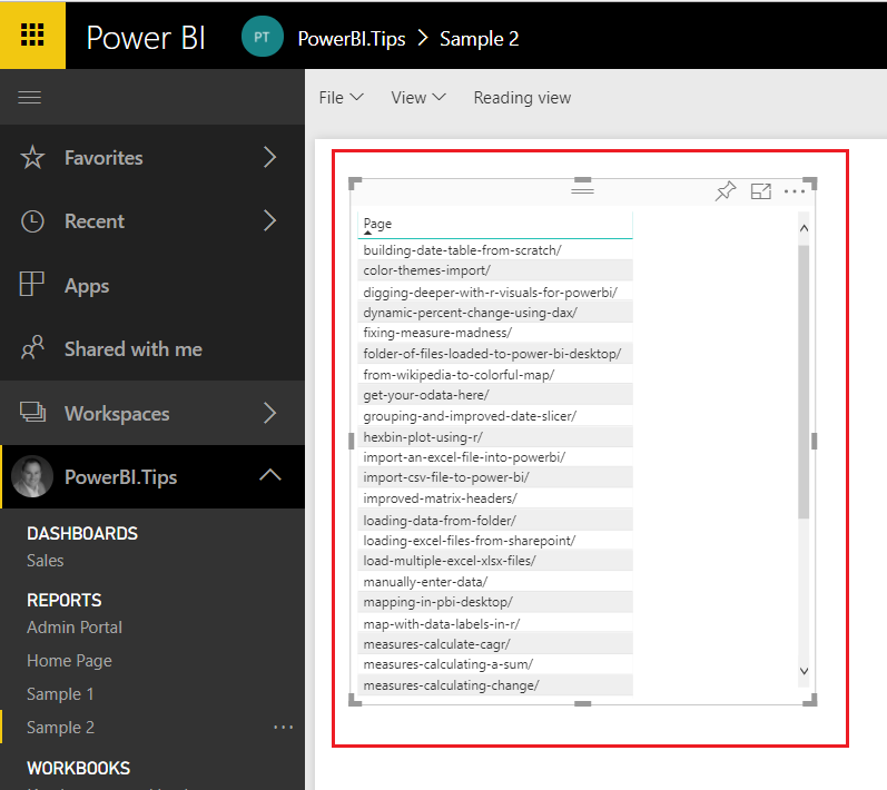
    Navigate to the report where you want to copy the visual from.  In this example I have created two reports, Sample 1 and Sample 2.  I will copy a table visual from Report Sample 1 and paste it into Report Sample 2.  Once you have opened the report Click the Edit report button on the top navigation bar.  This will change the report into edit mode and provide additional options.

    Navigate to Sample 1 Report
    Navigate to Sample 1 Report

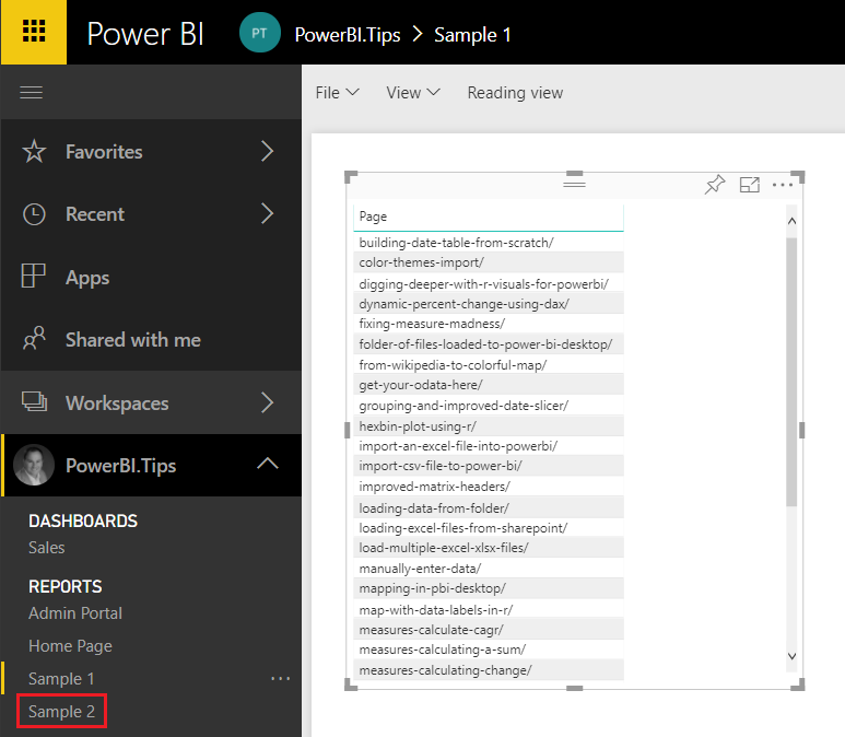
    Select the visual you wish to copy and press CTRLC, to copy the visual.  Next click on the new report Sample 2, in our example, where you want to paste the visual.

    Select Sample 2 Report
    Select Sample 2 Report

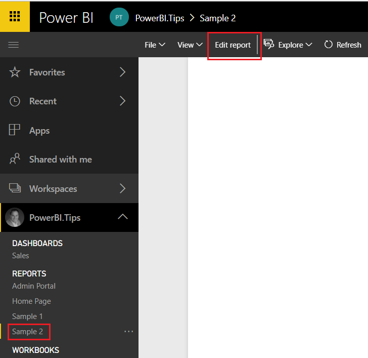
    Again, click the Edit report on the report (Sample 2) where the visual is being placed.

    Edit Sample 2 Report
    Edit Sample 2 Report

    Finally, click anywhere on the white space within the report page and press CTRL + V to paste the visual into the new report.

    Paste Visual to Sample 2 Report
    Paste Visual to Sample 2 Report

    That is it.  You have successfully moved a visual from one report to another.

    Points to Consider:

    1. Both the Copy From report and the Copy To reports need to be in the PowerBI.com service.
    2. Once you have copied the visual over to the new report you can download the report by clicking File, then selecting Download report (Preview).  You can only download reports from PowerBI.com, if the report was originally authored by the Power BI Desktop program.  If the report is made using the PowerBI.com service, the download report option will be grayed out.
    3. When coping from one report to another, you have to use the same tab in either internet explorer or chrome.  For this demo I used google chrome and was able to copy and paste the visual between report pages.

    I hope you enjoyed this little trick.  Please share it with someone else that might find this valuable.

  • Power BI Connections: Direct Query

    Power BI Connections: Direct Query

    Now that we’ve solidly gotten through the basics in terms of what connection types are in the opening blog, found here, and detailed out what is included in the default connection type of Import found here, let’s get on with some of the more interesting connections.

    Connection Type Outline
    Connection Type Outline

    Direct Query is the first connection type that we will discuss that extends, but at the same time limits functionality in the tool itself. In terms of data access this connection type allows us to access our data in the source system. The supported data sources for direct query can be found here. This is distinctly different than what we observed in the import method.  When using Import, the data is a snapshot and refreshed on a periodic basis, but with Direct Query it is live. “Live” means that with Direct Query the data stays in the source system and Power BI sends queries to the source system to return only the data it needs in order to display the visualizations properly. There are some pros and cons in using this connection so it is important to understand when you might use it, and when you should probably avoid this connection.

    Cons:

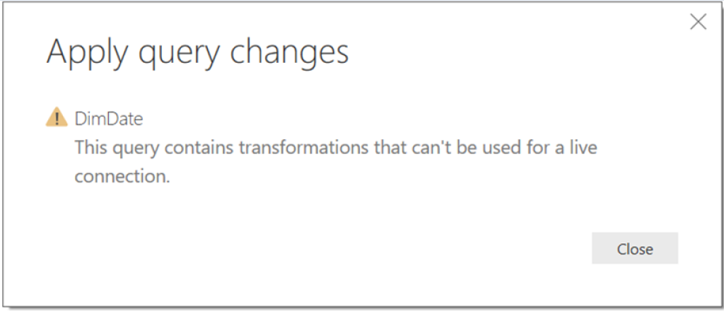
    • When Direct Query is used you can no longer do many of the data mashup actions in the “Edit Queries” section of Power BI. It is assumed that you will have already done this in the backend. You can do simple actions such as removing columns, but don’t expect to be able to manipulate the data much. The Query Editor will allow you to make transformations, but when you try to load to the model you will most likely get an error that looks something like this
    Direct Query Error
    Direct Query Error 
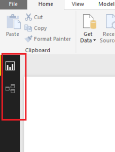
    • The data tab is also disabled in the model layer and thus you need to make sure that all the formatting and data transformations are completed in the source.
    Data Tab no longer present
    Data Tab No Longer Present
    • You can do some minor adjustments to format, but this could be a heavy restriction if you don’t have access to the data source.
    • There are performance impacts to the report that need to be taken into consideration. How large is the audience that will be interacting with the report? How busy is the source system, are there other processes that could be impacted?
    • Troubleshooting skills in source system language
    • Multiple applications required to adjust data ingestion and formatting

    Pros:

    • The Direct Query connection does not store any data. It constantly sends queries to the source to display the visuals with the appropriate filter contexts selected.
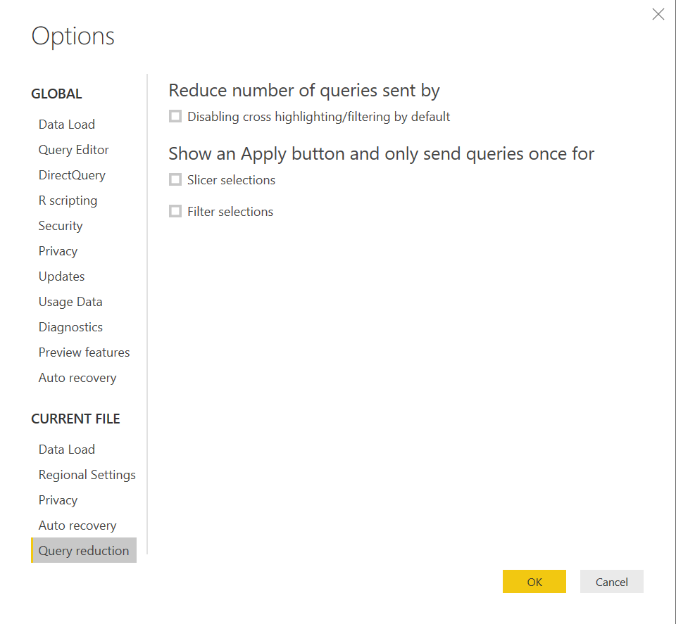
    • In the November 2017 release there is a new capability in Power BI allows you to reduce the traffic and enhance this connection method exponentially. The feature is called Query reduction, and allows you to enable an “apply” button on a slicer or filter. The benefit with this option is that you can set all your selections of a filter prior to Power BI executing the query. Before this feature was available, every selection you made would fire off a query to the source database. To enable this feature, go to File -> Options and Settings -> Options -> Query Reduction you will find these options to help with Direct Query Performance.
    Query Reduction Options
    Query Reduction Options

    Note: This enhancement greatly increases the performance of a Power BI report against the data source, but be aware that there could be poor query performance, or aspects of the solution that would require troubleshooting in the data source depending on what queries are being passed. This would require understanding of how to performance tune the source.

    • Deployment of the Direct Query connection requires the use of the gateway previously called the Enterprise Gateway. Note that the Enterprise Gateway is different than the personal Gateway.
    • No data is ingested into the model using Direct Query thus, there is no need to schedule a refresh. Once the dataset is connected to the Gateway, the data source feeds information to the report as the user interacts with the report.
    • It will always show the latest information when you are interacting with the report.

    Direct Query is a powerful connection type in that it produces the most up to date data. However, as we have seen, it does come with some considerations that need to be taken into account. The Pros and Cons of the connection mostly revolve around whether or not the end user can understand and deal with potential performance issues, updating data retrieval processes, and understand the downstream implications of a wider audience. Typically, Direct Query is used in extremely large datasets, or in reports that require the most up to date information. It will most likely always perform slower than an import connection and requires an understanding of tuning and troubleshooting of the data source to alleviate any performance issues.

  • Start of Month DAX Calendar

    Start of Month DAX Calendar

    While on a recent project I needed to build a variation of the DAX date table.  In my previous post, found here Creating DAX Date Tables I was built a date table for every day of the month for multiple years.  I’ve only ever needed to consume a fully populated date calendar, but in this instance because the data I was collecting was already aggregated to the first of the month I only needed a date calendar with each month’s start date.  After some playing around with my previous DAX functions I think I was able to come up with an elegant solution.

    Let’s get into it.

    Let’s begin by making a basic table.  Open Power BI Desktop, on the Modeling ribbon click New Table.

    Enter the following code:

    Dates = 
      GENERATE ( 
        CALENDAR ( DATE ( 2017, 1, 1 ), DATE ( 2017, 12, 31 ) ), 
        VAR currentDay = [Date]
        VAR day = DAY( currentDay )
        VAR month = MONTH ( currentDay ) 
        VAR year = YEAR ( currentDay )
      RETURN ROW ( 
        "day", day, 
        "month", month, 
        "year", year )
      )

    This will produce our standard table from January 1st to December 31st, 2017 with every day populated in between.  In, addition we get numerical values for Day, Month and Year.

    Note: This table is producing a list of dates using the Calendar DAX function then iterating row by row to calculate each numerical value for the Day, Month and Year.

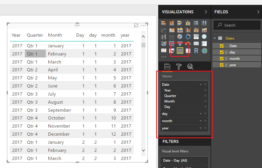
    Add the Table visual with the following Values from our created DAX table.

    Dates Table
    Dates Table

    Note: When you drag over the field labeled Date the field will be naturally added as a Date Hierarchy.  To remove the Date Hierarchy, you have to click the little drop down arrow next to the word DATE and select the word Date in the drop down menu.  This will remove the Year, Quarter, Month and Day date context from the visual.

    The date calendar we made has every date, but we want only the first of each month.

    Lets build a new table by following the previous steps and adding the following:

    Start of Month Dates =
      GENERATE (
        GENERATESERIES(1,12),
        VAR inc = [Value]
      RETURN ROW (
        "date", DATE(2017,inc,1)
        )
      )

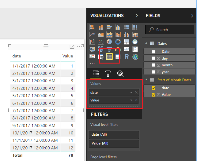
    Add the Table visual to the report page and add the following fields:

    Start of Month Date Table
    Start of Month Date Table

    Note: I already removed the Date Hierarchy using the instructions listed above in the previous note.

    This new DAX Date table is first generating a list of numbers 1 to 12 one for each month.  Then it iterates through the list and produces a date using the Date function were we manually provide the Year, and the day.  You can see the Generate function produces a column of data called [Value].  The variable denoted by VAR inc is capturing the number for each month.  So, now what if we want to produce more than one year of dates?  Super simple, just change the generate series from 1 to 12 to 1 to 48.  This will produce three years of dates.

    Change your Start of Months Dates to the following:

    Start of Month Dates =
      GENERATE (
        GENERATESERIES(1,48),
        VAR inc = [Value]
      RETURN ROW (
        "date", DATE(2017,inc,1)
        )
      )

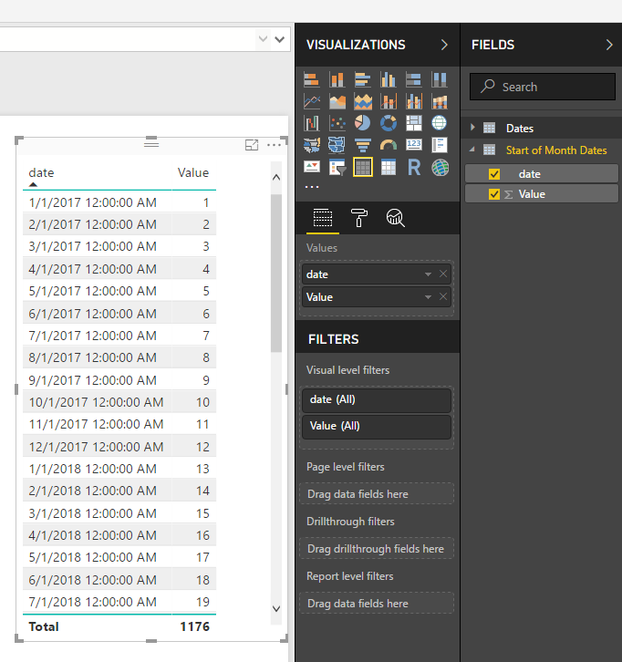
    With one number change we can produce 4 years of dates.

    Four Years of Dates
    Four Years of Dates

    Cool, let’s go a little further.  Just in case we need it we can also produce a list of dates that contain the end of the month.  Add the following your Start of Month Dates with the following DAX table (don’t forget the comma on line 1 in the ROW function):

    Start of Month Dates =
      GENERATE (
        GENERATESERIES(1,48),
        VAR inc = [Value]
      RETURN ROW (
        "Date", DATE(2017,inc,1) ,
        "Month End", EOMONTH( DATE(2017,inc,1), 0)
        )
      )

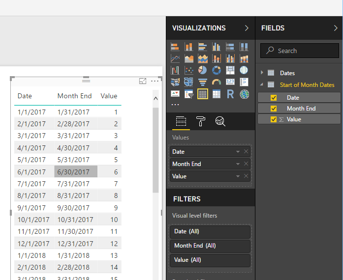
    We have added a new column to note the end of each month.

    Date Table with Start and End Columns
    Date Table with Start and End Columns

    Well, thanks for following along.  In my use case this start of month date table was exactly what I needed.  I thought this was a handy little DAX table, and I hope you have found this helpful as well.  Be sure to share this post if you found this helpful.

  • Custom Usage Metrics Reporting

    Custom Usage Metrics Reporting

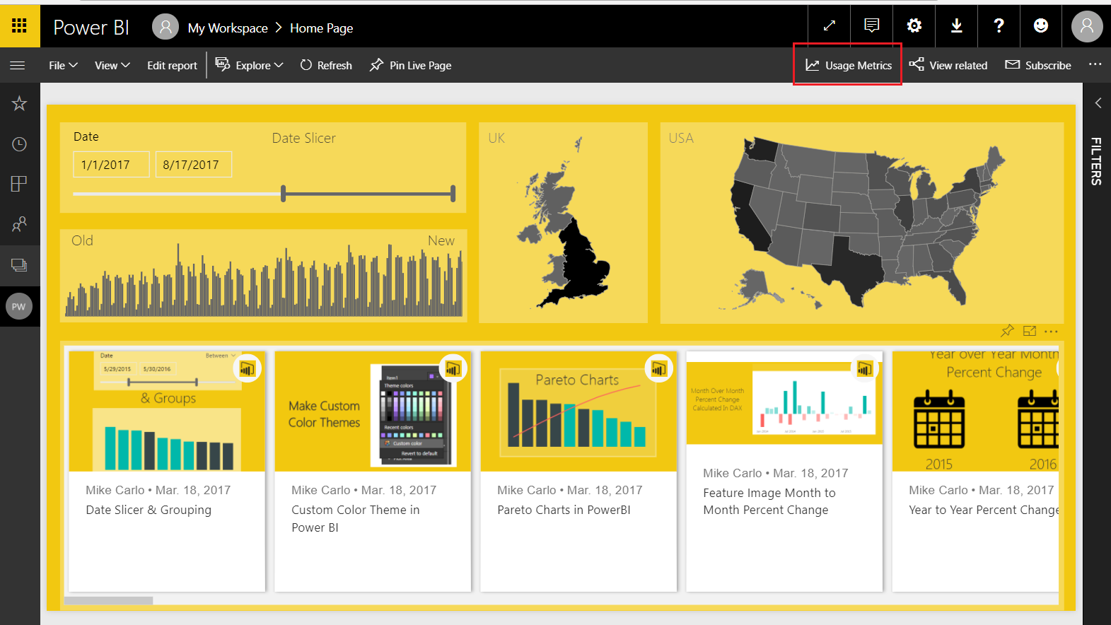
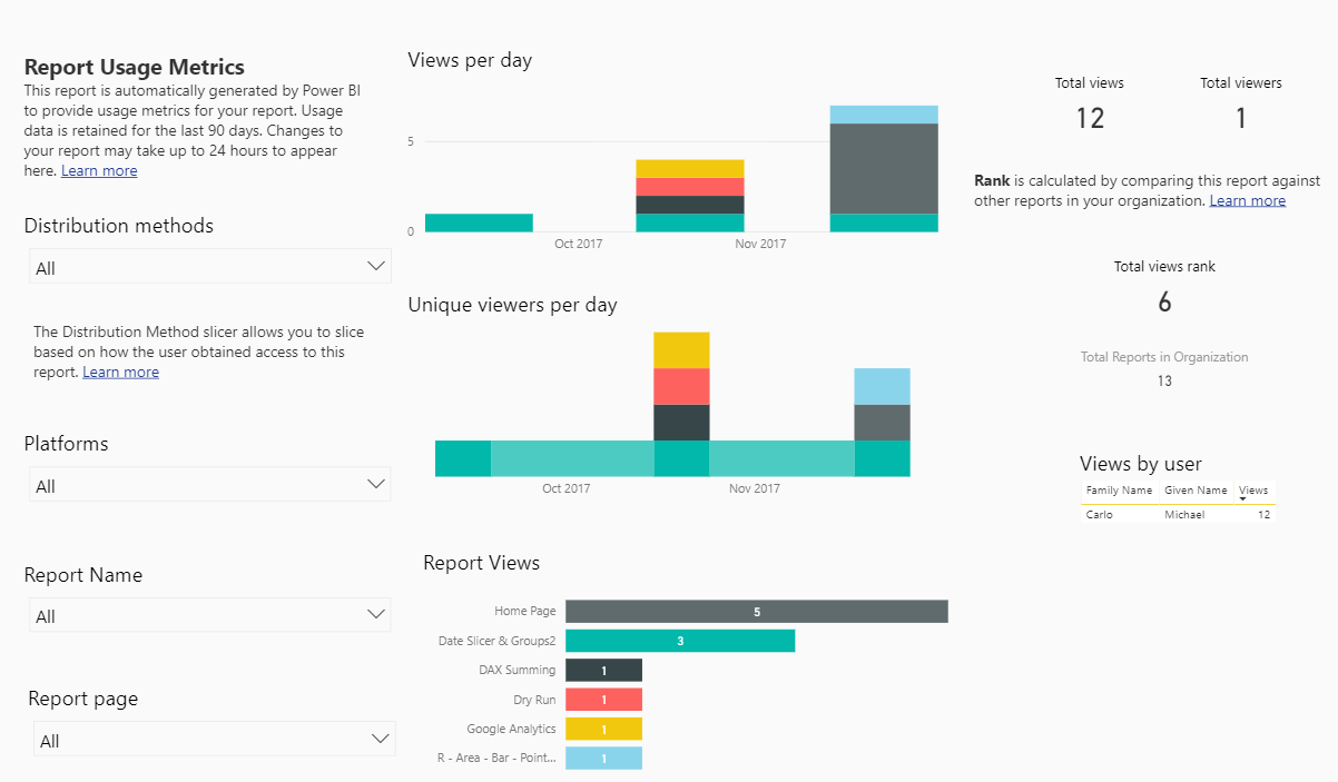
    One of the really cool features contained within the PowerBI.com service is the ability to monitor how often your dashboard or report is being viewed.  You’ll find this feature by opening up either a Dashboard or a Report, then clicking the button called Usage Metrics.  Clicking this button will generate a custom usage report.  For more details on Report Usage Metrics see the following article from Microsoft.

    Note: In order to see the usage metrics report you must be able to edit the report and have a minimum of a Power BI Pro license.  Also, the usage metric report only captures the last 90 days of report usage.

    Usage Metrics on Menu Bar

    The sad thing is that this report is only the usage metrics for the Dashboard or Report that you opened.  This report is also read only and cannot be modified.  However, there is a way to fix this, and see all the usage on all the Dashboards or Reports within a workspace.

    Let us begin.

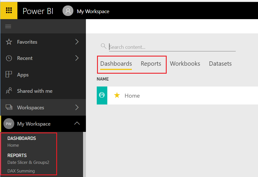
    You will first need to log into PowerBI.com, once you have logged in navigate to either a Dashboard or Report.  To open a dashboard or report start by opening a workspace in the left navigation bar.  If you are already in a workspace you can open a Report or Dashboard by clicking on the Dashboards or Reports headers in the main selection area of the workspace.

    Navigate to a Dashboard or Report
    Navigate to a Dashboard or Report

    For this tutorial I will use a report but the same steps will work for both the Dashboard and Report usage metric reports.  Open up the report that your interested in viewing the metrics.  I am using my report called Home for this example, this report is used on PowerBI.Tips, and you can view the report here if your interested.  Now that we have opened the report, click on the Usage Metrics link on the top navigation bar.  This will open up a usage metrics report.   This report is read only and does not allow changes.

    Link to Report Metrics
    Link to Report Metrics

    Here is where we get sneaky… If you observe the URL for the usage metrics report it looks like the following:

    https://app.powerbi.com/groups/me/reports/c6....26/ReportSection?filter=Reports~2FReportGuid%20eq%20%27....ca%27

    Notice the middle of the report where it states “?filter=Reports” this means the Usage Metrics report has been filtered for only one report in the workspace.  The report filter context is passing the Globally Unique Identifier (GUID) of the selected report down to the Report Metrics.  This is good news because knowing this we can modify the report and remove the filter, thus allowing visibility to all the reports in a workspace.

    First we will need to save a copy of the report so we can make changes.  With the Usage Metrics report open click File then in the drop down click Save As.

    Save Report As
    Save Report As

    This will save a copy of the report into the workspace.  Notice we now see in the Power BI header bar that the report has been named Report Usage Metrics Report – Copy.  Also we can now see an Edit report button.

    Usage Metrics Report - Copy
    Usage Metrics Report – Copy

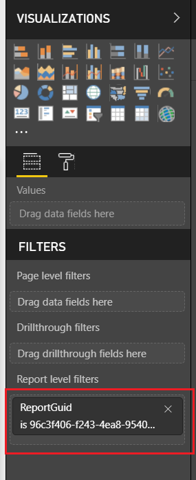
    Click on Edit report to start changing the report.  As soon as you open the report you can see in the visualizations pane that there is a Report filter applied.  Remove this filter by Clicking the little Grey X for the ReportGUID in the Report level filters section of the visualizations pane.

    Report Filters
    Report Filters

    After removing the report filters, we can see all the data from all reports.

    Let the modifications begin.

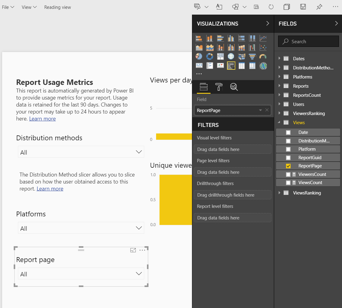
    On the left of the report we have a report page slicer.  This allows you to see the activity on one page of a report.  Now that we can see all the reports across the workspace filtering only pages of each report doesn’t make sense.  We need to add an additional slicer to select reports we are interested in.

    Report Page Slicer
    Report Page Slicer

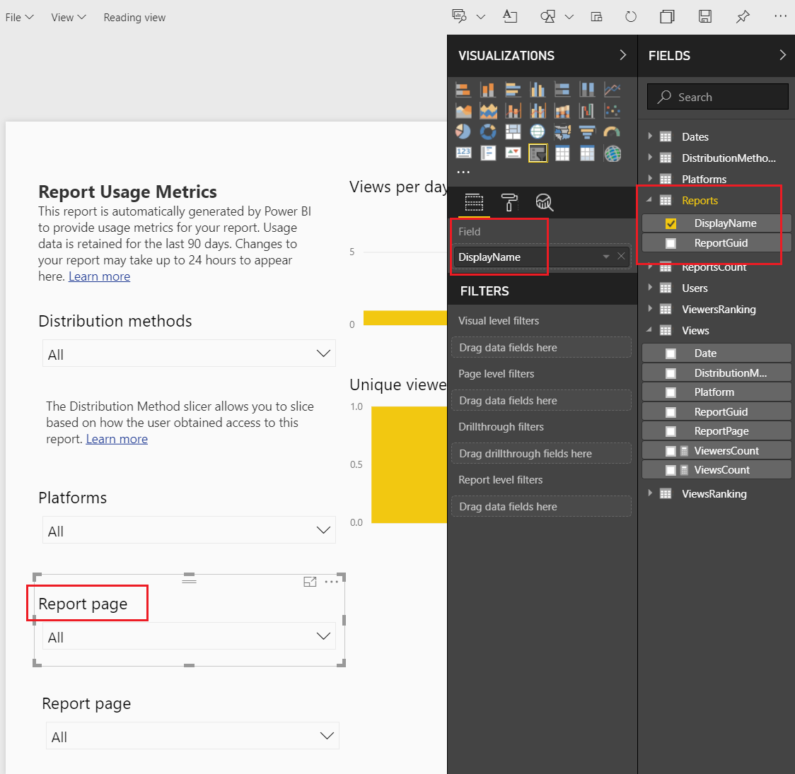
    Select the Report Page Slicer the using Ctrl C copy the slicer, then paste it using Ctrl V.  We should now have two slicers on the page.  Select the top slicer named Report page.  Change the field of the top slicer from ReportPage to DisplayName. The DisplayName is found under the Reports table in the Fields pane.

    Link Report Display Name
    Link Report Display Name

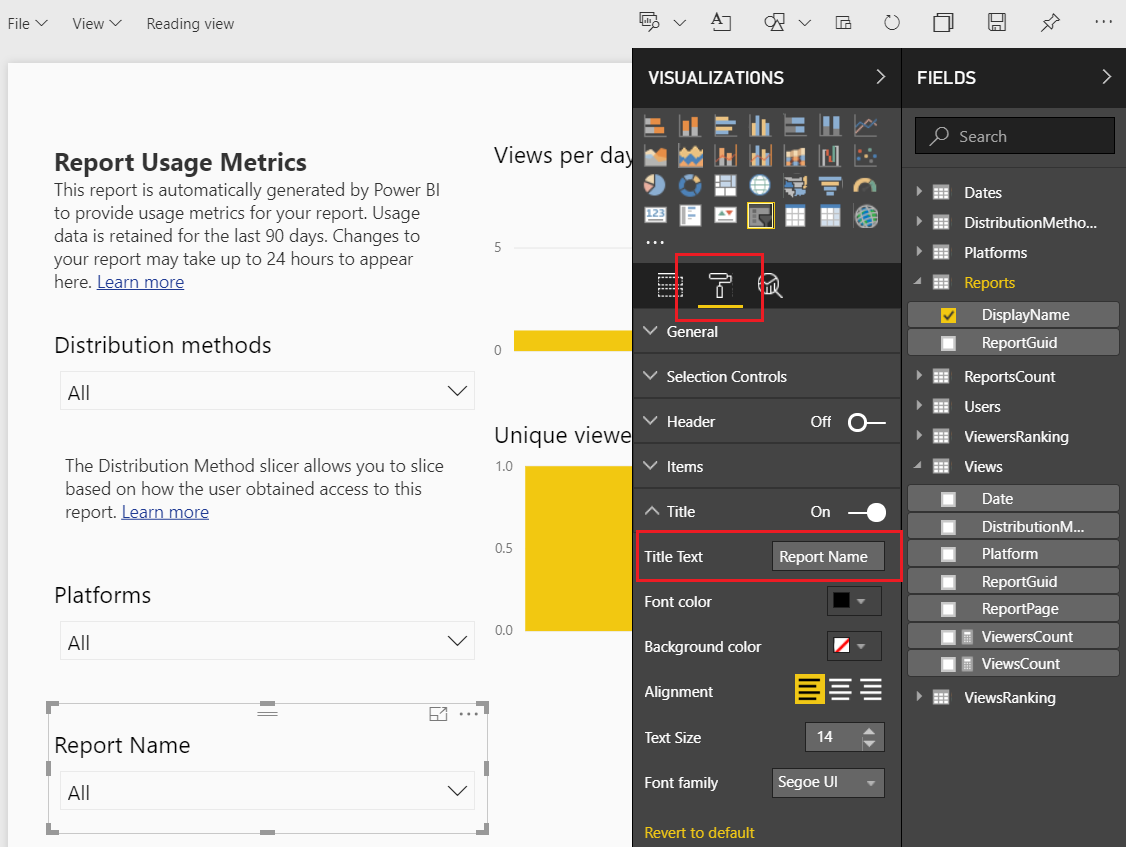
    Notice even though we changed the slicer information that the slicer title did not change.  We have to manually change the title description in the display settings.  Click the Paint Roller to open the display settings.  Expand the Title section and change the Title Text to Report Name.

    Change Slicer to Report Name
    Change Slicer to Report Name

    The title of the slicer visuals is now changed. Sweet!

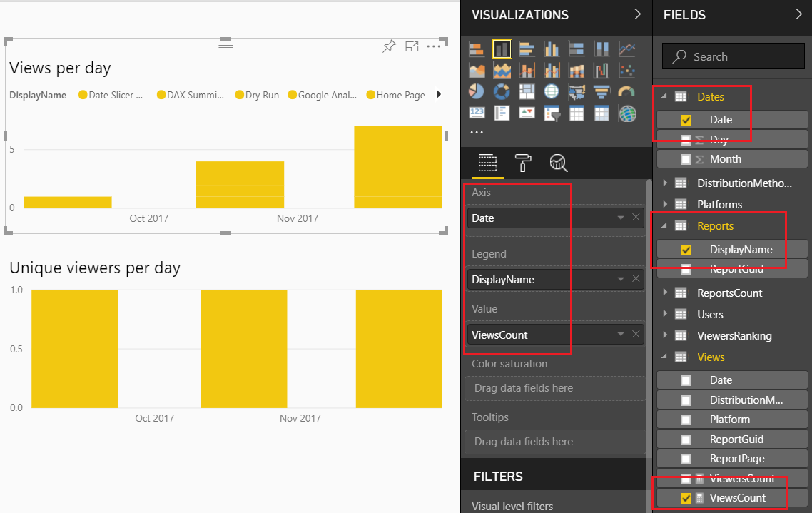
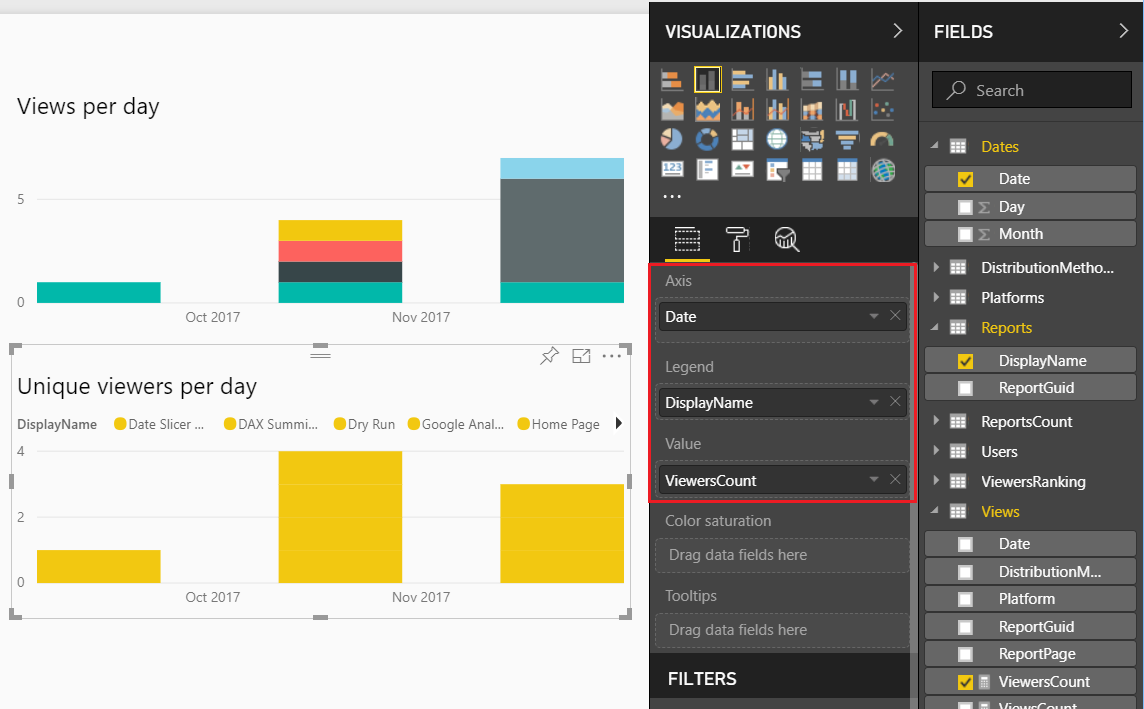
    Let’s move on to modify some of the standard visuals.  Select the report titled Views per day and change it to the following settings:

    Views Per Day Change
    Views Per Day Change

    Note: We changed the Axis Date column field.  We removed the date field from the views table and added the date from the Dates table. 

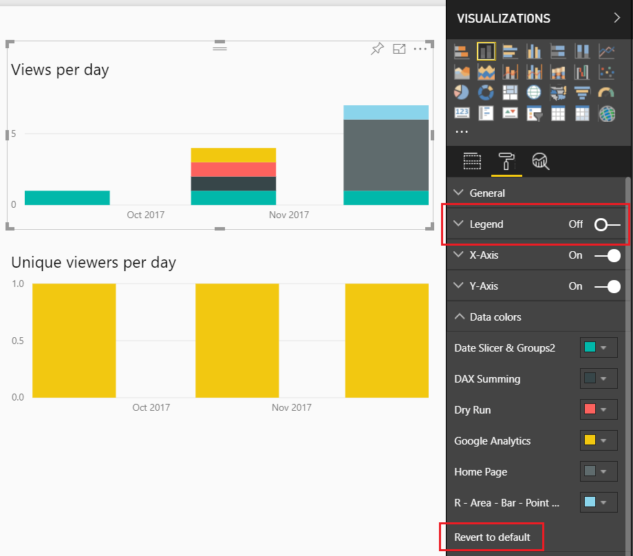
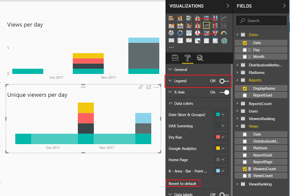
    This allows us to see over time the number of views per report.  Lets clean this up a bit.  Change the settings of this visual by Clicking on the Paint Roller ribbon.  Start by Turning Off the Legend, then open up the Data Colors, and Click the Revert to default to return the visual to it’s normal colors.

    Change Visual Settings
    Change Visual Settings

    Now, lets modify the Unique viewers per day.

    Change Unique Viewers per Day
    Change Unique Viewers per Day

    Again, the formatting of this visual isn’t great so let’s modify it.  Click on the Paint Roller again and Turning Off the Legend, then open up the Data ColorsClick the Revert to default to return the visual to it’s normal colors.  Finally, change the visual type from Stacked Column Chart to the Ribbon Chart.  Your visual should look like the following:

    Change Visual
    Change Visual

    This visual will show you which report has largest viewing audience.

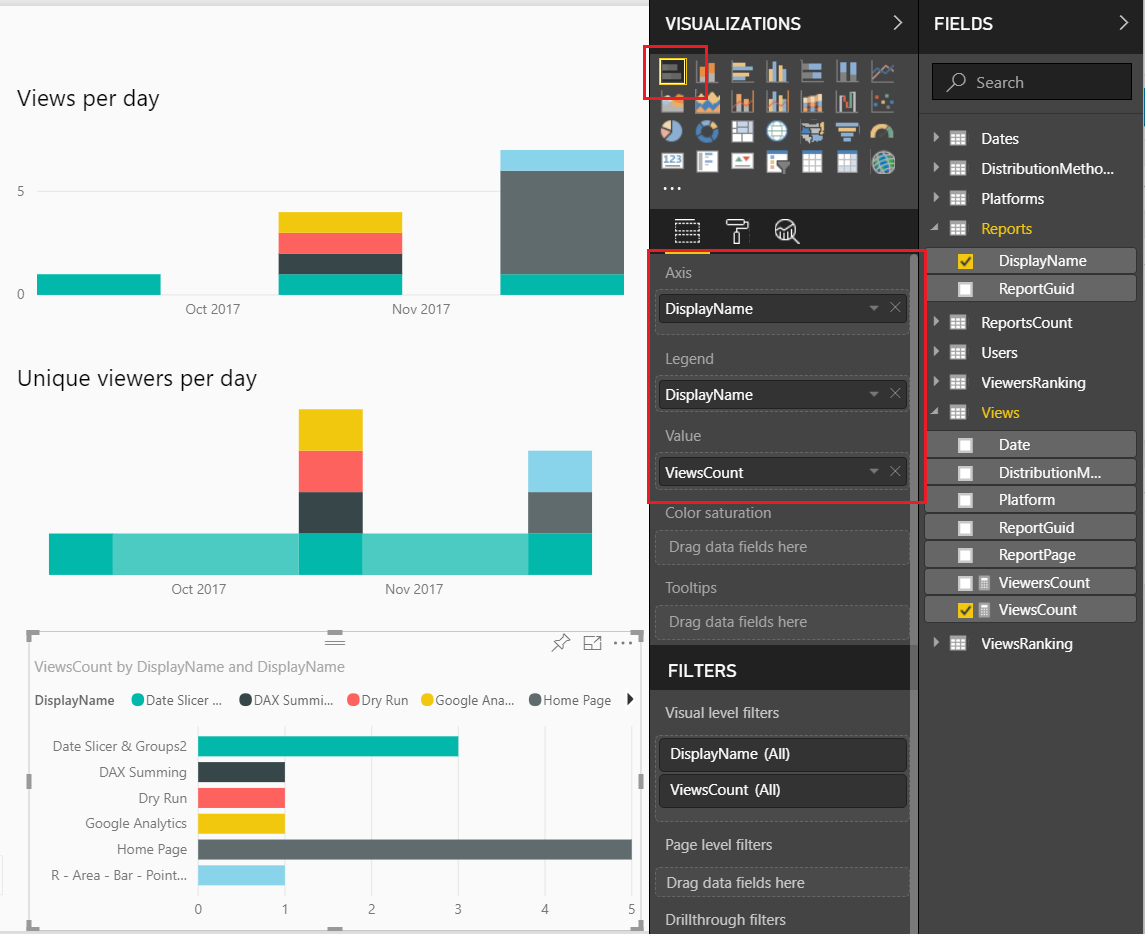
    You might have noticed that in both of these visuals I’ve been removing the legends.  Which means, you don’t know which report is represented by each color.  We will fix that by adding a final visual.  Add the Bar Chart visual from the visualization pane.  Add the following field names to the visual, as shown below:

    Add Bar Chart
    Add Bar Chart

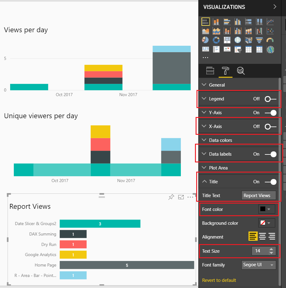
    Next, we will format the visual to clean it up.  Make the following changes, Toggle the Legend to OffToggle the X-Axis to Off, Toggle the Data labels to OnToggle the Title to On and change the Title Text to Report Views, finally change the Font color to Black and Text Size to 14.

    Formatting the Bar Chart
    Formatting the Bar Chart

    We want to sort the reports not by name but by how often they are viewed.  To do this, Click on the ellipsis and from the drop down Select sort by ViewsCount.

    Now we have a custom Usage Metrics Report.

    Final Report
    Final Report

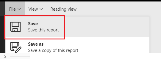
    Be sure to save the file.  Click on File then in the drop down Click the Save button.

    Save Changed Report
    Save Changed Report

    You will notice that our modified Usage Metrics Report will be saved in the Workspace.

    Thanks for following along.  If you found this tutorial helpful please share it with someone who will find this valuable.

  • Power BI Connections: Import

    Power BI Connections: Import

    Power BI’s default connection type is Import. In fact, if you have never dealt with a data source that handles multiple loading methods, you may never know that there are different loading methods because Power BI automatically connects via import. However, if you’ve ever worked with sourcing information from databases or models, then you have seen the option to select Import vs. Direct Query or Live Connection.

    Note: This is a continuation of the Power BI Connections series.  If you would like to read the overview of all the Power BI Connection types you can do so here.

    Below is a quick chart to outline some of the considerations to help you decide whether import is right for you.

    Connection Type Outline
    Connection Type Outline

    Import is the only connection type that brings to bear the full capabilities of the Power BI Desktop. As you move from Import to Direct Query to Live Connection, you trade off ease of use for solutions that will scale.

    Import will pull in the data from the data sources that you have connected to and store & compress the data within the PBIX file. The eventual publishing of the PBIX file will push the data to Azure services supported in the Power BI Backend. For more information on data movement and storage see the Power BI Security Whitepaper.

    When using import, the full Edit Queries suite is available to mash up any data source, transform data-sets and manipulate the data in any way you see fit.

    Query Editor
    Query Editor

    Once you click Close & Apply, the data is loaded into the “front end” of Power BI into the Vertipaq engine.

    Note: The Vertipaq engine is used in both Excel and SQL Server Analysis Services Tabular models. In simple terms, it is the backbone that compresses all your data to make it perform extremely fast when visualizing, and slicing & dicing. For more detailed information on the engine see an excerpt from Marco Russo & Alberto Ferrari’s book “The Definitive Guide to DAX: Business intelligence with Microsoft Excel, SQL Server Analysis Services, and Power BI” found here.

    At this point it is ready for you to extend by building out the relationships between your objects in the model section. After the model is set up you will now be able to add any additional calculations in the DAX (Data Analysis Expressions) formula language. There are two types expressions that you can create, measures and calculated columns. To create these, you can go to modeling, and select the option. When you do this, the formula bar will display. You can also right click on any column or field and select “New measure” or “New column” from those drop down lists.

    New DAX Measure or Column
    New DAX Measure or Column

    Other than the formula bar with intelli-sense, there are several built in tools that can help you build those calculations.

    The first method is to Right Click on the desired field and select an implicit calculation from the drop down:

    Using Implicit Calculations
    Using Implicit Calculations

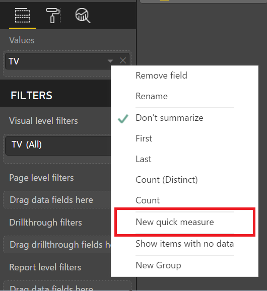
    The second is Quick Measures.  This can be accessed by using right click as described above.

    Using Quick Measures
    Using Quick Measures

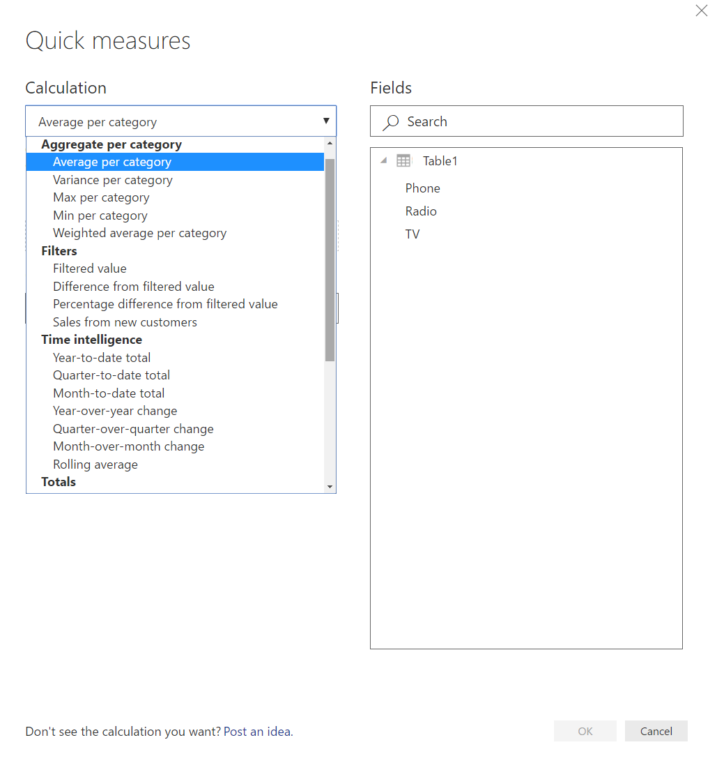
    Here is an example of the Quick Measure dialog box:

    Quick Measure Dialog Box
    Quick Measure Dialog Box

    Quick Measures allows you to choose from a wide variety of calculations to generate a measure. Once the measure is created, you can interrogate the measure and see the code that was generated.  Click on the measure (denoted by a little calculator next to the text) created by the Quick Measure dialog box to see the DAX code.

    Here is an example of what that looks like:

    Sample of Quick Measure
    Sample of Quick Measure

    This is a great method to get your feet wet while you’re learning DAX.

    Note: there are a lot of safety features added to these Quick Measures, such as, an “if” statement wrapped in a “isfiltered”.  You might have to remove these bits of code in order to play with the measure.

    When you have completed your report and publish the report & corresponding dataset to the Power BI Service, you will need to schedule a refresh.  This will be required for any report which relies on the Import Connection. There are numerous use cases that surround whether or not you need a gateway, but a simple rule applies. If the data comes from an on-premises source, you will need one, for cloud sources you usually do not, but you can find in depth refresh documentation here.

    The Import connection has the least amount of restrictions between the three methods, Import, Direct Query, and Live Connection. However, there are a few Import restrictions you should be aware of.

    First, depending on your data source and the size of the data set, the processing of the model could take a bit of time.

    Second, since all the data is being loaded into a table, there is a limitation on how big the file can get for successful publishing to the Power BI Service. That limit is 1 GB for free users & Power BI pro users, 2 GB for Report Server Reports and for Premium Users the size is only bound by the amount of memory you have purchased.

    Note:  The PBIX file can get as large as you want, however, it won’t let you publish.

    Using Import is good when:

    1. You can schedule your data to refresh
    2. Data only needs to be refreshed periodically
      1. Can be refreshed up to 8 scheduled refreshes in a day (restriction from Power BI Service)
    3. The amount of data your importing is relatively small (doesn’t need to scale)
    4. You need to mash up multiple sources such as Azure SQL database and google analytics data sources

    In summary, the Import method is the most flexible, provides all the tools to connect, mashup, extend and visualize your datasets within the Power BI Desktop. It is likely the most used connection type and is the default for all connections. The data you connect to is drawn in, and a copy created and used in both the Desktop and the Service. Scheduled refresh is a requirement for almost all scenarios, and it is likely a gateway is required as well if your data is not located in the cloud.