Data Preparation Tips
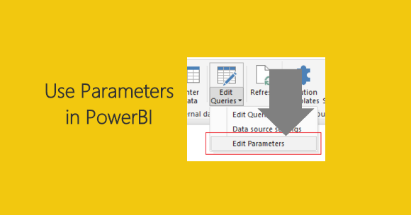
Using Parameters to Enable Sharing
This week I had a number of team members tell me how difficult it was to share a PBIX file and the corresponding data between team members. The department hasn’t committed 100% to the idea of […]