
Dynamic Visuals using Buttons
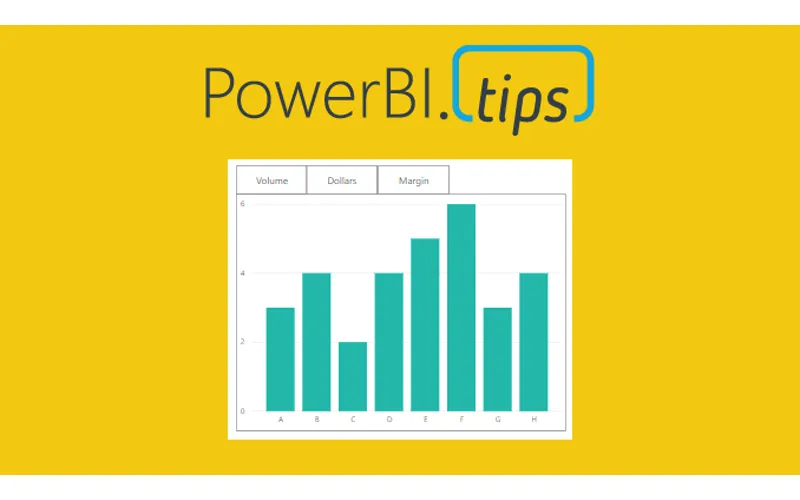
How do I use buttons to switch one chart between Volume, Dollars, and Margin?
TL;DR. Disconnected Control table. SWITCH on Number_ID returns Volume, Dollars, or Margin, default Volume. Bookmark only the slicer: Selected Visuals on, Display and Current Page off. Button Action runs it. Color the button from Number_ID. Title uses the type field. Hide the slicer.
What is the control table?
Home, Enter Data: a numeric ID and a description. The table must not relate to other tables. The measure reads Control[Number_ID]. The page never names the description column in the formula. The title step calls it the type field.
What does the measure return?
Selected Calculation is SWITCH on SELECTEDVALUE(Control[Number_ID]): 1 returns SUM(Sales[Volume]), 2 returns SUM(Sales[Dollars]), 3 returns SUM(Sales[Margin]), and the last argument (the default) is Volume again.
How are the three bookmarks recorded?
From the View ribbon, turn on the Selection Pane and the Bookmark Pane. Select one Number_ID, select only the slicer, Add Bookmark, and rename it Select 1, Select 2, or Select 3. Untick Display and Current Page. Tick Selected Visuals.
How does a button change the chart?
Blank buttons named Button_Volume, Button_Dollars, and Button_Margin. Action on, type Bookmark, mapped to Select 1, Select 2, and Select 3. The bar keeps Category on the axis and uses Selected Calculation as the value.
How does the page show which button is selected?
Button background: if Number_ID is 1, blue, otherwise white. Dollars uses 2. Margin uses 3. Hide the slicer with the eye in the Selection pane and turn visual headers off. The chart title is conditional formatting, field value, using the type field.
Related: Power BI Bookmarks Tips, Tricks, and Best Practices and Consolidate Report Pages Easily with Visual Grouping.
Sometimes, we want the users to see different metrics, but do not want to take up too much space on our page. The scenario we are going to walk through is how to build just one visual (in this case a bar graph). It will include a toggle that allows the user to select their desired calculation, either the sum of Volume, Dollars or Margin.
Final Solution
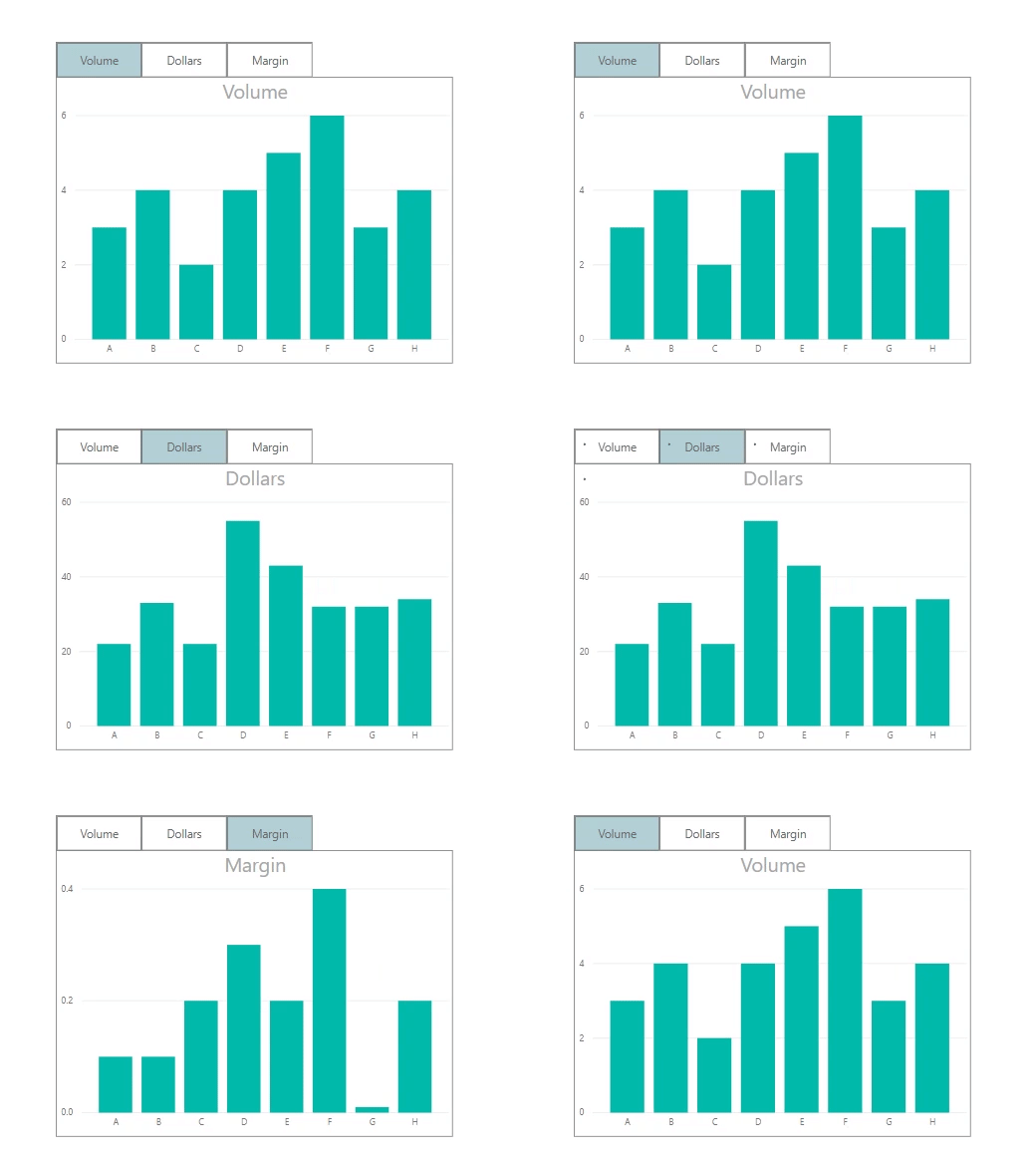
With buttons, we can change specific visuals on a page. Recently, with the release of conditional formatting on titles and backgrounds, we have some new methods to make this easier for the report author and cleaner for the report consumer.
The Build
Before we start, turn on the selection pane and bookmark pane. They can be turned on by clicking on the View ribbon and checking the correct boxes.
First, we’re going to create our control table. This will be a disassociated table. This table should not have any relationships to any of the other tables in our model. We just need to enter a numeric ID and a description of what we want. Click on the Enter Data button found on the Home ribbon. Enter the following data as shown. Click the OK button to close the Create Table dialog box**.**
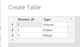
Now that’s set up, we can write our measure. This measure will see what is selected in the Number_ID column of our control table, then return the appropriate calculation. Use a switch statement to select the correct calculation. Create the following measure:
Selected Calculation =
SWITCH(
  SELECTEDVALUE(Control[Number_ID])
   ,1,SUM(Sales[Volume])
   ,2,SUM(Sales[Dollars])
   ,3,Sum(Sales[Margin])
   ,SUM(Sales[Volume])
)
Note: See there is a default value listed in the switch statement. The default calculation means that if nothing is selected, SUM( Sales[Volume] ) will be returned. The default value is represented by the last property in the switch statement.
Time to set up our visual. Add a bar graph with Category on the axis and the new measure, Selected Calculation, in the values fields. Then add a slicer for the Number_ID column. The Number_ID column comes from the control table we added earlier.
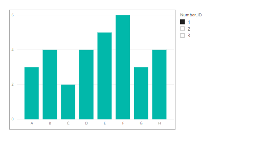
Switching the slicer can now change the graph to show the different calculations.
The next stage is to add three buttons to the top of the graph. In the Home tab of the ribbon, click Buttons and select Blank. Make sure the outline colors and outline width match on all objects, Buttons and chart outline.
Tip: Make sure you label your buttons in the Selection Pane. The selection pane can be turned on by clicking on the View ribbon and checking the box labeled Selection Pane. To Change the name of the button, double click the name listed in the Selection Pane. Giving a title (such as Button_Volume) will make it easily to see what visual items are on the page.
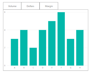
After this, it’s time to add the bookmarks.
The bookmark pane can be turned on by clicking on the View ribbon and checking the box labeled Bookmark Pane.
Step 1:
- Select a value of 1 in the Number_ID slicer.
- Select the slicer (and only the slicer) in the Selection pane.
- Click “Add Bookmark” in the Bookmarks pane.
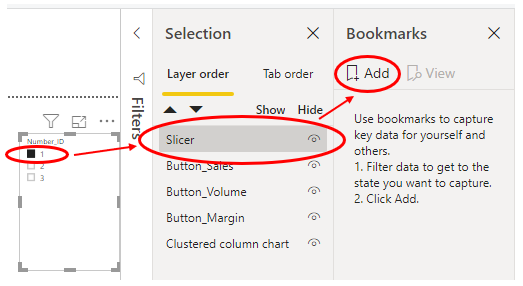
Step 2:
- In the Bookmarks pane, right click the bookmark and rename it to Select 1.
- Right click again, and untick “Display” and “Current Page”. Select “Selected Visuals”.
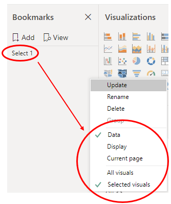
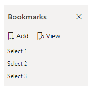
Now repeat step 1 and step 2, but do so with the values of 2 and 3 from Number_ID slicer. Name these bookmarks Select 2 and Select 3. You should finish with three bookmarks, each that filters Number_ID to a different value. You can test the bookmarks by clicking on them once in the bookmark pane.
On Button_Volume, assign the Select 1 bookmark (as Number_ID 1 refers to volume). To do this, click on Button_Volume in the selection pane. In the visualizations pane for this button, go to the property named “Action”. Turn it on, change the type to bookmark, and choose Select 1 in the dropdown.
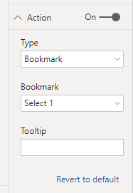
Repeat for Button_Dollars and assign Select 2. Then for Button_Margin and assign Select 3. Now the buttons can change the graph, but it’s a bit hard to see what is selected.
Add Conditional Formatting
This is where conditional formatting can help us! Select Button_Volume in the selection pane. Then in the visualizations pane, turn on the background property, select the ellipsis and click conditional formatting
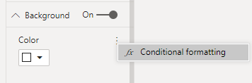
Here’s the settings we want:
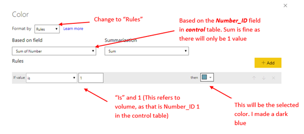
This is going to apply a rule if the Number_ID selected is 1, to give the button a blue background. As there are no other rules, any other number selected will default to the white.
Now, apply the same steps to the other two buttons, but make the rule “If value is 2” for Dollars, and “If value is 3” for Margin.
To tidy up, hide the slicer and turn the visual headers of all buttons off. You can click on the eye next to the slicer in the selection pane to hide it.

Turn the visual headers off by clicking the button, then in the visualizations pane.
Great! Now the tab shows the selected button and correct measure:
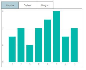
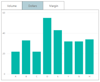
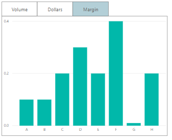
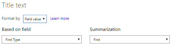
To make it even clearer, apply conditional formatting to the title of the graph. On the graph, open conditional formatting. Set it to field value and use the type field in the control panel.
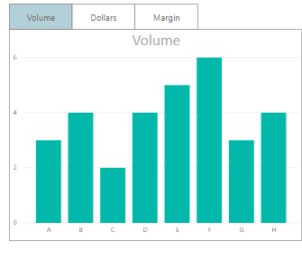
Using this control table allows for greater flexibility. We can add more calculations, easily edit them or even sync across pages, all without having to re-record any bookmarks.