Author: mike carlo

  • Ranking Values with Measures

    Ranking Values with Measures

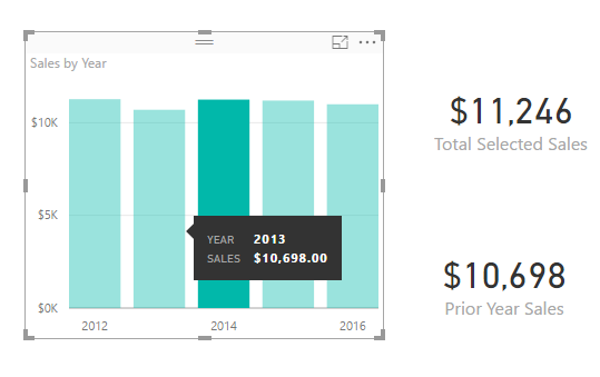
    In many reports we produce we often need a method to score or rank data.  For example, we may need to list the sales totals for the sales team and rank them from highest sales to lowest sales.  Ranking can be done as a calculated column, or as a measure.  When using a measure, the ranking becomes dynamic and takes on the filter context of the table, or visual, that is showing the data.  Calculating a rank as a measure can be useful if you want to allow the user to select different categorical values such as product type and then have the report automatically rank the selected items.  When the report filter context changes the items are automatically re-ranked.

    Alright, let’s jump into the data!

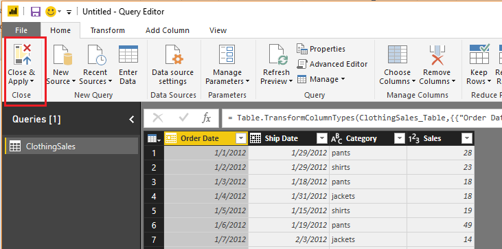
    Open PowerBI Desktop, Click the Get Data button on the Home ribbon and select Blank Query.  Click Connect to open the Query Editor.  On the View ribbon click the Advanced Editor button.  While in the Advanced Editor paste the following code into the editor window, click Done to complete the data load.

    Note: If you need some more help loading the data follow this tutorial about loading data using the Advanced Query Editor.  This tutorial teaches you how to copy and paste M code into the Advanced Editor.

    let
      Source = Excel.Workbook(Web.Contents("https://powerbitips03.blob.core.windows.net/blobpowerbitips03/wp-content/uploads/2017/05/Clothing-Sales.xlsx"), null, true),
      ClothingSales_Table = Source{[Item="ClothingSales",Kind="Table"]}[Data],
      #"Changed Type" = Table.TransformColumnTypes(ClothingSales_Table,{{"Date", type date}, {"Category", type text}, {"Sales", Int64.Type}})
    in
      #"Changed Type"

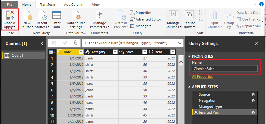
    Once you have copied the m code above into the query editor click Done.

    Clothing Sales Data
    Clothing Sales Data

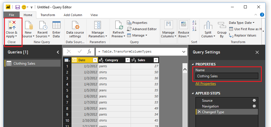
    Be sure to name your query Clothing Sales.  Then on the Home ribbon click Close & Apply to load the data into the data model.

    To understand how the ranking will work we must first understand the DAX function ALLSELECTED.  You can read more about the Microsoft documentation on this function here.

    To illustrate how the ALLSELECTED() function works we will make two measures and place them in a simple table.

    Begin by creating a sum of the Sales in the Clothing Sales table.  Click New Measure on the Home ribbon.  Enter in the following measure equation:

    Total Sales =  SUM ( ‘Clothing Sales'[Sales] )

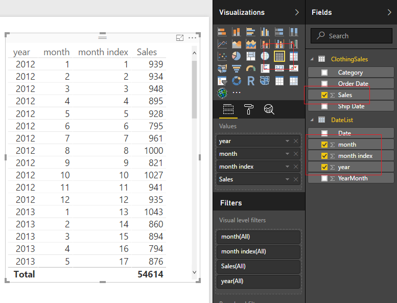
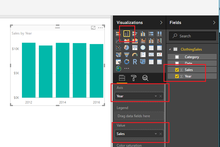
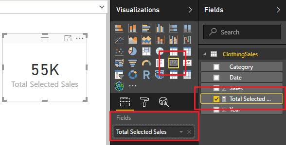
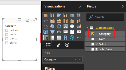
    Now, create a Table visual with the selected columns shown in the image below.

    Add Table Visual
    Add Table Visual

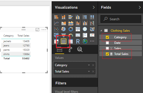
    Sweet, we can see that all the categorical items have been added together forming totals.  Add the Slicer visual for the Category column, see example below.

    Add Slicer
    Add Slicer

    Once the slicer is added we can select various items and see our table filter correctly.

    Using the Slicer
    Using the Slicer

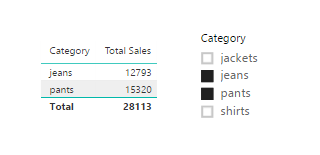
    Note: if you want to select multiple items in the slicer, hold the ctrl key and click on the multiple items that you want to select.  This is how I selected the multiple items in the image above.

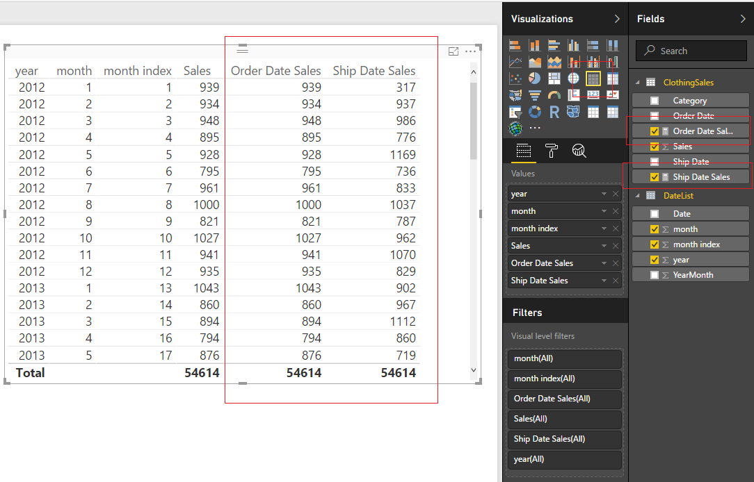
    Now, let us make a measure doing the same calculation but this time we will apply the ALLSELECTED() DAX function.  Click on New Measure on the Home ribbon and enter the following DAX formula.

    Total Sales ALLSELECTED = CALCULATE( sum( ‘Clothing Sales'[Sales] ) , ALLSELECTED( ‘Clothing Sales’ ) )

    Add this new measure into our existing table.

    AllSelected Filter Context
    AllSelected Filter Context

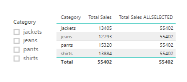
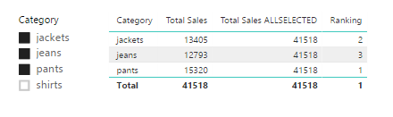
    In this new formula we are calculating the sum of all the clothing sales but using the filter context of all the items selected from our filters.  Notice with nothing selected in our slicers that the sum of all Total Sales 55k, is the same for each row of the table for the column Total Sales ALLSELECTED.  This is due to the fact that we changed the filter context for the sum calculation.

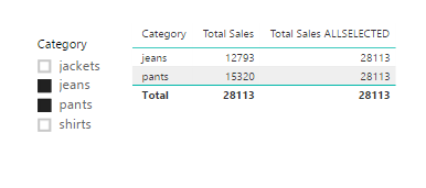
    Select Jeans and Pants from the slicer.  Notice we have the same results but with different totals.  The totals calculated using ALLSELECTED ignored the filter context of jeans and pants and calculated the total of all the selected sales.

    Select Jeans and Pants
    Select Jeans and Pants

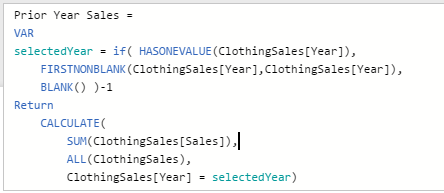
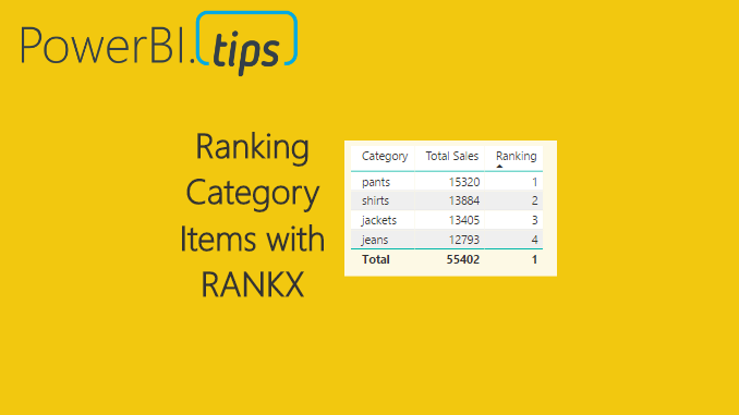
    Finally, we will now add the Ranking.  To calculate the rank we use the DAX function RANKX().  More documentation can be found on RANKX here.

    Create a new measure and add the following:

    Ranking = RANKX( ALLSELECTED( 'Clothing Sales'[Category] ) , CALCULATE( SUM( 'Clothing Sales'[Sales] ) ) )

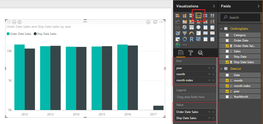
    Add the new measure, Ranking, to the table visual.  Ta Da, automatic ranking based on information that was selected from our slicer visual.

    Adding Ranking Measure
    Adding Ranking Measure

    Note: when we used the RANKX function we called out a specific column the Category column from our Clothing Sales table.  If you only specify the table name this measure will not work.  We are using the filter context of the categories to conduct the ranking operation. 


  • Use Multiple Connections Between Tables

    Use Multiple Connections Between Tables

    For those of you who work in supply chain management this tutorial will be right up your alley.  In my previous job position I had a lot of interaction with our shipping department.  We would look at when orders were placed from the customer, and conduct a comparison to what orders were actually shipped or cancelled prior to shipment.  Our analytics team would produce reports and metrics to our customers about orders and shipment information.

    In an ideal world, every product ordered on the purchase order would be shipped and some point in the future.  But, as we know, in the real world this isn’t always the case.  Orders get cancelled, products get re-ordered, challenges happen, and therefore we would need to track all these changes.  In our shipping analytics group, the team would pull data from our shipping system with columns similar to the following:

    Order Date, Ship date, Product type, and Shipped QTY

    Sometimes you want to sum the data by the order date, and in other cases you want a total by the shipped date.

    In this example, we will walk through making a measure that uses the DAX formula USERELATIONSHIP.  To learn more about this function from the Microsoft documentation follow this link.

    Open PowerBI Desktop, click the Get Data button on the Home ribbon and select Blank Query.  Click Connect to open the Query Editor.  On the View ribbon click the Advanced Editor button.  While in the Advanced Editor paste the following code into the editor window, click Done to complete the data load.

    Note: If you need some more help loading the data follow this tutorial about loading data using the Advanced Query Editor.  This tutorial teaches you how to copy and paste M code into the Advanced Editor.

    let
        Source = Excel.Workbook(Web.Contents("https://powerbitips03.blob.core.windows.net/blobpowerbitips03/wp-content/uploads/2017/06/Clothing-Sales-Ship-Order-Dates.xlsx"), null, true),
        ClothingSales_Table = Source{[Item="ClothingSales",Kind="Table"]}[Data],
        #"Changed Type" = Table.TransformColumnTypes(ClothingSales_Table,{{"Order Date", type date}, {"Ship Date", type date}, {"Category", type text}, {"Sales", Int64.Type}})
    in
        #"Changed Type"
    

    Your loaded data should look like the following:

    Sales Data Load
    Sales Data Load

    Click Close & Apply on the Home ribbon to load the data into the data model.

    We will want to create two measures, one that performs a calculation on the Order Date column, and one on the Ship Date.  To do this we need a date table to populate all the dates needed for this data set.

    We can do this by creating a DAX date table.

    On the Modeling ribbon click New Table.

    New DAX Table
    New DAX Table

    In the formula bar enter the following.

    DateList =
       GENERATE (
          CALENDAR ( DATE ( 2012, 1, 1 ), DATE ( 2017, 12, 31 ) ),
          VAR currentDay = [Date]
          VAR startYear = 2012 // we know this by looking at our data
          VAR month =  MONTH ( currentDay )
          VAR year =  YEAR ( currentDay )
       RETURN   ROW (
          “month”, month,
          “year”, year,
          “month index”, INT ( ( year – startYear ) * 12 + month ),
          “YearMonth”, year * 100 + month  )
     )

    Note: This DAX formula is building a date table, for each row we are building the columns, Month, Year, Month Index, and an integer for YearMonth index.  This is a simple way to repeatedly create a date calendar based on your data. 

    Great, we have completed the data loading.  Now, we need to link the date table to the Clothing Sales data.  To do this click on the Relationships button on the black navigation bar located on the left side of the screen.  Then Click & Drag the Date column from the DateList table to the Order Date column of the ClothingSales table.  This will create a one to one relationship link between the two tables.  Note that the relationship is illustrated in a solid white line.  This means it is an active relationship.

    Next, drag the Date column from the DateList table to the Ship Date column of the ClothingSales table.  We have made our second connection.  Note that this connection has dotted white line.  This means this connection is not active.  Also, we can observe that the relationship between the two tables, DateList and ClothingSales is a one to many relationship.  This is denoted by the * on the ClothingSales table, and the (1) one on the DateList table.  The * means there are duplicate values found in the ClothingSales table.  The (1) on the DateList table means in the Date column we only have unique values, no duplicates.

    Note: You can edit the connections between tables by double clicking the connecting wires.  This brings up the Edit Relationship dialog box which allows you to edit things like, the Cardinality, Cross Filter Direction and activating / deactivating the connection.

    Once you’re done your relationships should look like the following:

    Linked Tables
    Linked Tables

    By default, Power BI will only allow one active connection between tables.  Therefore, we have one connection active and the other has been inactivated by default.  Return to the report view by clicking the Report icon on the left black navigation bar.

    Report View
    Report View

    Now that we have completed the data modeling let’s make some visuals.  We will start by making a simple table to see what the data is doing.  Add the columns from the two tables, ClothingSales and DateList to a Table Visual.

    Create Table Visualization
    Create Table Visualization

    Great!  Now we have the total number of sales based on the order date.  We know this because it is the primary connection that we established earlier when we linked our two tables together.  But, what if I wanted to know the sales that were shipped based on the Ship Date.  Earlier we made this connection but it is inactive.

    Here is the awesomeness!  We can create a measure that calculates different results between a user specified relationship.

    First, we will re-calculate the sales number that we already have in our table.  On the Home ribbon click the New Measure and enter the following in the DAX formula bar:

    Order Date Sales =
       CALCULATE (
       SUM ( ClothingSales[Sales] ),
       USERELATIONSHIP ( ‘DateList ‘[Date], ClothingSales[Order Date] )
       )

    Note: In this DAX formula we are creating a explicit measure, meaning we are specifically telling Power BI to sum a column.  An implicit calculation is what we did earlier when we added the sales column to the table.

    The USERELATIONSHIP filter within the calculation forces Power BI to calculate the sum based on the dates listed in the Order Date column.  To see another demo on UseRelationship you can watch this video from Curbal.

    Create another measure with the following DAX formula:

    Ship Date Sales =
       CALCULATE (
       SUM ( ClothingSales[Sales] ),
       USERELATIONSHIP ( ‘DateList ‘[Date], ClothingSales[Ship Date] )
       )

    This time we are forcing Power BI to use the inactive relationship to calculate the sum of the sales by shipped date.  Add the two new measures to our table and we now can see how the calculations differ.

    Sales By Order & Ship Date
    Sales By Order & Ship Date

    The calculated sales for the order dates match our earlier column.  This is expected, and we can confirm that this calculation is working properly.  The shipped date sales are now calculating a different number.  In some cases, the Shipped Date Sales is lower than the orders, because in that month you took in more orders than you shipped.  In other months, the Shipped Date Sales is higher than the Order Date Sales, because there were likely large shipments ordered in the prior month and shipped in a different month.

    By adding a Bar Chart from the Visualizations pane, we can now see sales by order date and ship date.

    Bar Chart by Year
    Bar Chart by Year

    We can even dig deeper into the data.  Click the Expand button to see the data by Year and Month.

    Expand Button
    Expand Button

    Well that is about it.  I hope you enjoyed this tutorial about using two relationships between data tables.  If you want more information about DAX check out these books that I have found extremely helpful.

    This specific example was based of the article from Marco Russo at SQLBI on UserRelationship in Calculated Columns.  Follow Marco at http://www.sqlbi.com/articles/

  • UseRelationship DAX Tutorial – Curbal

    UseRelationship DAX Tutorial – Curbal

    Here is another great tutorial from Curbal.  This tutorial teaches you how to use the DAX function UserRelationship.  This is important when your dealing with a tables in your data model that have multiple relationships.  Power BI by design can only handle one relationship between two different tables.  This will also be an important function to use when you have source tables that contain multiple date columns.  This is a pretty slick function when handling supply chain type data sets.

    For the full documentation from Microsoft visit this page.

    The Highlights:

    Full video below:

    Curbal has been generating a lot of great content.  To learn about for more information you can visit the website found here, or visit the YouTube Channel.

    For more great videos about Power BI click the image below:

    PBI Videos


  • Microsoft Data Insights Summit

    Microsoft Data Insights Summit

    This year I had the wonderful privilege to attend the Microsoft Data Insights summit for 2017 as a speaker.  My topic was the Top Ten Tutorials from PowerBI.Tips.  So, let me say thank you to all those who attended you provided a very fun audience and were very positive, Thanks.   For those of you who couldn’t make it to the Data Insights Summit below is the actual talk:


    We went through 10 different tutorials in 50 minutes.  Needless to say we went pretty quick.  So, if you were there, or just want to go through the tutorials on your own here is the list of the Top Ten Tutorials.

    10. Loading Data From a Folder ( Link to Tutorial )

    9. Using Parameters ( Link to Tutorial )

    8. Loading Multiple Excel Files ( Link to Tutorial )

    7. Custom Date Tables ( Link to Tutorial )

    6. Percent Change ( Link to Tutorial )

    5. Histograms & Disassociated Tables ( Link to Tutorial )

    4. Bar and Whisker Plot in R ( Link to Tutorial )

    3. Bar, Scatter, and Area Chart in R ( Link to Tutorial )

    2. HEX Bin Scatter Plot in R ( Link to Tutorial )

    1. Color Theme Generator ( Link to Tutorial, Link to Advanced Color Theme Generator )


    If you wan to learn more about Power BI or DAX follow this Link to books and other helpful Power BI resources.

  • Power BI June 2017 Release

    Power BI June 2017 Release

    This month we have a big release for Power BI Desktop and for the Power BI service.  There are a number of great new features.  For the everyday user you will love the new Data bars for the new table & matrix visualizations.  For me this really feels like a feature that is making tables and the matrix views feel more like the pivot table and formatting that can be done in excel.  Great Job Microsoft!

    For the developer who want to who may be using Rest APIs you should definitely check out the newly added feature called Custom Data Connectors.  There was an announcement last month which now opens up the world for developers to write custom connectors right in Visual Studio.

    The full June release is described in the video below:

    For the full blog write up hit this link.

    For more details about the custom data connector follow these links for more resources:

    Data Connectors GitHub repo

    Data Connector technical reference

    M Library functions

    M Language specification

  • Using Variables within DAX

    Using Variables within DAX

    Every so often you find a hidden gem, something so valuable, just hiding there in plain sight.  Recently, I found out that I LOVE the using Variables with in a DAX expression.  Ok, brief introduction, I was trying to calculate sales changes between different years.  The data looked similar to the following table:

    Year Month Sales
    2013 1 20
    2013 2 25
    2014 1 22
    2014 2 23
    2015 1 21
    2015 2 31

    I wanted to sum the sales for each year and compare the percent change between each year.  If you have followed my blog for a while, I have a ton of tutorials about percent change.  ( See list of other tutorials dealing with percent change )

    Now, for the twist making this calculation more difficult.  I want to calculate percent change even when a filter is applied by clicking on a visual.  By using variables we can apply some data modeling voodoo magic to get the desired results.  See a sample of the measures working in the Power BI Embedded sample below:

    Let’s dive in!

    Open up PowerBI Desktop, Click the Get Data button on the Home ribbon and select Blank Query.  Click Connect to open the Query Editor.  On the View ribbon click the Advanced Editor button.  While in the Advanced Editor paste the following code into the editor window, click Done to complete the data load.

    Note: If you need some more help loading the data follow this tutorial about loading data using the Advanced Query Editor.  This tutorial teaches you how to copy and paste M code into the Advanced Editor.

    let
     Source = Excel.Workbook(Web.Contents("https://powerbitips03.blob.core.windows.net/blobpowerbitips03/wp-content/uploads/2017/05/Clothing-Sales.xlsx"), null, true),
     ClothingSales_Table = Source{[Item="ClothingSales",Kind="Table"]}[Data],
     #"Changed Type" = Table.TransformColumnTypes(ClothingSales_Table,{{"Date", type date}, {"Category", type text}, {"Sales", Int64.Type}}),
     #"Inserted Year" = Table.AddColumn(#"Changed Type", "Year", each Date.Year([Date]), type number)
    in
     #"Inserted Year"

    Your loaded data should look like the following:

    Load ClothingSales Data
    Load ClothingSales Data

    Rename the Query to ClothingSales, and click Close & Apply to load the data into the data model.

    It is a good practice to review the data columns and verify that the formatting is set up correctly.  To do this click on the the column Date in the Fields pane, then click on the Modeling ribbon.  In the Formatting section change the format to Date Time and select M/d/yyyy format.  Repeat this for the following columns:

    • Format Sales to Currency then select $ English (United States)
    • Format Year to Whole Number

    With our data properly formatted we are ready to build a simple bar chart.  See the image below for the bar chart set up:

    Create Bar Chart
    Create Bar Chart

    To start we will create a explicit calculation for the total selected sales.  On the Home ribbon click the New Measure button and enter the following code:

    Total Selected Sales = SUM(ClothingSales[Sales])

    Pro Tip: To learn more about explicit vs implicit calculations within Power BI Click the following link.

    Add a Card visual and add our new measure.

    Add Card Visual
    Add Card Visual

    Let’s change the formatting measure so we can see the full number.  With the Card still selected click the Paint Roller expand the section labeled Data label and change the units from Auto to None.  This allows us to see the entire sales number.

    Remove Number Formatting from Card
    Remove Number Formatting from Card

    Let’s enhance this card visual further by adding dollars formatting.  Make sure you have the Total Selected Sales measure selected by Clicking on the words of the measure.  Then, click on the Modeling ribbon click and change the Format to Currency, then select $ English (United States). The final format of the card visual should look like the image below:

    Final Card Format
    Final Card Format

    For the next step we will repeat the previous steps for our new measures.

    1. Create the measure
    2. Change the formatting of the card
    3. Change the formatting of the measure

    The next measure will calculate the prior year total sales, but only calculate this value when a filter context from a different visual is applied.  Take note this is the magic I was talking about!!

    Prior Year Sales = 
    VAR 
    selectedYear = if( HASONEVALUE(ClothingSales[Year]), 
        FIRSTNONBLANK(ClothingSales[Year],ClothingSales[Year]),
        BLANK() )-1
    Return 
        CALCULATE(
            SUM(ClothingSales[Sales]),
            ALL(ClothingSales),
            ClothingSales[Year] = selectedYear)

    I am going to pause a second here and explain what is going on in this measure as we have multiple things going on.  First, we are creating a variable with the VAR.  In the below image I show you that the variable that we are defining is called selectedYear.  SelectedYear returns a value of blank if multiple years are selected.  This is accomplished by using the if statement and the HASONEVALUE() DAX formula.  The Return in then allows us to output a value.  In this case we are using the CALCULATE() to sum all the sales.  The next part is crucial to making this work.  Within the Calculate we are applying two filters.  The first filter selects the entire table with the All() then we apply the filter from the earlier defined variable with the name of selectedYear.

    Prior Year Sales in Color
    Prior Year Sales in Color

    Apply the same formatting steps 2, and 3 mentioned earlier.  Now, we can select one of the years within our bar chart.  Doing so populates the two measures we created.  The selected year total sales, and the prior year of sales. I selected the year of 2014, which has sales of $11k.  Hover your mouse over the bar for year 2013 and the tool tip will appear showing a total sales of $10K.

    Selected Bar
    Selected Bar

    Now we will make our percent change measure.  Enter the following as a new measure:

    Percent Change = DIVIDE([Total Selected Sales],[Prior Year Sales],1)-1

    Pro Tip: Use the DAX function DIVIDE when dividing two numbers, this protects against odd cases where the denominator is zero.

    Click on the Modeling ribbon and change the formatting of the measure to Percentage.  Add a final measure that calculates the difference.  See measure below:

    Prior Year Delta = [Total Selected Sales] - if( [Prior Year Sales] = BLANK(), [Total Selected Sales],[Prior Year Sales])

    This measure calculates the total changes in sales between the two selected years.  The if statement at the end of the equation handles a special case that if you don’t have any individual year selected the prior year delta defaults to zero.

    Thanks for following along an learning about variables.  Trust me, these are super helpful.  Make sure you spend some learning how to leverage variables in your DAX equations.

    This Tutorial was inspired by the following article I found from SQLBI authored by the master of DAX Alberto Ferrari.  I mean, come on, Ferrari, how baller is that last name!  I guess that is why he is the master.  Kudos to you Alberto!

    Still need more reading about DAX, check out the following books:

  • Power BI May 2017 Release

    Power BI May 2017 Release

    It’s that exciting time of month again.  Time for another power BI desktop release.  This month here are a couple of good highlights you should check out.

    1. First up enhanced tables with word wrapping in both headers and table rows.  Woot Woot, I have really needed this feature!
    2. Clicking a row in the table will now allow filtering in other visuals.  Similar functionality to the matrix features that we already saw last month.
    3. Enhanced URL links for tables.  This on is interesting.  If you are an ad agency you should really pay attention to this one.  This allows you to embed a mailto command directly in a table.  Then you can click the link to send an email to someone directly from Power BI, perfect for following with a sales leads.
    4. Combo charts label density.  This feature is one I can really stand behind. Frankly, I didn’t know I needed it, but now that I have seen the light, this will be awesome.

    For the full Power BI Desktop release here is the full announcement.

    If you want to watch the full video for the release you can see the full video below:

    Download the latest release of Power BI Desktop here.

  • SUM & SUMX Tutorial – Curbal

    SUM & SUMX Tutorial – Curbal

    Learn how to use SUM() and SUMX() with this great video from Curbal. As you become more familiar with PowerBI you will increase your understanding of DAX (Database Analysis Expressions). Microsoft has an extensive list of all the expressions you can use found here.  One of the more common expressions you will use is SUM and SUMX.

    Example of SUM, SUMX and Calculate from PowerPivotPro

    Microsoft Documentation of SUM

    Microsoft Documentation of SUMX

    Using the SUMX and SUM expressions:

    To learn more about DAX I have read both of these book and found them extremely helpful.  They both cover the basics and then quickly get you understand how to make complex calculations which you will need to make the right visual work.

    Curbal has been generating a lot of great content.  To learn about for more information you can visit the website found here, or visit the YouTube Channel.

    For more great videos about Power BI click the image below:

    PBI Videos

  • Dynamic Filters in PowerBI

    Dynamic Filters in PowerBI

    This video talks about how to create custom links that apply report level filters.  This is super cool and provides a ton of wide flexibility when building drill down reports.  In this example Patrick talks to filtering a report based on a Sales Person (Lilly Code).  Great technique for drilling down into subsets of data within a report.  If implemented in correctly this will enhance the user experience.

    Dynamic filtering with PowerBI:

    In the above video Patrick has referred to a previous video done by Adam talking about report filters within the URL query string.  For convience I have linked the referred video below, so you can watch it all in one place.

    If you haven’t already make sure you go check out Adam’s site and YouTube Blog for more great information.

    For more great videos about Power BI click the image below:

    PBI Videos

  • Power BI April 2017 Release

    Power BI April 2017 Release

    With another month comes another exciting release of PowerBI desktop.  This month we have a number of really interesting features releases.  One of the more interesting feature releases you should definitely check out is the Add Column by Example.  I have seen a demo of this feature and can definitely see the potential for speeding up the data cleansing process in the query editor.  I’ve also included the YouTube video below for this feature.

    To read about the full release from Microsoft hit the link here.

    The April 2017 Update:


    Check out the Add Column by Example demo:

    For other great Power BI videos click the image below:

    PBI Videos