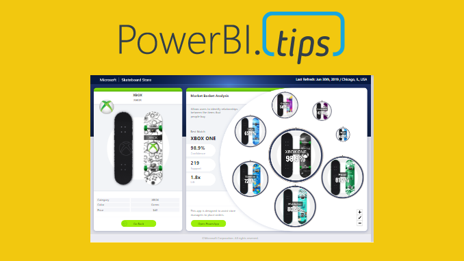
This report is just over the top amazing cool! Check out the work done by the Microsoft team to make this incredible report. It is called the Microsoft Sales & Returns report. We love this one so much we have produced over 48 HIGH RESOLUTION scrims based on this report design. Download all of them for free.
If you like the content from PowerBI.Tips please follow us on all the social outlets. Stay up to date on all the latest features and free tutorials. Subscribe to our YouTube Channel. Or follow us on the social channels, Twitter and LinkedIn where we will post all the announcements for new tutorials and content.
Introducing our PowerBI.tips SWAG store. Check out all the fun PowerBI.tips clothing and products:
Recently I had the privilege of working with Microsoft doing a Webinar on layouts. One thing we are passionate about at PowerBI.Tips is good looking reports that drive action. Often as report authors we spend a ton of time working on the data model, and the calculations. While these things are important, we must also consider the user experience.
You may have the most compelling report but lack some visual appeal. Alternatively we might have a great looking report but the navigation or interactions is un-intuitive. We then are spoiling the impact power of our report.
Use Layouts
This is where we feel our layouts make a great fit. It provides a shortcut to provide excellent looking reports on top of your existing data model.
Get your hands on some layouts now and try them out. Check out the downloads below.
Want a Layout without the PowerBI.Tips Branding. Check out these paid layouts.
If you like the content from PowerBI.Tips please follow us on all the social outlets. Stay up to date on all the latest features and free tutorials. Subscribe to our YouTube Channel. Or follow us on the social channels, Twitter and LinkedIn where we will post all the announcements for new tutorials and content.
Introducing our PowerBI.tips SWAG store. Check out all the fun PowerBI.tips clothing and products:
KPIs are a key visualization type used to convey high level metrics to the end users. They provide an at-a-glance metric that allows business users to know whether they are on track or off-track. Over the course of time that single metric number has been enhanced to include lines to showcase trends, date stamps, variance and many other metrics to convey key metrics in a compact and concise way. There are a number of different takes on what a KPI can or should look like. If you would like to take a look at all the different KPI visuals you can download from AppSource you can find those here there.
I’ve used several of the visuals from AppSource before, and
what I would recommend is that you always verify that the visual has the blue “Certified”
label if you plan on just using it. That means that the custom visual has met
certain code and verification criteria and the visual is not accessing or using
external resources. That is not to say that you can’t use the other visuals,
but I would recommend looking at them closer and potentially reaching out to the
owner of the custom visual to see if there are any extraction or third party
interactions that would not be acceptable risk for your company.
That being said, one of the great things about having custom visuals is that they typically offer more enhanced visual options or settings that you cannot find in the default visual set in Power BI. KPIs have been one of those visuals that needed a bit more enhancement. I’m happy to say in the latest December release of the Desktop it received it. If you’ve been looking elsewhere for your KPI visual, it might be high time to give the latest default version a little bit of a test run as it offers some of the key features that are plenty enough for me.
Basic Updates
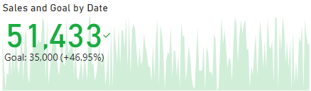
Prior to the December update the KPI visual was a bit standard. An example of what that looks like is here.
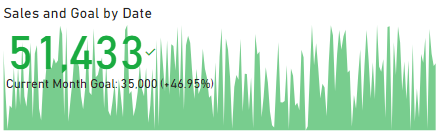
However, if you look at the below example of the new one, there have been several key updates that pop this KPI now by default and extend it to make it look more pleasing. The first change is obvious, the Font is DIN and brings a bold pop to the overall number. We’re off to a good start! We can also now change the Font family of the larger metric which will allow us to mirror the overall fonts we’ve selected within our other visuals.
The Indicator and Goal properties have received the most prominent updates, but there are also some key changes that allow us to now set the font colors both statically and conditionally.
Indicator Properties
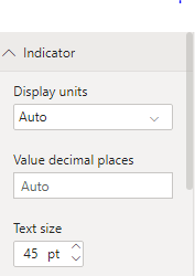
Let’s see how these changes impact things overall. First, lets take a look at the Indicator. The options went from this:
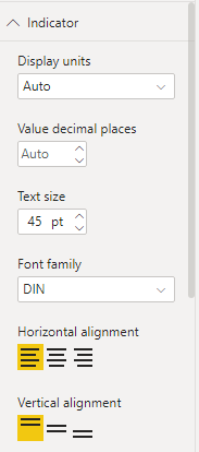
To this:
What does that do for our KPI? Aside from what we outlined above, it gives us a simple two click option to adjust where we want the number (Top & Left), which makes our trend seem a bit more trendy?
Another option we now have is to increase or decrease the transparency of the trend.
Goal Properties
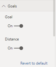
The second property area that received a bunch of changes is the Goals area. That looked like this:
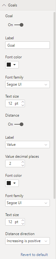
While the new properties pane looks like this:
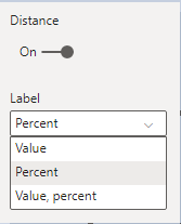
This change is almost like the difference between the Edison bamboo filament light bulb and the latest LED that lets you pick between millions of colors… Ok, maybe that’s a bit extreme, but you get the point. This property is now extremely useful. Note: the Goal label name can be changed and the metric returned for the distance value can be updated to show the percentage, value or both.
The color and font family for both Goal and Distance are updateable
now as well along with a new property for the Distance direction.
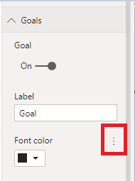
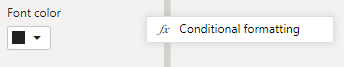
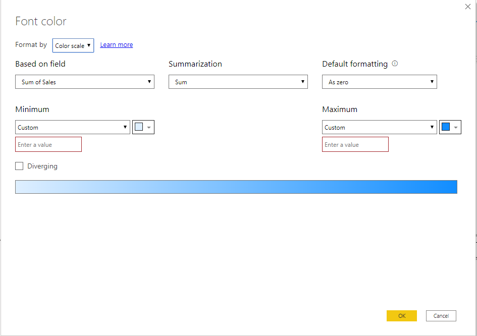
Conditional Formatting
One of the “hidden” things to be aware of is that the above screen shots are the default view of all properties. To see if you can use a conditional setting you need to hover the mouse over the Font color area. Doing so will illuminate the “…”
Clicking that gives us :
And one more click opens the dialogue where we can set our conditions.
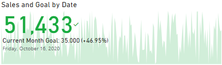
One final key property is the addition of the top level “Date” property. This is a great addition in that it takes away any doubt about what the current KPI context is without having to look at filters.
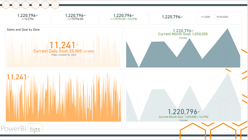
Showcase
Utilizing all the capabilities now given, we can create a series of KPIs that carry the vast majority of all our needs in the out of the box visual. Below is just an example of a bunch of different ways to format the KPI visual. The goal here is to show how many different ways we can see these metrics using the same KPI visual now that we have all these new properties at our disposal.
Sometimes the features we want to have added to visuals in Power BI aren’t being worked on. It isn’t for lack of effort on the Power BI team, believe me. But there are only a finite number of resources, and a backlog a mile long. Check out ideas.powerbi.com to see all the ideas being requested. I believe that is why they opened up a program to work with Power BI experts to engage with the Power BI team directly. These KPI features are a result of that program. The individual we can all shower with our thanks is James Dales. You can check out what James is up to on his blog – https://powerbi.jamesdales.com/, and be sure to hit him up on twitter and offer up a bit of thanks – @jamesdales
If you like the content from PowerBI.Tips, please follow us on all the social outlets to stay up to date on all the latest features and free tutorials. Subscribe to our YouTube Channel, and follow us on Twitter where we will post all the announcements for new tutorials and content. Alternatively, you can catch us on LinkedIn (Seth) LinkedIn (Mike) where we will post all the announcements for new tutorials and content.
As always, you’ll find the coolest PowerBI.tips SWAG in our store. Check out all the fun PowerBI.tips clothing and products:
For each visual in Power BI Desktop there is a button called Focus Mode. This feature highlights a single visual. While this can be helpful, it does remove the ability to change or adjust the visual based on filters or slicers. I’d like to introduce to you the concept of Scaling a visual.
In this tutorial we walk through how to take a collection of visuals. Then group all the visuals. Finally, control the group of visuals by hiding or showing them with bookmarks.
Check out this video tutorial on how to accomplish this within Power BI Desktop.
Tutorial Video
Downloads
Download the icons and sample PBIX file at my GitHub repo.
If you like the content from PowerBI.Tips please follow us on all the social outlets. Stay up to date on all the latest features and free tutorials. Subscribe to our YouTube Channel. Or follow us on the social channels, Twitter and LinkedIn where we will post all the announcements for new tutorials and content.
Introducing our PowerBI.tips SWAG store. Check out all the fun PowerBI.tips clothing and products:
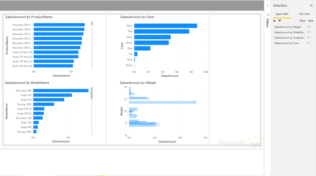
We do a ton of Layouts here at powerbi.tips and with the introduction of the new visual grouping feature I was looking for different ways I could utilize that functionality to make templates for different reporting scenarios. First, if you aren’t familiar with how to build a visual group, be sure to check out a blog Mike wrote on this a little while ago on the subject.
While I was exploring an idea of how I might leverage this new feature, a challenge I’d seen re-occurring in the Power BI Community forums popped to the forefront of my mind. This new feature gives a perfect solution for answering the question of Report page consolidation.
Time and again I’ve seen people talk about navigation issues related to the number of pages or tabs they have in their reports. Sometimes, particularly in embedded scenario’s, you can’t reduce the pages and break them up into smaller reports. This could already be accomplished in the past, but man oh man, good luck finding what you were looking for in the selection pane. Let me show you how easy this is to accomplish with the addition of the new visual grouping feature. By walking through these few examples you can extend this to however many pages you need following the same patterns I describe below.
Setup:
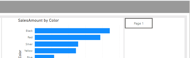
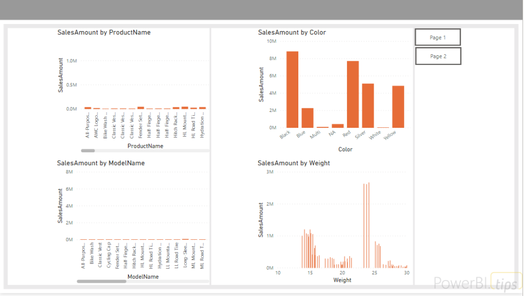
On your main
page, make some room for buttons that you can create to toggle your pages
on/off. You can see I did that in the
image below.
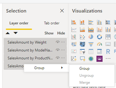
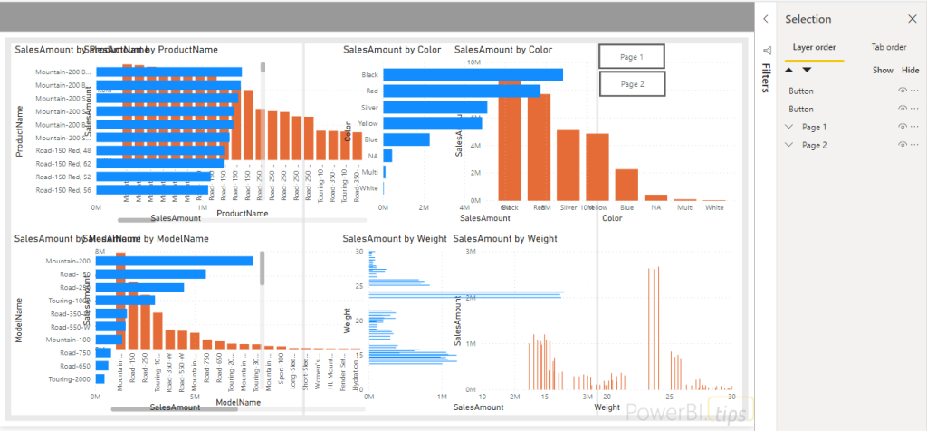
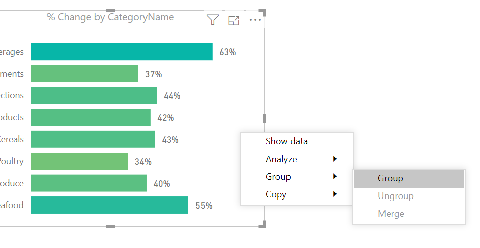
Next we’re going to click on the top object of the selection pane and hold SHIFT + Click the last object, this will highlight all the objects.
Right click and select Group from the drop down menu.
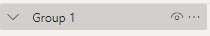
This will
create a “Group 1”
Let’s rename this to Page 1. You can do that by Double Clicking on the group name and typing in the new name, Page 1.
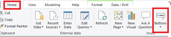
Next, we’ll
create a button called “Page 1”
Select the Home ribbon, then click the icon called Buttons.
Choose a Blank button from the drop down. In the formatting pane under the visualization area choose the section titled Button Text and toggle it on, then type in Page 1.
Place the button in on the right side of the screen.
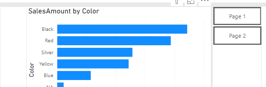
Great, now since we just created this button, let’s create a second button. This one will be for our “Page 2”. Follow the same steps above or select the Page 1 button and do a CTRL + C (copy command) / CTRL +V (paste command) to create a new button. Rename it to Page 2 and you should end up with this
Prep Additional Page
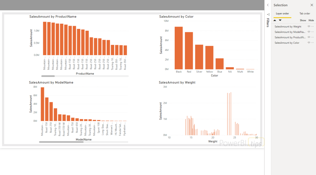
Now, here is where this gets cool. Imagine you have N number of pages, all with roughly 10 objects on each page. We are going to go to each page and condense all the objects down to a single one. Go to your second page, in the same fashion that we created our page 1 group, we select all the objects in the selection pane.
An alternative method would be to just click on your report canvas and CTRL + A to select all objects, then right click and create group. We now see our new group in the selection pane and we can double click to rename it Page 2.
Bring It Together
Now Click on the Page 2 group and hold CTRL +C to copy the group
Navigate to page 1 and CTRL + V to paste the group.
This will
bring all the objects from your Page 2, to page 1 and it will look like a giant
mess similar to this
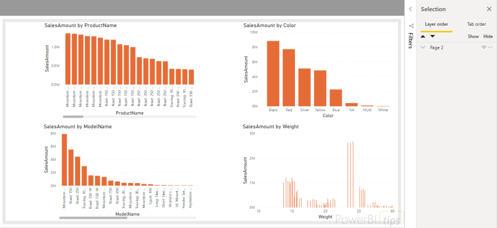
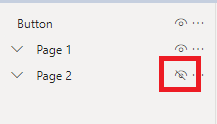
But you know what isn’t a mess? The Selection pane! Because we created the group, all we need to do is toggle the Page 2 visual icon to off
And our page
looks normal again. Now let’s hook up the buttons and bookmarks.
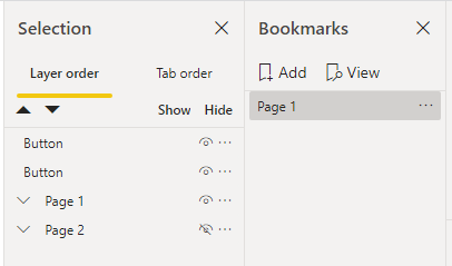
Go to the View ribbon and open the Bookmarks pane.
Click the Add button at the top of the window. This will create a snapshot of the current state of the report page. Double Click the bookmark that is created and change the name to Page 1.
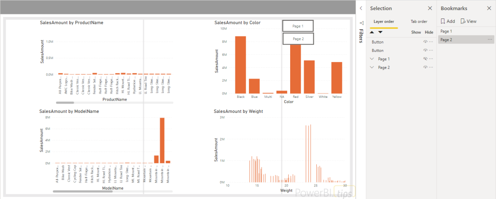
Now, toggle the Page 1 visual group off from the Selection Window. Then turn the visibility of Page 2 visual group to on.
Create a second bookmark. Now, change the name to Page 2. You’ll likely notice that things just aren’t aligned right (at least in my case that is true because I’m using a background.
But
since the visual grouping is its own object, all I need to do is select it and
all the visuals resize for me! I don’t have to individually mess around with
each one! Super cool.
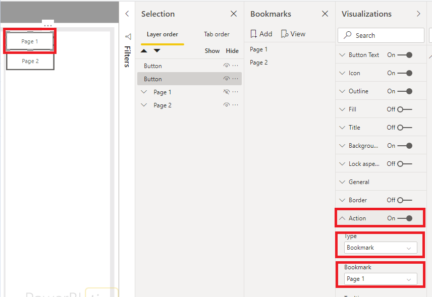
The last thing we need to do is connect our buttons with our bookmarks. We Select the Page 1 button. Choose the Action in the formatting and toggle it On.
Select the Bookmark from the Type drop down. Then Select the Page 1 bookmark we created.
Repeat the same thing for Page 2. You have just created navigation buttons to the two views of your report pages.
CTRL + Click in Power BI desktop will activate the actions on the buttons. Finally, you can see that you will toggle between the report pages on the single page. WHEW!
Closing
This was possible before visual grouping, but now it is an EXTREMELY clean and efficient way to consolidate your report pages and add a ton of objects into a single page. You do have a lot of objects on the page, but don’t worry there isn’t a performance impact because they don’t render until you click the button to make them appear. You can test this out by enabling the Performance Analyzer in the View ribbon.
Visual grouping coupled with bookmark grouping have made these features fun to use and easily manageable for all. This is just a simple use case where extending the use of visual grouping to help us manage our reports better can make a world of difference as we build. I hope you enjoyed this post and that it helps you clean up any reports you may have that got a little unwieldy.
If you like the content from PowerBI.Tips, please follow us on all the social outlets to stay up to date on all the latest features and free tutorials. Subscribe to our YouTube Channel, and follow us on Twitter where we will post all the announcements for new tutorials and content. Alternatively, you can catch us on LinkedIn (Seth) LinkedIn (Mike) where we will post all the announcements for new tutorials and content.
As always, you’ll find the coolest PowerBI.tips SWAG in our store. Check out all the fun PowerBI.tips clothing and products:
We are starting today off with a fun chart. We will be making a filled donut chart. Typically, I don’t use donut charts but in this case I think we have a good reason, and it’s delicious…
The data being used in this visual varies from o to 100%. This could be something like a test score or a compliance number. Thus, we will be using the donut chart to represent a completion of 100% or some variant below.
Video on how to build this chart.
During this video we used a couple measures. They are the following:
Measures
Average Product Score = AVERAGE( 'Product Scores'[Score] ) / 100
Average Product Score Inverse = 1 - [Average Product Score]
Where the value of the Score comes from the Product Scores table. The Score column ranges from 0 to 100%. If you like this visual and want to download a sample file visit my GitHub page.
If you like the content from PowerBI.Tips please follow us on all the social outlets. Stay up to date on all the latest features and free tutorials. Subscribe to our YouTube Channel. Or follow us on the social channels, Twitter and LinkedIn where we will post all the announcements for new tutorials and content.
Introducing our PowerBI.tips SWAG store. Check out all the fun PowerBI.tips clothing and products:
This post will answer how to sort a measure that returns text values to a custom order, without affecting other columns. It will utilize the DAX functions of REPT() and UNICHAR(8203) – a Zero width space.
The requirements
I’ve been working at a florist! In this example, I have been in charge of looking after four plants, named A, B, C and D. The florist owner is a big Power BI fan, and asked me to measure how much water I have been giving them a day to put in a report. They need at least 20ml to survive, but over 50ml will stop them growing as well.
Create a table with the flowing: The flowers get under 20 ml, label as Bad. When the flowers get 20 – 50 ml, label as Good. Finally, if the flowers receive over 50 ml, label as Warning. I’ve been asked to show them in order of Bad, Warning then Good. This is vital so the plants needing attention are at the top of the table.
Creating the table
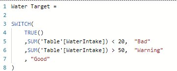
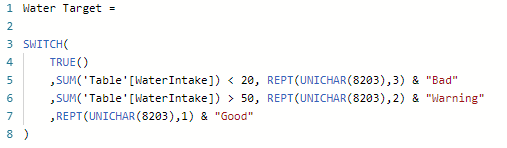
Here is the measure I create:
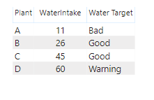
Adding this to a table:
Now comes the question, how can I order this to put Bad and Warning together? If I order by Water Target measure, this will be alphabetical. Sorting by WaterIntake can not give me the correct order either. One option would be to make a conditional column and use the “Sort by Column”. However, this may be a complicated calculation, especially on more complex measures. In addition it will sort every visual by this column, when I only want to sort in this one table.
Creating the custom sort
My solution? Make use of the UNICHAR() function. For those unaware of this function, UNICHAR() can return characters based on their UNICODE number. This can include more text characters not included on the standard keyboard.
A character that can help is UNICHAR(8203). This is a “Zero width space”. This is a space that has not width, so it is essentially invisible and will not be visible in the measure. The Zero width space is still recognized as a character by DAX. Spaces come before any letter in the alphabet. Two spaces comes before one, and so on.
The second function I will utilize is REPT(). REPT() or replicate, simply repeats text multiple times. It takes two arguments, the text and the times to repeat.
For example: REPT( "Hi", 3 ) will return the text "HiHiHi"
To change the sort order, I will repeat the Zero width space in front of the text. The text I want to appear first will have the space repeated the most amount of times. This will put it first in an alphabetical list. I will use the & symbol to concatenate the Zero width spaces and the text.
Now, “Bad” has the Zero width space repeated three times in front of it. This now puts it first in an alphabetical list. Warning has the Zero width space repeated twice, putting it second. “Good” has it once putting it third.
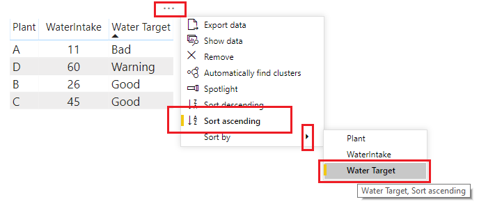
Applying the sort
Now I can arrange my table by Water Target (alphabetical), in an ascending order:
And success! I’ve added a custom sort to my text measure, without making any other measures or columns.
If you like the content from PowerBI.Tips please follow us on all the social outlets to stay up to date on all the latest features and free tutorials. Subscribe to our YouTube Channel. Or follow us on the social channels, Twitter and LinkedIn where we will post all the announcements for new tutorials and content.
Introducing our PowerBI.tips SWAG store. Check out all the fun PowerBI.tips clothing and products:
The release of grouping visuals was an extremely welcomed
feature. As one who builds lots of reports grouping elements together is
essential to stay organized and to increase report building speed. Since I’ve
been using this great new, I found an interesting design element to style
groupings for reporting impact. The grouped visuals feature enables a new
property, background color. This can be
applied for the entire group of visuals.
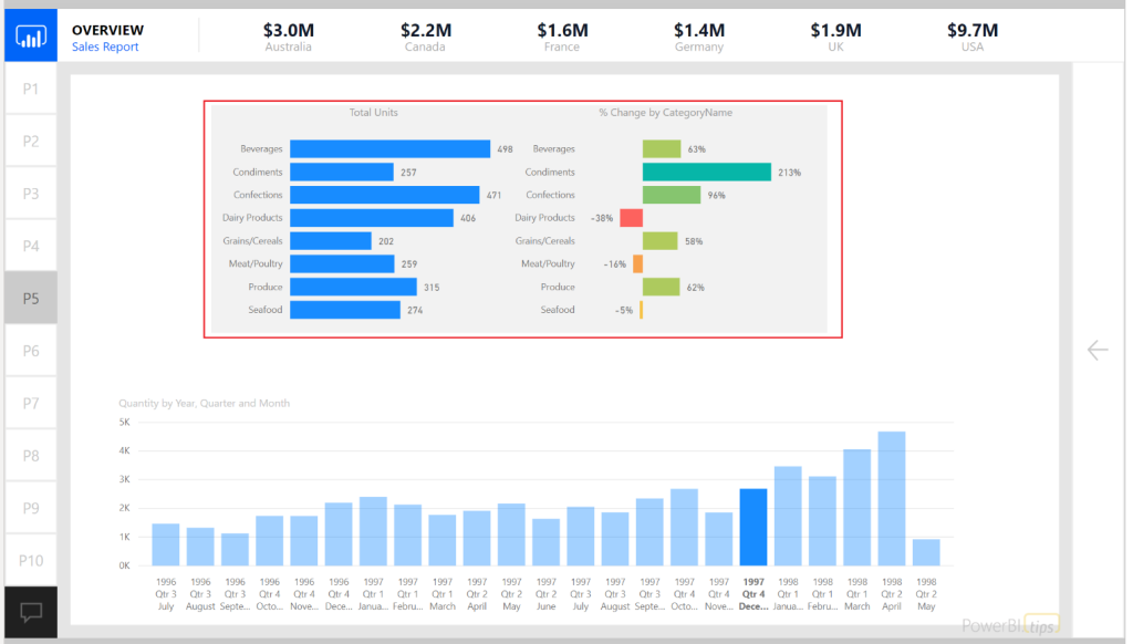
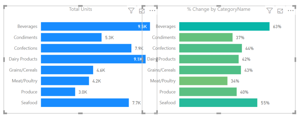
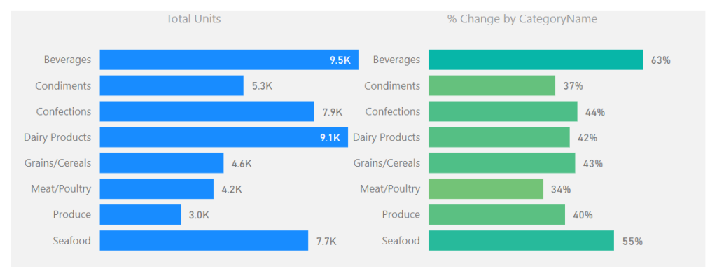
See the following example of setting a background around two
visuals.
In this example the intent is to show the user that these
two visuals are related. The graph on the left shows the number of units sold
for a selected time period. The bar chart on the right shows the relative sales
over time represented as a percent change. This illustrates the principle of
position and direction. The number of units sold is what happened right now. It
is my place in time with respect to sales. However, this does not show any
context to performance. The percent change provides the directional context. Since the position and direction are an
important insight as a paired visual, we use the grouping to visually bind the
two.
For those who have done some research around design
principals inevitably you will stumble across the Gestalt
Principals of design. Grouping
visuals with a common background falls into the Law of Common Region or Law of
Proximity.
Alright let’s walk through how to use grouping with
backgrounds colors.
Once you have created the visuals which will be grouped together;
select each visual by holding CTRL and Selecting each
visual.
Right Click on one of the visuals and select the menu
item labeled Group, in the flyout menu select the option called Group.
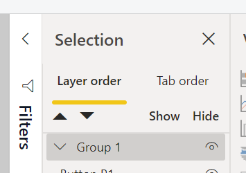
A grouped element will be created in the Selection Pane.
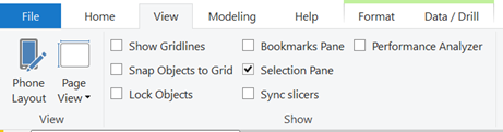
Note: If you don’t see the Selection Pane, you will need
to turn this on. The setting to turn the
Selection Pane is found in the View ribbon with the check box for Selection
Pane. See below for reference.
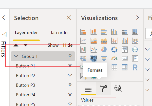
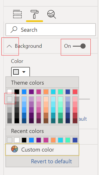
With the newly created group being selected, Click on
the Paint Roller (Format) icon in the Visualizations Pane.
Expand the property section called Background.
Toggle the background to be On and select a Color from the
drop-down menu. For this example, I
selected the very first shade of grey in the first column of colors.
The final product will be a grouped arrangement of visuals
with a shaded background.
To extend this idea further we can take the same approach
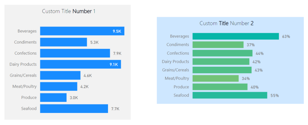
when working with Text boxes and Visuals.
Often, I find I need more style for applying a Text box or header to a
visual. In these cases, I will use two
visual elements to create one visual.
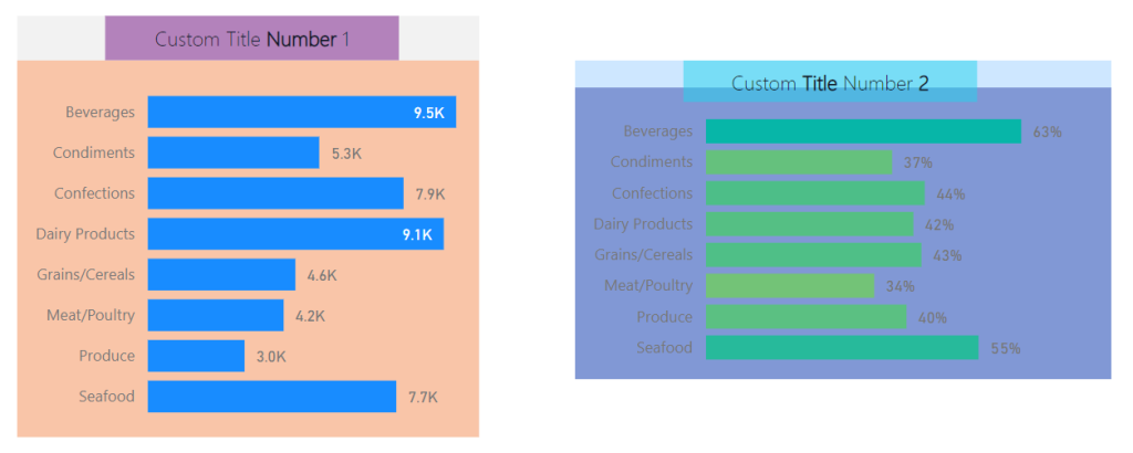
See this example of two visuals with custom titles created with a
textbox.
Note: Backgrounds are colored differently to illustrate
that each background for the grouped visuals is different.
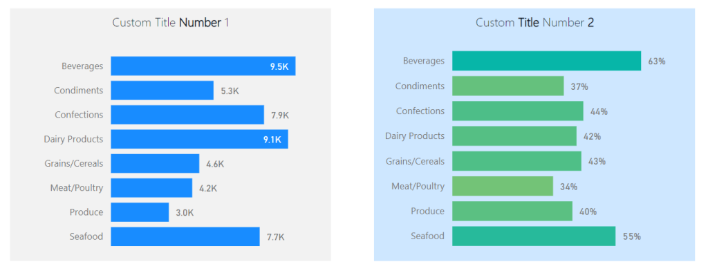
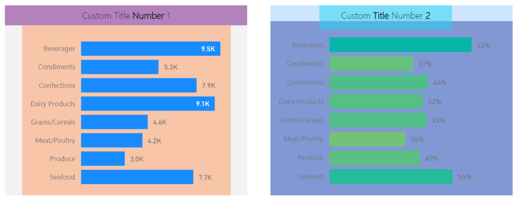
While this meets the need the boxes are not identical in
size. This violates yet another Gestalt
Principle, symmetry. The bounding
regions of the elements inside the grouping define the outer perimeter of the
background shading. Knowing this we can
modify the visuals within the groups to provide a symmetrical background shape.
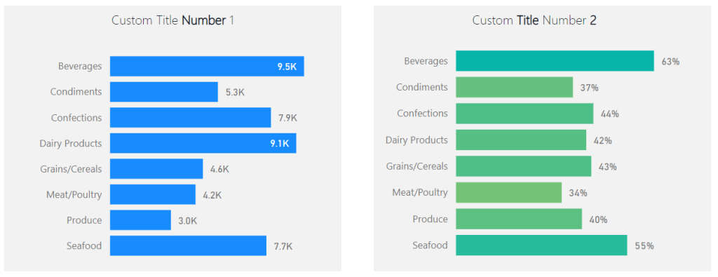
Here are the same before and after images with each visual
object colored to see the adjustments in size for each visual type. This creates the proper background
sizes.
Before:
After:
The visual on the left required an increase of the text box
at the top to get the desired width of the background shape. By contrast the visual on the right required
an extension of the bar chart in length to acquire the desired length of the
background. The result provides a
symmetric view of both visual groups.
If you like the content from PowerBI.Tips please follow us on all the social outlets. Stay up to date on all the latest features and free tutorials. Subscribe to our YouTube Channel. Or follow us on the social channels, Twitter and LinkedIn where we will post all the announcements for new tutorials and content.
Introducing our PowerBI.tips SWAG store. Check out all the fun PowerBI.tips clothing and products:
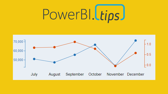
Ever need two different scales on the Y-Axis of a line chart? If so, then this tutorial is for you. While creating a dual y-axis line chart is pretty common in excel, it is not as easy in power BI. The only standard chart that comes with Power BI Desktop that enables dual y-axis is the Column and line combo chart types.
For this particular visual I needed to show correlation between two time series with different Y-axis scales. The Y-axis on the left of the chart had data elements in the thousands, but the right side needed percentages. The tutorial below illustrates how to accomplish by building a custom visual using the Charts.PowerBI.Tips tool.
Video Tutorial
note: there are a bunch of really good custom visuals that can be downloaded from the Microsoft App Source store. However, this article will not review all third party visuals that are able to produce a dual Y-axis line chart.
Source files
All files used to create this visual are located here on GitHub.
Layout file
The file used in this tutorial was a derivation of the Sunset layout from PowerBI.Tips. If you like this file, you can download it here:
If you like the content from PowerBI.Tips please follow us on all the social outlets. Stay up to date on all the latest features and free tutorials. Subscribe to our YouTube Channel. Or follow us on the social channels, Twitter and LinkedIn where we will post all the announcements for new tutorials and content.
Introducing our PowerBI.tips SWAG store. Check out all the fun PowerBI.tips clothing and products:
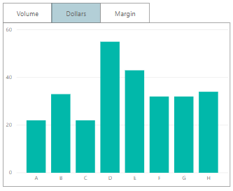
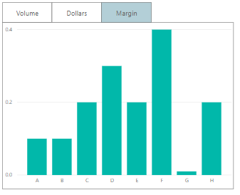
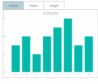
Sometimes, we want the users to see different metrics, but
do not want to take up too much space on our page. The scenario we are going to
walk through is how to build just one visual (in this case a bar graph). It
will include a toggle that allows the user to select their desired calculation,
either the sum of Volume, Dollars or Margin.
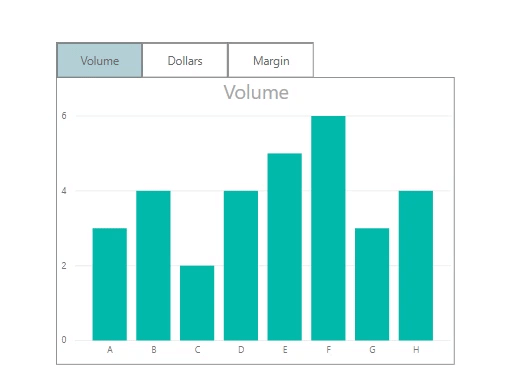
Final Solution
With buttons, we can change specific visuals on a page. Recently,
with the release of conditional formatting on titles and backgrounds, we have
some new methods to make this easier for the report author and cleaner for the
report consumer.
The Build
Before we start, turn on the selection pane and bookmark
pane. They can be turned on by clicking on the View ribbon and checking the
correct boxes.
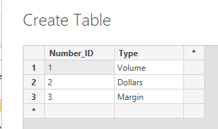
First, we’re going to create our control table. This
will be a disassociated table. This table should not have any relationships to
any of the other tables in our model. We just need to enter a numeric ID and a
description of what we want. Click on
the Enter Data button found on the Home ribbon. Enter the
following data as shown. Click the OK button to close the Create
Table dialog box.
Now that’s set up, we can write our measure. This measure will see what is selected in the Number_ID column of our control table, then return the appropriate calculation. Use a switch statement to select the correct calculation. Create the following measure:
Note: See there is a default value listed in the switch
statement. The default calculation means that if nothing is selected, SUM(
Sales[Volume] ) will be returned. The default value is represented by the last
property in the switch statement.
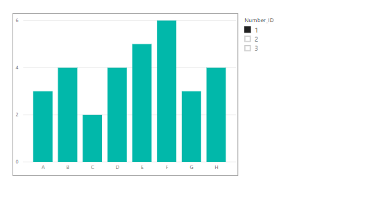
Time to set up our visual. Add a bar graph with Category on the
axis and the new measure, Selected Calculation, in the values
fields. Then add a slicer for the Number_ID column. The Number_ID
column comes from the control table we added earlier.
Switching the slicer can now change the graph to show the
different calculations.
The next stage is to add three buttons to the top of the
graph. In the Home tab of the ribbon, click Buttons and select Blank. Make sure
the outline colors and outline width match on all objects, Buttons and chart
outline.
Tip: Make sure you label your buttons in the Selection Pane. The selection pane can be turned on by clicking on the View ribbon and checking the box labeled Selection Pane. To Change the name of the button, double click the name listed in the Selection Pane. Giving a title (such as Button_Volume) will make it easily to see what visual items are on the page.
After this, it’s time to add the bookmarks.
The bookmark pane can be turned on by clicking on the
View ribbon and checking the box labeled Bookmark Pane.
Step 1:
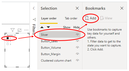
Select a value of 1
in the Number_ID slicer.
Select the slicer (and only the slicer) in the
Selection pane.
Click “Add Bookmark” in the Bookmarks pane.
Step 2:
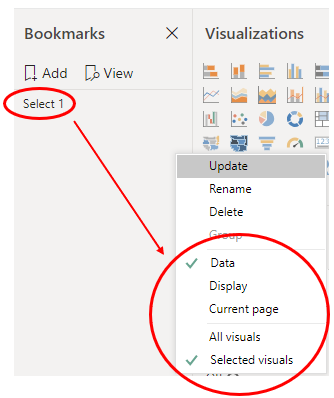
In the Bookmarks pane, right click the bookmark and rename it to Select 1.
Right click again, and untick “Display” and “Current Page”. Select “Selected Visuals”.
Now repeat step 1 and step 2, but do so with the values of 2 and 3 from Number_ID
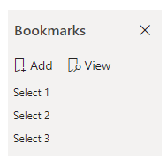
slicer. Name these bookmarks Select 2 and Select 3. You should finish with
three bookmarks, each that filters Number_ID to a different value. You
can test the bookmarks by clicking on them once in the bookmark pane.
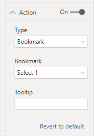
On Button_Volume, assign the Select 1 bookmark (as Number_ID
1 refers to volume). To do this, click on Button_Volume in the selection pane.
In the visualizations pane for this button, go to the property named “Action”.
Turn it on, change the type to bookmark, and choose Select 1 in the dropdown.
Repeat for Button_Dollars and assign Select 2. Then
for Button_Margin and assign Select 3. Now the buttons can change the
graph, but it’s a bit hard to see what is selected.
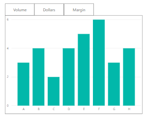
Add Conditional Formatting
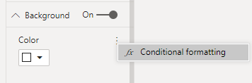
This is where conditional formatting can help us! Select Button_Volume
in the selection pane. Then in the visualizations pane, turn on the background
property, select the ellipsis and click conditional formatting
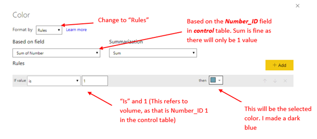
Here’s the settings we want:
This is going to apply a rule if the Number_ID selected is 1, to give the button a blue background. As there are no other rules, any other number selected will default to the white.
Now, apply the same steps to the other two buttons, but make
the rule “If value is 2” for Dollars, and “If
value is 3” for Margin.
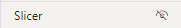
To tidy up, hide the slicer and turn the visual headers of all buttons off. You can click on the eye next to the slicer in the selection pane to hide it.
Turn the visual headers off by clicking the button, then in
the visualizations pane.
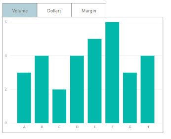
Great! Now the tab shows the selected button and correct
measure:
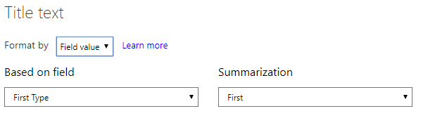
To make it even clearer, apply conditional formatting to the
title of the graph. On the graph, open conditional formatting. Set it to field
value and use the type field in the control panel.
Using this control table allows for greater flexibility. We can add more calculations, easily edit them or even sync across pages, all without having to re-record any bookmarks.
If you like the content from PowerBI.Tips please follow us on all the social outlets to stay up to date on all the latest features and free tutorials. Subscribe to our YouTube Channel. Or follow us on the social channels, Twitter and LinkedIn where we will post all the announcements for new tutorials and content.
Introducing our PowerBI.tips SWAG store. Check out all the fun PowerBI.tips clothing and products:
Manage Consent
To provide the best experiences, we use technologies like cookies to store and/or access device information. Consenting to these technologies will allow us to process data such as browsing behavior or unique IDs on this site. Not consenting or withdrawing consent, may adversely affect certain features and functions.
Functional
Always active
The technical storage or access is strictly necessary for the legitimate purpose of enabling the use of a specific service explicitly requested by the subscriber or user, or for the sole purpose of carrying out the transmission of a communication over an electronic communications network.
Preferences
The technical storage or access is necessary for the legitimate purpose of storing preferences that are not requested by the subscriber or user.
Statistics
The technical storage or access that is used exclusively for statistical purposes.The technical storage or access that is used exclusively for anonymous statistical purposes. Without a subpoena, voluntary compliance on the part of your Internet Service Provider, or additional records from a third party, information stored or retrieved for this purpose alone cannot usually be used to identify you.
Marketing
The technical storage or access is required to create user profiles to send advertising, or to track the user on a website or across several websites for similar marketing purposes.