Tag: Beginner Skill Level

  • Power BI Hack: Download Report Authored in Browser as PBIX

    Power BI Hack: Download Report Authored in Browser as PBIX

    The Problem

    Most of you have probably run into a situation where someone in your organization has authored a report in the Power BI web service, and now they want to make changes that can only be done with Power BI Desktop. So, you try to download the PBIX file from the Power BI web service, only to discover that you can’t, because if it wasn’t created as a PBIX, it can’t be downloaded as a PBIX. Infuriating!

    :rage:

    The Solution (sorta…)

    There’s actually a way to get around this problem. If you publish a blank PBIX file to the Power BI web service, you can copy the contents of the report that was originally authored in the browser into that blank report. And since that report was originally a PBIX file, you can download that instead!

    Unfortunately, the only way to do this right now is to use the Power BI REST API and hit the Update Report Content In Group endpoint, and this process is just about as straightforward as Lombard Avenue in San Francisco. (Actually, probably even less so.)

    File:Lombard Street SFA.jpg - Wikimedia Commons
    Lombard Avenue in San Francisco: Famously bendy, but still more straightforward than manually hitting Power BI APIs.

    PowerShell to the Rescue!

    :powershell:
    Hooray for PowerShell!

    So, I wrote a PowerShell function to simplify and streamline this process, and its only prerequisite is the MicrosoftPowerBIMgmt.Profile module for PowerShell. Just run the script file (linked below) in your PowerShell terminal, and then call the Copy-PowerBIReportContentToBlankPBIXFile function directly from that same window. The expected parameters are:

    • sourceReportId: The ID of the report to copy from
    • sourceWorkspaceId: The ID of the workspace to copy from
    • targetReportId: The ID of the report to copy to
    • targetWorkspaceId: The ID of the workspace to copy to (this one is optional – if you leave it blank, the function will assume both source and target are in the same workspace)

    Download the Copy-PowerBIReportContentToBlankPBIXFile.ps1 PowerShell script file here.

    As always, feedback and suggestions are 100% welcome and encouraged. 

    :sunglasses:

    Cheers!

    ~ James


    Acknowledgements:
    This PS function was inspired by a blog article written by one of the top minds in the Power BI space, Mathias Thierbach. Check out his article here. And if you’re not already using his pbi-tools for Power BI version control, you should check that out too.

    If you like the content from PowerBI.Tips, please follow us on all the social outlets. Stay up to date on all the latest features and free tutorials.  Subscribe to our YouTube Channel.  Or follow us on the social channels, Twitter and LinkedIn, where we post all the announcements for new tutorials and content.

    Introducing our PowerBI.tips SWAG store! Check out all the fun PowerBI.tips clothing and products:

    Hasta La Vista Data
    Go Ahead Make My Data
    PBIX Hat


  • Power BI Support Channel: Microsoft Teams Tips

    Power BI Support Channel: Microsoft Teams Tips

    When organisations deploy Power BI, it is important to offer support to users. Often this can be in the form of formal help desk and tickets. In addition to this, many companies use Microsoft Teams to set up specialised support channels. Teams offers a quick and straightforward way for users to get answers to questions. However, best practices should be followed when setting these up. This article focuses on some communication tips in Microsoft teams to help create a successful support channel.

    Additionally, we recommend reading the Power BI Adoption Roadmap. This roadmap goes into detail about rolling out Power BI and setting up user support. It is a vital part of creating a data culture within your organisation.


    Use a Power BI support channel

    It can be beneficial to have an individual location for users to ask for help and support with Power BI. Typically, there will be a dedicated set of users who are knowledgeable and proficient with the tool. Some organisations give them nicknames such as champions, super users, or rockstars. In this article, we will refer to them as the BI team.

    An organisation can, and should, set up different teams for individual projects. As part of a Centre of Excellence (CoE) or a User Support Hub, there may also be a team specifically for Power BI or the Power Platform. This specialised team would have channels dedicated to supporting and assisting the wider organisation.

    To implement this correctly, the BI team should encourage users and ensure awareness of the correct teams. For example, there may be a project team working on a problem involving Power BI. After some deliberation, the project team gets stuck and decides to ask the help of the BI team. One of the project team members collects the relevant information they head to the support channel, which could be part of the CoE. Posting in this correct support channel, rather than the project channel, allows the project team to get answers quicker.

    A centralised Power BI support channel

    Having a centralised Power BI support channel depends on organisational structure and may not suit all businesses. However, there are several advantages for a centralised channel. There is a centralised area for the BI team to focus on, instead of users asking questions in multiple areas. A central location can also encourage users to collaborate and ask questions, helping adoption and learning at the organisation. Other users can see the results and responses, which may answer their own issues without need of additional help.

    Additionally, the BI team members do not need to be added to multiple teams to support every query. This also reduces the BI team from receiving large amount of support emails, or direct contact from users asking for help. If users email and speak to BI team members directly for support, the BI team should politely tell them to ask the question on the correct channel.

    The BI team should include a wiki on the channel. This can have helpful information about the BI team itself.


    Asking support questions

    A support channel can be invaluable to a business and be a great alternative to a help desk. However, even if it is not an official ticket, thought and structure should be put into the question. Lack of information can cause wasted time for the BI team to figure out exactly what the need is. This goes against the goal of getting users a timely answer. It will also have a knock-on effect as other questions will take longer to be answered. Additionally, it is often a source of great frustration to the BI team when there is not enough information to provide a response.

    One effective way to aid users is to create a question template. Place this in the wiki of the channel and pin a message in the channel chat telling users to visit the wiki, so they can easily find it. Still, even with advice, many users may ask poorly formulated question. In this case, it can be easy for the BI team to respond negatively. However, this is not useful and may result in users not reaching out for help. Instead, the BI team should remind the user how to formulate a question and point to the template. If necessary, they can de-prioritise questions that do not use the template while prioritising those that do. Having your question prioritised, and therefore answered quicker, is a big incentive for people to ask questions in the desired format.

    Screenshot of a teams response, reading:

Thanks for contacting the BI team. This question has been marked as low priority, due to there being some missing information. Adding more information will help us resolve your question promptly. Feel free to edit the question and fill in all the information using the Question Template in Wiki. Thank you
    Example Response

    Question Template

    Here is an example of a template you can supply to users. When users have a question or issue, they are expected to copy the template and answer the headings as required.


    Business need
    Give some context on why this is needed to be looked at. If it is affecting reports or datasets, say what they are and who uses them.

    Issue
    Go into detail and explain what the issue is. List out anything you’ve tried before.

    Expected behaviour
    Explain what you would like to see and the output you were expecting.

    Code
    Use the code snippet function to add any code examples. Please format it first, using tools such as DAX formatter.

    Link (optional)
    If this relates to questions or messages in other teams, you can link to them here. You can copy a message link by clicking the ellipsis on the message. Alternatively, you can link directly to the channel the same way. Note that the BI team member will need to be added to the channel to see any messages.

    Attachments
    Attachments are a great way to show the trouble you are having. Include examples where you can, and try to include data where possible


    Tag lists

    A feature called Tag lists allow you to mention specific people. This helps users make specific people aware of the message, while not tagging a channel directly, which can be frustrating to those in it. Tag lists are great for alerting the correct people to a problem, without sending unnecessary notifications to others. An example could be tag lists could be “DAX Experts” within the BI team. This group contains those who are experienced in DAX. When users need DAX help, they can @ tag that list. The people in the list would get a notification that a high priority issue has been raised. Now only the DAX experts get notified, as they are the ones who can respond to the query.

    Tag lists as notifications

    Other uses for tag lists are opt-in notifications. Let’s take an example of a fictional company. The company creates a team called “News and Announcements”. Here, they post valuable news and information about Power BI. The company needs to follow the monthly release of Power BI, as software downloads are tightly controlled. Some users wish to know as soon as a new release is announced, while others are not as interested.

    First, they create a tag list named “Power BI Release Alerts“. Users who want to be in this tag list can opt in. Now, whenever there is a monthly release of Power BI release, a designated user will post an announcement in this channel. The poster tags the “Power BI Release Alerts” tag list in the post. This allows users to sign up for alerts and get notifications about the announcement. Others who do not need to know as quick can still find the information but view it in their own time.

    The tag lists should be an opt in group. The organisation size and structure will affect how to manage this. Some organisations will allow users to assign and manage tag lists, and to add themselves to the appropriate lists. Others may have a formal request process set up to be add or remove a user from a list.


    Use a hierarchical folder structure

    Within your files section, be careful how you arrange documents. Take time in creating a logical folder structure.  A new user should be able to access the files and understand the logic of the folder structure.

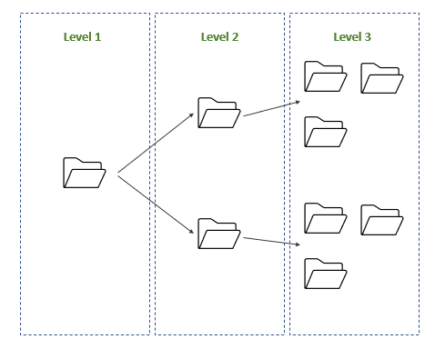
    Hierarchical folder structures rely on various levels. The top levels are used only for navigation and keeping the file structure clean. Direct files should be saved in lower down folders. This stops users adding multiple and unrelated folders, or saving files in the root folders.

    An example of a hierarchical folder structure:

    1st Level: High Level Subject Areas
    2nd Level: Subjects
    3rd Level: Breakdowns
    4th Level: Individual files saved inside level 3 folders


    Best Practices in Communicating on Teams Power BI support channels

    When using the Power BI support channel, reply to the correct conversation rather than starting a new one. This will keep the channel tidy and the responses will have context. When starting a post, set a subject like you would an email. You can do this by clicking the format button under the input box (shown in the image below).

    Image showing location of format button
    Format button

    Only if necessary, notify people that are the recipient of the message by tagging. You should think carefully about tagging people. Tagging someone implies there is a need for them to read the post urgently. If you are asking a question in a support channel, it is unlikely you need to tag someone, as they will be reading the channel when possible. When possible, tagging should be reserved for tag lists, to allow correct users to be notified. Additionally, always avoid tagging the team or channels directly. There is no need to notify everyone, as they are part of the team anyway.

    Use chats for conversations that do not require outcomes. Chats are good for working sessions, informal talk or quick questions. In many cases it can be helpful to mute chats to stop alerts distracting you do not participate in it often. Try and keep conversation in the appropriate Channel if you need a quick response from someone.

    If you do use chats, follow the no hello rules. Don’t start a chat with just “hello”. Feel free to add a greeting, but include why you want to speak to that person too!

    When creating Channels, make use of the apps. There are many different apps you can add, or create your own in Power Apps, such as the Power BI Version Control app.
     

  • 8 Mistakes I made to Start Learning Power BI

    8 Mistakes I made to Start Learning Power BI

    If you want to start learning Power BI, or are looking to improve your skills, there are lots of areas you can start. However, learning itself is a skill. When I started out, I had a few things that slowed down my progress. These are eight common mistakes that I made when I started my journey of Power BI, and the lessons I learned along the way!

    note with the text "never stop learning" written on it

    1) Trying to Focus on Learning too Narrow

    There is a lot of areas to cover in Power BI. Most people see the visual design side of Power BI (being graphs and visuals). Yet, there is much, much more. Power Query and DAX are two detailed languages to learn in themselves. Next, there are tabular models and analysis services. Then you have the Power BI service, governance, and all things that come with software deployment. On top of that, all the third-party tools and add-ons.

    You do not need to master these, but you should have breadth in your learning. Understanding the fundamentals and basic concepts of each stage in Power BI. When starting out, I dived into Power Query and wanted to be an expert modeller. While this is not a bad idea, I neglected some basics of database design and governance. Without these, my skills were not complete enough to be considered an expert in any one aspect.

    Lessons Learned: See the bigger picture and start with the fundamentals. Don’t stop being a specialist if wanted, but get the basics covered first. Look at the skills matrix. Try to get to at least level 4/5 in each subject, then dive into the detail.


    2) Trying to Focus on Learning Everything

    A warning to the previous post, is to try and master all the areas. As I learned more, I thought learning Power BI required me to learn everything about it. Yet this was an unrealistic task. When I went to start learning Power BI, I tried to master Power Query, DAX, Analysis Services, design theory, governance among many more. The result is that I was taking on too much and forgetting most of what I had learned.

    Lessons Learned: Find your niche. You may love story telling, enjoy writing complicated Power Query or advising users on admin features. It is a careful balance to not focus on too narrow or too broad. Learning is an iterative process though. To find an area you excel at and enjoy the most, you need to experience more. First, learn the fundamentals and get a good breadth of knowledge. Next, get involved in your favourite areas and get a good depth of knowledge.


    3) Saying YES to every request

    This is one of the biggest mistakes I made (and see others make) when taking requests. Stakeholders requesting reports are often less versed in Power BI. As a result, they may not understand best practices or visual design theory. It happened a lot – they would ask for unique and specific requirements. I took it as a challenge to try and deliver exactly what they wanted. This often-meant creative hacks, crazy DAX, and bizarre uses of visuals.

    While I was pleased that I could stretch Power BI to meet users’ needs, I know now this was a bad approach. This resulted in hours of fixing the complicated visuals when things went wrong. Changes that should be small turned into complex projects.

    Leason learned: You are the expert for a reason. Knowing how Power BI should be used is an important skill. Being able to explain this and not over customizing reports is even more important. Learn how to take requests from users and understand what they really want. The story the report tells is much more important than the style of visuals on a page.


    4) Not Understanding enough about I.T. practices

    I came from a business side analytics role. I was a big excel user and loved creating complex and unique solutions to solve difficult problems. However, I did not know enough about I.T. best practices. These include DevOps, releases, or multiple environments (e.g. DEV, TEST, PROD).

    While I could develop reports, I did not know the processes to deploy them. I did not know how to thoroughly test.

    Lessons Learned: While you do not need to be an expert, you should know the basics. When you start learning Power BI, make sure you spend a bit of time understanding these. Moreover, contact your I.T. department and ask about the practices in your organization.


    5) Start Learning Power BI too advanced – not at the fundamentals

    I love learning new skills. The more complex, the better. Trying to learn the most difficult and complex tasks seemed like a clever idea to quickly advance and become a pro. Yet, the reality is a little different. You may have heard the phrase “Don’t run before you can walk”. By diving in too quickly to the complex tasks, I missed some fundamental knowledge. This slowed my learning down overall. Without that knowledge, I found it difficult to grasp the why. This doesn’t just apply to skills in Power BI Desktop, but fundamentals in databases and data transformation too.

    One area I did this is when I was learning to data model. I tried to learn all advanced methods and specialised tricks. I would find complex ways of doing powerful tasks. But without the fundamentals, I wouldn’t fully know the why. I learned replacing long text keys with integers was a good idea. Learning about data storage and the reasons behind this helped me know why to do this and understand the best methods.

    Lessons Learned: When you start learning Power BI make sure to learn the basics. Even as a seasoned developer, make sure you revisit them. Learn the fundamentals of skills such as databases or data storage. Learn about STAR schema, keys, dimension, and fact tables.


    6) Going too fast in learning DAX

    At the start, DAX seemed like the holy grail. It was familiar from an excel background. So, I set off to master it. It seemed simple enough to do.

    I was wrong. DAX is hard. In fact, DAX is extremely hard. Many beginners will say DAX is easy. Only until you learn DAX, you know it is not. While it may be easy to do some calculations, others can seem impossible. Writing DAX requires a knowledge of how it works. DAX also works differently to anything I have used before.

    The worst scenario is not knowing DAX’s difficulties. You may end up writing incorrect DAX, and not know it is wrong. Users will consistently come back saying the numbers are wrong. Eventually, people will stop trusting your reports. Luckily, you do not need to be an expert in DAX. You can be a great developer will reasonable skills.

    Lessons Learned: If you are struggling, first make sure you model is following best practices. This is the often cause of most DAX issues. If you want to be an expert, then great. This can be a valuable skill when you start learning Power BI. Otherwise, ensure you learn and re-learn the fundamentals. Read this article on the what the fundamentals are. Educate, practice the skills, then re-educate. Never stop learning DAX, and never stop visiting the fundamentals. Read this amazing article by SQLBI.


    7) Start Learning Power BI by Ignoring best practices

    Learning new skills is fantastic and often I was eager to show them off. The more complicated an answer was, the more I wanted to include it in a report. This gave me great confidence and made me feel like I really knew the subject.

    However, this rarely translated into better reports. What I found was changes became difficult to make. Additionally, reports would break in the future. Minor changes and growing data would often mean repair was needed for the reports. Ignoring modelling standards such as STAR schema resulted in hours spent in DAX.

    Lessons Learned: Learn the best practices and religiously follow them. Microsoft have an excellent resource for this. Simple is often better – you want to design reports that are robust, and users can trust will not break.


    8) Start Learning Power BI without asking for help

    There are lots of areas you can start with in Power BI. To be a great developer, it takes knowing lots of different skillsets. While there is a great deal of paid training, this may not be available to everyone. Self-training is an effective way to learn, but everyone will need some help sometimes. Thankfully, the Power BI community is an outstanding community. There are some amazing people who spend their time helping others. Yes, it is important to learn by making mistakes and figuring things out on your own. However, if you are really stuck on a problem or concept, reach out for help before getting slowed down or frustrated.

    Lessons Learned: Knowing how and where to ask for help, however, is important. Even if someone likes to help a lot, sending unsolicited messages to people you do not know can come off rude and annoying. Luckily, there are a number of places you can go for help:

    Community.PowerBi.com – This is the first place to go for specific questions when stuck. Please don’t treat this as a place for free consulting, but rather to help you understand concepts you are stuck on.

    User Groups – These are great to join and attend monthly meetings. They normally have a local community that include all levels of knowledge – great for learning and asking questions.

    Social Media – There are a number of active communities. There is a great Reddit group and some active users on Twitter. In addition, LinkedIn has many users who love to share knowledge (feel free to follow myself or PowerBI.tips too!).


    Conclusion

    It can sometimes be overwhelming to know where to start in a new skill. There is a phenomenon called the Dunning-Kruger effect. This is the effect that often, when you start learning, it will feel easy. However, as you learn more, you realise how much knowledge there is and feel there is so much you don’t know. Please, do not let this put you off. This is a very common feeling that almost everyone goes through.

    Instead, focus on getting great at the basics. Keep it simple and to things you can complete. Reach out, join the community, and ask questions. Of course, most of all, have fun!

  • Mind Blown

    Mind Blown

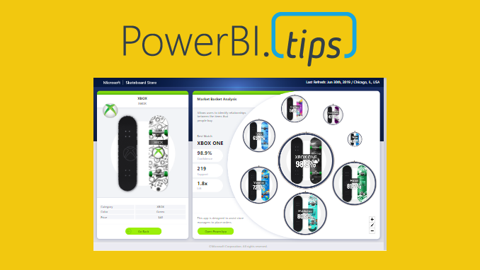
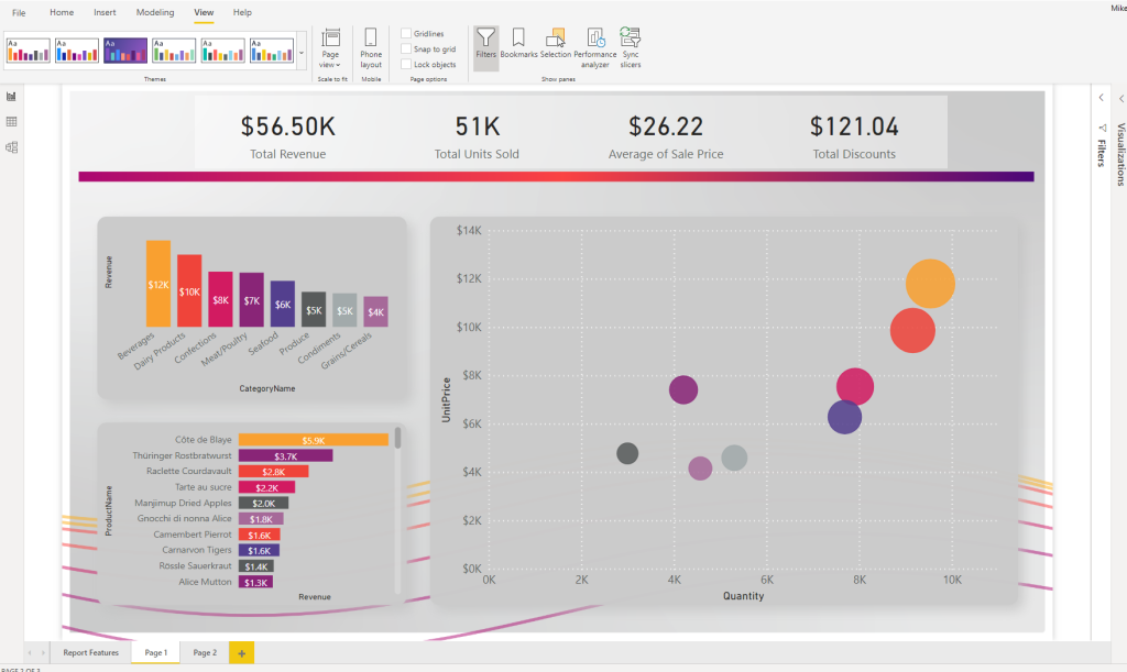
    This report is just over the top amazing cool! Check out the work done by the Microsoft team to make this incredible report. It is called the Microsoft Sales & Returns report. We love this one so much we have produced over 48 HIGH RESOLUTION scrims based on this report design. Download all of them for free.
    Download Scrims

    Here is the link to the Scrims for this report: https://powerbi.tips/product/scrims-msft-skateboard-report-free/

    Download a copy of this report to play with it: https://github.com/MikeCarlo/Msft-Skateboard-Report

    Sample Report

    Scrims

    Not sure what a scrim is. Check out the following page to learn about a scrim and how to use them for your reports.

    Learn about Scrims

    Instructions on how to use a Scrim

    If you like the content from PowerBI.Tips please follow us on all the social outlets. Stay up to date on all the latest features and free tutorials.  Subscribe to our YouTube Channel.  Or follow us on the social channels, Twitter and LinkedIn where we will post all the announcements for new tutorials and content.

    Introducing our PowerBI.tips SWAG store. Check out all the fun PowerBI.tips clothing and products:

    Check out the new Merch!

    Hasta La Vista Data
    Go Ahead Make My Data
    PBIX Hat


  • Power Query API Considerations

    Power Query API Considerations

    This article is the second part in a series on API calls. It will look at some best practices and considerations when using API calls in Power Query. While it does not serve as a definitive list, it is an important start to consider performance when using such queries.

    The articles in the first part of the series can be read here:

    Historical Stock Price Function in Power Query

    Average Household Income Function in Power Query

    Performance Considerations

    Use Batch Queries where possible

    Batch queries refer to sending information in “batches”. Making an API call requires information to be sent to an external source, that information returned, then the information parsed and then loaded. Imagine we are doing this for thousands of different dimensions. Consequently, you will have the exact same process to be repeated this many times. Instead, check in the API documentation if batch queries are available. As a result, you may be able to send many of the dimensions in the same API call. This will drastically reduce the amount of times this process happens.

    Use Data Factory

    Data Factory is an Azure service that offers no/low code solution to Extract, Transform and Load (ETL) or ELT (Extract Load, Transform) processes. These are called “pipelines”. Pipelines are repeatable processes that allow you to copy and move data from one source to another (read the documentation here).

    Let’s say you’re trying to load a high level of stock data for thousands of stocks. By doing this in Power Query may put big stress on your gateway. Your gateway may get overloaded and cannot handle sending so many complex API calls. It may be a better idea to load the data into a separate table (such as Azure Synapse). Then your power BI report can read this file directly. Read this documentation for a good overview of this architecture.

    Shifting this to the Azure cloud can leverage Data Factory’s auto-scalability and ability to handle large volumes of data. This results in a more reliable and robust process.

    Consider the most efficient design

    Always consider the way that will send the least number of queries. For example, if you are using historical data that doesn’t change, think if you need to refresh this data every day. In addition, try and avoid sending the same information multiple times. Do queries off unique lists.

    Only return the correct data

    If you load data into Power Query from a source such as SQL Server and then remove columns, a process called Query Folding will take place. Essentially, the data isn’t even loaded into Power Query – it edits the SQL query to not include these columns.

    This can only be done on certain sources. Custom APIs will not do this. Therefore, make sure you send the correct queries. Don’t return extra bits of data that is not needed and make sure you only return columns you will use.

    Review

    While this is by no way a definitive list, it should serve as a starting point to acknowledge performance considerations. Pay attention to how many queries are sent out and try to limit duplication. Remember, Power Query is a powerful tool, but make sure you are using the right tool for the job. Very large and complex operations can be improved with the help of other tools, such as Data Factory.

  • Introducing Scrims

    Introducing Scrims

    PowerBI.tips is excited to announce our new tool to help you build the best looking reports, Scrims.

    We’ve built out a fast and easy solution for snapping visualizations into place while giving your reports the extra special look and feel that allows your audiences to be impressed without losing focus on the important stuff. We developed Scrims to give you this shortcut to amazing looking reports

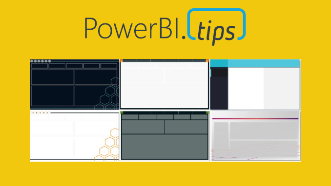
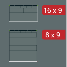
    16:9 (1280 x 720) examples

    What are Scrims?

    A Scrim is a background image that you would use on your Power BI Report pages. Why the name Scrim? The term scrim is used in theater productions. It is a backdrop that is placed on the stage behind the actors. It adds context & engages the audience with the production. We thought this idea crosses over well with Power BI.

    A scrim can change the mood of a theater just like a well designed background image in your report. Scrims were developed to be easily adaptable to different color themes and in each set of offerings we release we’ll be providing you with as many color options as possible.

    Why Do I need One?

    Scrims solve several problems.

    1. The most important problem it solves is time. As BI practitioners ourselves we know the demands that are placed on you. More often then not the visual look and feel gets the least amount of attention due to deadlines. We want all the time you invest in the data and building visuals to impress your audiences by being presented in a beautiful way.
    2. Scrims are designed the same way we developed Layouts. By emphasizing proper design focused on the Gestalt design principles to ensure the end users experience enjoyable and non-distracting reports.
    3. Using a Scrim you will reduce the number of objects on the page. Less elements means faster rendering reports. Here is a blog that tests this by adding more visuals to a page “More Visuals Mo Problems”. Scrims add the illusion of a very large number of objects without a negative impact.

    Scrims come in a Bundle

    A Scrim bundle contains a series of images that you can use in any way you want in your Power BI file. Each Scrim will have different page sizes to best suit your report needs. Every Scrim will contain a default 16 x 9 (1280 x 720) aspect ratio. Most Scrim bundles will have additional ratios such as 8 x 9 (1280 x 1440) or 4:3 (960 x 720). You will see the sizes prominently displayed for each bundle with the red tags.

    8:9 (1280 x 1440) examples

    Each bundle contains 6 pages minimum for each size, which means on average you will receive at least 12 pages in each bundle. Each Scrim bundle also includes the color theme that corresponds with it in JSON format to easily upload into your Power BI Report.

    Theme Color example
  • Scrims Instructions

    Scrims Instructions

    Thanks for your interest in our product Scrims. For more details on what is a scrim click this link to Learn More.

    Download a scrim from the products page. You can access all the available scrims here.

    Instructions

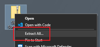
    After downloading, you will have a Zip file stored on your computer. Right Click on the zip file and Select the option Extract All from the drop down menu.

    Right click menu option Extract All

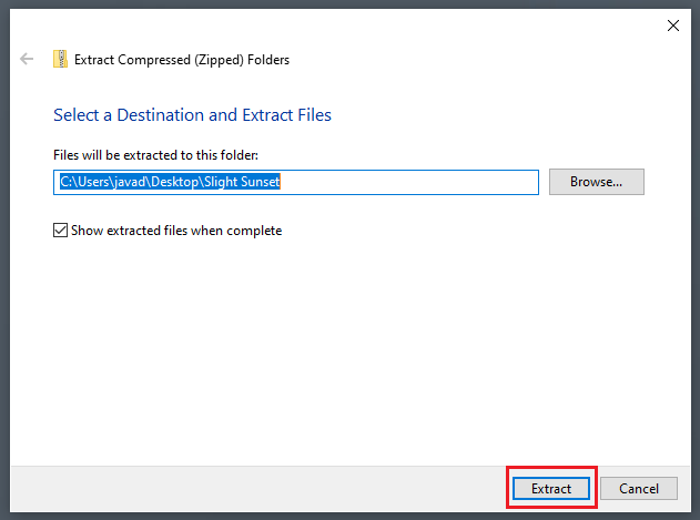
    The extract compressed folder menu will appear. Click on the Extract button found in the bottom right corner of the menu.

    Extract Compressed folder dialog box.

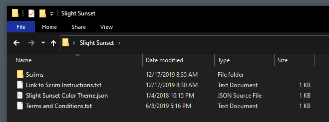
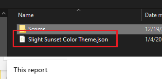
    A new folder will be extracted to the location noted in the previous menu screen. Open the newly created folder. Within this folder you will find all the images for the Scrims and a JSON theme file to use within your report.

    Folder contents, Scrims images, links to instructions, terms & conditions, and color theme file.

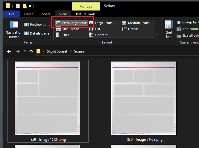
    When working with scrims it is helpful to see which image contains the the correct background layout for each of your pages. I find that it is helpful when reviewing images as Extra large icons. To turn this on, Open the View ribbon in the File Explorer. Then in the Layout window select the option titled Extra large icons.

    Change view of File Explorer to Extra Large Icons

    Add Scrims to Report

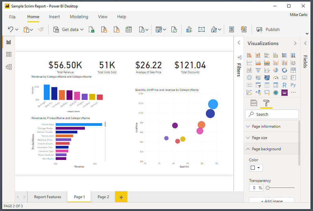
    Open a Power BI report in the Power BI Desktop application.

    Image of a Power BI report in Power bi desktop

    Note: Reports do not necessary have to be brand new. You can use scrims on existing reports. For illustration purposes an existing report was opened with only visuals. The remainder of this tutorial will show you how to add scrims to a pre-developed report.

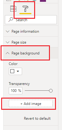
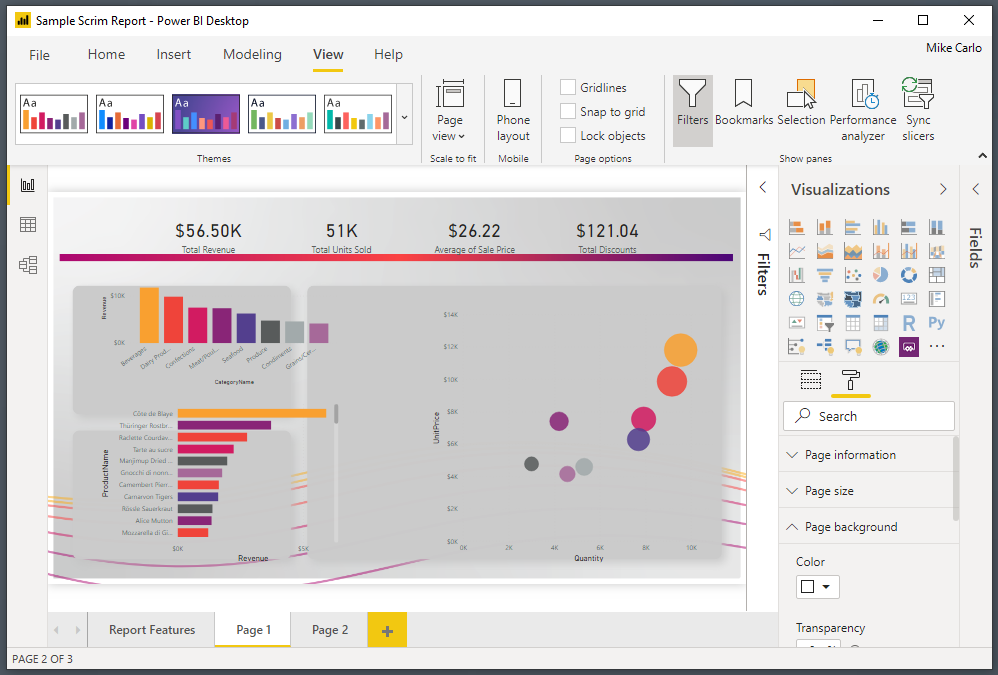
    Click on the Paint Roller button. Then Open up the Page background item in the menu options. Click on the option labeled Add image.

    Note: for these options to appear you have to have a report open and none of the visuals selected on the page.

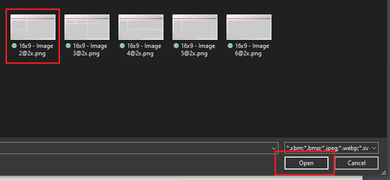
    In the open file selection dialog box pick the scrim that you want to load. Click on Open to load the image to the report page.

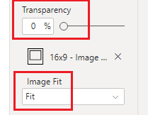
    The image will not initially appear. This is because the default settings for background are set incorrectly for this feature. Change the transparency to 0% and adjust the Image Fit to the drop down option of Fit.

    Note: Images provided in scrims are larger than the report page pixel size. This is because in order for the images to not look blurry we have to supply a larger image. The Fit feature then scales the image back down to the report canvas size but retains a crisp and clean look.

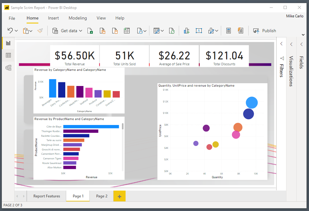
    Our report should now look similar to the following:

    Add JSON Themes

    Initially the visuals will not be formatted for the style of the report. We can control this by using a JSON theme file to pre-format some options for the visuals.

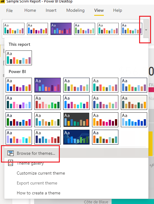
    On the View ribbon, select the Drop Down Arrow icon. Then Select the option at the bottom of the menu titled Browse for themes…

    Navigate to the scrims download folder and add the supplied theme with scrim download.

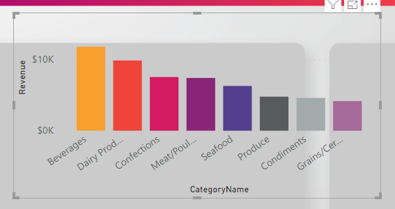
    This will apply formatting for the colors and some Visual style properties.

    Clean up Visuals

    Next Select individual visuals and Align them to the defined areas within the scrim.

    See sample image below with visuals aligned to the scrim.

    Finalize Report

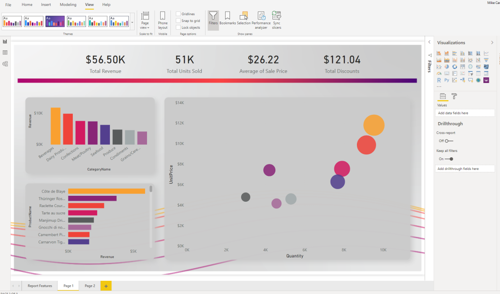
    Apply any additional style properties for your visuals. In the below image the following settings are added for reference:

    • The top 4 cards are grouped and the group
    • The Grouped cards were applied a background of white @ 40% transparency
    • Labels were added to the bar charts
    • Unneeded axis were removed from the bar charts for clarity
    • White lines were added to the scatter chart for x and y axis

    Then rinse wash and repeat for every other page you need to develop.

    Here is a completed sample of this report:

    Check out scrims today

  • More Visuals Mo Problems

    More Visuals Mo Problems

    In some recent conversations the notion of minimizing the number of required visuals came up as a topic. While I know from talking with the Microsoft development team more visuals on a report page increases load time. But I haven’t been able to find any substantial numbers on how performance is impacted by increasing the visual count on a page. Spoiler alert, adding a ton of visuals to a page slows it down.

    Test Set up

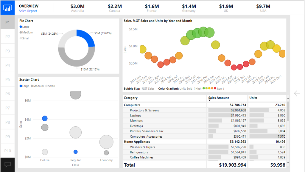
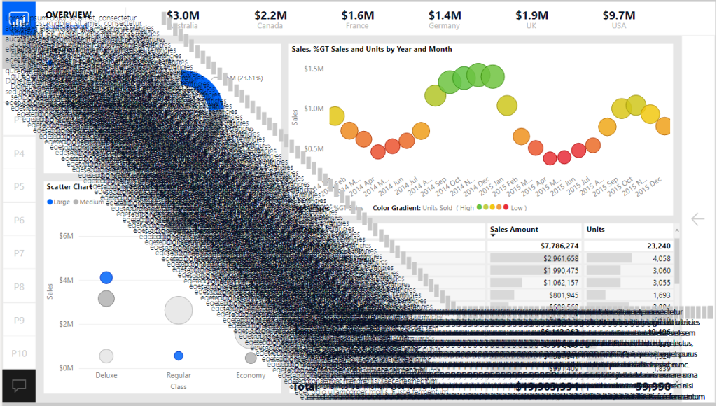
    To begin our test I started with a know report the Microsoft September 2018 Layout. This was a good sample as it already had a number of visuals and buttons on the page. I then proceeded to create a single text box with some text in it. Then copy the text box over one hundred times. All the text boxes are placed into a single group. Grouping the text boxes allows for the ability to toggle on and off all of the visuals with a single click.

    Here is the before image of the report with the text boxes turned off:

    Now with all 100 text boxes turned on. Yes, not pretty I know, but it makes the point.

    Conducting the Test

    Now that the set up was complete we are able to use the performance analyzer to render all the visuals on the page.

    To open the performance analyzer with the new modern Power BI ribbon. Navigate to the View ribbon and click on the Performance analyzer button.

    With the Performance analyzer window open we Click the Start Recording button. This begins how the visuals perform when you interact with the report.

    There are two options at this point to start recording data.

    1. We can click on items on the report page
    2. Click the Refresh visuals button to refresh the entire page

    I chose option number two since I wanted a consistent method to record performance. This removes any human error by performing a sequence of clicks across the screen.

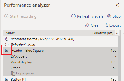
    After clicking the Refresh visuals the Performance analyzer generates a ton of data that we can sift through to understand performance of the report page. You can expand on one of the visual elements to understand how many milliseconds it takes for the visual to render by function.

    Note: For more details on each performance component read up on the Microsoft documentation found here: https://docs.microsoft.com/en-us/power-bi/desktop-performance-analyzer

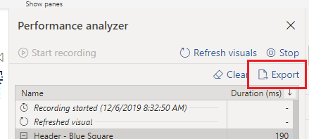
    We can now export the data from the recording by Clicking the Export button.

    For my test I ran 5 performance tests with the text boxes turned off and 5 tests with the text boxes turned off. The process was the following:

    1. Click Start Recording
    2. Click Refresh visuals
    3. Click Export to extract the data, name the file for future review
    4. Click Clear to remove all data
    5. Go back to step 2 to Refresh visuals
    6. Repeat process until 5 performance tests are complete
    7. Turn on the Text boxes and repeat the process for 5 performance tests

    The Test Results

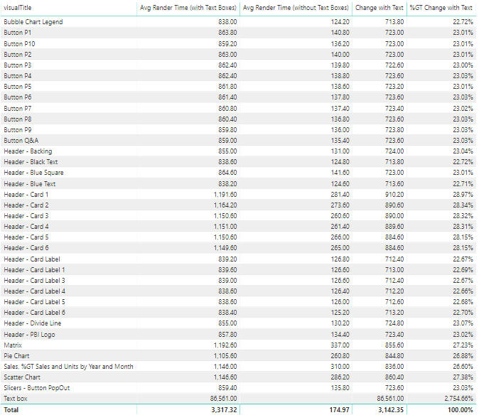
    Finally we can dig into the data and figure how much impact we incurred from all the visuals. After a bit of playing around with the datasets in Power Query we are able to come up with the following results.

    At a high level adding the 100 extra text boxes increased the load time from 174 ms up to 3,100 ms which is a approximately a staggering 1700 % increase in load time.

    Here is the detailed break down for average load times compared with and without text boxes.

    There are some interesting notes here. When we added the text boxes it caused all other visuals to increase load time from 22 up to 28 % percent longer per object. Clearly the text boxes took the longest to render.

    If you’d like to test this on your own, you can download these materials from this GitHub location: https://github.com/MikeCarlo/PBIReportVisualPerformanceTest

    Implications & Observations

    After completing this test there were a couple of observations that I felt would be best practices when building future reports.

    1. It is important to take time to clearly label your visual elements on the report canvas. Doing so makes it easy to identify each item in the performance analyzer.
    2. Increasing the number of visuals on a page hurts rendering performance. So think carefully about how many visuals you need to add to convey the data story you are trying to tell.
    3. When a visual is not shown it does not impact performance rendering of the page.
    4. A trend I am seeing is individuals are creating really long pages. Meaning the page is 1280 x 3000 or even 4000 pixels long. This is a nice feature that lets the report consumer scroll through multiple visuals. However, this has an unintended consequence adding all the extra visuals is slowing the time for the report to render. Instead of increasing the page length it would be better to control which visuals are being shown by using Bookmarks and Grouping. To learn more about bookmarks & grouping visuals visit:
    5. Limit adding style elements such as drop shadows and visual shading images as these will increase load speeds. Instead push those types of changes down to a background image that can be placed on the page. This is the technique used in creating PowerBI.Tips layouts.

    If you like the content from PowerBI.Tips please follow us on all the social outlets. Stay up to date on all the latest features and free tutorials.  Subscribe to our YouTube Channel.  Or follow us on the social channels, Twitter and LinkedIn where we will post all the announcements for new tutorials and content.

    Introducing our PowerBI.tips SWAG store. Check out all the fun PowerBI.tips clothing and products:

    Check out the new Merch!

    Hasta La Vista Data
    Go Ahead Make My Data
    PBIX Hat


  • Quick Access Toolbar for the Win

    Quick Access Toolbar for the Win

    I’m a lazy engineer.  Let me qualify my statement.  In lazy I mean I like to find the path of least resistance, the shortest distance between two points.  Everyday I challenge myself to be lazy, or efficient how ever you want to view it.  As I have built many reports in Power BI over the years here is a fantastic trick, I use almost every day, Customizing the Quick Access Toolbar.

    Here are a couple reasons why I think this will speed up your report writing.

    • There are only a few shortcuts that I am aware of for Power BI Desktop, thus making your own shortcuts with Hotkeys is faster for repetitive tasks.
    • To achieve a simple task, you might have to jump between ribbons, again adding time.
    • When you set up Hotkeys you don’t have to remove your hand from the keyboard and wiggle your mouse around then come back to the keyboard.  Again, wasting time.

    Enough reasons, if you are still reading this then clearly you are lazy like me.  Let’s just get to the good stuff…

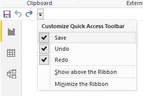
    By default, you get the following Quick Access Toolbar:

    The icons are Save, Undo, and Redo.

    While these icons are good, YOU DON’T NEED THEM… lol

    You can automatically save by using Ctrl + S

    Undo is simply Ctrl + Z

    And Redo… lets be honest no one uses this one.

    Another aspect of the Quick Access Toolbar is when you hit the Alt key you can reveal numbers on the toolbar:

    Pressing the number or letter triggers the next button press. 

    Example:

    • Alt + 1 will automatically save the file

    To take this further you can string together multiple key presses to dig even deeper into the menus

    Example:

    • Alt + H + ii  brings up the import image dialog box
    • Alt + G + D  opens the menu to get data
    • Alt + W + C  Opens the Selection Pane,  Repeating this command closes the Selection Pane

    The downside with multiple commands it takes more time to learn the key strokes to be fast.  As a personal preference I like to use one-step key press options (Ctrl + s or Ctrl + z).  It is easier for my simple mind to remember and commit to memory.  If you use Adobe products for images or video, you will be familiar with this technique.  From my opinion Adobe has some of the best most useful shortcuts that enhance productivity.

    Make it Custom

    Let’s begin customizing our menu. 

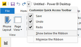
    First Click the Down Arrow at the far right of the toolbar.

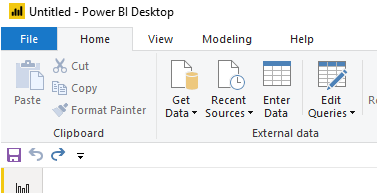
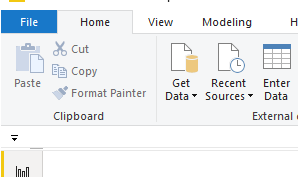
    Click on the item in the dropdown menu called Show below the Ribbon.  This will move the toolbar to the bottom of the ribbon.

    For each item in the dropdown list Uncheck each item, Save, Undo, and Redo.  This will remove all the items from the toolbar.

    The Quick Access Toolbar will now look like the following image:

    In our next step we need a hidden toolbar to appear, the Format ribbon.  This Ribbon only appears when multiple elements are on the page.  Thus, we will need to add some generic shapes to the page to reveal the toolbar.

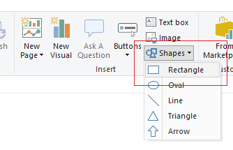
    Add three Shapes (Squares) to the report page.  Click on the Home ribbon and select the Shapes icon listed in the Insert section of the ribbon.  Then Select the item in the drop-down list labeled Rectangle.

    After adding one rectangle select the rectangle with your cursor.  Use Ctrl + C to copy the shape.  Then, use Ctrl + V to past Two more rectangles on the page.  Use your cursor and move the shapes across the report page.  The order of the shapes does not matter, they just need to be distributed across the page. See below for reference.

    Use Ctrl + A to select everything on the page.

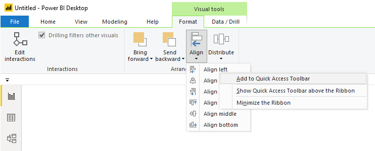
    Notice a new ribbon appears, the Format ribbon.  This is called a context aware ribbon.  This has been a long standard best practice in office products.  Only show the ribbons that are needed.  Thus, the format ribbon and the Data / Drill ribbons are not exposed until you have visuals selected on the page.

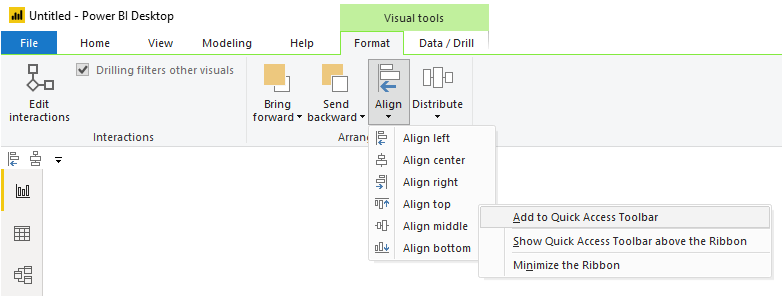
    Click on the Format ribbon.  Click the button called Align in the Arrange section of the Format ribbon.  Then Right click on the first item in the align menu called Align left.  Upon doing this, a menu will appear.  Select the first item in the list called Add to Quick Access Toolbar.

    Repeat the same process by adding the Distribute Vertically action from the Distribute button on the Format ribbon.

    Next, Add the Align top action from the Align button on the Format ribbon.

    Finally, Add the Distribute horizontally action from the Distribute button on the Format ribbon.

    Using the combination of Aligning an Edge / Distribution is just so much faster then moving one object at a time. 

    For example, here is a random arrangement of 5 shapes on a page.

    Using our newly created shortcuts I select the Items I want to move.

    Then using our new key combo, Alt + 3, Boom all the top edges are aligned.

    Then the magic, press Alt + 4 and all the items are evenly distributed

    Superfast and efficient, aka lazy..

    Side Note:

    When I am training new users in building Power BI reports, I like to point out the following, it is important to align your elements on the page.  This follows along with one of the Gestalt principles, symmetry.  Your eye can perceive slight differences in objects that are misaligned.  I can’t tell you the number of reports has something like the following:

    The change is subtle but your eye picks it up.  When these out of alignment objects are near another visual with a straight edge it is even more apparent.

    (Steps off the Soap Box) Ok, enough diversions.  Let’s finish with adding two more items that I use every time I build a report, Selection Pane, and Bookmarks Pane.  We can add these items to the menu as well. 

    Navigate to the View ribbon (or hit Alt + W if you want to be fancy).

    Right Click on the item called Selection Pane.  Select the item in the dropdown Add to Quick Access Toolbar.

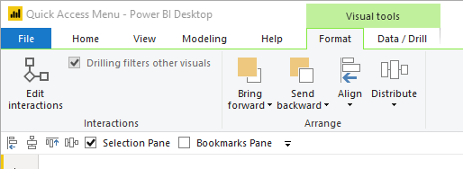
    Do the same for the Bookmarks Pane.  When you are finished your Quick Access Toolbar should look like the following:

    You may be asking yourself… So why did we move the menu to the bottom of the ribbon?  We could have just left it on the top of the screen.  You would be right.  But, I do want to point out one odd behavior when the Quick Access Toolbar is at the top of the ribbon. 

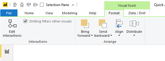
    When I have multiple visuals selected on the page the contextual menu appears.  See below image with the Quick Access Toolbar at the top:

    When this happens any items to the right might get chopped off, and you must access them using the double sideways arrow.  The Alt + # keys will still work even though the items are hidden, but I don’t like the experience of having some of my menu items hidden.  If you had many icons distributed across the Quick Access Toolbar, say 9 of them, you would have to remember its position in the alt keys.  This is the reason why I prefer to show the Quick Access Toolbar below the ribbon.  When the context aware menus appear the Quick Access Toolbar is not covered.

    Thanks for reading along.  Have a great day and I hope this tip / trick makes you a little bit more productive!

    If you like the content from PowerBI.Tips please follow us on all the social outlets. Stay up to date on all the latest features and free tutorials.  Subscribe to our YouTube Channel.  Or follow us on the social channels, Twitter and LinkedIn where we will post all the announcements for new tutorials and content.

    Introducing our PowerBI.tips SWAG store. Check out all the fun PowerBI.tips clothing and products:

    Check out the new Merch!

    Hasta La Vista Data
    Go Ahead Make My Data
    PBIX Hat


  • Make Custom Visuals – Create a Bar Chart

    Make Custom Visuals – Create a Bar Chart

    With the release of the custom visuals building tool Charts.PowerBI.Tips we received a number of comments requesting tutorials on how to build visuals.  Ask and you shall receive!  Below is a basic tutorial on how to create a Bar chart.  Within this tutorial we review a couple of the features of the chart tool and how to use them.

    Video Tutorial on Building a Basic Bar Chart Custom Visual

    Comment below on other topics you would like to see.

    Be sure to follow:

    If you like the content from PowerBI.Tips please follow us on all the social outlets to stay up to date on all the latest features and free tutorials.  Subscribe on YouTube.  Or follow us on the social channels, Twitter and LinkedIn where we will post all the announcements for new tutorials and content.

    YouTube Linkedin Twitter