Tag: Power BI

  • Updating PBIX Files in SharePoint: Do’s & Don’ts

    Updating PBIX Files in SharePoint: Do’s & Don’ts

    I recently encountered a really frustrating experience related to a set of reports seeming to not update after some data source changes. I’d done this change before, and had another co-worker take on the task of updating some of the other reports in the same fashion. After a bit he reached out and explained that a few of the reports wouldn’t update while the others had… This was odd since we were making the same type of change. Queue hours of testing, changing, fixing one report without any idea how I did it, and then hitting a brick wall with the remaining two.

    The Setup: The data sources for the original reports were Excel spreadsheets stored in a SharePoint Online folder. The PBIX file connected to Excel files in SharePoint online using a Web connection. Once the reports were created, we stored the PBIX files in a separate SharePoint Online folder. Next, we opened the Power BI Service and connected to the reports directly from Power BI to a SharePoint team site, if you aren’t familiar with that process you can read about it in depth in an article that Mike Carlo wrote -> here. (The TLDR -> Get data -> Files -> SharePoint Folder -> navigate to folder -> Click on PBIX -> Connect)

    By connecting to the PBIX files from the PBI Service the dataset, report and dashboard for the report are loaded and sync’d. Where this comes in very handy indeed, is linking the SharePoint folder to your windows explorer and accessing the file, making changes, and saving the PBIX in that “local” location no longer requires you to re-publish the report from the PBIX and the changes make their way to the Service without any further work. I had made several changes to the reports from an asthetics perspective, and maybe added a new measure here and there, but hadn’t done anything drastic until just recently when we updated the sources. Due to some changes on the backend processes that were generating the Excel files, it became apparent that it would be easier for the Dev team if we used CSV files instead of xlsx. The team went through and changed the reports and 3 of the 5 reports we were working on broke in the Service giving this error.

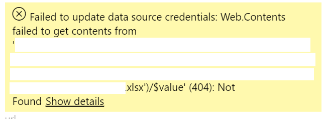
    “Failed to update data source credentials: Web.Contents failed to get contents from” after updating data source

    At first, I thought it was the use of parameters in the report, but after determining that wasn’t the issue, it actually helped me figure out that the report in the Service wasn’t updating because the parameters were still showing the “xlsx” file type from the files that I had already removed from the SharePoint location. After repeated attempts to change the datasources manually in the original file, delete and replace, and every other combination of things to try a refresh, I was stumped. What was more confusing, is that connecting to the file again from the PBI Service created another dataset & report of the exact same name!

    In my mind, that wasn’t supposed to happen, and I was getting more frustrated because things were not behaving as I would expect. My initial assumption here was that the PBI Service would look at the new PBIX of the same name and recognize the changes and replace the existing dataset and report, the same way that it does if I manually push a PBIX via the “Publish” action. But using this direct connect method, refreshing the dataset did nothing…(cue the “grrrr”).

    The solution:

    Thanks to the fantastic Power BI team, they were able to determine my issue and share with me the root cause of some of the datasets not updating. The issue is that when you connect to the PBIX files in this manner, the PBI Service looks at the root id of the PBIX file in the OneDrive location and that file id cannot be deleted and replaced with another one. If you do that, you get the above error on the dataset source because it cannot find the file id. If you remove the file out of SharePoint then when you insert it back into the folder the ID will be different. This is what breaks the dataset in Power BI, and also the reason it allows what appears to be the same named dataset and report. However there is good news, because you are in SharePoint you will be able to go back in version history of the folder and pull the previous versions of the reports and resolve the issue in the datasets. I did end up having to replace one of the reports, but lucky for us it was only a single user for the customer report and re-sending a shared link was a really low impact compared to what it could have been.

    Here are the following guidelines I can offer up after going through this.

    Do:

    • Sync the SharePoint folder to your local storage
    • Open the report directly from the synced folder and update it in location
    • Leave the originals file in the folder and replace it with the new one
    • Do try to resurrect your previous version of the report PBIX in the folder (if you are hitting this issue now)

    Don’t:

    • Move the file to your local machine, then back to the SharePoint folder
    • Remove the file from the folder (You can do this if you move it to a SharePoint folder, update and move it back, but if the dataset refreshes during that time in the Service it will break and you will need to fix the credentials when you have put the file back.

    I hope you found this post worthwhile, error messages are hard to track down to the root causes and due to the nature of this being a tricky one for me to solve I thought I would share the experience and hopefully help others avoid it or solve the errors that match above.

    When testing out this issue again, I did uncover this error message which is much more specific. It came up after I made the breaking change, but prior to an automated refresh.
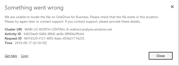
    “We are unable to locate the file on OneDrive for Business. Please check that the file exists in this location.”

    If you like the content from PowerBI.Tips, please follow us on all the social outlets to stay up to date on all the latest features and free tutorials.  Subscribe to our YouTube Channel, and follow us on Twitter where we will post all the announcements for new tutorials and content. Alternatively, you can catch us on LinkedIn (Seth) LinkedIn (Mike) where we will post all the announcements for new tutorials and content.

    As always, you’ll find the coolest PowerBI.tips SWAG in our store. Check out all the fun PowerBI.tips clothing and products:
    Store Merchandise

  • New Layout – One

    New Layout – One

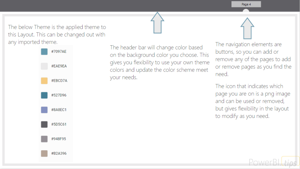
    This layout continues to deliver fantastic visual guides to make your reports look top notch. This layout utilizes buttons for navigation without locking in the position in the layout background. We also really like how this layout uses the theme templates to change the background header color to anything you would want. The semi-circle that indicates which page you are on is a free form image and can be changed around if you want to re-arrange the pages. Our branded layout gives you 5 pages of fun, while our unbranded version throws in 10 pages and includes all 10 background .png image files to make your report building even easier.

    Features of this report

    • Free documentation provided by PowerBI.Tips included on the Report Features page
    • 10 pages of different layouts – Unbranded
    • 5 pages with navigation built with buttons in the report (Easily swap out a different background)
    • 10 PNG images of all the backgrounds to use in this report or others – Unbranded
    • Navigation dot – included icon image for complete flexibility
    • Customizable top ribbon (color of buttons and background header are can be altered with themes)
    • No PowerBI.Tips Branding on any of the main report pages – Unbranded
    One – Capabilities

    Get a feel for all the page layouts and interactions available in this report by using the below example we’ve embedded via Power BI.

    Sample of report

  • Dynamic Visuals using Buttons

    Dynamic Visuals using Buttons

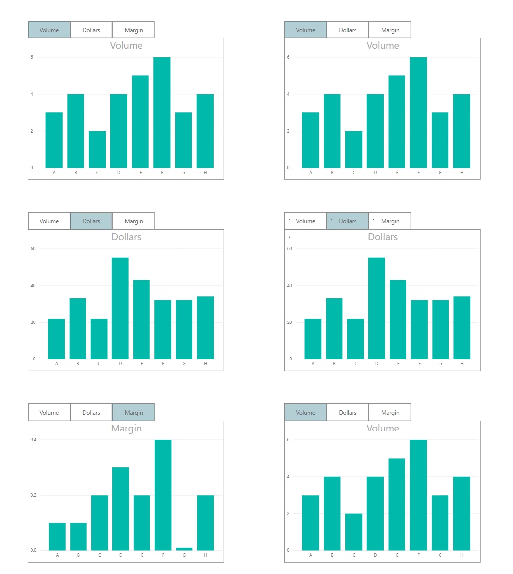
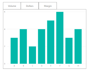
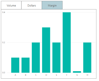
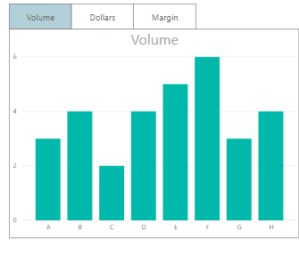
    Sometimes, we want the users to see different metrics, but do not want to take up too much space on our page. The scenario we are going to walk through is how to build just one visual (in this case a bar graph). It will include a toggle that allows the user to select their desired calculation, either the sum of Volume, Dollars or Margin.

    Final Solution

    With buttons, we can change specific visuals on a page. Recently, with the release of conditional formatting on titles and backgrounds, we have some new methods to make this easier for the report author and cleaner for the report consumer.

    The Build

    Before we start, turn on the selection pane and bookmark pane. They can be turned on by clicking on the View ribbon and checking the correct boxes.

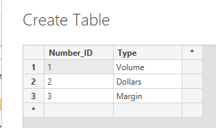
    First, we’re going to create our control table. This will be a disassociated table. This table should not have any relationships to any of the other tables in our model. We just need to enter a numeric ID and a description of what we want.  Click on the Enter Data button found on the Home ribbon. Enter the following data as shown. Click the OK button to close the Create Table dialog box.

    Now that’s set up, we can write our measure. This measure will see what is selected in the Number_ID column of our control table, then return the appropriate calculation. Use a switch statement to select the correct calculation. Create the following measure:

    Selected Calculation = 
    SWITCH(
      SELECTEDVALUE(Control[Number_ID])
       ,1,SUM(Sales[Volume])
       ,2,SUM(Sales[Dollars])
       ,3,Sum(Sales[Margin])
       ,SUM(Sales[Volume])
    )

    Note: See there is a default value listed in the switch statement. The default calculation means that if nothing is selected, SUM( Sales[Volume] ) will be returned. The default value is represented by the last property in the switch statement.

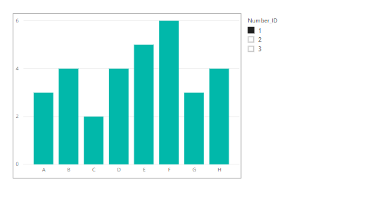
    Time to set up our visual. Add a bar graph with Category on the axis and the new measure, Selected Calculation, in the values fields. Then add a slicer for the Number_ID column. The Number_ID column comes from the control table we added earlier.            

    Switching the slicer can now change the graph to show the different calculations.

    The next stage is to add three buttons to the top of the graph. In the Home tab of the ribbon, click Buttons and select Blank. Make sure the outline colors and outline width match on all objects, Buttons and chart outline.

    Tip: Make sure you label your buttons in the Selection Pane. The selection pane can be turned on by clicking on the View ribbon and checking the box labeled Selection Pane. To Change the name of the button, double click the name listed in the Selection Pane. Giving a title (such as Button_Volume) will make it easily to see what visual items are on the page.

    After this, it’s time to add the bookmarks.

    The bookmark pane can be turned on by clicking on the View ribbon and checking the box labeled Bookmark Pane.

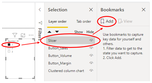
    Step 1:

    • Select a value of 1 in the Number_ID slicer.
    • Select the slicer (and only the slicer) in the Selection pane.
    • Click “Add Bookmark” in the Bookmarks pane.

    Step 2:

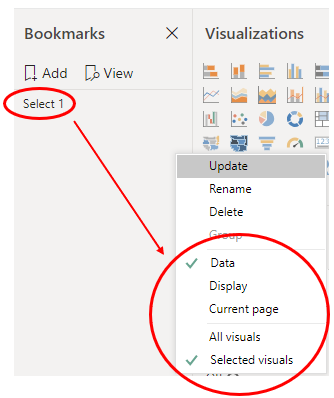
    • In the Bookmarks pane, right click the bookmark and rename it to Select 1.
    • Right click again, and untick “Display” and “Current Page”. Select “Selected Visuals”.

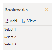
    Now repeat step 1 and step 2, but do so with the values of 2 and 3 from Number_ID slicer. Name these bookmarks Select 2 and Select 3. You should finish with three bookmarks, each that filters Number_ID to a different value. You can test the bookmarks by clicking on them once in the bookmark pane.

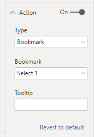
    On Button_Volume, assign the Select 1 bookmark (as Number_ID 1 refers to volume). To do this, click on Button_Volume in the selection pane. In the visualizations pane for this button, go to the property named “Action”. Turn it on, change the type to bookmark, and choose Select 1 in the dropdown.

    Repeat for Button_Dollars and assign Select 2. Then for Button_Margin and assign Select 3. Now the buttons can change the graph, but it’s a bit hard to see what is selected.

    Add Conditional Formatting

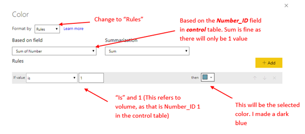
    This is where conditional formatting can help us! Select Button_Volume in the selection pane. Then in the visualizations pane, turn on the background property, select the ellipsis and click conditional formatting

    Here’s the settings we want:

    This is going to apply a rule if the Number_ID selected is 1, to give the button a blue background. As there are no other rules, any other number selected will default to the white.

    Now, apply the same steps to the other two buttons, but make the rule “If value is 2” for Dollars, and “If value is 3” for Margin.

    To tidy up, hide the slicer and turn the visual headers of all buttons off. You can click on the eye next to the slicer in the selection pane to hide it.

    Turn the visual headers off by clicking the button, then in the visualizations pane.

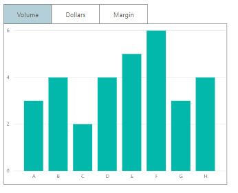
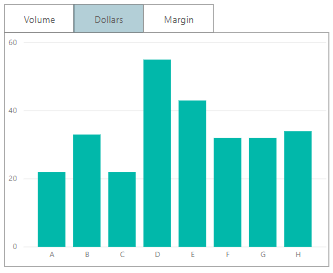
    Great! Now the tab shows the selected button and correct measure:

    To make it even clearer, apply conditional formatting to the title of the graph. On the graph, open conditional formatting. Set it to field value and use the type field in the control panel.

    Using this control table allows for greater flexibility. We can add more calculations, easily edit them or even sync across pages, all without having to re-record any bookmarks.

    If you like the content from PowerBI.Tips please follow us on all the social outlets to stay up to date on all the latest features and free tutorials.  Subscribe to our YouTube Channel.  Or follow us on the social channels, Twitter and LinkedIn where we will post all the announcements for new tutorials and content.

    Introducing our PowerBI.tips SWAG store. Check out all the fun PowerBI.tips clothing and products:
    Store Merchandise

  • Icons upon Icons

    Icons upon Icons

    I am just bursting with excitement!! This month the amazing Power BI team has yet again come out with a great new feature, Icon sets. In addition to this you can enhance these icon sets by adding your own custom icons to your Power BI reports. Woo Hoo….

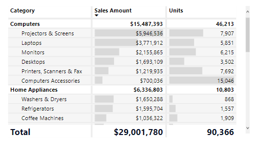
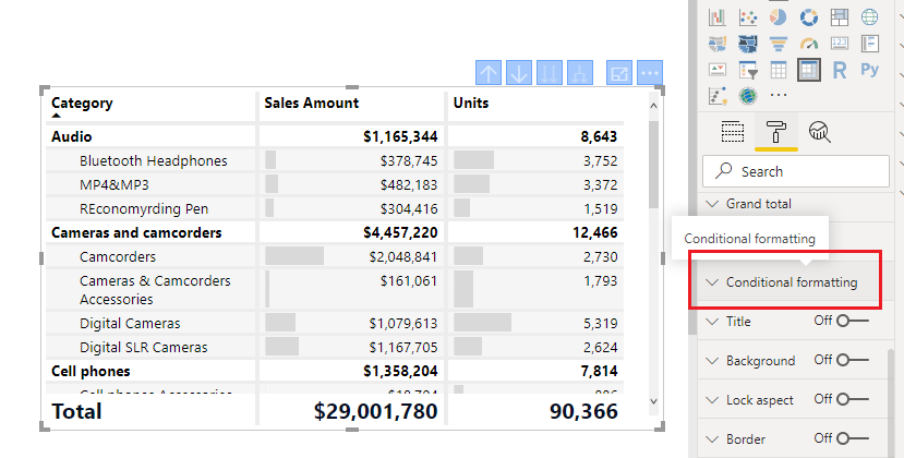
    So what does this mean? Well, now you have a new Conditional Formatting box found in the settings of the Table and the Matrix properties. To use a built in Icon from Power BI. Create either a table or a Matrix visual with some data.

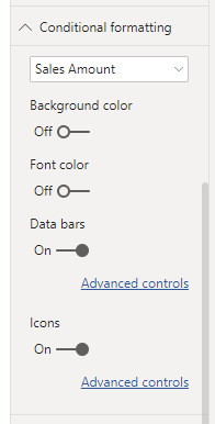
    Select the visual and adjust it’s properties by clicking on the Paint Roller and opening the Conditional Formatting window.

    Scroll down until you see the toggle button for Icons. Turn the Icons On.

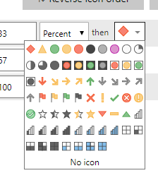
    Click on the Advanced Controls to set the properties of the icons based on the data properties. This type of dialog box should look familiar as it is similar to the previous boxes for conditional formatting. Opening this window shows Icons for each Rule in the list. To adjust an icon Click on the Drop Down Arrow next to the icon you wish to change. There are multiple icons to choose from.

    There are limited selections by default, but you can enhance this by adding your own icons with the custom Json theme files. At PowerBI.tips we love our theme files. They make using standard settings so much easier.

    Loading the Custom Icons

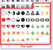
    For starters we have already done the hard work of creating an additional 50 icons for you to use in your reports. Download the Icon Theme File Here

    Update: Special thanks to Reid Havens from Havens Consulting for contributing extra icons to this Icon Set.

    With this file you get these additional icons:

    To add these additional icons follow these steps:

    1. Download the theme file -> Here
    2. Unzip the downloaded file to find the PowerBITips Icons v1.json file
    3. Navigate to the Home ribbon in Power BI Desktop
    4. Click on the Switch Theme button
    5. Select the list item Import Theme from the drop down menu
    6. The open file dialog box will open. Select the PowerBITips Icons v1.json file that you downloaded earlier.

    Boom, and just like that you have loaded your new icons. Now you can return to the icons for your table or matrix and adjust until your heart is content.

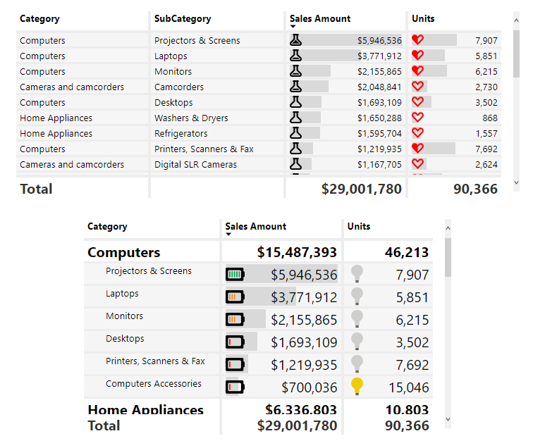
    Here is a sample of a table and a matrix with some custom icons applied:

    Update 2019/08/06: When publishing the Power BI file to the PowerBI.com service, the fill colors for the shapes need to have a %23 instead of a # (HASH) infront of the HEX codes. Thus, the format should look like fill=’%23FF0000′ instead of fill=’#FF0000′

    If you liked the tables from this blog they came from one of our Layouts that we produce. The Microsoft Layout September 2018, download it here.

    If you like the content from PowerBI.Tips please follow us on all the social outlets. Stay up to date on all the latest features and free tutorials.  Subscribe to our YouTube Channel.  Or follow us on the social channels, Twitter and LinkedIn where we will post all the announcements for new tutorials and content.

    Introducing our PowerBI.tips SWAG store. Check out all the fun PowerBI.tips clothing and products:

    Check out the new Merch!

    Hasta La Vista Data
    Go Ahead Make My Data
    PBIX Hat


  • The Dynamic Time Matrix

    The Dynamic Time Matrix

    Time and time again when I begin talking with Excel users and ask to see what current reports they are using, they usually show me a table with a mixed bag of columns split by different time ranges. A comparison of month over month, or year over year, mixed in with a few daily totals or cumulative totals all rolled up from values on other tabs to produce their preferred view (or dashboard). Typically, the first approach I take is to describe how we can break up this single table view of things and start looking at the aggregations of these values in easily digestible pieces and slice and dice them in different times ranges. I’ve explained that the goal should be to produce easy to consume visuals for comparison using measures and plotting these out in different ways to glean insights quicker. Most of the time, this works, but other times… it is second best to what the analyst or uber Excel user wants to see… they want to see their numbers, and they want to see them the same way they have them in Excel.

    The Challenge:

    Recently, I encountered this all too familiar scenario (Time Ranges in a table/matrix) except this time, I wanted to see if I could reproduce the output exactly as the end user wanted it rather than move them in a different direction.

    The first group of columns showed the days in the current week, the second group showed the weeks in the current month, followed by the Months to date, a year to date column and static columns of a Goal and Forecast.

    I’ll spare you the details of researching a better way than producing these as individual measures,  and suffice to say that I was able to come up with a solution based on a few calculated columns, a disassociated table, and a single measure to produce the output I was searching for.

    The Solution:

    The above screenshot is of the dynamic matrix that you can download from the link at the end of this blog. As I developed this solution it came to my attention that there are actually a couple ways we could build this solution. The first of those would be to have a time slicer drive all the different time ranges, this would be useful for analyzing older datasets in the different ranges, but my goal was to create a solution that follows the “Set it and forget it” train of thought. This solution will restrict the view of data to never exceed the current day, the neat thing is, the current day is when you read this blog, not a static point in time. I’ve pre-loaded data out to the end of 2020, so the sample should continue to work and change each time the file is opened.

    Before we dig into things, I want to convey that the DAX dove a bit deeper into the weeds than I initially expected, and I’ll do my best to describe what I did and why.

    The Data

    Sample Data

    I’ve modified my original solution to use a sample of Adventure works data that I created, this simple dataset consists of a column to group things by (ModelName), a date (StartDate) and the value to aggregate (ListPrice). This solution should cover a wide range of different use cases so don’t get hung up on the exact columns here. A grouping column, a date column and a value column are all you need.

    Here are the steps I took after creating the dataset and loading it into Excel:

    Load Data table from Excel into Power Query, Close & Apply

    Create a calculated date table (DAX):

    Date = 
    VAR MinYear = 2018
    VAR MaxYear = 2020
    RETURN
    ADDCOLUMNS (
        FILTER (
            CALENDARAUTO( ), 
            AND ( YEAR ( [Date] ) >= MinYear, YEAR ( [Date] ) <= MaxYear )
        ),
        "Calendar Year", YEAR ( [Date] ),
        "Month Name", FORMAT ( [Date], "mmmm" ),
        "Month Number", MONTH ( [Date] ),
        "Weekday", FORMAT ( [Date], "dddd" ),
        "Week Number", WEEKNUM([Date]),
        "Weekday number", WEEKDAY( [Date] ),
        "Quarter", "Q" & TRUNC ( ( MONTH ( [Date] ) - 1 ) / 3 ) + 1
    )

    Your MinYear / MaxYear will obviously be different, but the core columns for what we need are in this output.

    Add Calculated Columns

    Now we need to add some filter columns to the date table we just created in order to get the current time frames we care about.

    IsInCurrentYear = if(YEAR(NOW())= [Calendar Year],1,0)
    IsInCurrentMonth = if([isInCurrentYear] && MONTH(NOW())=[Month Number],1,0)
    IsInCurrentWeek = if([isInCurrentYear] && WEEKNUM(NOW())=[Week Number],1,0)
    

    Create a Disassociated table (Dax Table)

    This is our grouping table, this is the first key element in which we create a series of different DAX calculated tables to create the different time range groups we want to roll up our aggregate amount by. In each case, we are pulling all current and previous years, the current months in this year to date, the current weeks in the current month and the current days in the week. Then we union those values together where the “Group” is the top level time range, and the value is the specific time range values. Then we add an index column so that we can order the values in the way that we want.

    The final output should look something like this:

    This is the DAX code to create the calculated table. Each “Summarize” creates the time groups and values rolled up for the particular time range we are interested in. This is wrapped in the “AddColumns” function to add in a workable index that allows us to order all the values in the correct order dynamically. Initially, the static Index column works to sort the Group column, but the dates won’t sort as Calendar dates so I added the second way to dynamically generate an index to sort the values by. I retain the original Index value and ensure the counts returned from the date table align in sequential order. Essentially retaining the Group/Value index to sort by. Then we wrap all that in “SelectColumns” so that we can specify the column names. If we didn’t do this, the first column name would be “Calendar Year”.

    TimeRange = 
    SELECTCOLUMNS(
    UNION(
        ADDCOLUMNS(
        SUMMARIZE(FILTER('Date', 'Date'[Calendar Year] <= YEAR(NOW())), 'Date'[Calendar Year], "Group", "By Year", "Index", 4),
            "DayIndex", CONCATENATE(4, FORMAT(CALCULATE(COUNT('Date'[Date]), ALL('Date'), FILTER('Date', 'Date'[Calendar Year]<=EARLIER('Date'[Calendar Year]))),"000"))
                ),
        ADDCOLUMNS(
                   SUMMARIZE(FILTER('Date', 'Date'[Month Number] <= MONTH(NOW()) && 'Date'[Calendar Year] = YEAR(NOW())), 'Date'[Month Number], "Group", "By Month", "Index", 3),
            "DayIndex", CONCATENATE(3, FORMAT(CALCULATE(COUNT('Date'[Date]), ALL('Date'), FILTER('Date', 'Date'[Month Number]<=EARLIER('Date'[Month Number]))),"000"))
                ),
        ADDCOLUMNS(
                   SUMMARIZE(FILTER('Date', 'Date'[IsInCurrentMOnth] = 1 && 'Date'[Week Number] <= WEEKNUM(NOW()) && 'Date'[Calendar Year] = YEAR(NOW())), 'Date'[Week Number], "Group", "By Week", "Index", 2),
            "DayIndex", CONCATENATE(2, FORMAT(CALCULATE(COUNT('Date'[Date]), ALL('Date'), FILTER('Date', 'Date'[Week Number]<=EARLIER('Date'[Week Number]))),"000"))
                ),
        ADDCOLUMNS(
            SUMMARIZE(FILTER('Date', 'Date'[IsInCurrentWeek] = 1 && 'Date'[Date] <= NOW()), 'Date'[Date], "Group", "By Day", "Index", 1),
            "DayIndex", CONCATENATE(1, FORMAT(CALCULATE(COUNT('Date'[Date]), ALL('Date'), FILTER('Date', 'Date'[Date]<=EARLIER('Date'[Date]))),"000"))
                ),
                   DATATABLE("Header", STRING, "Group", STRING, "Index", INTEGER, "DayIndex", INTEGER,
                       {{"Goal", "Overall", 5,0}, {"Forecast", "Overall", 5,0}})),
        "Value", 'Date'[Calendar Year], "Group", [Group], "Index", [Index], "DayIndex", [DayIndex]
    )
    

    Create a relationship between the Date table and the Data Table

    This would be on ‘Date’[Date] and ‘Data’[StartDate]

    Create our Measures

    Now we need to take the grouping table and merge it with the aggregated value via our measures. In the Data table we want to create the following measures.

    First Measure:
    List Price = SUM(Data[ListPrice])
    
    Second Measure:
    TimeValue = 
        VAR Val =
        SWITCH(SELECTEDVALUE('TimeRange'[Group]),
            "By Year", CALCULATE(TOTALYTD([List Price], 'Date'[Date], FILTER('Date', 'Date'[Date]<= TODAY())), FILTER('Date', 'Date'[Calendar Year] = VALUE(MAX('TimeRange'[Value])))),
            "By Month", CALCULATE(TOTALMTD([List Price], 'Date'[Date], FILTER('Date', 'Date'[Date]<= TODAY())), FILTER('Date', 'Date'[Month Number] = VALUE(MAX('TimeRange'[Value])) && 'Date'[Calendar Year] = YEAR(NOW()))),
            "By Week", CALCULATE(SUM(Data[ListPrice]), FILTER('Date', 'Date'[Week Number] = VALUE(MAX('TimeRange'[Value])) && 'Date'[Calendar Year] = YEAR(NOW()) && 'Date'[Date]<= TODAY())),
            "By Day", CALCULATE(SUM(Data[ListPrice]), FILTER('Date', 'Date'[Date] = DATEVALUE(MAX('TimeRange'[Value])))),
            --Remove SWITCH below if you only want time range
            SWITCH(SELECTEDVALUE(TimeRange[Value]),
               "Goal", [List Price] * 1.2,
               "Forecast", [List Price] * RAND() 
                )
        )
        RETURN
            FORMAT(Val, "CURRENCY")

    Create the Matrix

    Create a Matrix visual and drop the columns into the following rows and columns:

    You will have something that looks like this:

    Dynamic Time Matrix First Level

    Are you ready for the magic? Head over to the far right of the visual and click down on the “Expand all down one level in the Hierarchy” button ->  and BOOM!

    Dynamic Time Matrix Complete

    We have our fully functional time range matrix that will adjust dynamically based on the current day. No need to update, change or alter anything! I hope you enjoyed this tip, I certainly was excited to put this solution together. There are so many different ways you could alter this solution, using different dates (swap in fiscal calendar dates), add different final total or percentage columns at the end, my mind keeps coming up with new solutions, and I hope you can use this as well!

    You can find the full solution in this PBIX download which includes the sample data set.

    If you like the content from PowerBI.Tips, please follow us on all the social outlets to stay up to date on all the latest features and free tutorials.  Subscribe to our YouTube Channel, and follow us on Twitter where we will post all the announcements for new tutorials and content. Alternatively, you can catch us on LinkedIn (Seth) LinkedIn (Mike) where we will post all the announcements for new tutorials and content.

    As always, you’ll find the coolest PowerBI.tips SWAG in our store. Check out all the fun PowerBI.tips clothing and products:
    Store Merchandise

    After many requests, we are now selling out layouts unbranded so that you can use them in all your business applications. Be sure to check out our first offerings and stay tuned for more to come in the future. Learn more about Layouts.

  • Quick Access Toolbar for the Win

    Quick Access Toolbar for the Win

    I’m a lazy engineer.  Let me qualify my statement.  In lazy I mean I like to find the path of least resistance, the shortest distance between two points.  Everyday I challenge myself to be lazy, or efficient how ever you want to view it.  As I have built many reports in Power BI over the years here is a fantastic trick, I use almost every day, Customizing the Quick Access Toolbar.

    Here are a couple reasons why I think this will speed up your report writing.

    • There are only a few shortcuts that I am aware of for Power BI Desktop, thus making your own shortcuts with Hotkeys is faster for repetitive tasks.
    • To achieve a simple task, you might have to jump between ribbons, again adding time.
    • When you set up Hotkeys you don’t have to remove your hand from the keyboard and wiggle your mouse around then come back to the keyboard.  Again, wasting time.

    Enough reasons, if you are still reading this then clearly you are lazy like me.  Let’s just get to the good stuff…

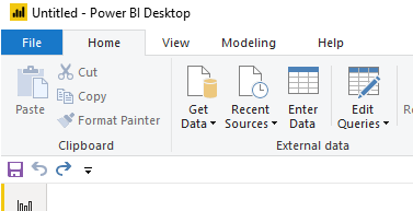
    By default, you get the following Quick Access Toolbar:

    The icons are Save, Undo, and Redo.

    While these icons are good, YOU DON’T NEED THEM… lol

    You can automatically save by using Ctrl + S

    Undo is simply Ctrl + Z

    And Redo… lets be honest no one uses this one.

    Another aspect of the Quick Access Toolbar is when you hit the Alt key you can reveal numbers on the toolbar:

    Pressing the number or letter triggers the next button press. 

    Example:

    • Alt + 1 will automatically save the file

    To take this further you can string together multiple key presses to dig even deeper into the menus

    Example:

    • Alt + H + ii  brings up the import image dialog box
    • Alt + G + D  opens the menu to get data
    • Alt + W + C  Opens the Selection Pane,  Repeating this command closes the Selection Pane

    The downside with multiple commands it takes more time to learn the key strokes to be fast.  As a personal preference I like to use one-step key press options (Ctrl + s or Ctrl + z).  It is easier for my simple mind to remember and commit to memory.  If you use Adobe products for images or video, you will be familiar with this technique.  From my opinion Adobe has some of the best most useful shortcuts that enhance productivity.

    Make it Custom

    Let’s begin customizing our menu. 

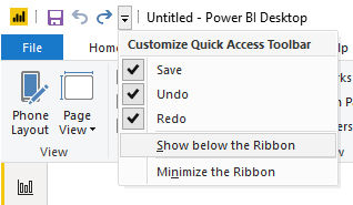
    First Click the Down Arrow at the far right of the toolbar.

    Click on the item in the dropdown menu called Show below the Ribbon.  This will move the toolbar to the bottom of the ribbon.

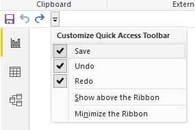
    For each item in the dropdown list Uncheck each item, Save, Undo, and Redo.  This will remove all the items from the toolbar.

    The Quick Access Toolbar will now look like the following image:

    In our next step we need a hidden toolbar to appear, the Format ribbon.  This Ribbon only appears when multiple elements are on the page.  Thus, we will need to add some generic shapes to the page to reveal the toolbar.

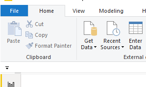
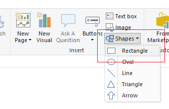
    Add three Shapes (Squares) to the report page.  Click on the Home ribbon and select the Shapes icon listed in the Insert section of the ribbon.  Then Select the item in the drop-down list labeled Rectangle.

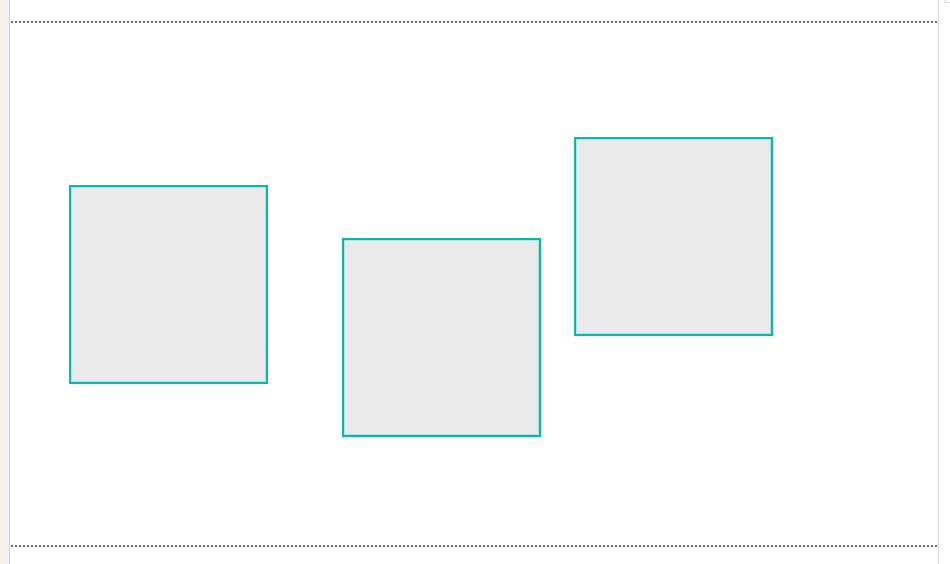
    After adding one rectangle select the rectangle with your cursor.  Use Ctrl + C to copy the shape.  Then, use Ctrl + V to past Two more rectangles on the page.  Use your cursor and move the shapes across the report page.  The order of the shapes does not matter, they just need to be distributed across the page. See below for reference.

    Use Ctrl + A to select everything on the page.

    Notice a new ribbon appears, the Format ribbon.  This is called a context aware ribbon.  This has been a long standard best practice in office products.  Only show the ribbons that are needed.  Thus, the format ribbon and the Data / Drill ribbons are not exposed until you have visuals selected on the page.

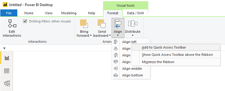
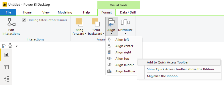
    Click on the Format ribbon.  Click the button called Align in the Arrange section of the Format ribbon.  Then Right click on the first item in the align menu called Align left.  Upon doing this, a menu will appear.  Select the first item in the list called Add to Quick Access Toolbar.

    Repeat the same process by adding the Distribute Vertically action from the Distribute button on the Format ribbon.

    Next, Add the Align top action from the Align button on the Format ribbon.

    Finally, Add the Distribute horizontally action from the Distribute button on the Format ribbon.

    Using the combination of Aligning an Edge / Distribution is just so much faster then moving one object at a time. 

    For example, here is a random arrangement of 5 shapes on a page.

    Using our newly created shortcuts I select the Items I want to move.

    Then using our new key combo, Alt + 3, Boom all the top edges are aligned.

    Then the magic, press Alt + 4 and all the items are evenly distributed

    Superfast and efficient, aka lazy..

    Side Note:

    When I am training new users in building Power BI reports, I like to point out the following, it is important to align your elements on the page.  This follows along with one of the Gestalt principles, symmetry.  Your eye can perceive slight differences in objects that are misaligned.  I can’t tell you the number of reports has something like the following:

    The change is subtle but your eye picks it up.  When these out of alignment objects are near another visual with a straight edge it is even more apparent.

    (Steps off the Soap Box) Ok, enough diversions.  Let’s finish with adding two more items that I use every time I build a report, Selection Pane, and Bookmarks Pane.  We can add these items to the menu as well. 

    Navigate to the View ribbon (or hit Alt + W if you want to be fancy).

    Right Click on the item called Selection Pane.  Select the item in the dropdown Add to Quick Access Toolbar.

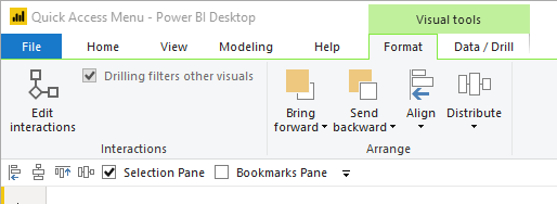
    Do the same for the Bookmarks Pane.  When you are finished your Quick Access Toolbar should look like the following:

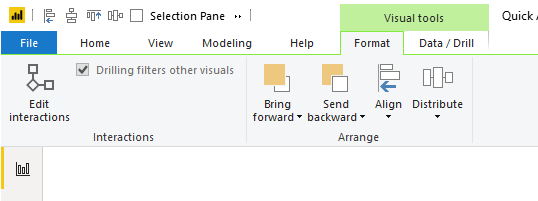
    You may be asking yourself… So why did we move the menu to the bottom of the ribbon?  We could have just left it on the top of the screen.  You would be right.  But, I do want to point out one odd behavior when the Quick Access Toolbar is at the top of the ribbon. 

    When I have multiple visuals selected on the page the contextual menu appears.  See below image with the Quick Access Toolbar at the top:

    When this happens any items to the right might get chopped off, and you must access them using the double sideways arrow.  The Alt + # keys will still work even though the items are hidden, but I don’t like the experience of having some of my menu items hidden.  If you had many icons distributed across the Quick Access Toolbar, say 9 of them, you would have to remember its position in the alt keys.  This is the reason why I prefer to show the Quick Access Toolbar below the ribbon.  When the context aware menus appear the Quick Access Toolbar is not covered.

    Thanks for reading along.  Have a great day and I hope this tip / trick makes you a little bit more productive!

    If you like the content from PowerBI.Tips please follow us on all the social outlets. Stay up to date on all the latest features and free tutorials.  Subscribe to our YouTube Channel.  Or follow us on the social channels, Twitter and LinkedIn where we will post all the announcements for new tutorials and content.

    Introducing our PowerBI.tips SWAG store. Check out all the fun PowerBI.tips clothing and products:

    Check out the new Merch!

    Hasta La Vista Data
    Go Ahead Make My Data
    PBIX Hat


  • Make Custom Visuals with no Code

    Make Custom Visuals with no Code

    Welcome to another installment of building custom visuals with the Charts tool from PowerBI.Tips. In this edition we make the following custom visual.

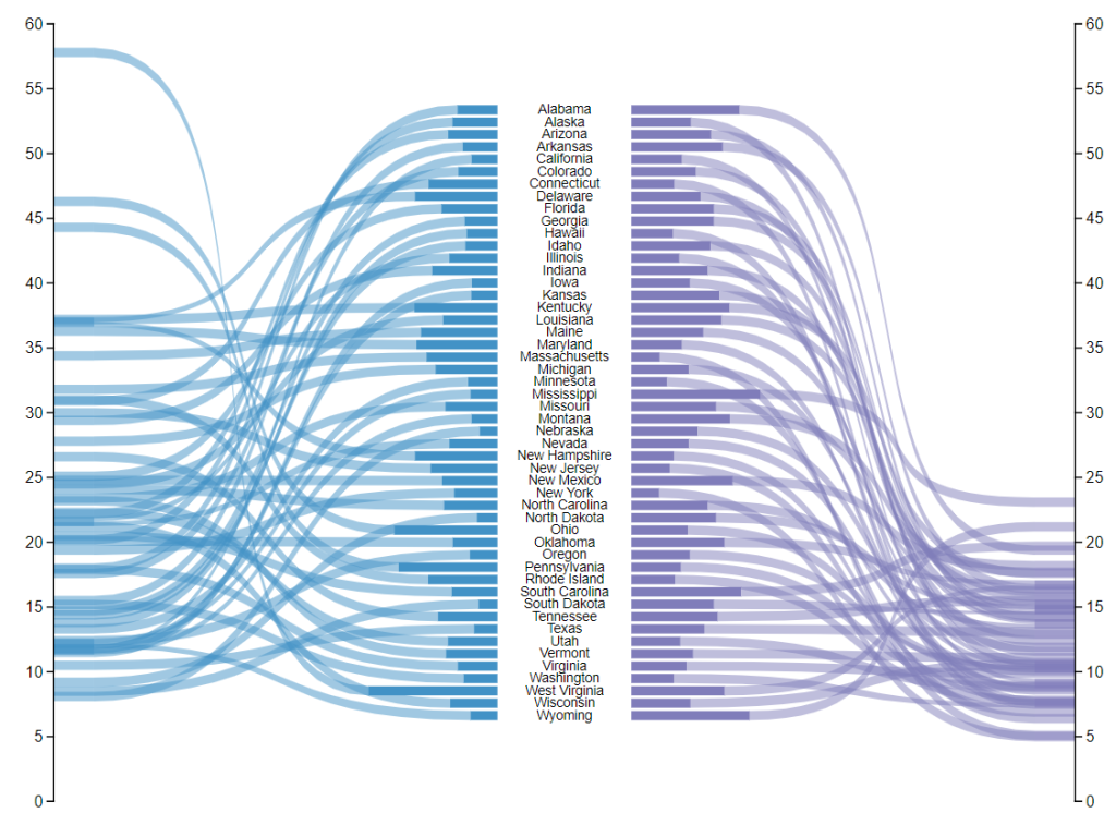
    Custom Ribbon Chart

    This chart comes to us from the sharp mind of Nick Snapp, Check out is work on Charts.PowerBI.Tips within our custom visual gallery. This chart combines the ability to see both the relative size of values between states as well as distributions of data with adjacent number lines. Pretty cool don’t you think?

    Below is the walk through video on how to build this custom chart.

    Building the Custom Visual

    If you want some other help making custom visuals check out this other tutorial building a simple bar chart.

    If you like the content from PowerBI.Tips please follow us on all the social outlets. Stay up to date on all the latest features and free tutorials.  Subscribe to our YouTube Channel.  Or follow us on the social channels, Twitter and LinkedIn where we will post all the announcements for new tutorials and content.

    Introducing our PowerBI.tips SWAG store. Check out all the fun PowerBI.tips clothing and products:

    Check out the new Merch!

    Hasta La Vista Data
    Go Ahead Make My Data
    PBIX Hat


  • 2019 Microsoft Business Application Summit Retrospective

    2019 Microsoft Business Application Summit Retrospective

    This year the Microsoft Business Application Summit (MBAS) was held in Atlanta Georgia. Despite some travel snafu’s (3 rebooking’s and 9 delays), we made it into Atlanta late the night before the preconference sessions. Which was good, because we were presenting one!

    (A special thanks to Adam Saxton (Guy in a Cube) who went way out of his way to pick up a bunch of materials we needed for the preconference. If you don’t follow Adam and his awesome Power BI channel, be sure to check it out -> YouTube Link Guy in a Cube)

    Our “Data visualization with Power BI” preconference session was packed with 180 people and we had a fantastic time showing people how to build no-code custom visuals with the new “Charts” http://charts.powerbi.tips/ (Gallery here: http://gallery.powerbi.tips/) tool based on the Microsoft Research team that developed Charticulator, how to create themes and layouts and many other tips and tricks. The good news for all our followers on powerbi.tips is that we have that content created now and we will be sharing that over time in the form of blogs and other training materials posted to the site.

    We each individually had the opportunity to spend some quality Q&A time in the Community Lounge with some great one on one time with many of the conference goers. And we finished off the whirlwind tour with the final session time of the conference where we presented the “Microsoft Power BI: Data visualization best practices”. Here is our session from the conference.

    Here is a detailed video of the creation of the custom ribbon chart at the end of the session:

    Link to Session BRK 3023 on YouTube

    All the sessions of MBAS can be found in the Power BI Community Video Gallery

    Top Takeaways:

    The best part of any conference is the people you meet. The social aspect and meeting new people are one of the most important aspects of any conference event. We hope all the attendees at MBAS made some great new connections, we know we did!

    It is an exciting time to be in the business of data, and the MBAS conference has merged in Dynamics with the Power Platform tools. The keynote by James Phillips brings to light Microsoft’s next steps in the evolution of how these tools are transforming businesses, and the future is bright indeed. Be sure to check out his Keynote

    Power BI is still on a rocket ship of greatness. The roadmap is exciting, the community is growing bigger and better every day, and more and more businesses are leveraging the tool to change the way their users interact with data on a daily basis.

    Our Favorites:

    Of course, our favorites all revolve around the tool we love, Power BI! An absolute must watch video is the road map session that outlines the near term features that are going to amaze you

    Link to road map session

    We’re huge fans of Power BI dataflows, so of course we recommend those sessions. Here is a Great Overview and explanation dataflows.

    Want more information on dataflows, check out these sessions from the conference.

  • New Layout – Square One

    New Layout – Square One

    “Square One” utilizes the color theme as a background component that adds a pop of accent color only. This gives you the end user the maximum flexibility to incorporate color themes that match your needs without drawing to much attention on the main part of the page. Click here to download

    The icons are part of the background so that the colors come through with the icons, but this also keeps the same flexibility in that if you have different icons, you can always place those behind the clear buttons placed on the report. We’ve only tied in 3 of the icons to buttons and bookmarks as the others can be added by you as you develop and build out the report.

    The idea behind the icons on the right follow two different thought patterns.

    First, a Summary, more granular, and then table views of data. In this vein, you would create a clear bookmark to re-direct to the different pages showing that level of information.

    Second, would be to create toggles on each page to view visuals in current state vs. over time and use the icons to flip between the two.

    Let us know your thoughts on this new layout idea, we hope you get a lot of use out of it!

    Sample of Report:

  • New Layout – Smooth Operator

    New Layout – Smooth Operator

    Hey everyone! We’re excited to release our latest layout “Smooth Operator”. Click here to download.  We’ve gotten some great feedback from our users and the previous layouts were a bit heavy handed as we tried to create a perfect experience with adding visuals. The difficulty of trying to link up a dataset to the x/y axis made some of those a bit burdensome. As a result, we’re going to streamline the layouts to be super easy to use but yet still providing as much enhanced value with bookmarks, areas for visuals, and using json themes to change look and feel of background and visual elements.

    We’re interested in your thoughts on this streamlined approach, so please let us know how you like the new layout – and expect more like it in the future!

    Sample of Report: