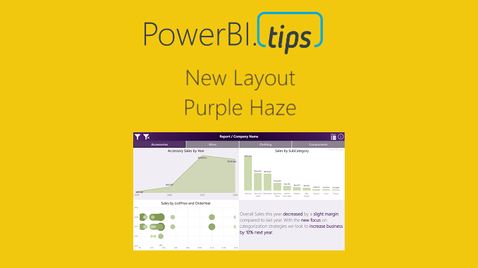
In honor of the 2018 Business Applications Summit, PowerBI.Tips has published a new layout, Purple Haze. Purple Haze is the brain child of Seth Bauer, and utilizes the latest features of the July 2018 Power BI Desktop.
In the previous versions of Power BI desktop there was always a header present at the top of a visual. Now, the header is no longer needed, and design elements within the report can extend all the way to the very top of the report page. This is great news for report designers and new possibilities for Layouts.
Hit the link to download the Purple Haze layout.
Cool Features of Purple Haze:
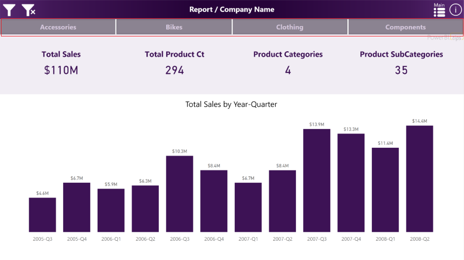
- The report comes with four (4) pages. In the example the are listed as Accessories, Bikes, Clothing, and Components. By Clicking on these buttons the report navigates to a new page where all the visuals for these topics exist.
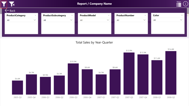
- The filters across the top of the report are using an upper third filter context window. This window is exposed when clicking on the filter icon, which is found in the upper left hand corner of the report:
We hope you enjoy this new free layout.
Be sure to follow:
If you like the content generated from PowerBI.Tips please follow me on all the social outlets to stay up to date on all the latest features and free tutorials. Subscribe to me on YouTube. Or follow me on the social channels, Twitter and LinkedIn where I will post all the announcements for new tutorials and content.
 |
 |
 |


I read this piece of writing fully on the topic of the comparison of most recent
and earlier technologies, it’s awesome article.
Hi there, everything is going nicely here and ofcourse every one is sharing
data, that’s genuinely good, keep up writing.
This is the great layout with a light purple color. Keep updating.