Year: 2018

  • Game Time – DAX Mission Impossible

    Game Time – DAX Mission Impossible

    PowerBI.Tips and Phil Seamark are proud to release our third game written in Power BI, DAX Mission Impossible.  This game is similar to the game play of the old game of Hang Man.  However, Phil and I decided that was a bit morbid so instead we decided to change the style of the game a bit.  Your mission, should you choose to accept it is to disarm the bomb by guess letters that comprise a DAX formula.  You have 5 chances, to guess the expression correctly.  If you guess the wrong letter, the Power BI Logo will slowly dis-appear, and once it is all gone… Boom…

    Play the game below:

    For a full screen version of the game follow this link.  Phil Seamark has also completed a very well documented blog on how this game is built.  To read more about it follow this link.  We hope you enjoyed this game.  If you are curious and want to download the file to see how it works follow this link to get a free download.

      Be sure to follow:

    If you like the content generated from PowerBI.Tips please follow me on all the social outlets to stay up to date on all the latest features and free tutorials.  Subscribe to me on YouTube.  Or follow me on the social channels, Twitter and LinkedIn where I will post all the announcements for new tutorials and content.

    YouTube Linkedin Twitter
  • Microsoft Business Applications Summit – New Layout – Purple Haze

    Microsoft Business Applications Summit – New Layout – Purple Haze

    In honor of the 2018 Business Applications Summit, PowerBI.Tips has published a new layout, Purple Haze.  Purple Haze is the brain child of Seth Bauer, and utilizes the latest features of the July 2018 Power BI Desktop.

    In the previous versions of Power BI desktop there was always a header present at the top of a visual.   Now, the header is no longer needed, and design elements within the report can extend all the way to the very top of the report page.  This is great news for report designers and new possibilities for Layouts.

    Hit the link to download the Purple Haze layout.

    [product id=”18324″ ]

    Cool Features of Purple Haze:

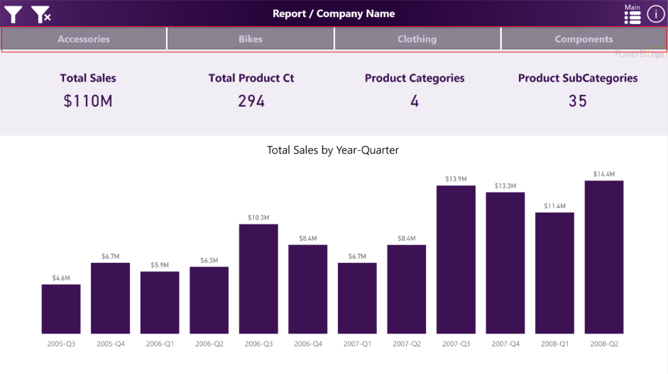
    • The report comes with four (4) pages.  In the example the are listed as Accessories, Bikes, Clothing, and Components.  By Clicking on these buttons the report navigates to a new page where all the visuals for these topics exist.
    Purple Haze Menu Bar
    Purple Haze Menu Bar
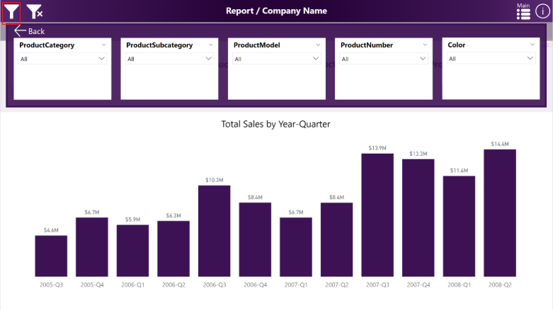
    • The filters across the top of the report are using an upper third filter context window.  This window is exposed when clicking on the filter icon, which is found in the upper left hand corner of the report:
    Purple Haze Filter Menu
    Purple Haze Filter Menu

    We hope you enjoy this new free layout.

    Be sure to follow:

    If you like the content generated from PowerBI.Tips please follow me on all the social outlets to stay up to date on all the latest features and free tutorials.  Subscribe to me on YouTube.  Or follow me on the social channels, Twitter and LinkedIn where I will post all the announcements for new tutorials and content.

    YouTube Linkedin Twitter
  • Microsoft Business Application Summit – PowerBI.Tips 2018 Top Tips and Tricks

    Microsoft Business Application Summit – PowerBI.Tips 2018 Top Tips and Tricks

    Want to give a special thanks to the Microsoft PowerBI team for allowing PowerBI.Tips to participate in the 2018 Microsoft Business Application Summit. If you were not able to make it to this event don’t worry, we are bringing the PowerBI.Tips session to you.

    The 2018 Top Tips and Tricks from PowerBI.Tips Session:

    MBAS Video

    What is in this Video:

    Link to Video is here

    In this video session Seth Bauer and Myself walk through a number of most viewed / used features of PowerBI.Tips.

    The following topics are covered within this session.

    1. Crazy Table Gymnastics
    2. Center the X-Axis in a Visual
    3. Segmented Filtering a Report Page with Slicers
    4. Filter a Slicer
    5. Query Editing and Adding Data Types to M Code
    6. Using the Lingo tool to modify the Power BI Linguistics Schema
    7. Create beautiful reports quickly by using Layouts
    8. Making a Date Table in DAX / use time indexes to create efficient measures for time analysis

    If you want to watch all the content from the Business Applications Summit you can zoom over to the official page here.

    Be sure to follow:

    If you like the content generated from PowerBI.Tips please follow me on all the social outlets.  Stay up to date on all the latest features and free tutorials.  Subscribe to me on YouTube.  Or, follow me on the social channels, Twitter and LinkedIn, where I will post all the announcements for new tutorials and content.

    YouTube Linkedin Twitter


  • Tic Tac Power BI

    Tic Tac Power BI

    I am proud to announce another joint development game between Philip Seamark and myself (Mike Carlo) of a Tic Tac Toe game.  To read about how this game was made jump over to Phil’s blog post found here.  If you just want to play the Tic Tact Toe game you can do so below in this Embedded sample found below:


    To play the game in full screen mode visit this link.  Additionally, ff you want your own copy of Tic Tac Toe you can download your copy here.

    Be sure to follow:

    If you like the content generated from PowerBI.Tips please follow me on all the social outlets.  Stay up to date on all the latest features, free tutorials and downloads.  Subscribe to me on YouTube.  Or follow me on the social channels, Twitter and LinkedIn, where I will post all the announcements for new tutorials and content.

    YouTube Linkedin Twitter
  • Center the X-Axis on a Line Chart

    Center the X-Axis on a Line Chart

    Sometimes when your working on a line chart you want the x-axis to stay centered on a chart. This tutorial will walk you through how to create an X-Axis that will always center it’s self on the graph.

    Video Support Material:

    The measures discussed within this tutorial are:

    Variance All = SUM(Sales[Variance])

    The column name Variance is found in the data table called sales.  This is just a numerical column.

    After summing up all the variances we can calculate the min and max lines.

    Const Max Line = [Variance All] * 1.2
    
    Const Min Line = -1 * [Const Max Line]

    Finally to calculate the variance to date you can use this filtered measure, which will only produce historical values.

    Variance To Date = CALCULATE([Variance All], FILTER('Sales','Sales'[Date] <= EOMONTH(TODAY(),0)))

    Thanks for watching our short tutorial.  If you like this video please be sure to follow me (Seth Bauer) on Twitter, LinkedIn and be sure to subscribe to the PowerBI.Tips YouTube channel.

  • Power BI and Sudoku – Yes Please

    Power BI and Sudoku – Yes Please

    This week Philip Seamark, an avid Power BI developer has released a joint project with PowerBI.Tips, a full Sudoku game in Power BI.  To be totally honest with you Phil did all the hard work, I just contributed the pretty background and provided some suggestions.  To learn more about how Phil build this amazing game within Power BI check out his blog post about it here.

    The Game

    If you want to play this Power BI file you can do so below:

    To play the Sudoku game in full screen use this link.

    Want the file:

    If you are interested in looking at this file to see how it works you can download the file using the link below.

    [product id=”18054″ ]

    Be sure to follow:

    If you like the content generated from PowerBI.Tips please follow me on all the social outlets to stay up to date on all the latest features and free tutorials.  Subscribe to me on YouTube.  Or follow me on the social channels, Twitter and LinkedIn where I will post all the announcements for new tutorials and content.

    YouTube Linkedin Twitter


  • Segmented Filtering with Slicers

    Segmented Filtering with Slicers

    This weeks tutorial focuses on the need to control groups of visuals independently.  This recently came up in a project where I needed to adjust all the items on the left side of the screen independently from the right side.  By using the Edit Interactions button found on the Format ribbon you are able to adjust how different visuals interact with each other.  Finally, adding multiple Slicers to the page for controls finishes out the report.  I hope you enjoy this weeks tutorial.

    Followup:

    On the demo page of the report you’ll notice that when various items are selected, some of the non-selected items dis-appear.  This is handled by using some formatting within the measures for the visuals.  All the measures used in this tutorial are listed below:

    Taking an Average of a Numerical Column:

    Average of Values = 
    VAR calc = AVERAGE( Data[Value] )
    RETURN if( calc = BLANK(), "", calc )

    Making Dynamic Titles off of a list of items in a table:

    Title = 
    VAR title = CONCATENATEX( VALUES( Data[Customer] ), Data[Customer], " & " )
    RETURN if( title = BLANK(), "", title )

    Producing a sum of values:

    Total of Values = 
    VAR calc = SUM( Data[Value] )
    RETURN if( calc = BLANK(), "", calc )

    Want the file:

    Need a little more help? Like the content from PowerBI.Tips.  Please consider purchasing the demo PBIX file to support more great content.

    [product id=”17894″ ]

    Be sure to follow:

    If you like the content generated from PowerBI.Tips please follow me on all the social outlets to stay up to date on all the latest features and free tutorials.  Subscribe to me on YouTube.  Or follow me on the social channels, Twitter and LinkedIn where I will post all the announcements for new tutorials and content.

    YouTube Linkedin Twitter
  • Data Table Filters

    Data Table Filters

    Hands down best feature this year to date, Data Table Filtering!  In the June 2018 Power BI Desktop Microsoft released the ability for you to navigate to the Data Table view.  While on this view drop down icons now appear which enable filtering of the Data Table.  This is super helpful when looking at the raw data that has been loaded into your data model.  Check out the video below to see how the feature works.

    Other Thoughts:

    For those of you who like Excel, and data tables in Excel, this feature will make you feel right at home within a pivot table type feel.  I hope you enjoy this month’s update as much as I did.  Thanks for stopping by.

    For the official documentation from Microsoft follow this link to the blog announcement.

    If you like the content generated from PowerBI.Tips please follow me on all the social outlets to stay up to date on all the latest features and free tutorials.

    Subscribe to me on YouTube.  Or follow me on the social channels, Twitter and LinkedIn where I will post all the announcements for new tutorials and content.

    YouTube Linkedin Twitter
  • Apply a Filter to a Slicer

    Apply a Filter to a Slicer

    Often when working with a Power BI report you will add a slicer that has a “Blank” item in the selection criteria.  From a usability standpoint you might not want this item shown.  Or maybe you have multiple items in the slicer that you would like to hide from the report consumers.  The video, linked below, walks you through why the “Blank” item is shown and how to remove it.

    Video on Adding Filters to a Slicer

    Additional Slicer Materials

    If you want to read more about syncing slicers check the official documentation release from the Microsoft Power BI Blog.  This feature was originally released in February of 2018 and was announced here in the Power BI Blog.

    Thanks for watching.  If you like this content be sure to subscribe and follow along for more content.

    Subscribe to me on YouTube.  Or follow me on the social channels, Twitter and LinkedIn where I will post all the announcements for new tutorials and content.

    YouTube Linkedin Twitter
  • When to Use Publish to Web

    When to Use Publish to Web

    There are often questions surrounding Publish to Web.  What is it?  How can I use it to share my reports?  This video walks through the proper usage for Publish to Web and how to manage the Power BI tenant settings.

    Check out this video explaining the full details surrounding this topic:

    If you like this video please be sure to follow me on Twitter, LinkedIn and be sure to subscribe to the PowerBI.Tips YouTube channel.