Data Sources
Power BI datasets: A Method to the Madness
As report authors we sometimes get caught up in how easy it is to create a report and provide value to the business. Each report is an opportunity to make a big contribution to the […]
As report authors we sometimes get caught up in how easy it is to create a report and provide value to the business. Each report is an opportunity to make a big contribution to the […]
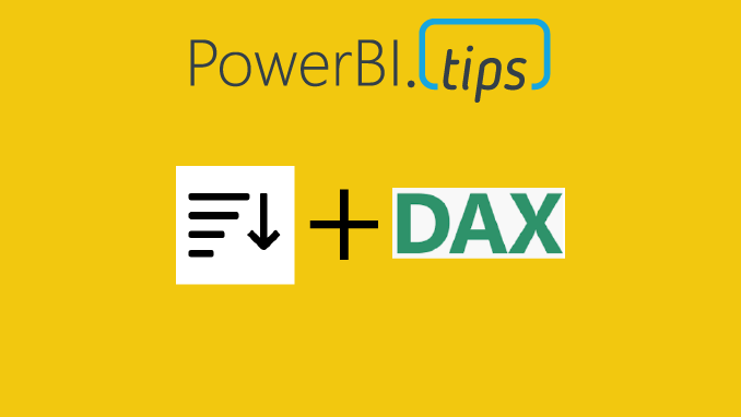
This post will answer how to sort a measure that returns text values to a custom order, without affecting other columns. It will utilize the DAX functions of REPT() and UNICHAR(8203) – a Zero width […]
Grouping with Style The release of grouping visuals was an extremely welcomed feature. As one who builds lots of reports grouping elements together is essential to stay organized and to increase report building speed. Since […]
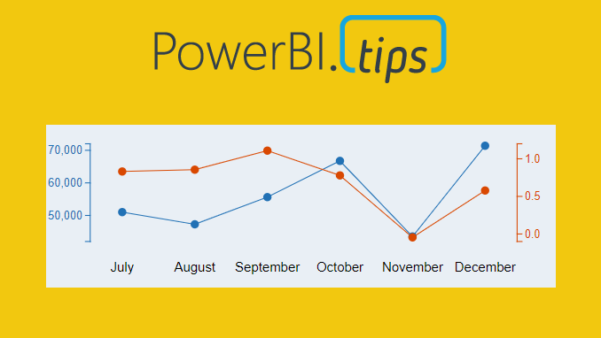
Ever need two different scales on the Y-Axis of a line chart? If so, then this tutorial is for you. While creating a dual y-axis line chart is pretty common in excel, it is not […]
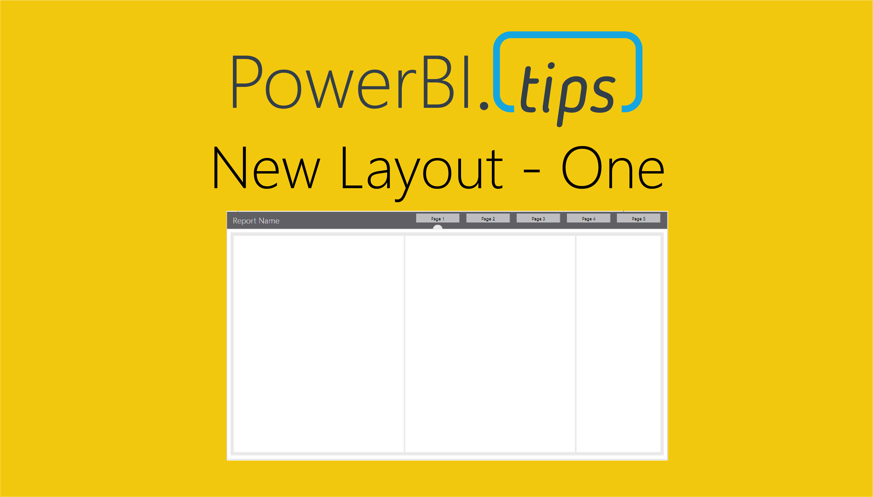
This layout continues to deliver fantastic visual guides to make your reports look top notch. This layout utilizes buttons for navigation without locking in the position in the layout background. We also really like how […]
Sometimes, we want the users to see different metrics, but do not want to take up too much space on our page. The scenario we are going to walk through is how to build just […]
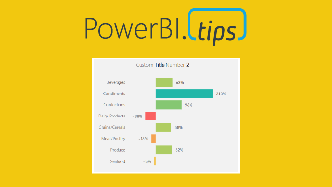
I am just bursting with excitement!! This month the amazing Power BI team has yet again come out with a great new feature, Icon sets. In addition to this you can enhance these icon sets […]
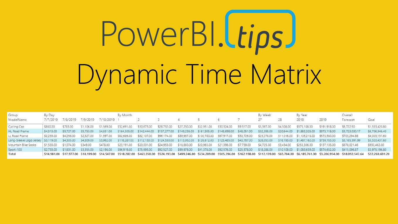
Time and time again when I begin talking with Excel users and ask to see what current reports they are using, they usually show me a table with a mixed bag of columns split by […]
I’m a lazy engineer. Let me qualify my statement. In lazy I mean I like to find the path of least resistance, the shortest distance between two points. Everyday I challenge myself to be lazy, […]
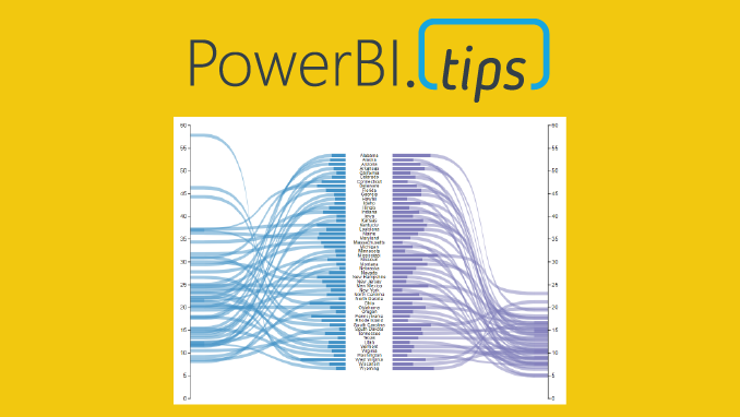
Welcome to another installment of building custom visuals with the Charts tool from PowerBI.Tips. In this edition we make the following custom visual. This chart comes to us from the sharp mind of Nick Snapp, […]
Copyright © 2024 | MH Magazine WordPress Theme by MH Themes