Sep 11, 2019
Dual Y-Axis Line Chart
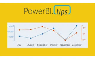
Ever need two different scales on the Y-Axis of a line chart? If so, then this tutorial is for you. Learn how to create a dual y-axis line chart.
Page 20 of 24
Sep 11, 2019
Ever need two different scales on the Y-Axis of a line chart? If so, then this tutorial is for you. Learn how to create a dual y-axis line chart.
Sep 3, 2019
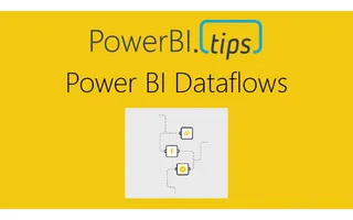
There are different ways you can connect to a multitude of different data sources. I’ve written about the different connection types before and you ca...
Aug 30, 2019
This layout continues to deliver fantastic visual guides to make your reports look top notch. This layout utilizes buttons for navigation without lock...
Aug 8, 2019
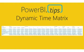
Sometimes, we want the users to see different metrics, but do not want to take up too much space on our page. The scenario we are going to walk throug...
Jul 18, 2019
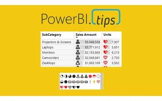
I am just bursting with excitement!! This month the amazing Power BI team has yet again come out with a great new feature, Icon sets. In addition to t...
Jul 11, 2019
Time and time again when I begin talking with Excel users and ask to see what current reports they are using, they usually show me a table with a mixe...
Jul 3, 2019
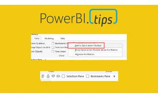
I’m a lazy engineer. Let me qualify my statement. In lazy I mean I like to find the path of least resistance, the shortest distance between two poin...

Jun 20, 2019
This year the Microsoft Business Application Summit (MBAS) was held in Atlanta Georgia. Despite some travel snafu’s (3 rebooking’s and 9 delays), we m...
Jun 20, 2019
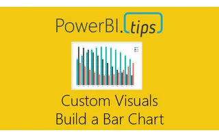
Welcome to another installment of building custom visuals with the Charts tool from PowerBI.Tips.
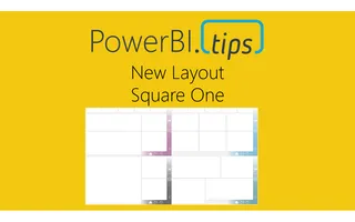
May 1, 2019
“Square One” utilizes the color theme as a background component that adds a pop of accent color only. This gives you the end user the maximum flexibil...
Mar 21, 2019
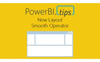
Hey everyone! We're excited to release our latest layout 'Smooth Operator'. Download it now and give your reports a fresh look.
Feb 12, 2019
With the release of the custom visuals building tool Charts.PowerBI.Tips we received a number of comments requesting tu...

Jan 21, 2019
To celebrate joining the Power BI Cat team next week, I thought I would update a DAX game I built last November (2018) which was a DAX-based maze game...
Dec 4, 2018
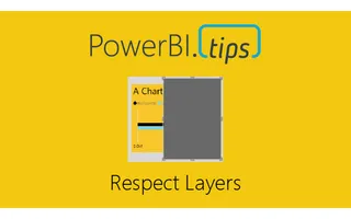
If you are like me and you like making your reports look extra good with different visual elements you’ve probably come across the issue before where...

Nov 26, 2018
If you haven’t had your mind melted over the past few games that Phil Seamark has developed here is one more, aMAZEing DAX. This month’s game is a Ga...
Nov 13, 2018
I have been holding on to a copy of Satya Nadella’s book “Hit Refresh” for quite some time. With all the Power BI goodness, the job, etc.… I just hadn...
Oct 2, 2018
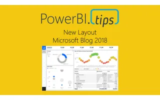
In the September 2018 blog post the Microsoft team released a new layout. This layout has a number of really nice design elements. However, upon rev...
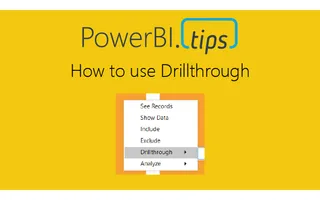
Sep 10, 2018
In Power BI reports various features are used to enhance the reporting experience. Drillthrough allows users to navigate to different report pages wi...
Sep 10, 2018
In Power BI reports various features are used to enhance the reporting experience. A hierarchy is a ordered set of values that are linked to the leve...
Sep 10, 2018
In Power BI reports various features are used to enhance the reporting experience. Focus mode allows for a single visual to expand for dedicated inte...
Sep 10, 2018
In Power BI reports various features are used to enhance the reporting experience. The Ellipsis allows users to open an option menu specific to a vis...
Sep 10, 2018
In Power BI reports various features are used to enhance the reporting experience. Tooltips appear when the cursor is hovering over a visual. Not al...
Sep 4, 2018
When you design a report, there are a number of things to consider. For example, the types of visuals, the colors used within the visuals, and the lo...

Aug 21, 2018
PowerBI.Tips and Phil Seamark are proud to release our third game written in Power BI, DAX Mission Impossible. This game is similar to the game play...